Thoughtful Typography and Playful Design
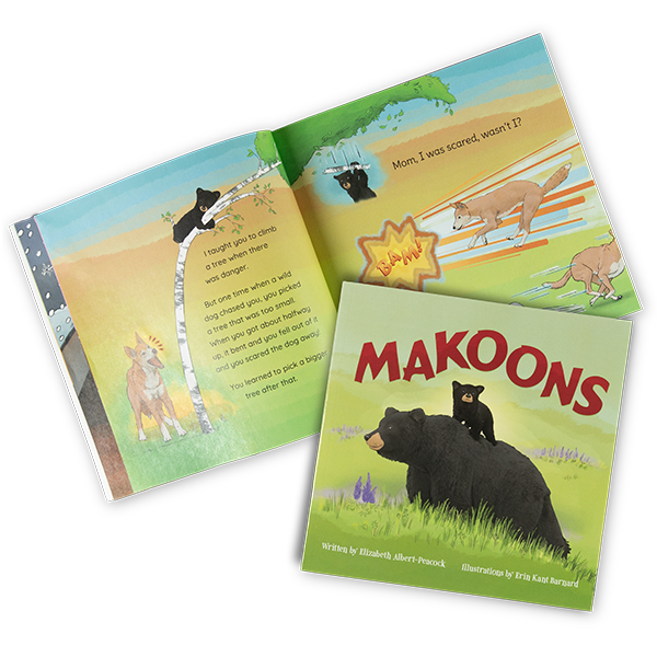
This delightful tale weaves Anishinaabe traditions with universal themes of growth, curiosity, and purpose, creating a story that is as enriching as it is entertaining.
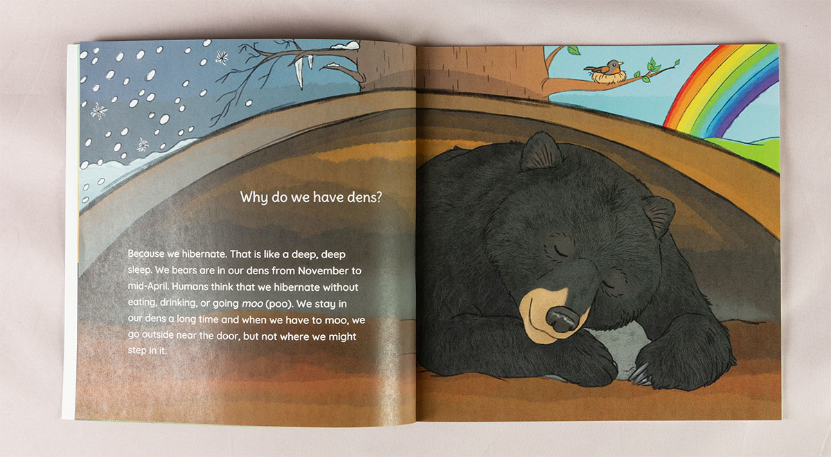
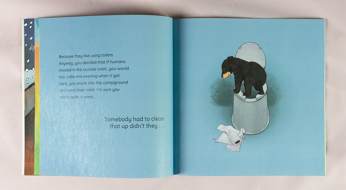
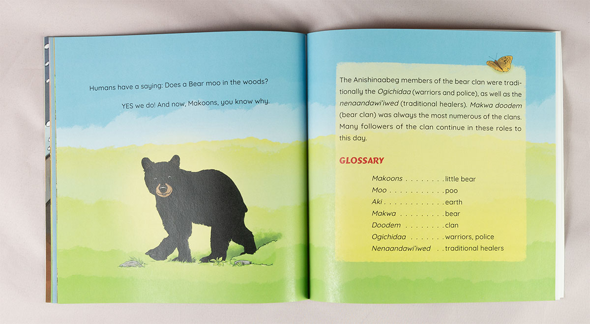
As the designer, my focus was on ensuring the typography and layout supported the narrative’s clarity and emotional tone.

Since author Elizabeth Albert-Peacock’s story alternates between the voices of the cub and its mother, I differentiated these voices through typography: the cub’s playful, curious nature is reflected in a slightly more stylized and larger font, while the mother’s calm, nurturing demeanor is conveyed through a clean sans serif. This subtle distinction helps guide readers through the dialogue effortlessly.
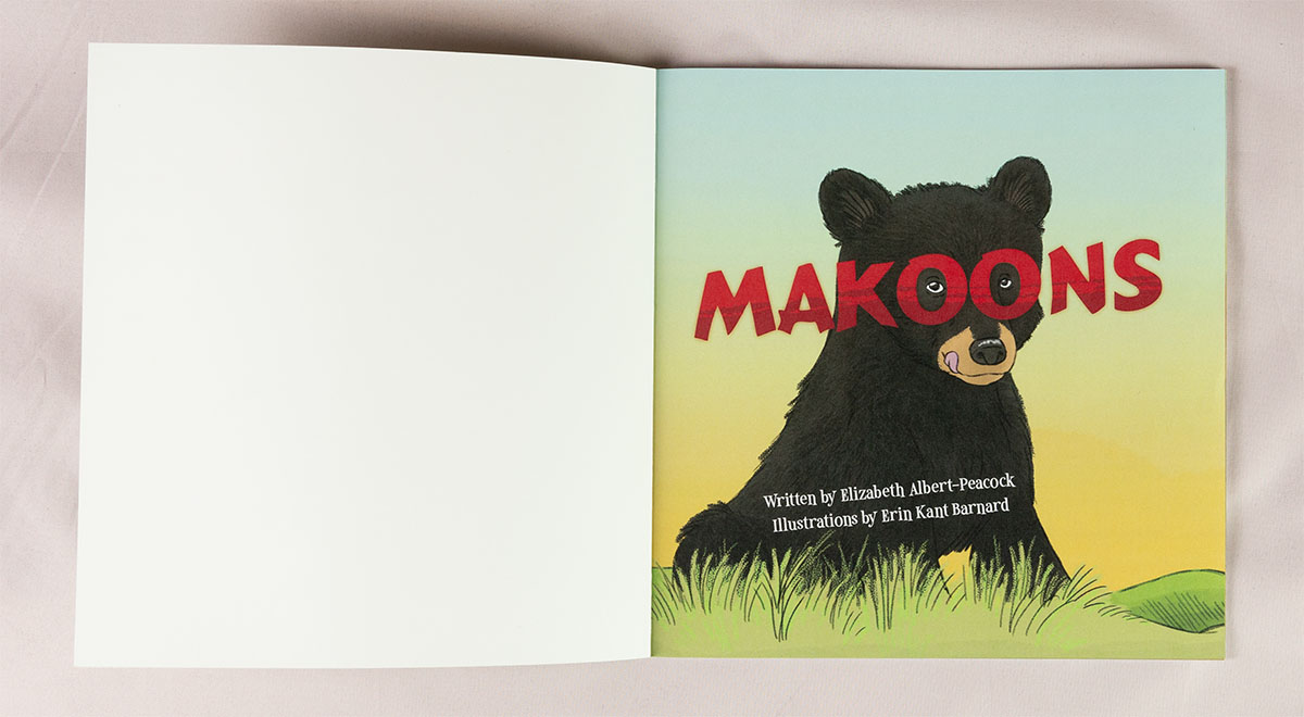
The book’s playful design is especially evident on the title page, where Makoons peeks through the “OO” in the title—a custom detail I developed in collaboration with illustrator Erin Kant Barnard. This touch captures the cub’s charm and playfulness while tying the design seamlessly to the story’s spirit.
Project Reflections
Collaborating with the illustrator required thoughtful integration of her artwork into the book’s overall layout. While Erin’s initial designs showcased a strong artistic voice, the layouts posed some challenges with tight margins and typography that didn’t align with professional readability standards. I reworked these elements and adjusted several of her compositions, ensuring her art could shine without crowding or compromising the text.
Using her layered artwork, I also created cohesive title and copyright pages—elements not initially provided in the project scope. These adjustments ensured the final product met both aesthetic and functional goals.
For the interior, I prioritized readable, well-balanced text to enhance the story’s accessibility for young readers while maintaining a polished, professional design. Makoons reflects a seamless blend of narrative, art, and design, inviting readers into a warm, engaging world.


