When artist and labor activist Ricardo Levins Morales set out to publish a collection of his writings, he already had a deep connection with his readers and a distinct creative voice. What he needed was a book design that could bring those qualities forward—one that honored his vision while guiding the work into its final, physical form.
That’s where I came in.
Creative Brief
Ricardo provided the guiding vision and generously opened his archive of artwork. From there, I helped the book become what it wanted to be—selecting art, shaping its structure and visual tone into a cohesive, engaging experience.
This is the kind of design I love most: a blend of clarity, creative trust, and close listening.
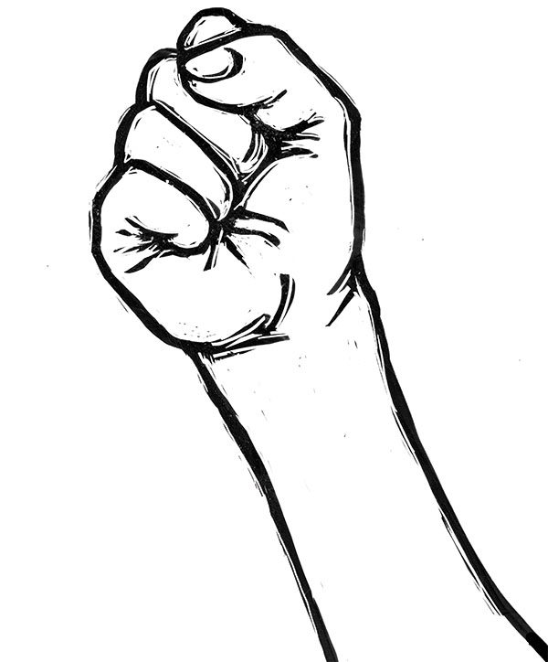
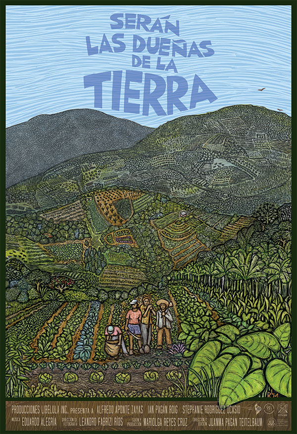
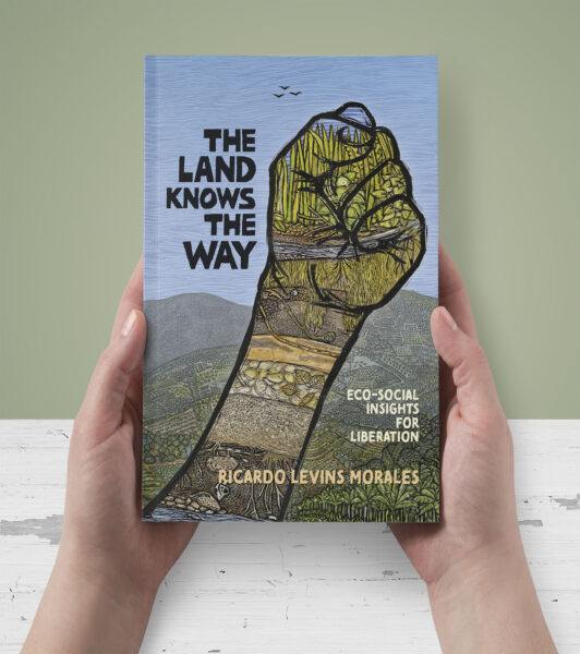
A Cover That Carries Layers
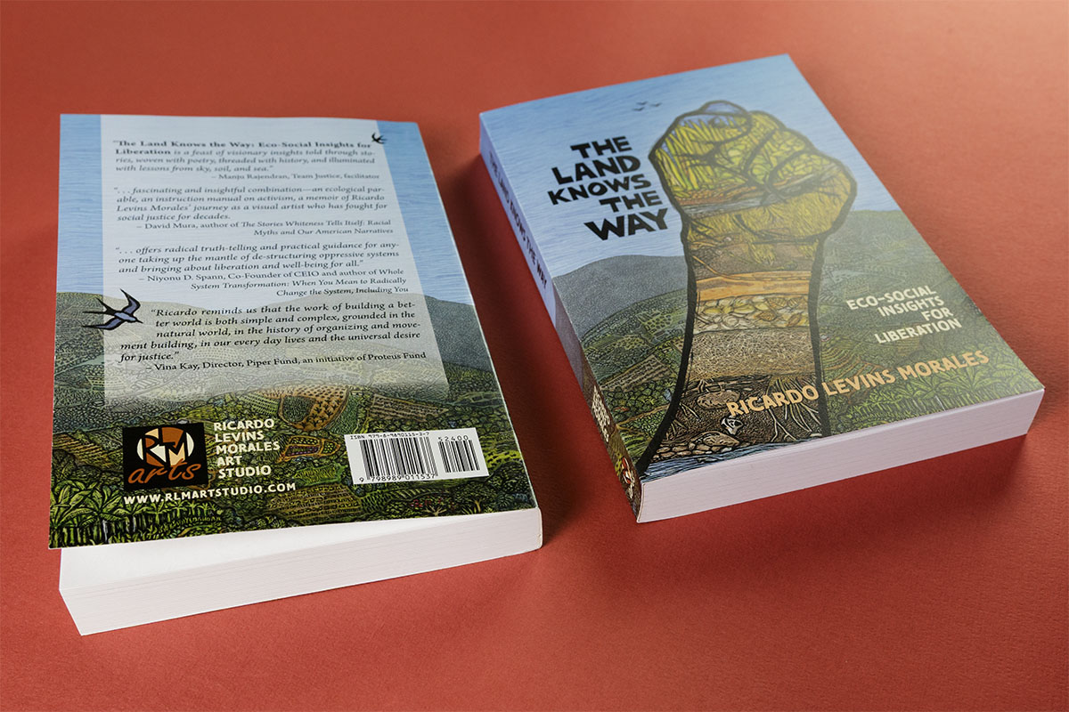
The cover art is a composite of four original pieces—centered around a raised fist drawn in Ricardo’s signature style. We selected the primary image together, and then I extended and layered it to create a front-to-back wrap, using mirrored textures and sky detail to unify the composition. The hand-lettered title (created by Ricardo, following a typeset template I provided) balances visual energy with personal character. Its placement—anchored in the upper left—adds a quiet tension that echoes the book’s themes of solidarity and resistance.
Interior Structure & Rhythm
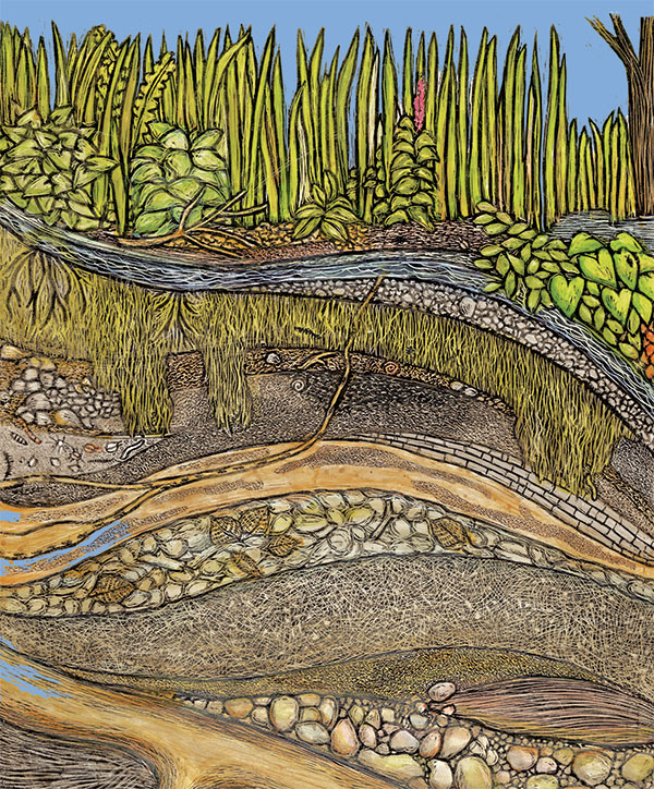
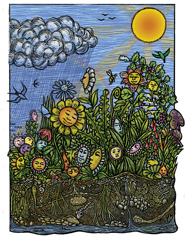
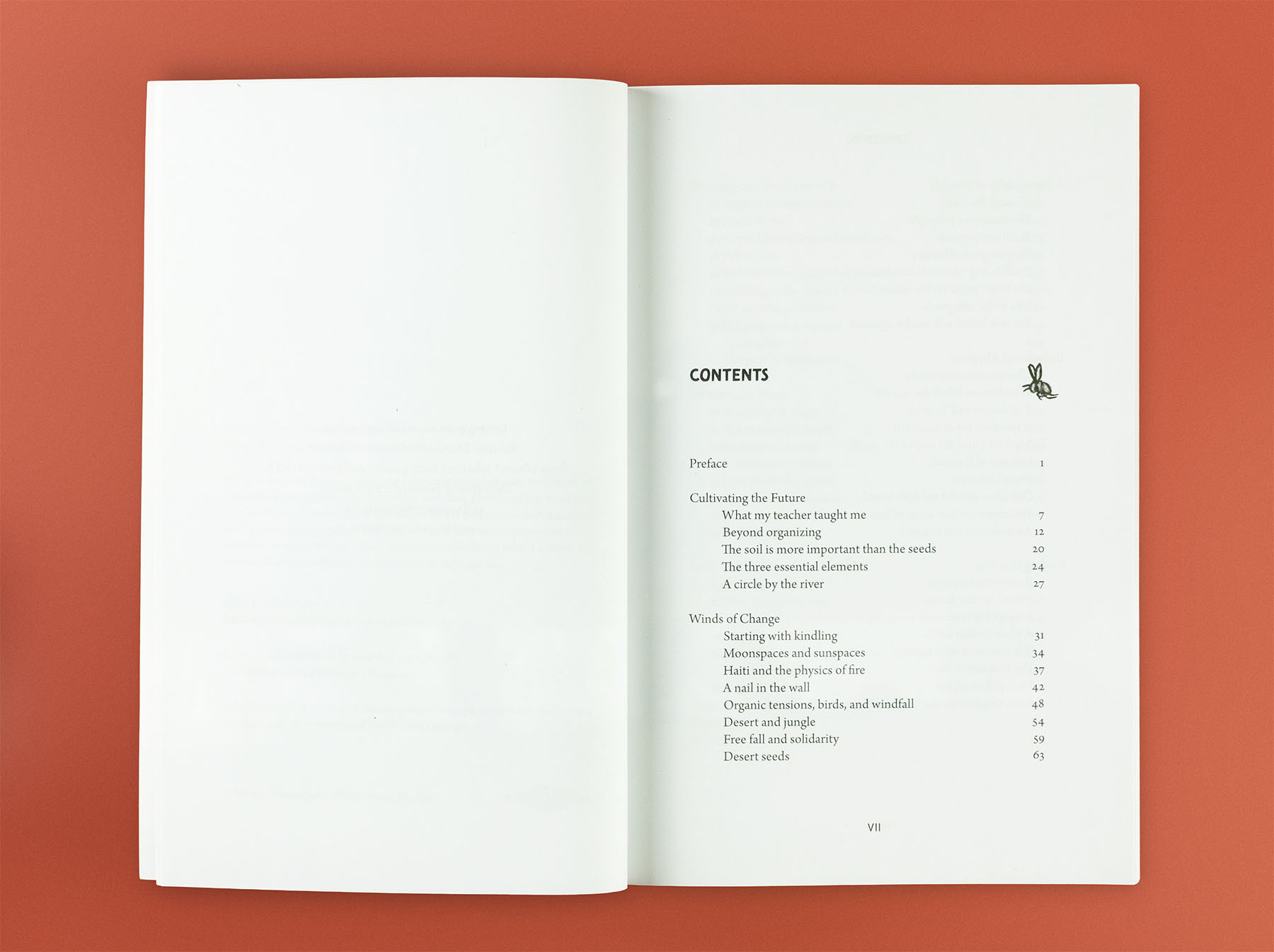
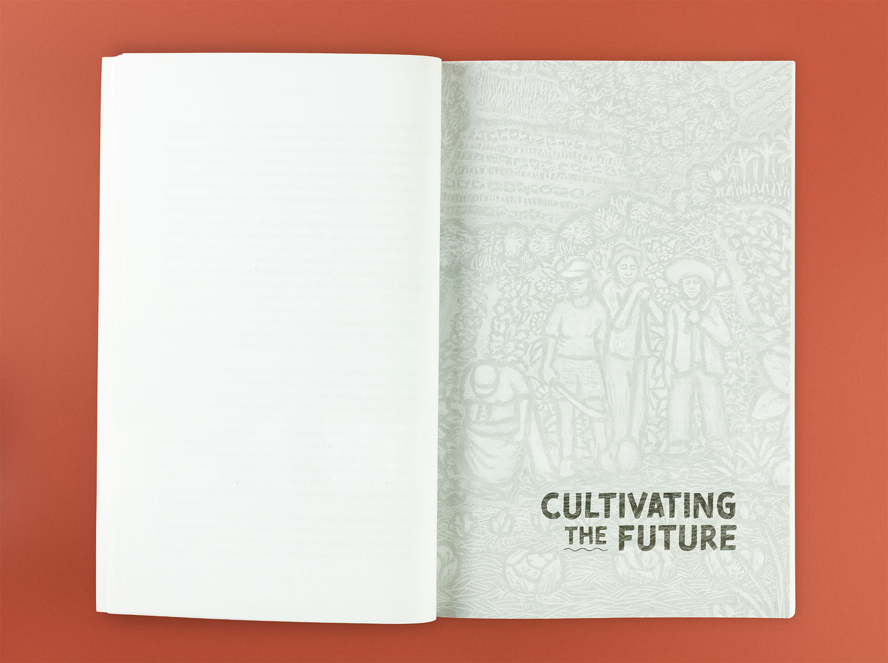
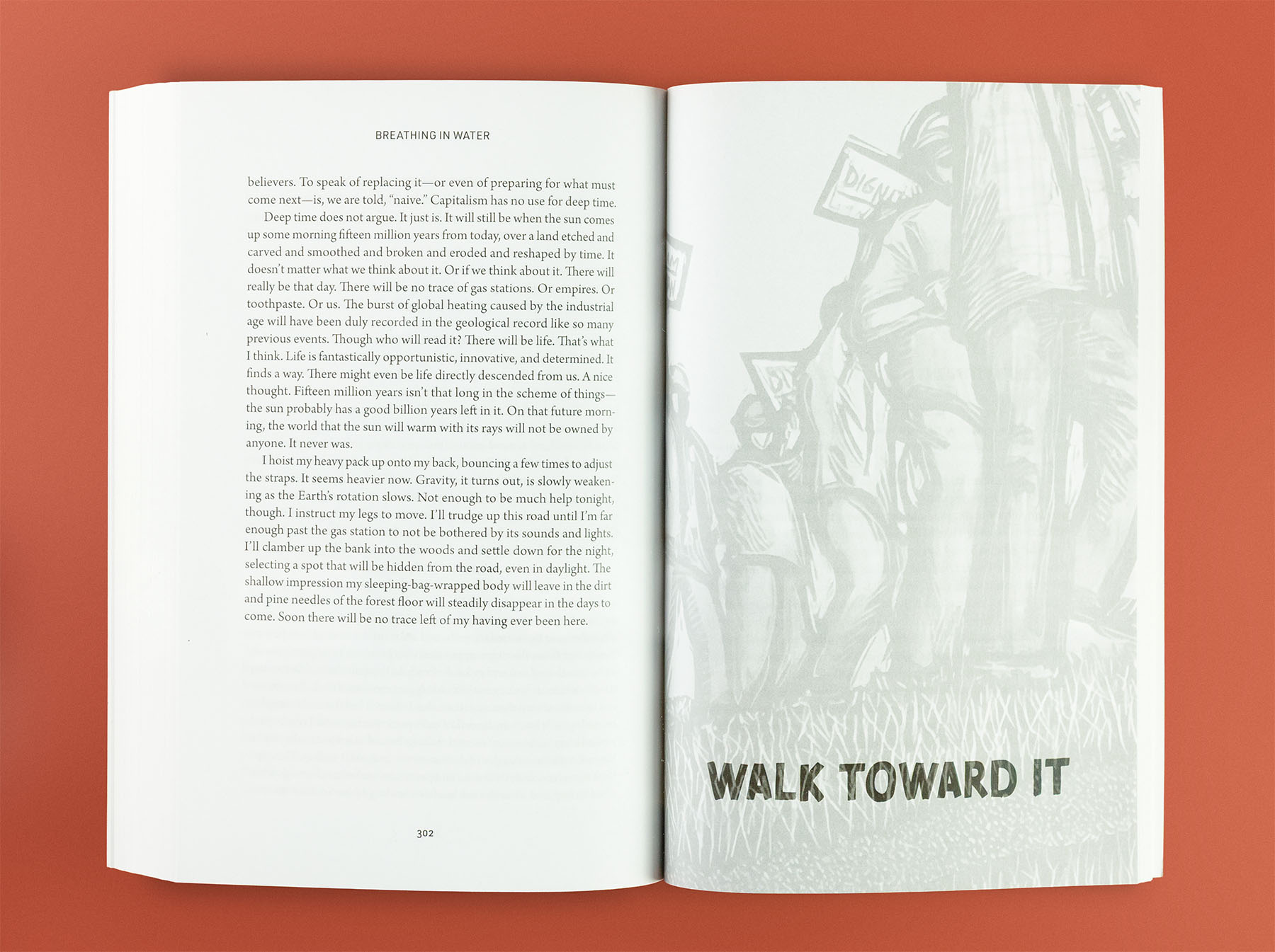
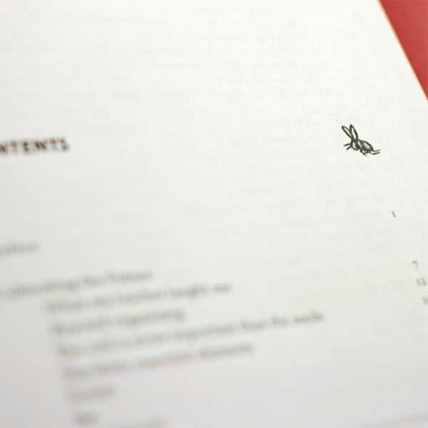
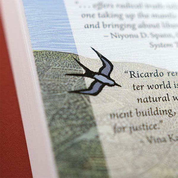
Inside, 63 essays are organized into eight sections, each introduced with a full-bleed piece of art. I selected and formatted these images from Ricardo’s archive—zooming in on moments of richness or symbolism, always keeping legibility and emotional resonance in mind. A clear, carefully organized table of contents helps readers navigate the collection, alongside a references section and complete index.
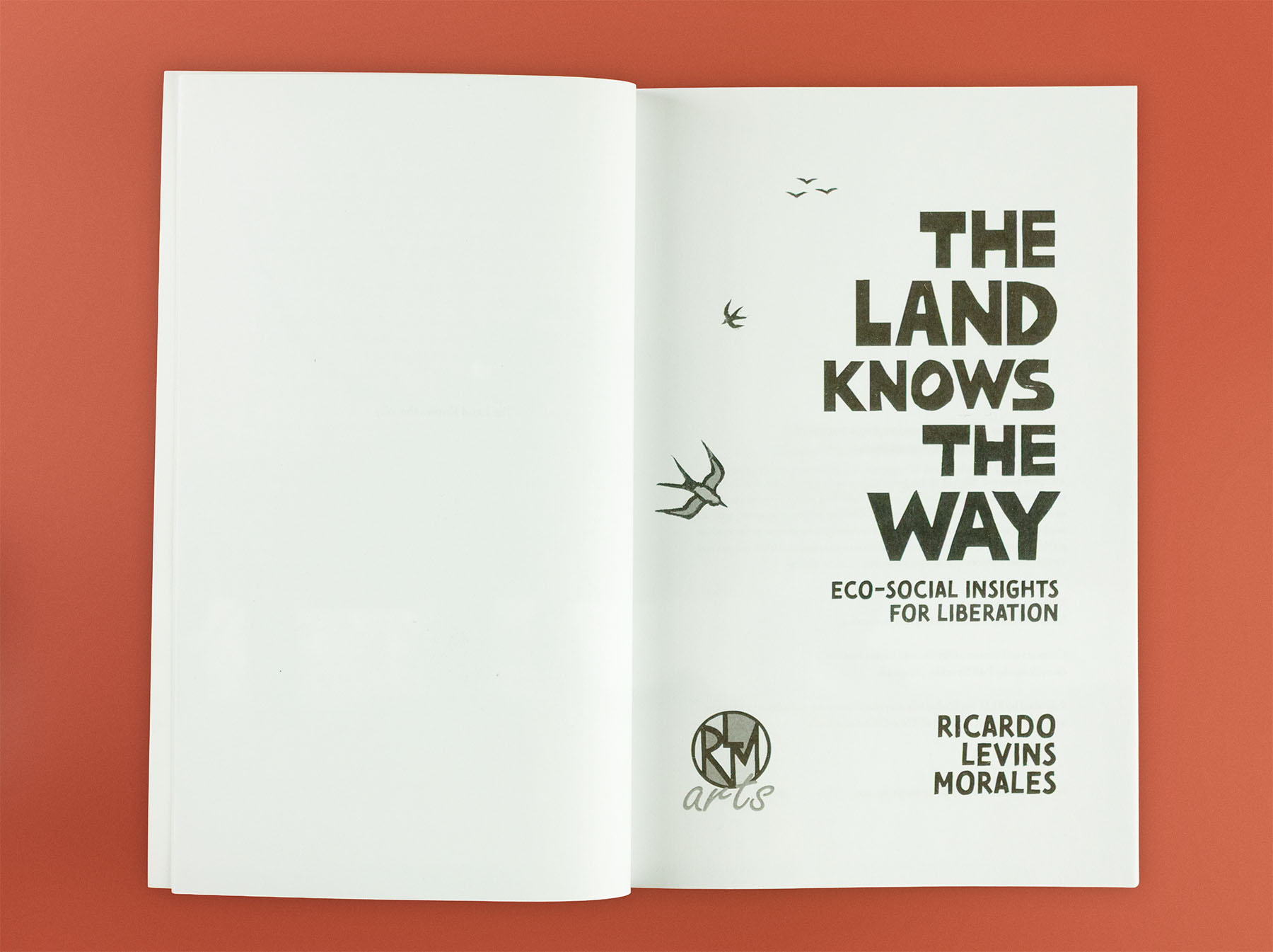
Typography pairs the expressive Tomarik Brush with the refined clarity of Arno Pro. Running heads, wide margins, and centered folios keep the layout elegant and unobtrusive—letting the writing shine while maintaining visual texture.
Design That Supports Meaning
More than arranging images and type, my role was to help shape the visual and structural form supporting Ricardo’s ideas. That meant knowing when to lead, and when to let the work speak for itself. This project brought together design, interpretation, and intuition—the kind of collaboration that feels less like executing a vision and more like discovering it together.
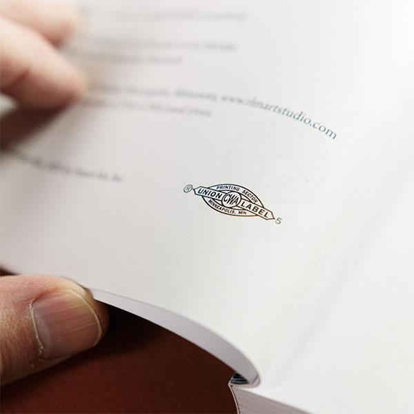
Production included a short-run print at SmartSet, a local B-Corp printer, and a larger union-printed edition in Maryland—aligning the final product with the values at the heart of the work.
“The pleasure is mutual. You’ve added so much to the project.”
Ricardo Levins Morales, on the design of The Land Knows the Way