A Tale of Love, Art, and Design Evolution
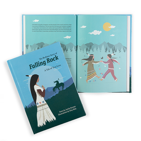
When I joined the team for Falling Rock—a beautifully illustrated story by Justin Kerson with art by Brazilian illustrator Eloy Bida—it was already brimming with creative potential. Eloy’s vivid, hard-edged digital art captured the story’s heart: a tender tale of Miwok lovers and an act of courage that ripples across time.
Yet, as is often the case, the manuscript needed some design magic to elevate it into a polished book worthy of the story within.
Reflections
Originally envisioned as a compact 5 x 8 paperback, the book’s preliminary layout left room for improvement. Fonts clashed, margins meandered, and key fundamentals like page numbering weren’t quite where they needed to be.
After some thoughtful conversation, Justin entrusted me with reimagining the book’s design. This was an opportunity to resolve the issues and craft a presentation that honored both his words and Eloy’s art.
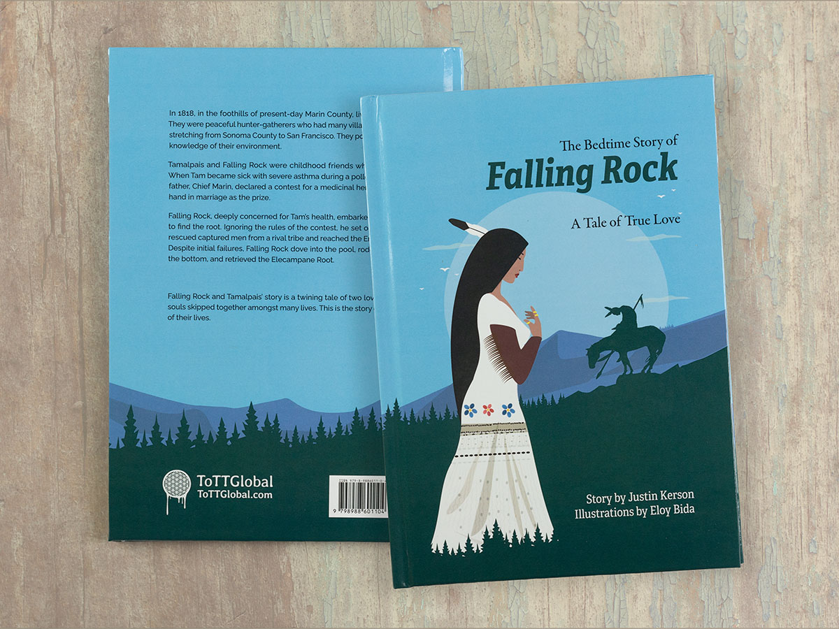
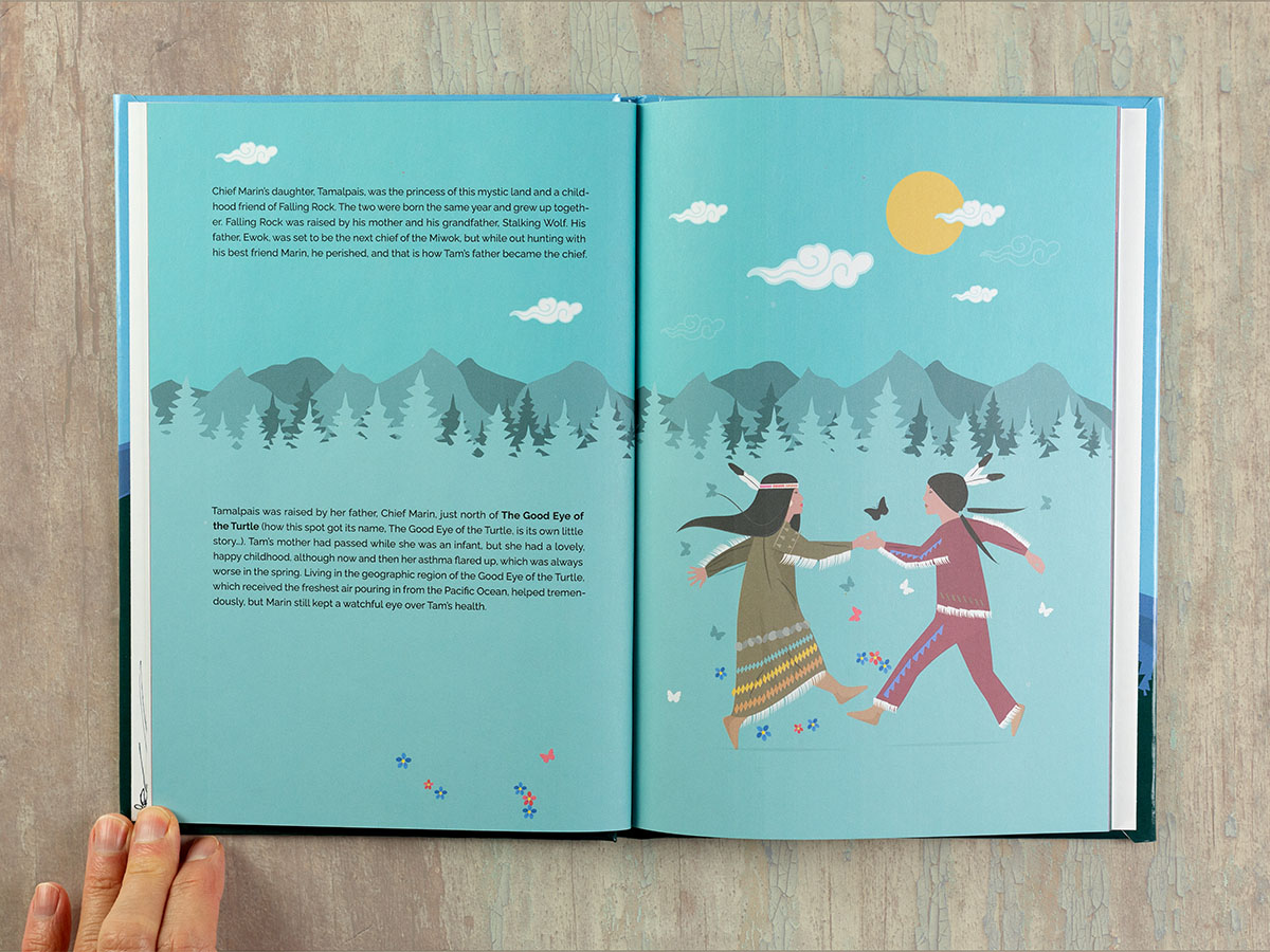
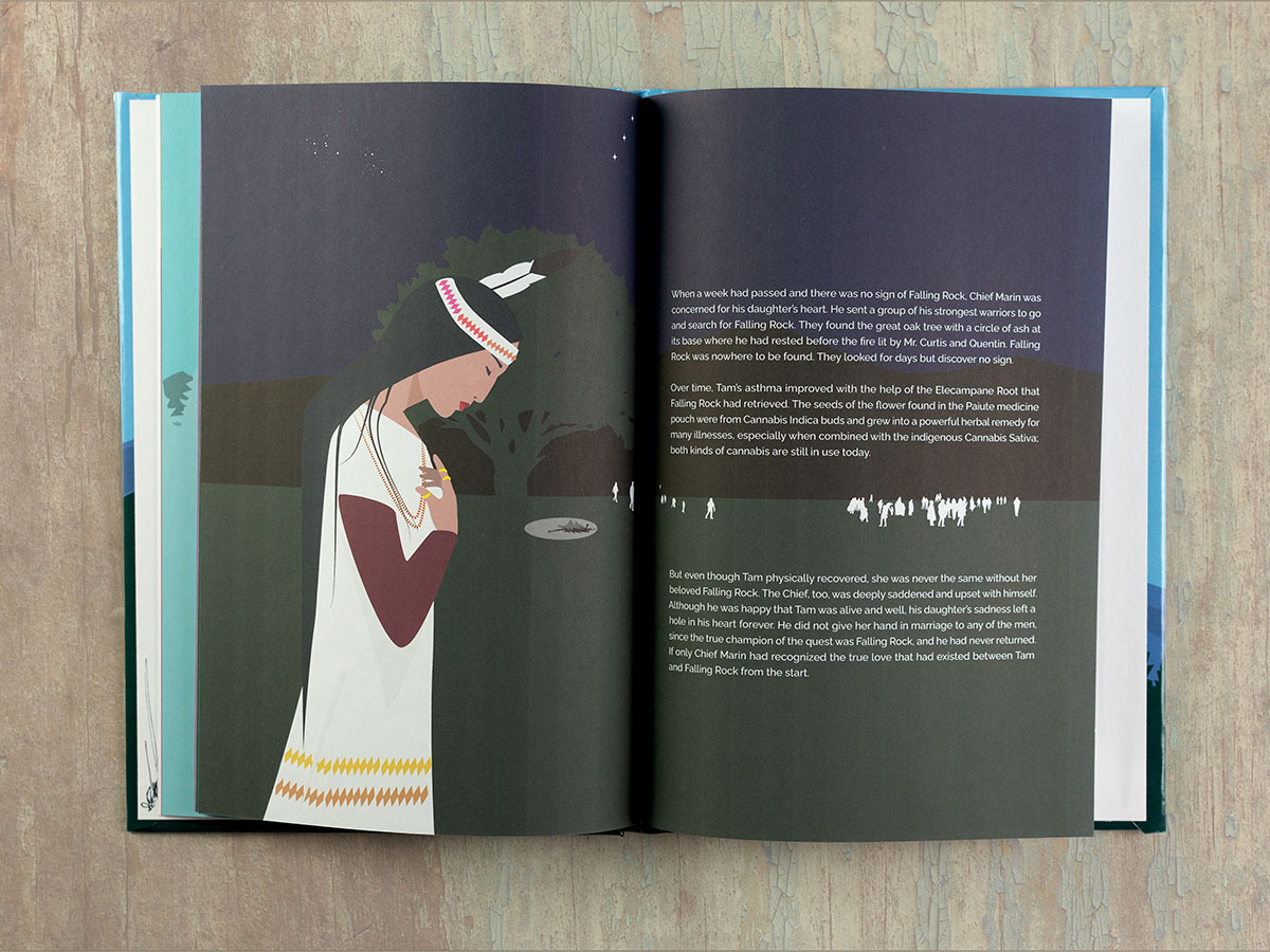
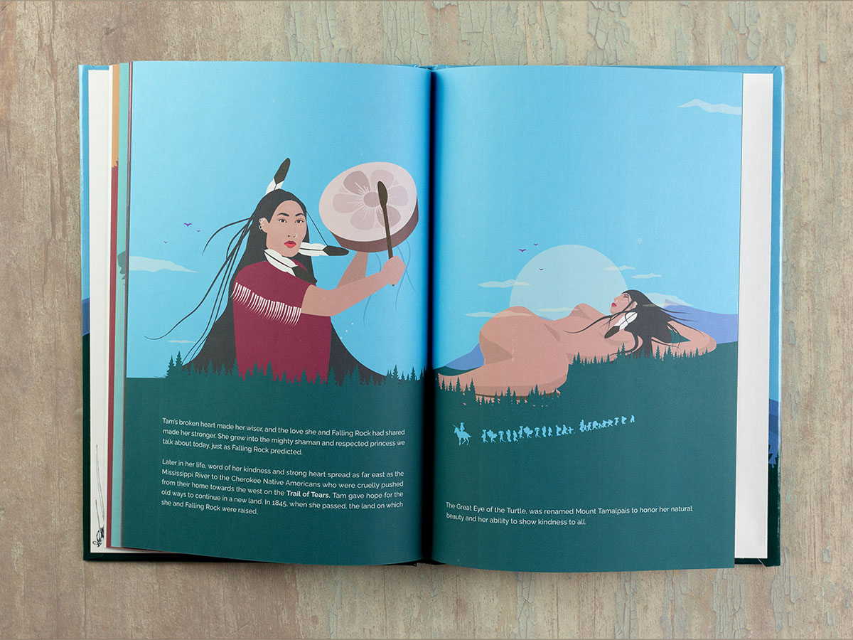
To better showcase the bold illustrations, we resized the book to a striking 7 x 10 format, lending the story room to breathe while preserving the integrity of Eloy’s vector-based artwork. I leaned into a clean sans serif for the text, softening it with a slab serif for headings to mirror the story’s balance of humanity and strength.
A right-justified italic slab serif paired with a traditional serif subtitle added an unexpected but fitting harmony for the title. From cover design to interior layout, I carefully adjusted every element to unify the book’s visual language, ensuring it flowed seamlessly and professionally.
We settled on a POD laminated gloss hardcover for Falling Rock. It allowed Justin to better manage inventory while emphasizing its tactile appeal and striking cover art.
There were revisions aplenty—tweaks to images, recoloring backgrounds, and text adjustments. Still, each step reinforced the project’s collaborative spirit and reminded me of the delicate dance of guiding first-time publishers through the process.
The journey didn’t stop with print. At Justin’s insistence, I also created a digital adaptation. This meant a fixed-layout ePub, necessary to preserve the relationship between text and illustrations in the digital format. While fixed-layout ePubs have their quirks, this effort ensured the story could reach more readers while staying true to its design.
In the end, Falling Rock emerged as something both Justin and I were proud of—a beautiful book that not only conveyed his vision but enhanced it. As Justin put it, “Thank you for the help & patience along the process!” For me, it was a reminder of why I love what I do: crafting books with care, creativity, and a touch of whimsy to bring stories like this to life.

