Weaving Story Elements into Design
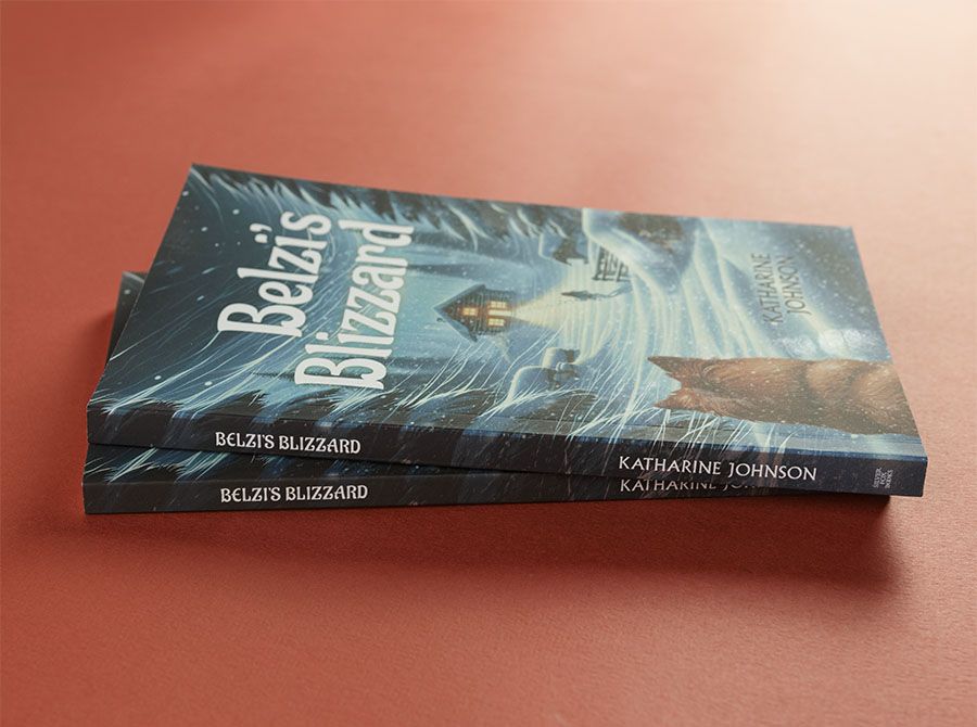
Designing the cover and interior for Belzi’s Blizzard was an exciting challenge that balanced the serious tone of the story with a design that would resonate with its middle-grade audience.
This novella, my fourth collaboration with author Katharine Johnson, follows 12-year-old Belzi through a week-long blizzard in 2020 as she uncovers family secrets, isolated with her estranged grandmother deep in Minnesota’s North Woods.
Reflections
As usual in my process, the project began with a meeting to develop the creative brief. Katharine and I discussed the themes, imagery, and symbolism—drawn from her own North Woods upbringing.
Cover Development
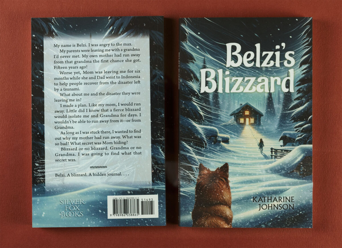
A central goal was to reflect the mystery, danger, and isolation permeating the story. Katharine wanted to avoid neutral white, gray, and black—so common to “blizzard” books. I developed five cover concepts featuring the essential story elements: a snow-covered scene, a Finnish Spitz dog, a cabin, and Belzi herself. To give her a range to consider, some were more abstract, while others were more literal in illustration style. I solved the “no gray” mandate with cooler neutrals and spots of warmer browns and yellows. AI image generators played a crucial role in sourcing initial visuals for the cover, but I refined much of the final artwork, redrawing elements to ensure harmonious composition and suitability for print.
The final design of the cover was chosen after input from Katharine’s target audience (her grandkids) and further refinements. It features a mysterious scene that captures Belzi’s adventurous spirit and the story’s wintery suspense. Typography was a critical element, balancing playfulness with sophistication to appeal to tween readers while hinting at the story’s mature themes. Katharine’s feedback after receiving the book was especially gratifying: “My husband said, ‘Best Cover Ever!’ I agree (even though I like them all)!”
My husband said, “Best Cover Ever!”
Author Katharine Johnson
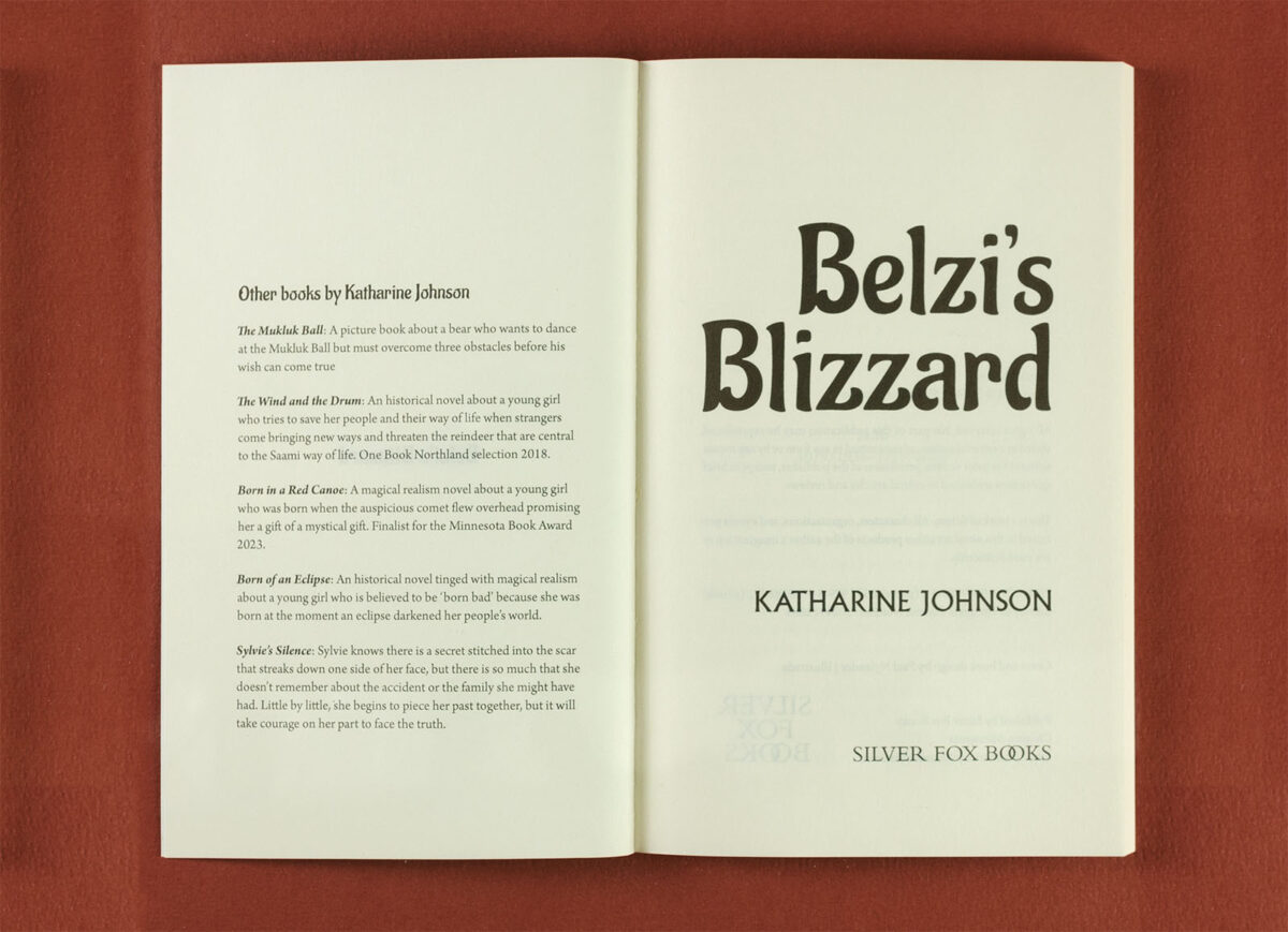
Coordinating Interior
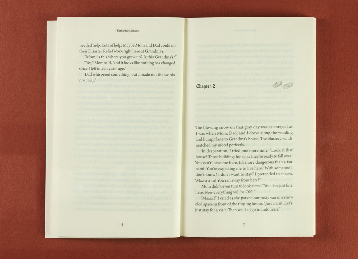
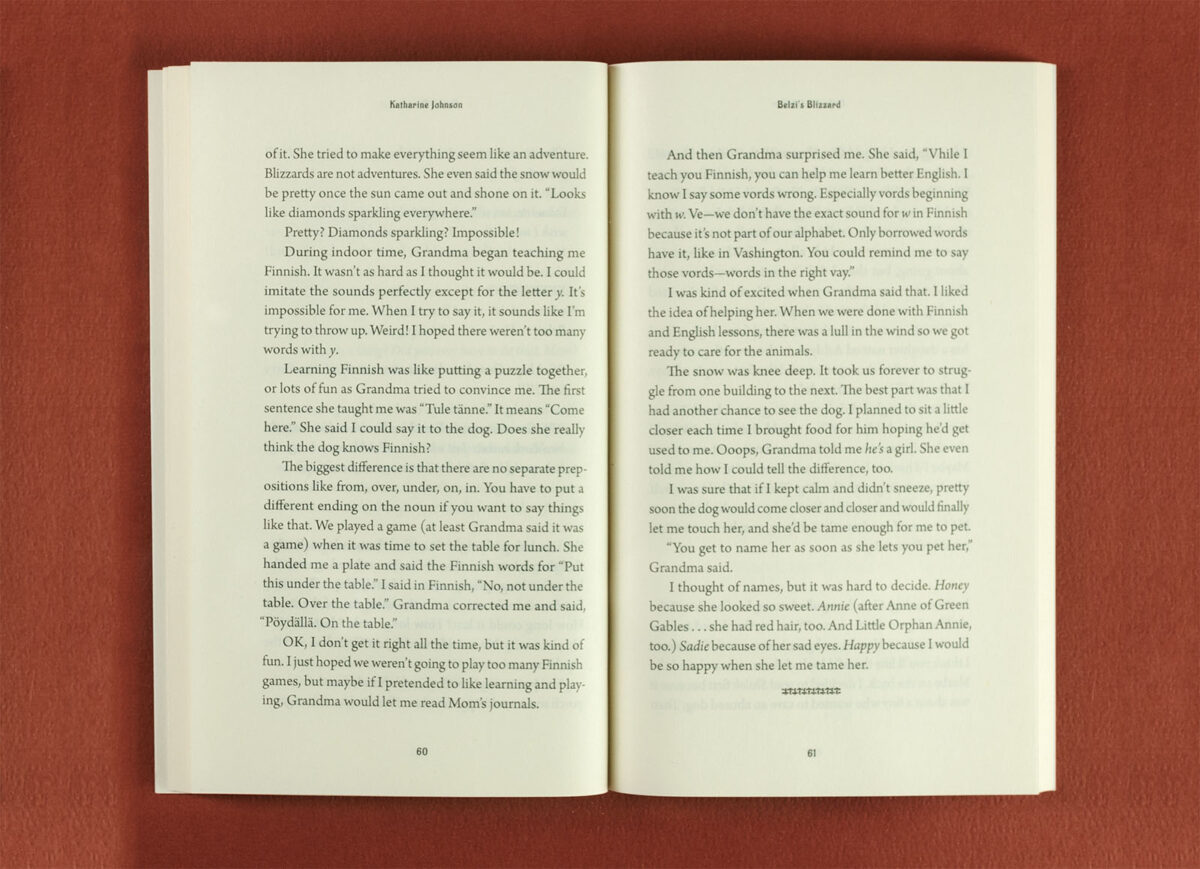
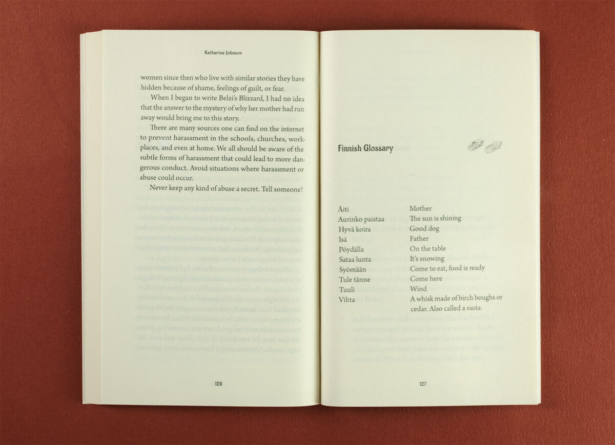
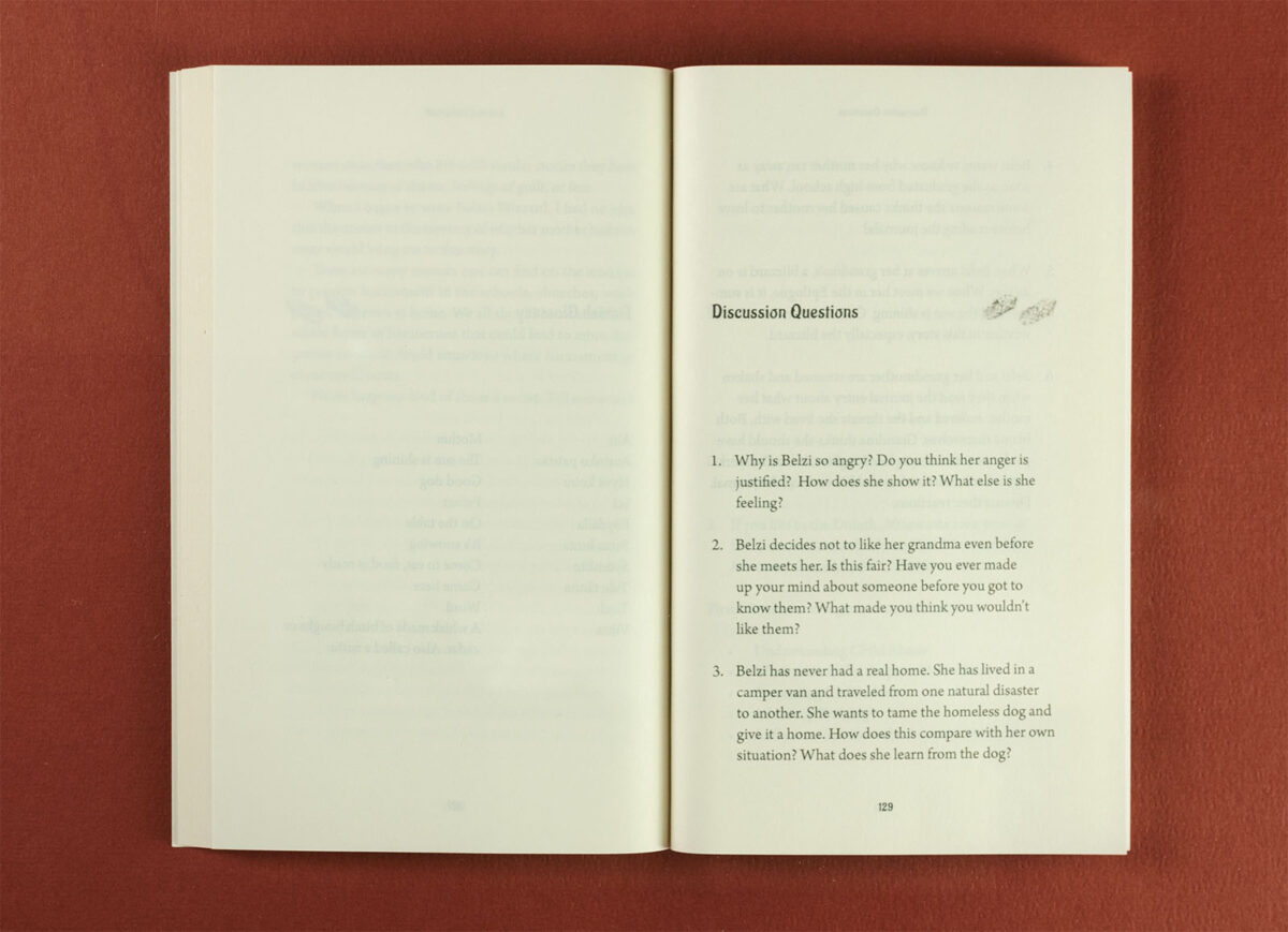
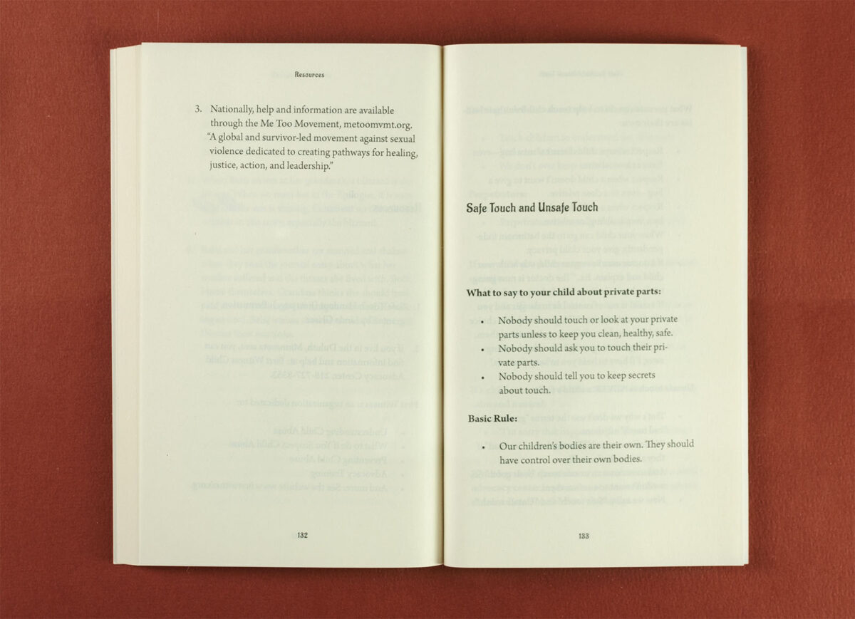
For the interior, I opted for a clean and readable layout, typesetting the text in a font size slightly more akin to adult novels than what I had used in Katharine’s previous MG novel, Sylvie’s Silence, while still ensuring comfort for younger readers. Katharine’s numbered, but unnamed chapters were introduced using the title font. To add a special touch, I incorporated a pair of birch bark woven shoes—a nod to Belzi’s (and Katharine’s) grandmother—as chapter openers. A woven bark motif also appeared as a divider line, reinforcing the connection to the story’s setting and Finnish heritage.
The result was a thoughtfully crafted book designed to invite readers into Belzi’s world while honoring the serious themes of the narrative. Collaborating with Katharine on Belzi’s Blizzard was another rewarding opportunity to bring her vivid stories to life, combining creative spark with careful craftsmanship.

