
Paper choice depends on the book usage
One of the more perplexing questions to answer in preparing a book for production is what paper to use. Because there are just so many options!
For an art book with color images, generally my go to is an 80# or 100# text weight coated matte white stock. (That is 80 or 100 pound basis weight; see “50=20” below for more about basis weights).
For a black and white book with images, such as a memoir, more often I use a lower grade paper, such as an uncoated (“offset white”) stock, in a 50, 55, 60, or even 70# text weight stock. Depending on the quality of the images to be printed, the next step up, still uncoated but more processed, are the opaque papers, perhaps a 70 or 80#.
For a novel, or other book without images, often a cream or natural paper is used, commonly a 50, 55, or 60#, but as low as a 40# if the budget is tight.
What do all these numbers mean?
And how are you supposed to know which option is right?
Aside of budget, there are three factors to consider:
- Bulk—the thickness of the paper and the resulting book
- Show through—how much of what is printed on the back of the paper you can see
- Page feel—what does the paper feel like, and how it drapes as you turn the page
Higher weight papers (larger number) will give you more bulk, and less show through. A heavier paper will feel more substantial and even luxurious. As a designer, generally I want to use as heavy a paper as possible. But this comes at a cost, and practical budget considerations for a project must be factored in as well.
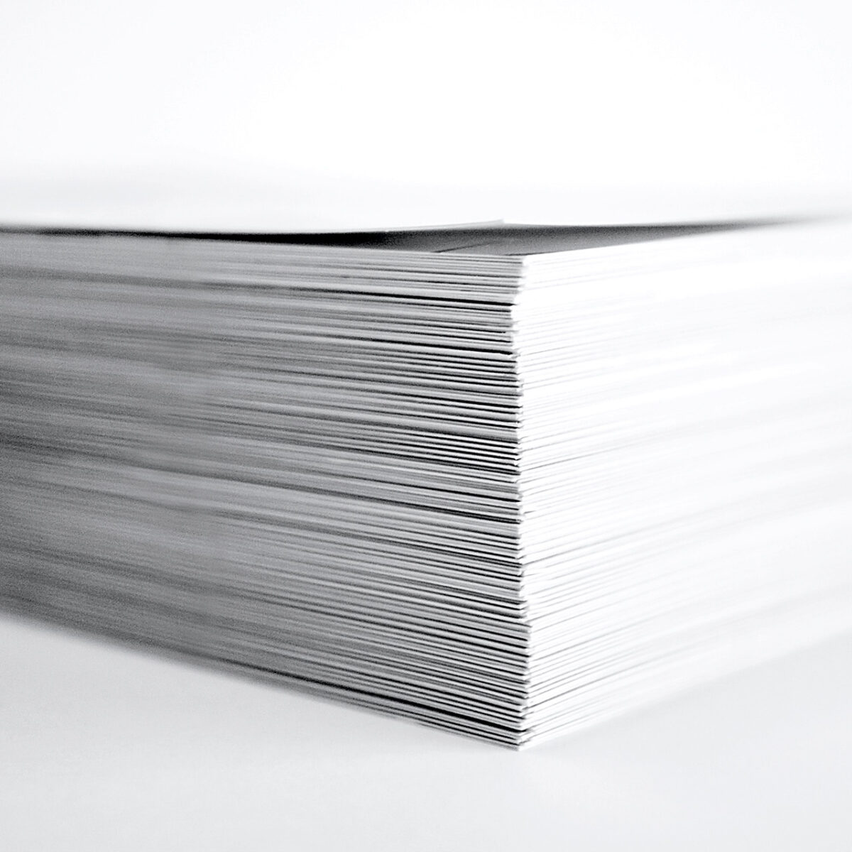
Bulk
Part of the answer comes from the bulk, the thickness of paper. Paper manufacturers measure a paper’s caliper, or thickness, in points (pt) = 1/1000th of an inch. (NOT to be confused with typographic points, which are 1/72nd of an inch!) Instead of referring to the thickness of paper, printers and binders more commonly reference the pages-per-inch (ppi) of a paper. Two ways of describing the same thing.
More often than not, a publisher wants their book to look more impressive with a thicker spine. While there is variation from paper manufacturer to manufacturer, in uncoated stocks the pages-per-inch (PPI) is fairly predictable: using a Boise offset as a reference, 50# is about 520 ppi (4.0 pt), 60# is 440 ppi (4.6 pt), and 70# is 380 ppi (5.4 pt). Domtar’s Husky smooth offset is very similar.
You see what a difference this makes in the apparent thickness of a book: for a 300 pp. paperback (perfect bound) book with a 10 pt. C1S cover, in each of the weights (50#, 60#, 70#) the spine thickness is about 0.60″, 0.70″, and 0.80″, respectively. This is a huge difference!
The opaque stocks, being somewhat more processed, tend to be slightly thinner at equal weights. Still, an 80# opaque smooth from Domtar’s Lynx line is 330 ppi (6.1 pt); that 300 page book now 0.92″!
Because of its additional processing, coated papers are denser and therefore thinner for a given basis weight. In general, the smoother the finish on the paper, the thinner the sheet (and lower ppi) for a given basis weight. But with a luxurious feel!
My go-to for coated sheets in a book is an 80# matte (or silk), such as the Sappi EuroArt Plus which is about 500 ppi (4.3 pt, or 0.62″ for 300 pp.), or the 100#, 385 ppi (5.4 pt, or 0.80″ for 300 pp.). You see these are equivalent in thickness to the 60# and 70# offset papers, but with the heavier weight, which is why they drape so beautifully.
Unless the crispness is needed for photography, I generally would never use a gloss paper for a book, but for completeness, the 80# Sappi EuroArt Plus gloss is 556 ppi (3.7 pt, 0.56″) and 100 is 426 ppi (4.8 pt, 0.72″).
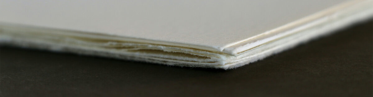
Show through
But thickness is not the only consideration. There is also show-through—how much of the back side page can you see through the page? For text-only, with a baseline grid aligning all lines front and back (and good registration at the printer), you can get away with more show-through, and so the 50 and 60# offset papers will work fine. But with many large images or other graphics, the show-through can be distracting and so the 60 or 70# paper, or ideally an opaque paper is preferred.
By the way, the so-called opaque papers, which have additional finishing to make a smoother surface and, as the name implies, more opaque sheet. For image heavy books, this is a good choice.
Despite being thinner, the surface coatings of a coated sheet also help prevent show-through. This is one of the key reasons that I use coated 80 or 100# paper for an art book: the large heavy full color imagery needs a substantial amount of paper behind it to hold all the ink/toner, and to avoid distracting the reader with “ghosts” of other pages. Coated sheets also hold the ink (or toner) on the surface, generally making for crisper and brighter images—especially good for color books.
Page feel
The final factor is page feel. To give you a baseline, A 50 lb. text weight sheet (also referenced as 50# or 50T) is the same as a regular 20 lb. office paper (see “50 = 20,” below). It is fairly light, and while not quite “flimsy,” it doesn’t feel very substantial. A 60# will feel better, and a 70# actually has some heft to it. For a small (6 x 9 or under) this is probably plenty.
For even larger books the page feel (and durability, in the case of children’s books) becomes even more important. It is hard to beat the luxury of a 100# sheet of paper in a large square or landscape book. It just feels special, significant.
Paper cost
But cost plays a role here, too. Heavier paper, more processed and coated paper, is more expensive to buy and more expensive to ship (it weighs more when shipping a book—or cases of books—as well). Paper prices can vary dramatically, especially in this era of supply chain uncertainty. But for a book I spec’ed recently, a short run 500 copies of a 6 x 9 300 pp. digital b&w with 4c perfect bound softcover book priced by one printer was roughly
- $1,900 for 50# uncoated white offset, $3.75/book (0.60″ spine)
- $2,100 for 60# uncoated white offset, $4.05/book (0.70″ spine) +10% wrt. 50#
- $2,700 for 70# uncoated white offset, $5.23/book (0.80″ spine) +40% wrt. 50#
- $3,100 for 80# uncoated white opaque, $6.13/book (0.92″ spine)* +60% wrt. 50#
- $3,000 for 80# matte coated white, $5.87/book (0.62″ spine) +60% wrt. 50#
- $3,400 for 100# matte coated white, $6.67/book (0.80″ spine)* +80% wrt. 50#
Take this with a grain of salt; prices vary wildly right now, and the size of a book (and waste due to the corresponding sheet size that the printer runs) can dramatically affect things. But clearly, understanding your budget is as important in your reader’s expectations.
*) To be honest, it wold be a very special situation to warrant using this heavy of a paper for a book as small as a 6 x 9. But stranger things have happened …
Why 50 = 20 in paper math: basis weight
Wondering what the “weight” numbers actually refer to—the weight of what exactly? And what do I mean when I say a 50# text weight paper is the same as a 20 lb. office paper?
The weight is by ream (500 sheets) in the basis size of the paper. And that is where it get confusing.
The basis sheet size of office paper (also known as bond paper) is only 17 x 22 inches, while a text paper’s basis sheet size is 25 x 38. 500 sheets of 25 x 38 paper is 2.5 times heavier than the exact same paper with 17 x 22 sheets. Which is why 50 lb. (text weight) = 20 lb. (bond weight) in paper math!
It is also why that ream of 20 lb. 8-1/2 x 11 office paper you stuff into your printer doesn’t actually weight 20 lbs. 8-1/2 x 11 is a quarter of a 17 x 22 sheet. So that pack of paper weighs 5 lbs. even though the basis weight is 20 lb.
Other common equivalents: 60T (60 lb. text weight) = 24 lb. bond; 70T = 28 lb. bond.
Just as the metric system is more logical for most things, likewise the rest of the world has it easier in paper weights because they use a standard measure of grams per square meter (GSM), which is independent of the basis sheet size. That same 50 lb. text = 20 lb. office is about 75 gsm; 60T is 90 gsm; 70T is 105 gsm.
It is all just different ways of saying the same thing. And, yes, it is designed to confuse you. 😉
Credits
Cover image by JJ Ying; loose sheets photo by Brandi Redd; sheet detail photo by Pierre Bamin; and paper stack photo by ron dyar, all from Unsplash.
Leave a Reply
You must be logged in to post a comment.