
While they may seem to serve similar functions, the design of a website it completely different than the design of a book.
I’m speaking from personal experience here: the design of this website.
First and foremost, a book’s page has four definite boundaries. A website has only one: the “bottom” may exist arbitrarily far away from the “top.” And as for the sides, well a book doesn’t change size on you when the user turns it on its side, or resize when the “window” it is viewed in resized.
Although layout and content are somewhat decoupled in both formats, this idea of responsive design is critical to a website. But it also contains its own set of limitations in what you can do within the design, because layout has to be programmed on a website.
A book cannot be changed (easily) after it is done. A website is never actually finished: articles and other new content area added, and old content is retired. Graphics and images can be updated and refreshed. And they need to be if a website it to remain relevant. A book is static, and so must be timeless.
A book is in black and white, or CMYK color, generally, while a webpage is in a richer RGB color space. But a printed book’s color (save for fading) is predictable and fixed at the time of production. The color of a website (or ebook, for that matter) depends on the viewer’s device, and so color is unreliable.
As I reworked my own website between 2020 and 2021, I came to realize that applying my honed design skills wasn’t going to work; I needed to rethink things.
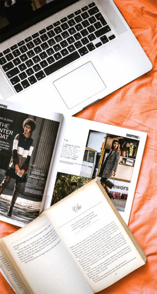
I needed to start thinking more like a publication designer: magazine layouts still follow a layout grid, but you are far more likely to see things breaking out of the grid than you do in a book.
Why? Because the objective is different. A generally held axiom of book interior design work is that the design should take second place to the content. That is to say, the design of a book should do everything it can to help the reader not notice that it is “designed.” The reader is there not to admire the desinger’s handywork, but to follow a story, learn an idea, or generally consume content. And while that is largely true for a magazine as well, most magazines are also marketing portals, full of ads. For the content to compete with all that noise, it too must have the volume turned up.
Just like a website.