
On a recent photo book project (David PZ Wong’s Beauty in Plain Sight) I had the opportunity to explore the challenge that comes from printing black and white photos. David’s project involved two books, one of color photos and another of B&W photos.
Now, you might think B&W is easier than color… that is, until I ask the simple question:
“What color of black do you want?”
In most black and white trade books with photos (e.g. The Story of Everyday German Peasant Life, Tapestry, Conflict to Combat), the text and images are both printed with just black ink (or black toner in the case of digital printing). The color of black is whatever the ink/toner color is—usually a fairly neutral or slightly cool, dark, dark black.
Whether a warm black (include more reds and yellows) or a cool black (more blues) is appropriate depends on the context. Many older photos tended to be warm. Indeed, we’ve all seen sepia photos in which the blacks are actually brown.
High end art books featuring black and white photography are different. They tend to be printed with offset printers using a technique known as “duotones.” In this process, the printer uses two different inks to create a richer, deeper black—closer to the appearance of traditional wet darkroom prints. The choice of black inks, a warm black and a warm grey, or a cool black with a warm grey, can be tuned to further mimic the original darkroom processes and toner coloration.
In a similar fashion, in my letterpress work I frequently hand mix my own blacks, blending various primary and secondary colors to achieve the sort of depth and tonality in the prints I want to achieve. We did this in the creation of the original images for My Mighty Journey. The same sort of blended or custom blacks is possible with offset printing.
Overcoming the Limitations of Digital Presses
Digital presses, the sort used for short-run books (under 1,000), cannot do duotones. They are fixed into their Cyan-Magenta-Yellow-Black 4-color toner-based system.
So, the general rule of thumb is to only use black ink/toner for black and white images. Images are converted to greyscale and are run as clean black-only halftones. This is clean, sharp, less expensive, and by far easier for the printer. This is the advice detailed by book printer Bookmobile in a blog post of theirs a few years back.
The alternative is that we mimic the duotone effect by using a “Rich Black”—a black made up of printed dots of all four colors. After all, a balanced overlay of Cyan, Magenta, and Yellow halftone dots produces something that, to the eye, looks to be a neutral dark grey.
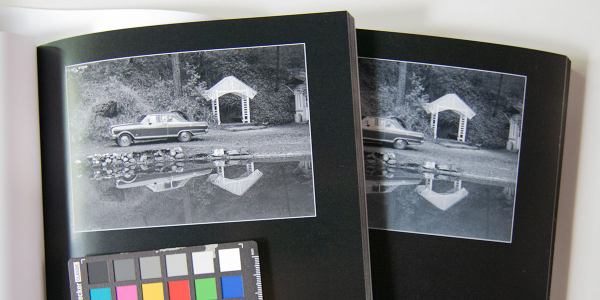
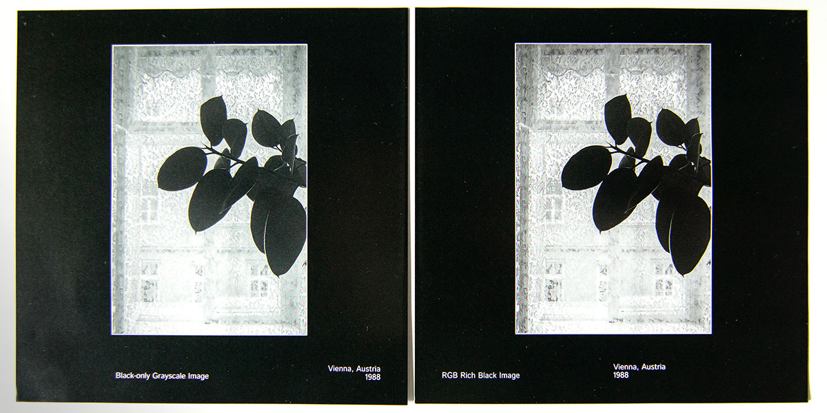
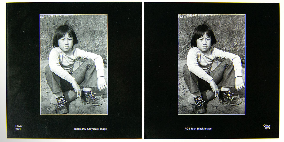
You can see this by looking very closely (through a loope or magnifier). Considering a couple of the images from Beauty, and a black-only or rich-black version:

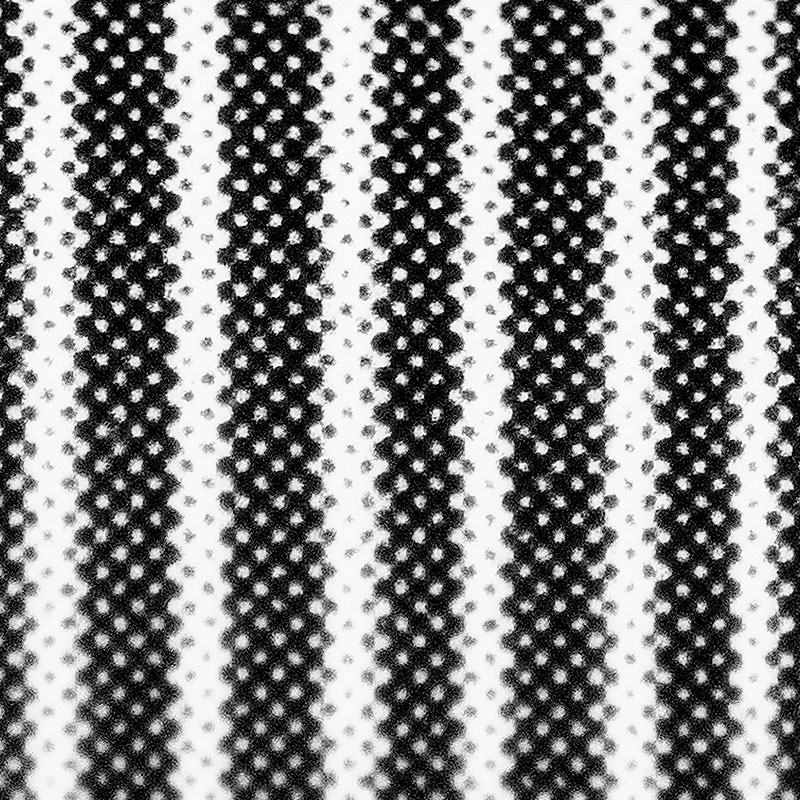
Black-only 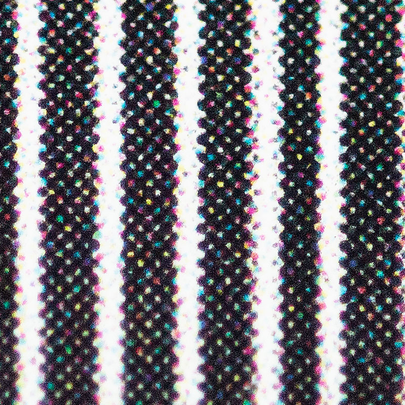
Rich-black

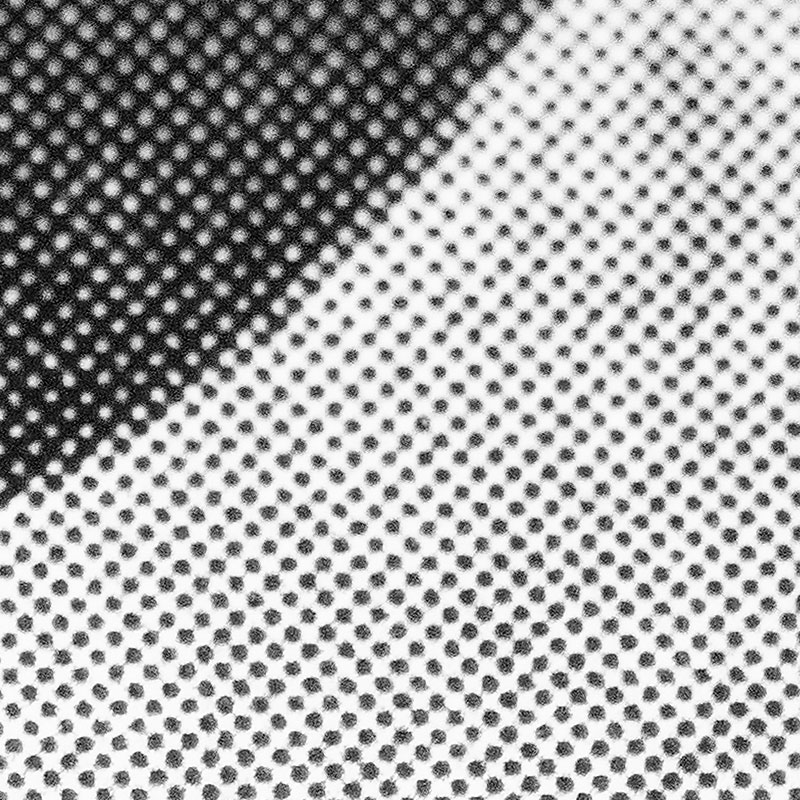
Black-only 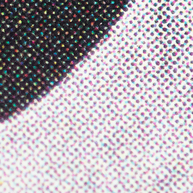
Rich-black
(And please pardon the blurriness… I’m not really set up well for taking these kinds of photographs!)
Printer Tests, First Round
Now theoretically, this all works well. I control the tonality of the black by adding a little more or less Cyan (blue, i.e. cool) or more or less Magenta and Yellow (i.e. red or orange, i.e. warm). But practically, things can become more difficult. MUCH more difficult, as we discovered in tests for Beauty in Plain Sight.
With the first printer we tried, everything looked reasonable on the test prints, and I was pleased that my adjustments were working. David looked at both the black-only and rich-black versions, and decided he preferred the rich-black—it did have more depth to the blacks, and based on our tests, the rich black stayed just warm of neutral, as we hoped.
Unfortunately, it turns out that they didn’t control their color calibrations very well. When it came to running a hard proof of the books, all the images had a pronounced blue (Cyan) cast. It was especially noticeable in the B&W images.
(This is why I always recommend hard copy proofs. Trust, but verify.)
The printer recalibrated things and ran some more test pages for us. But in the end, they made the decision that they just were not comfortable holding the “neutral” rich black we were seeking. I’ll give them full credit for admitting their mistake and taking responsibility.
The problem of using color for black and white is that when you are running so close to neutral, any slight errors in the printer—a little too much Cyan in this example—look very bad. Color prints done at the same time and with the same overdriven Cyan do not look nearly so bad. Close to neutral is very different than actually neutral.
Printer Tests, Second Round
We ended up bringing the project back to Bookmobile Craft Digital Printing, a short-run digital printer here in the Twin Cities. Bookmobile is well known for their high quality. But we still put them to the test.
Bookmobile printed several test pages for us, images which I had prepared for black-only and warm-of-neutral rich-black printing. (These are also the examples I showed earlier in this post.) Again, David preferred the rich-black. The difference this time is that Bookmobile was able to replicate their test results in the final proof, and the finished product.
Conclusion
I didn’t touch on cost considerations—black-only printing is generally less expensive than color printing. But setting that issue aside, the the deepest black in black and white photography reproduced on a short-run digital book press: rich black. It is worth the effort, but it depends on using a printer that is able to maintain their neutral calibration of Cyan, Magenta, and Yellow toners.
Leave a Reply
You must be logged in to post a comment.