Typography Brings the Story to Life
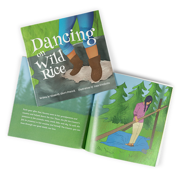
It’s fair to say that we Minnesotans love our wild rice. But the traditions surrounding the origins of wild rice harvesting are often lost on us. Dancing on Wild Rice invites readers into that history through the story of a young girl uncovering her Ojibwe roots. Written by Betsy Albert-Peacock and illustrated by Anna Granholm, it’s a heartfelt reminder of the power of reconnecting with tradition.

Project Reflections
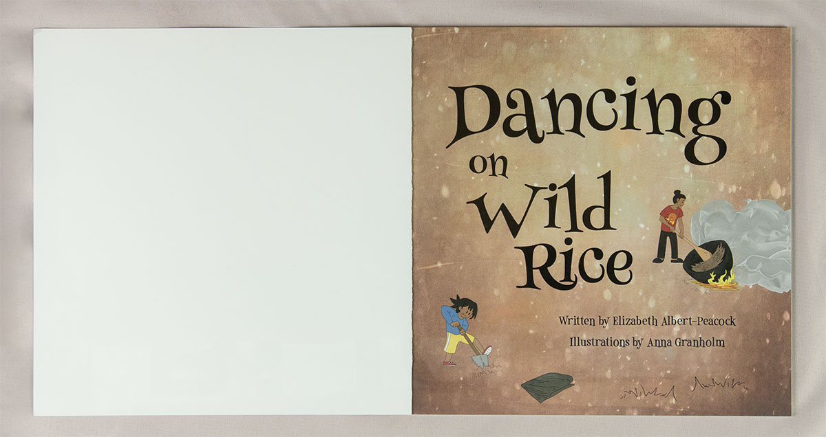
This project brought plenty of opportunities for creative problem-solving. Anna’s layered digital illustrations made it easy to adjust foreground elements or background textures to perfectly frame the text—a lifesaver for achieving a harmonious balance on every page. The original title, “Children Who Dance on Wild Rice,” evolved during early cover design concepts to become the more concise and evocative final title.
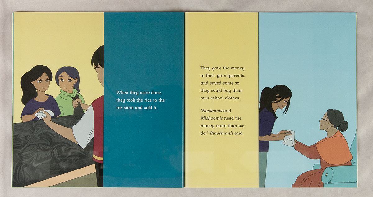
The layout itself embraces simplicity, featuring single-page illustrations to keep the focus on the story and art. While the structure may not break new ground, it provides a steady, supportive framework for the author’s mission to preserve native traditions.
The cover design showcases bold, engaging typography to draw readers in, while the interior takes a more subdued approach, allowing the story and art to shine. It’s this balance—thoughtful yet unobtrusive—that ties the entire project together, creating a book that feels true to its roots and inviting to its readers.


