Project Overview
The rerelease of author Chris Fink’s first fiction short story collection includes a new cover, new foreword, and adaptation of the previous interior. Using a bit of AI wizardry, I built on a stock photo to create the perfect, unique wraparound cover spread.
Design Brief
This short story collection, originally released in 2013, looks at understated aspects of the life of the rural everyman: farm implements, watering holes, dirt, sweat, and hard work. Forty Press acquired the rights and worked with author Chris Fink to rerelease the book in 2023.
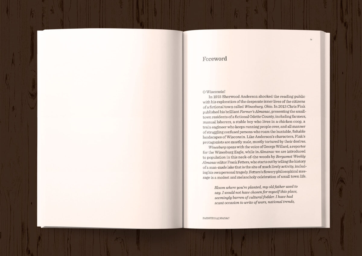
Initially, we planned only to add the new foreword by Bonnie Jo Campbell; otherwise, we would be reutilizing the existing design—tweaking the table of contents and the associated ePub.
Thankfully, Chris pressed to also include a cover redesign in the project, giving us the flexibility to update both the back and front covers and create something more appropriate to the new literary releases of today’s market.
Cover Update
The original cover by Kelly Hobkirk for Emergency Press in 2013 wasn’t bad. It just didn’t fit with an updated perspective on the book. Through discussions I had with author Chris Fink and managing editor Nick Dimassis, we realized that the ten-year-old stylized illustration failed to convey the personal, and perhaps gritty, nature of the stories. Stories of boys becoming men, equally applicable to young and old men.
Contemporary literary covers need to really grab the reader. While we wanted to avoid a nostalgic feel or an expression of “the good old days,” the stories are generally timeless. When I pressed for examples, we talked of rock-picking crews, detasseling corn, baling hay—the sorts of work that both boys and men might get in farm country, and all featured in the book’s stories. Solid, honest work.
The three initial directions we considered:
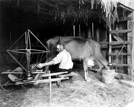
- Farmer in a dairy barn, listening to an old-fashioned radio, desperate to connect to the outside world.
- The rock-picking crew, walking the rows beside an old tractor, perhaps before a storm.
- A boy throwing a baseball into the back of a barn, playing a lonely game of catch.
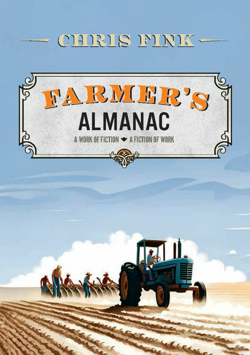
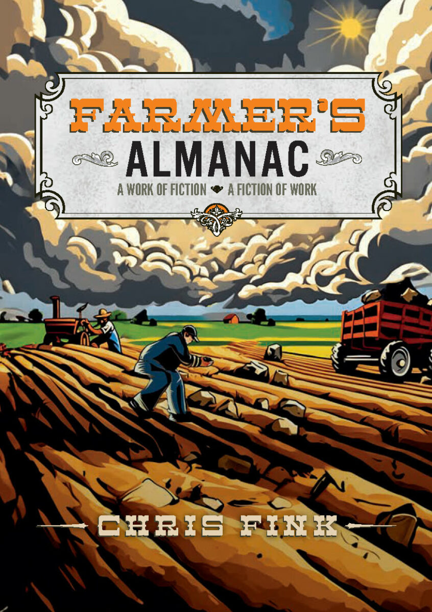
Considering illustration styles, Chris is particularly fond of Thomas Hart Benton in the early 1900’s. But he also liked the idea of an old photo, perhaps black and white.
New Cover Concepts
After noodling on this for a while, we regrouped, and I presented fourteen different directions, including the original. This number of cover concepts is undoubtedly excessive, but it did help me to focus the discussion around viable directions. Five of these were considered finalists, and with a few tweaks, these went out for consideration by the inner circle.
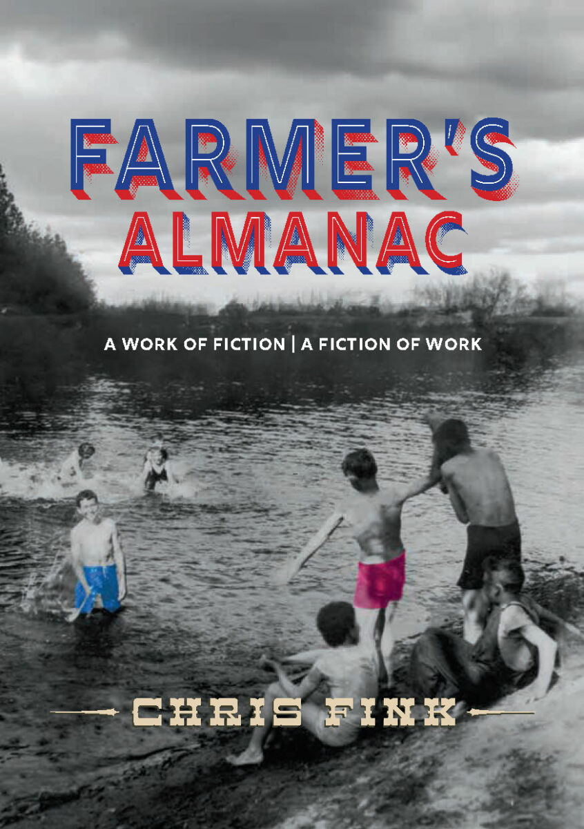
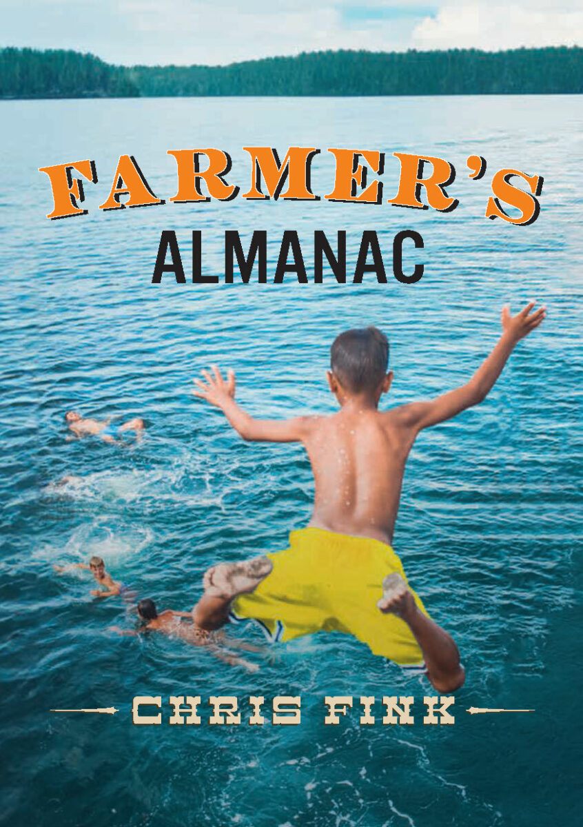
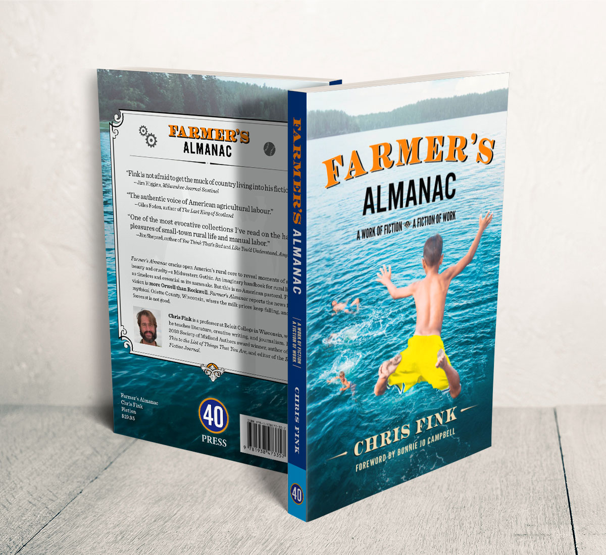
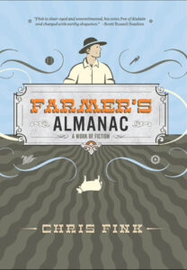
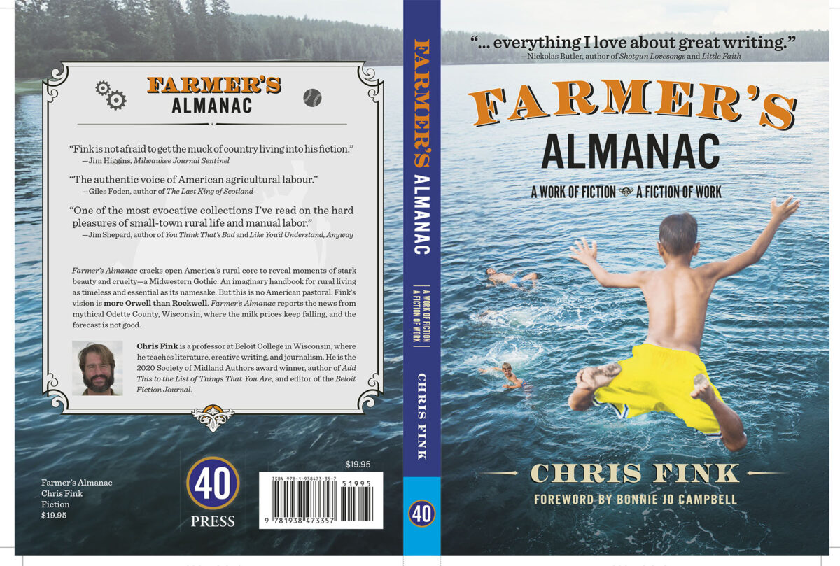
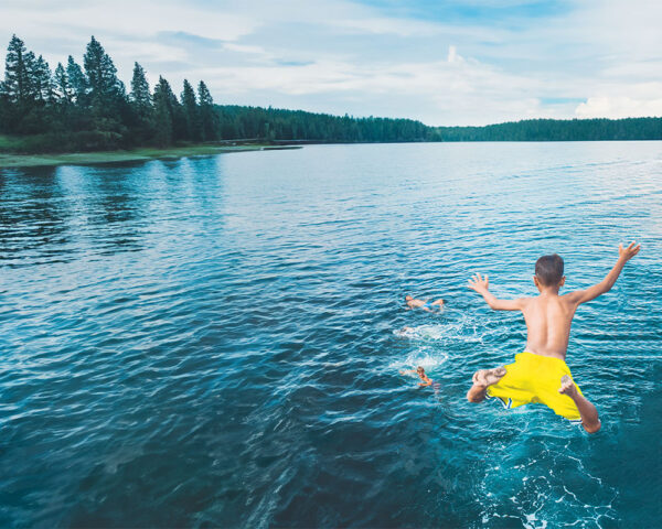
We quickly agreed on the boy leaping through the air into a swimming hole with his friends. While this scene isn’t from the book, it combines elements from two stories in the spirit of what Chris described while also offering an uplifting and engaging scene.
Thoughts on Digital Manipulation and Generative AI
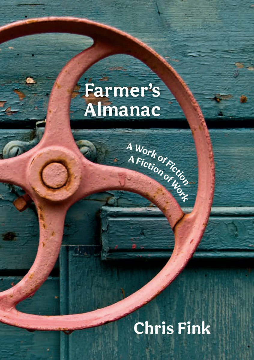
Of the five finalists, only the photo of the blue-stained wood with a red wheel was not modified. Changes to the others ranged from adding or modifying the color of the swimming boys’ shorts (a reference to one of the stories) to the complete generation of the illustrated images based on collaged stock imagery I supplied.
Digital manipulation of images (mainly utilizing Photoshop) has been around for decades. I started using Photoshop in the early 1990s to clean up and enhance my photographs and art.
Generative AI has taken this idea of manipulation into an entirely new direction, allowing the subtraction or addition of elements or backgrounds, often with surprisingly good results—if one knows the limits of the tools.
Since Thomas Hart Benton is no longer available for commissions, it was interesting to try to mimic his style using generative AI engines. The tools improve every few weeks, but as of late 2023, the results were promising but needed refinement.
I used composite photos to guide the generative algorithm. I reworked both the illustrations we considered to make them usable in a book cover environment. Neither is as strong as an original Benton, but both had promise.
Ultimately, the photo of the boy jumping was considered a more compelling cover. But that photo, a stock image, was also significantly modified:
- I updated the color of the boy’s shorts to help him “pop.”
- Several of the other swimmers were moved or replaced.
- I extended the background in all directions, particularly to the left for the back cover wrap.

While this change might have been possible before generative AI (probably compositing several different photos together), it likely would not have been economical for this project. We would only have been able to consider so many cover variations if I had blown my entire image budget on photo compositing.
The fair and ethical use of technology such as this will continue to be debated. As it should. But for my purposes, the combination of work by two humans (the stock photographer and myself as designer), assisted by machine learning, allowed the creation of something that none of us could have created by ourselves. That is a win in my mind.
Interior Updates
To manage costs, the plan was to use the original print-ready PDF from the first edition as the basis for the second edition. While I would have preferred to extract the text and redo the typesetting (there are a few places where I can’t entirely agree with the typesetting decisions made in the original), there wasn’t a strong marketing reason to do so.
However, since we added the foreword and needed to update the ISBN and copyright page notices, this required some extra gyrations.
To make this work without the original design files, I first recreated the based layout in InDesign—fonts, margins, styles, … everything. Then, I created the new front and back matter and spliced the whole thing into a new print-ready PDF. PDF is an excellent format for making such changes.
I also exported the updated sections as ePub elements. The old and new pieces were seamlessly integrated in a similar, but less straightforward, way to the PDF changes.