When Katherine Pickett set out to publish her debut novel Debra Lee Won’t Break, she knew she wanted a cover that was visually compelling but not overcooked—something that carried emotional weight without slipping into cliché. From our first conversation, it was clear this wasn’t a “fluff story” or a summer beach read.
Creative Brief
This story is about strength, vulnerability, and healing—told through the steady cadence of cycling, the ache of strained friendship, and the quiet persistence of someone who won’t give up.
Our briefing conversation gave me a strong sense of who Katherine was writing for—adults navigating the complexities of caregiving, identity, and long-standing relationships. She had a clear goal for her audience and a strong emotional throughline, even if the visuals weren’t yet defined. My role was to help shape this idea into a cover that the book itself seemed to ask for: resolve and determination, but with an undercurrent of reaffirmed friendship.
Cover Development
What followed was a deeply collaborative process. We explored possibilities and pared back ideas that felt visually promising but misaligned with the story’s heart. Katherine appreciated having a professional partner in her corner—someone she could trust to balance visual clarity with emotional nuance. “I was looking for someone who is professional and supportive, knowledgeable of the industry, and also talented with visual media,” she said. “You checked all the boxes.”

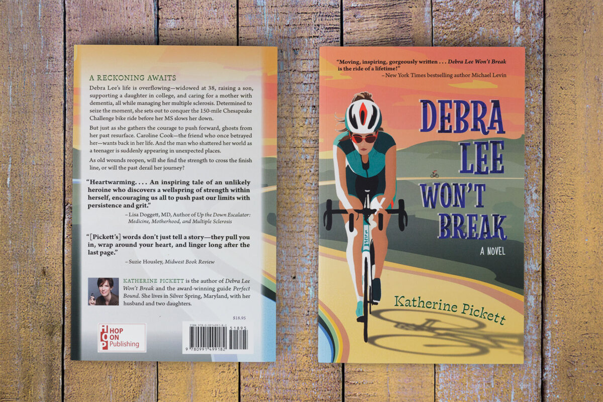
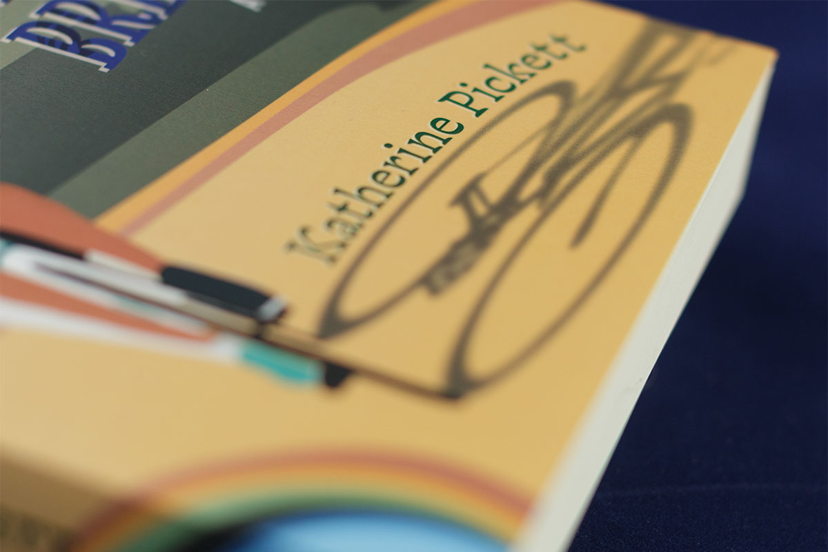
The final design features a stylized sunrise ride along the Chesapeake River, reinforcing the idea of Debra Lee in motion, focused, and in control. Rolling green hills, a rising sun, and shimmering water wrap around the spine, creating visual continuity and an intentional rhythm to match the story’s pacing. The cyclist’s expression is subtle—determined, but not hardened. And in the distance, almost hidden, a second rider appears: her friend, her past, her future. Both are on the same path but heading in different directions. It’s a moment suspended between solitude and connection.

Interior and Production
Katherine handled the book’s interior herself to keep costs manageable, but I offered guidance on layout decisions to ensure a smooth reading experience and stylistic continuity with the cover. As she described in her feedback, the process provided professional support without pressure—something she valued deeply as a first-time novelist stepping into the publishing world.
She also shared that she felt seen in the process—not pressured to overspend or present herself as anything other than the thoughtful, capable debut novelist she was. “I knew you to be a down-to-earth person who wouldn’t judge me for needing to save some money here and there or for not selling a million copies.” That sense of grounded partnership shaped not only the result but the experience itself.


