“A sense of place defines this book. Staiger reminds us that history is the lived experience of people in a distinct place … where weather matters and … the cycle of seasons mirrors the cycles of life.”
Kathleen Norris, Dakota: A Spiritual Geography
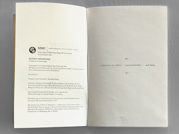
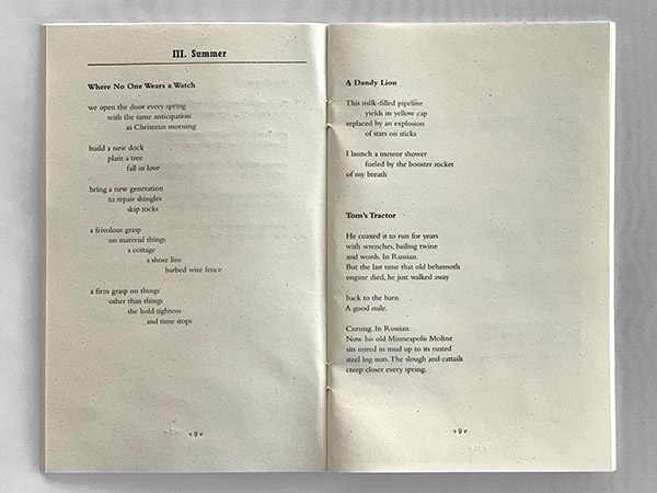
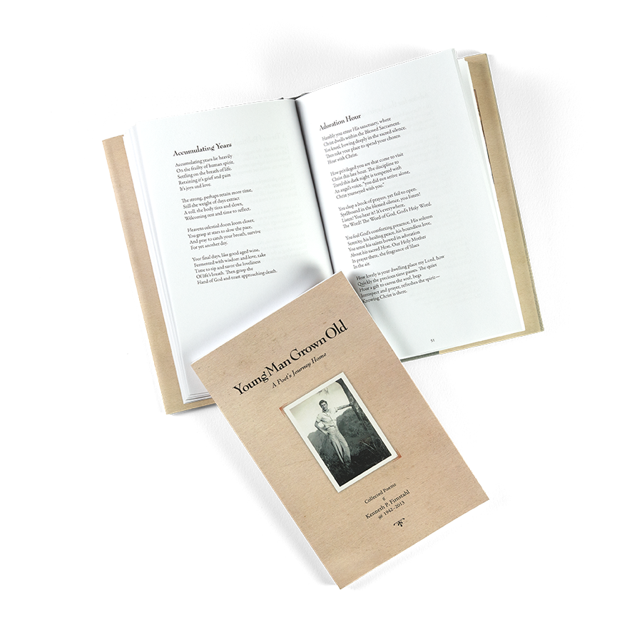
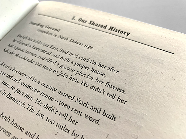
Utilizing two classic Monotype fonts, Bembo 11/14 for the text (and bold titles), and Rockwell Condensed bold for headings, I established a visual structure to allow the seven different sections to remain cohesive, yet distinct. Rockwell condensed light was used for the page numbers, set off using an ornament from Konstantine Studio’s Church of the Wildwood ornaments font.
While all this was set digitally, my end target here was creating files for use by Michigan plate maker Owosso to create the etched and machined magnesium plates mounted type high on hardwood blocks. This required creating imposed plate-ready files, 20 in total for the 20 printing plates (and 40 resultant pages).
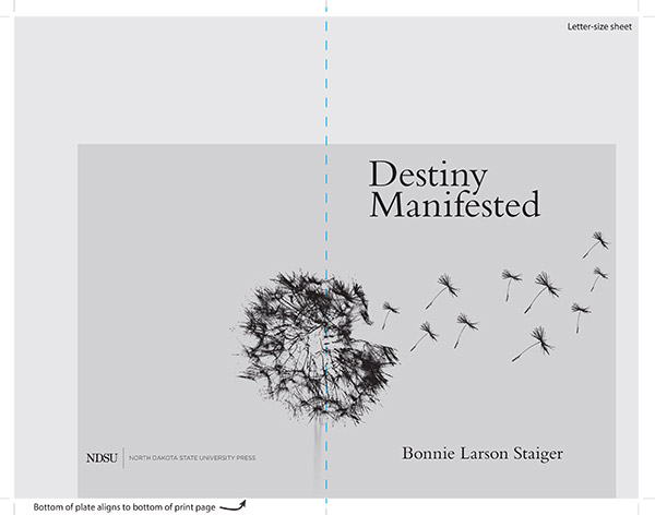
In order to save the press some money, the plates were undersized, minimizing wasted space. To aid in printing, I created an extra plate positioning reference guide showing the plate and its placement on the final printed sheet.
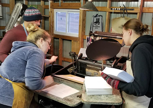
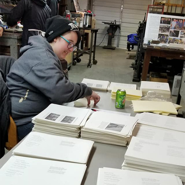
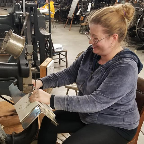
Printing and binding were done by the NDSU “Introduction to Publishing” class with instructor and NDSU Press head Suzzanne Kelley. An amazing hands-on introduction for the students, all printing is accomplished on a hand-fed Chandler & Price platen press.
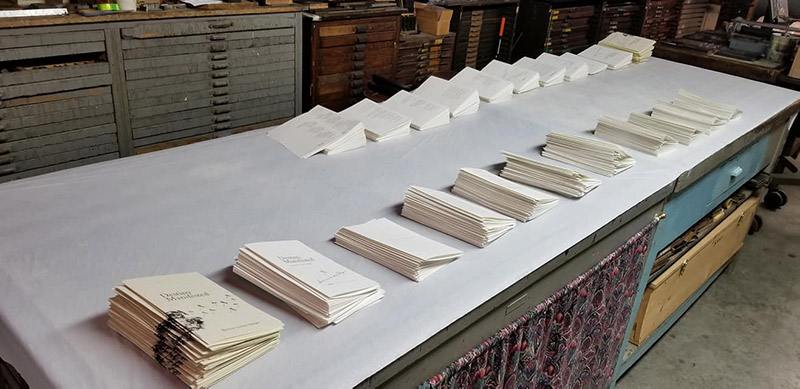
Each plate was mounted in the press, inked and printed for the entire edition. Pages are printed two-sided, so no only did I need to impose the pages (sort them to they appear in order when bound), but the students needed to keep track of which page was printed front and back side.
As pages were printed and dried, they were sorted, gathered into the single signature, and saddle-stitch bound.
(Photos of printing and binding courtesy of Suzzanne Kelley)

