A Family’s Vision, A Professional Touch
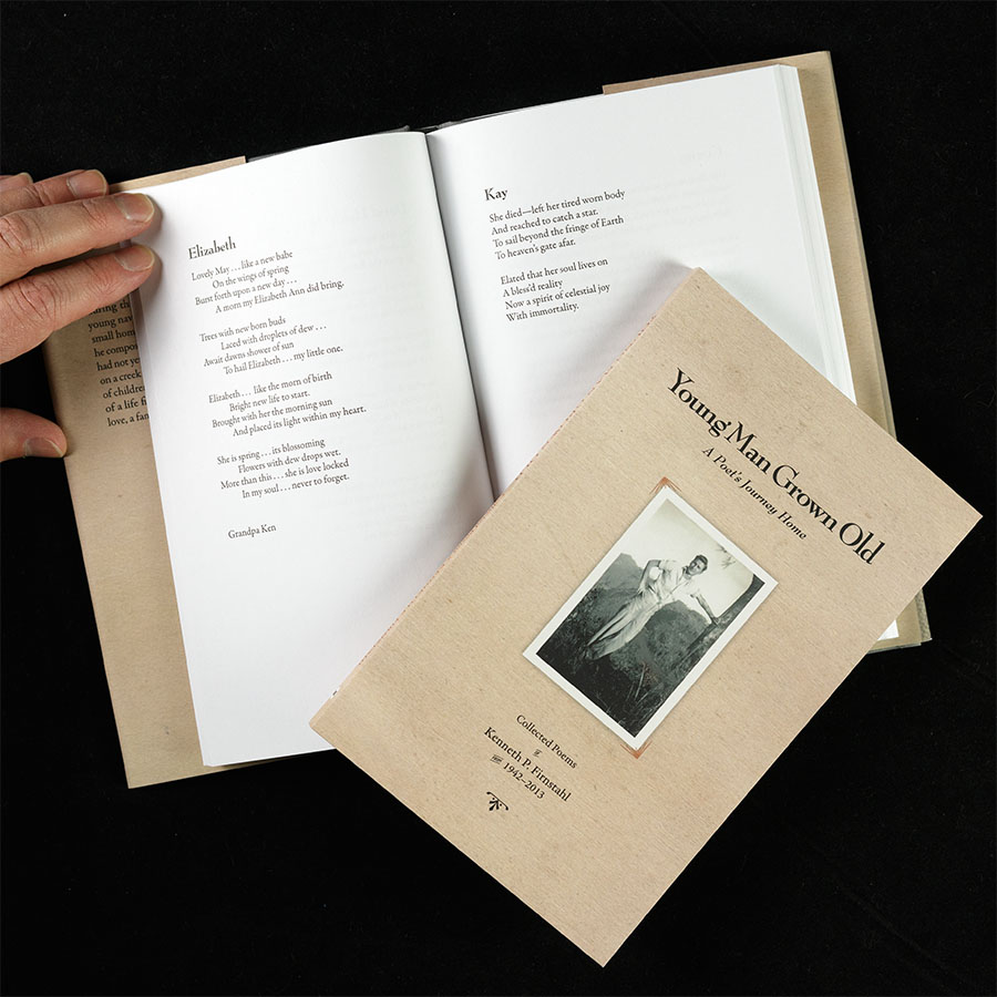
When MaryJo and her niece Laura approached me about designing Young Man Grown Old, they had a deeply personal mission: to honor the life and work of their father and grandfather, Kenneth Firnstahl. This collection of Ken’s poetry, spanning his youth during military service to his passing in 2015, was intended as a keepsake for the family and a way to share his personal and poignant writing with distant relatives and others.
Reflections
MaryJo’s introduction came via her “up North” neighbor, Norton Stillman, a seasoned publisher who knew I have experience working with independent authors and specialize in high-touch projects. From the outset, I recognized that this project would require substantial collaboration and guidance—a level of care I’m happy to offer, provided clients understand the investment involved.
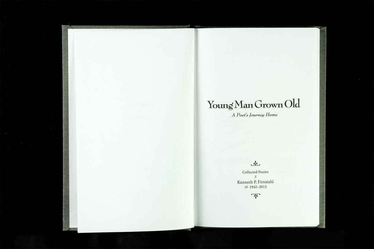
Ken originally shared his poems as “in-the-moment” pieces—individual sheets given to family members or written for specific occasions. Laura’s painstaking work to digitize and organize these scattered pieces was the foundation of this project. While compiling a loved one’s writings into a book is a natural step for many families, MaryJo had a grander vision. She wanted the collection to feel polished and professional, akin to the collected works of renowned poets like T.S. Eliot—clean, elegant, and focused on the author.
The decision to create both a dust-jacketed hardcover and a more affordable softcover edition presented unique challenges. With the small quantities anticipated, I recommended IngramSpark’s print-on-demand service as the best balance of quality and cost. While not quite at the level of traditional bookbinding, their digital cloth option provided a “pretty good” compromise for the hardcover’s appearance.
Crafting the Book
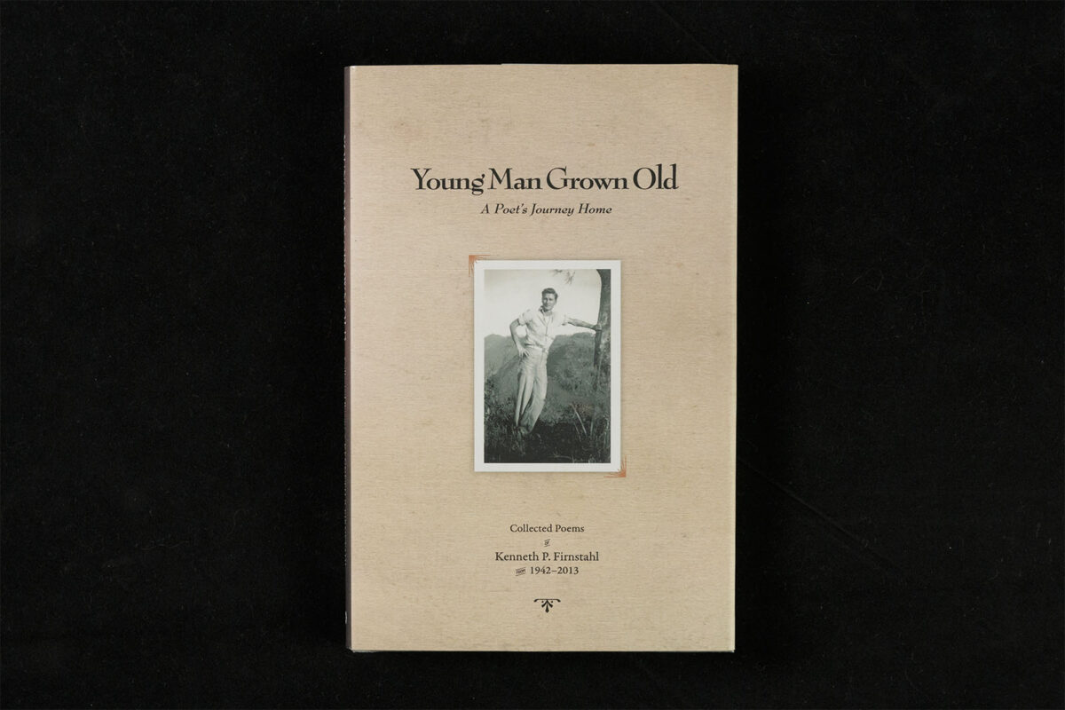
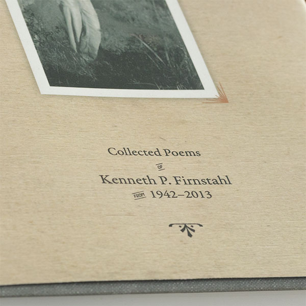
Laura had a clear vision for the cover, having mocked up an initial design herself. My role was to elevate her concept with refined typography, spacing, and subtle textures that distinguish a designer’s touch from off-the-shelf templates. I presented nine variations—four iterations of her original idea with different title fonts and five entirely new concepts to ensure we explored all possibilities.
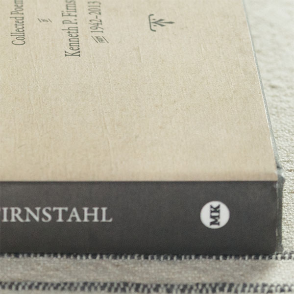
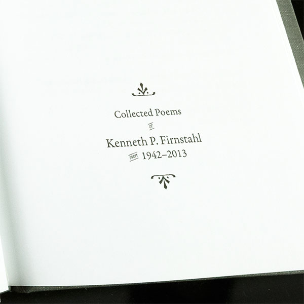
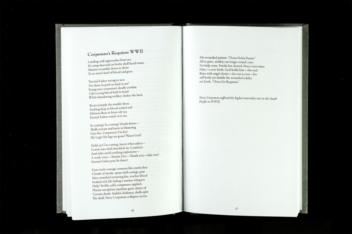
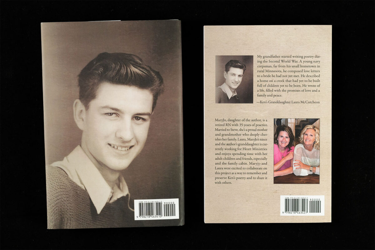
The final hardcover design featured a “famous dead poet” aesthetic: a full-bleed image of Ken on the back cover, Laura’s heartfelt description of the collection on the front flap, and brief bios of MaryJo and Laura on the back flap. I adapted this layout for the softcover, placing the flap information on the back cover, creating two distinct yet cohesive editions.
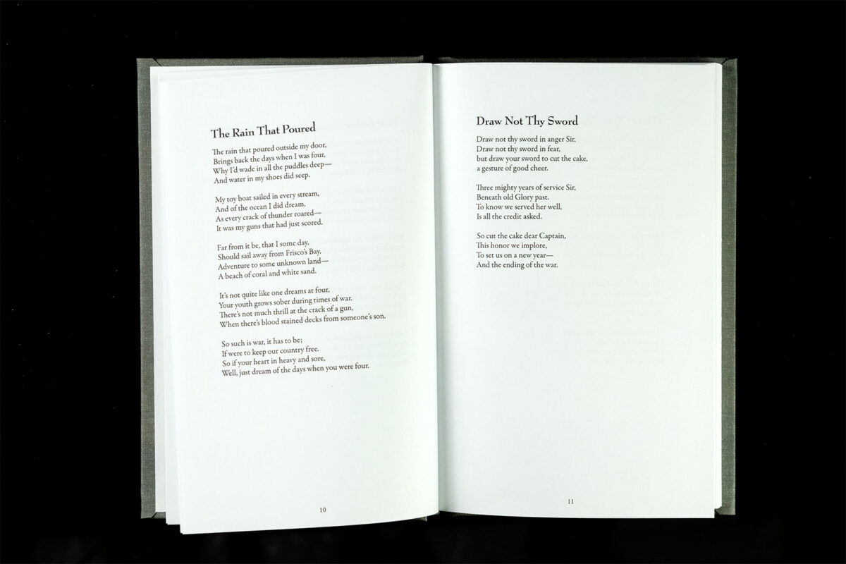
With the cover set, the interior design became a careful exercise in subtlety and precision. I coordinated fonts for poem titles and section dividers to complement the overall aesthetic. The book’s size, margins, and spacing required careful calculation to avoid awkward breaks and highlight the poetry’s rhythm and flow. After considering several formats, we settled on a 5.5 x 8.5 size—perfect for balancing readability and page count.
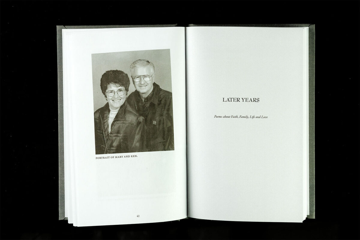
Laura grouped the poems into thematic sections: early years, family, and later years, with a photo section in the middle. She provided individual files for each poem, along with a master table of contents. To streamline the process, I utilized custom InDesign scripts to organize and analyze the content, ensuring efficiency and accuracy.
Photo Preparation
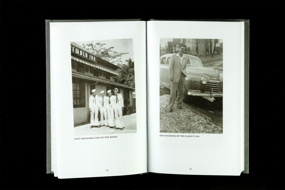
The family’s archive of photographs presented a challenge: while some images were already digitized, others were low-quality snapshots or other hard copies—even an image still in its frame! Entrusting me with this archive, MaryJo allowed me to carefully scan, digitally restore, and prepare the selected images for black-and-white printing. Placing these photos in a dedicated section near the book’s center ensured they complemented rather than disrupted the flow of the poetry.
The Result
As with any family project, there were moments of tension and miscommunication. At times, I felt like a mediator as much as a designer! However, by maintaining professionalism and keeping the focus on our shared goal, we created something truly special—a book that balances elegance and approachability while preserving a touch of whimsy.
Young Man Grown Old is more than a poetry collection; it is a testament to a family’s love and dedication. Through careful design choices, thoughtful craftsmanship, and close collaboration, we produced a book that MaryJo, Laura, and the entire Firnstahl family can cherish for generations.

