Designing Continuity for Thrilling Spy Novel
Bernard Rappa’s Vendetta, with its intricate narrative—weaving the art world and post-WWII espionage—needed a design as engaging as the story itself.
John Schaidler, who edited both of Bernard’s books, introduced us. They needed help with the design of the book and to help Bernard self-publish this prequel/sequel. With my expertise in book design and a strong track record of guiding new self-publishers, I was well-prepared to assist Bernard in bringing his vision to life.
Reflection
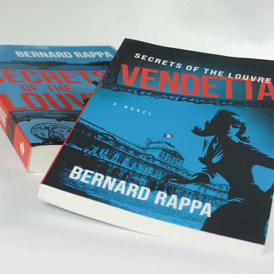
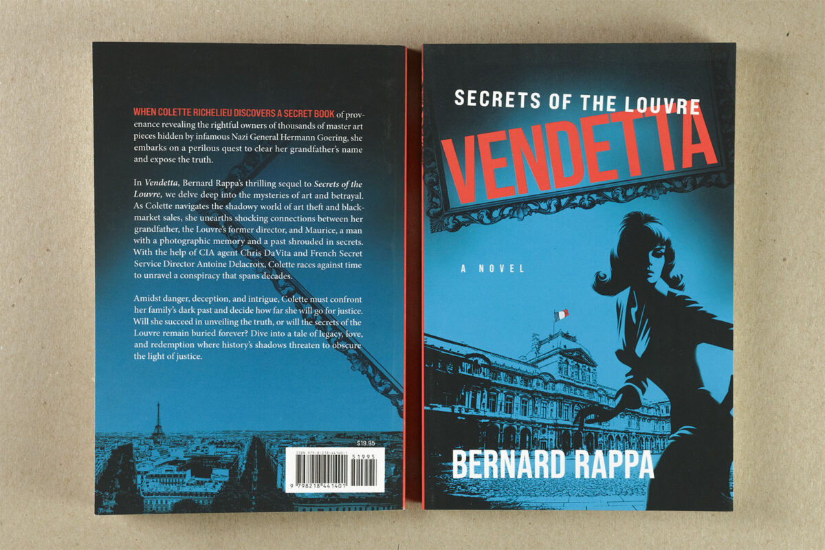
Our collaboration began with a discussion of visual concepts, during which Bernard shared a treasure trove of research images and ideas. We analyzed the cover of his first book, Secrets of the Louvre, noting its noir styling and bold use of blue and red elements. Bernard’s initial cover concept, sketched with the help of his son and niece, provided a helpful starting point but ultimately wasn’t the best direction for his genre. While he hoped to use some of his grandfather’s artwork, I gently steered him toward a more fitting approach that reflected the story’s late 1960s and early 1970s setting.
More than any other requested element, Bernard wanted his heroine, Colette, prominently featured on the cover. Based on that discussion, I presented several concept covers during our next meeting. After careful consideration, we chose a design that complemented Secrets of the Louvre while setting a fresh tone for Vendetta.
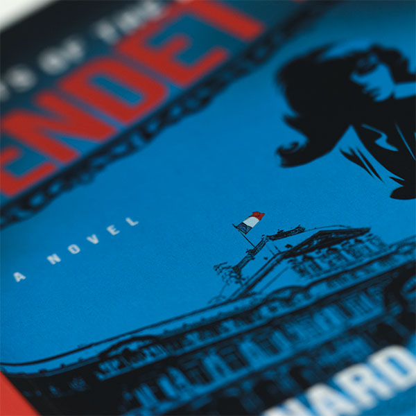
Using a combination of public domain and stock art, I crafted a striking composite featuring the Louvre as it appeared during the book’s time period—a detail overlooked by the first book’s designer—along with an evocative portrayal of Colette. To maintain continuity with the series, I mimicked the noir aesthetic and incorporated bold blue and red hues. One detail I’m particularly proud of is the inclusion of the French flag in full color, subtly preserved amidst the black-and-white noir styling—a small touch that truly shines in print.
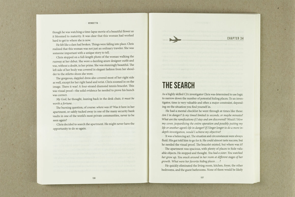
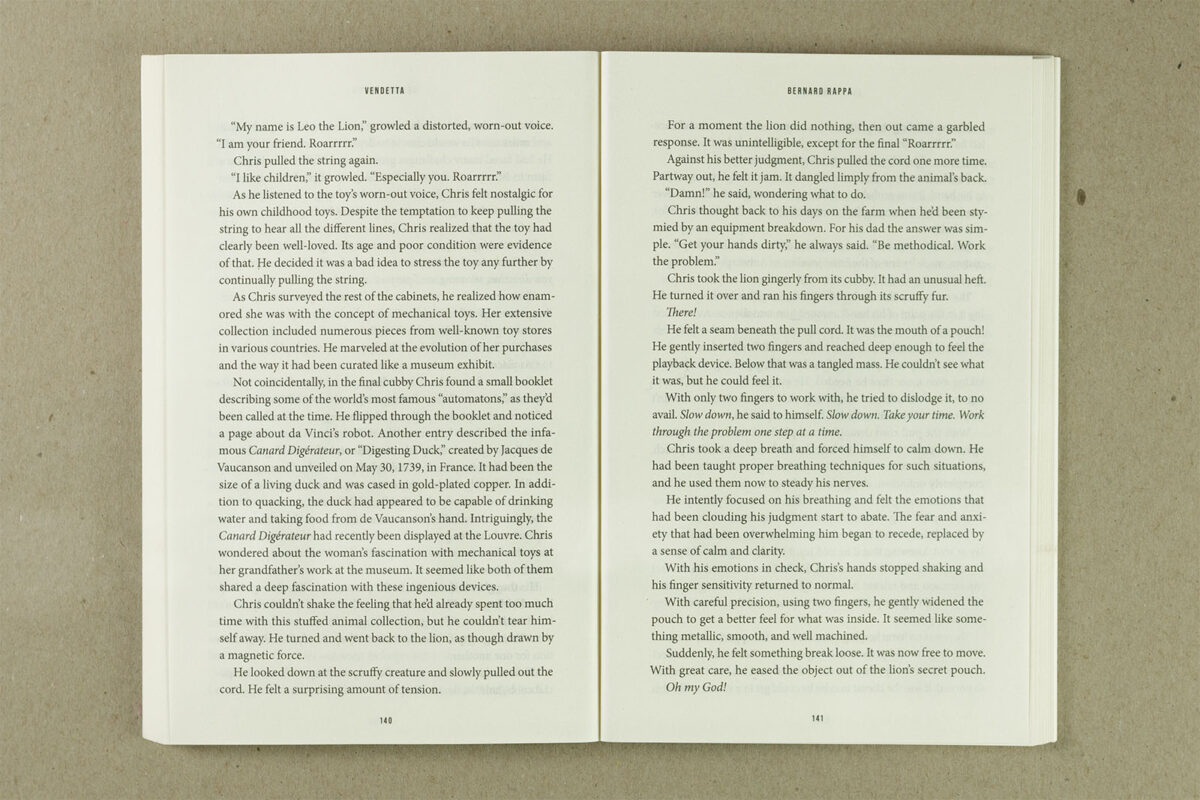
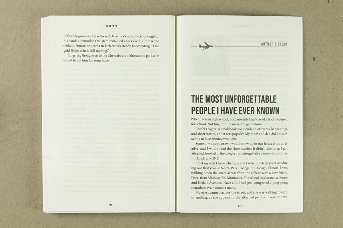
The interior design required careful attention to design elements. I deconstructed the original book’s layout, closely matching its fonts and structure while introducing refinements. I replaced the previous design element used for chapter openings with a cleaner, stylized 1960s-era airliner, reflecting the story’s period and themes. This approach ensured consistency with the first book while elevating the overall design.
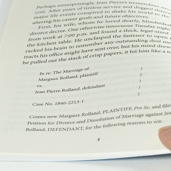

Throughout the process, I adhered to my customary workflow, starting with a design briefing, moving through concept creation and revisions, and culminating in meticulous proofreading and print preparation. This framework allowed for creative exploration while ensuring every detail aligned with Bernard’s vision. After finalizing the design and making several small text adjustments, we sent the book to production, confident in its ability to captivate readers.
Working on Vendetta was an exciting journey combining historical intrigue and artistic innovation. The final product pairs seamlessly with Secrets of the Louvre, leveling up the series and embodying the suspense, depth, and sophistication of Bernard Rappa’s storytelling.


