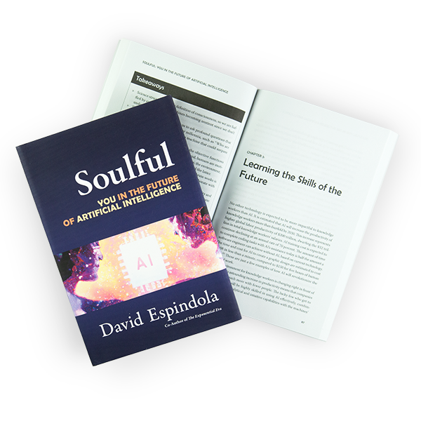
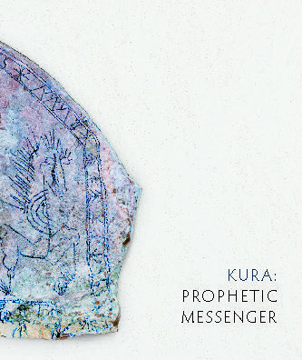
Art/Essay Kura: Prophetic Messenger
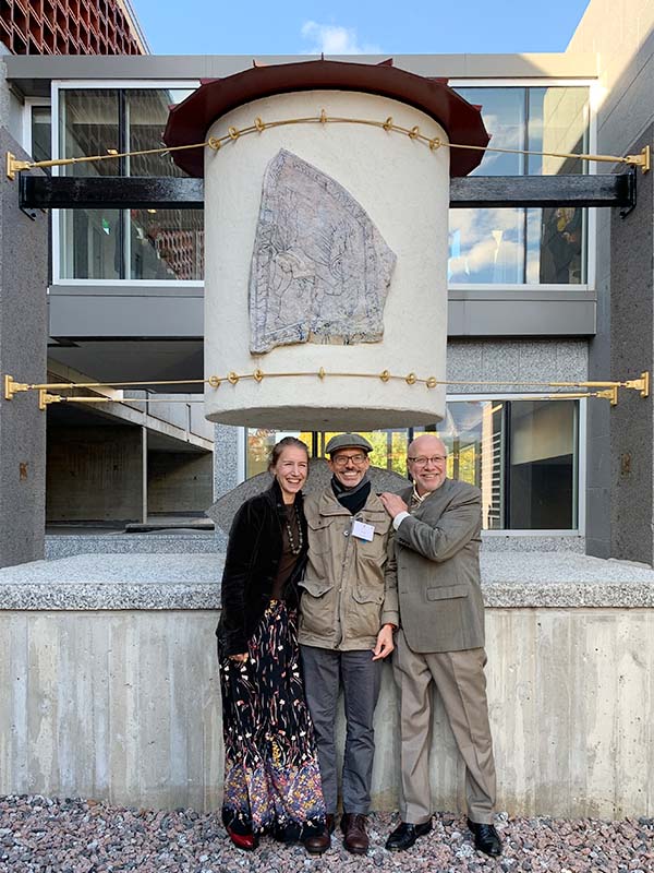
Master potter Richard Bresnahan’s Kura: Prophetic Messenger does more than document the creation of this multi-layered sculpture. It is the realization of his philosophy of life. Starting from a general notion of how to explain the sculpture—the idea behind it, the people around it, and the seeds within it—I was tasked with turning that idea into a book worthy of this legacy. It would take months of work, hundreds of photographs, and the carefully chosen words of his daughter, his wife, and well-respected colleagues. I count myself lucky to be a part of that team.
Design Challenges
- Create a lasting legacy to document the sculpture for participants and donors.
- Guide the reader through the hidden story of the contents of the sculpture.
- Ensure photographic quality of professional studio and portrait images while integrating older scanned film and lower-quality cell phone images.
- Create a double fold-out to show the artist’s complete conceptual notebook.
- Maintain consistency with the Pottery’s other books while also standing apart.
Project Brief
Richard Bresnahan is not only a world-renowned artist but an equally accomplished teacher. As such, while he wanted to guide the creation of this magnum opus, he also went to great lengths to keep out of the process and let the team he had gathered—all experts in our own right—figure out how to achieve his vision.
Photographer Paul Wegner, a long-time friend of the pottery, had already been working on documenting the process and the people involved in creating the sculpture. He would be serving as photo editor, tasked with preparing the hundreds of photos and overseeing the selection of images for the photo essay section of the book.
Margaret Bresnahan had taken the job of managing the project. She established the structure and identity of the book, edited the book’s text, authored the artist chapter, and generally operated as the book’s managing editor. There were many moving pieces, many information sources to be compiled, and an ambitious schedule to maintain.
The sculpture was first described to me as “a seed silo, called ‘Kura: Prophetic Messenger,’ named after the Japanese word for ‘storehouse.’ It holds 184 types of corn, bean, and squash seeds stored in a series of clay vessels made at The Saint John’s Pottery and wood-fired in the Johanna Kiln in 2019. Each seed vessel also contains the name and description of an artist. In the center of the silo, a large ceramic jar holds a letterpress-printed scroll of the Rule of St. Benedict.”
As for the book itself, the title had been selected, and the general structure was already established: two essays, followed by a photo essay, studio photos, seed catalog, and artist bios. The size, a 9.25 x 11 vertical book, and use of the Optima typeface were chosen to be consistent with three books previously published in cooperation with the pottery studio.
The guiding “comparables” were two very different types of books: the documentation of the art of Jeanne-Claude and Cristo, and the FedCo Seed catalogs. Oh, I knew from the beginning this would be a fun project!
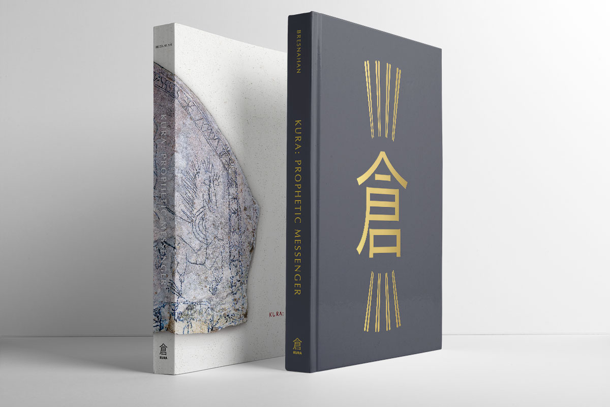
Cover Development
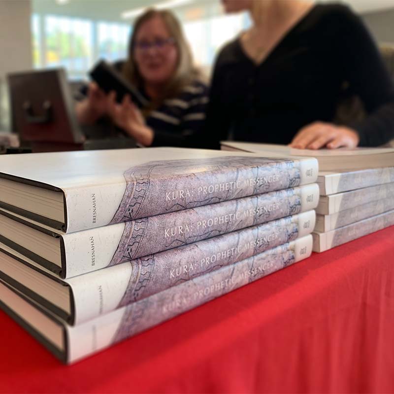
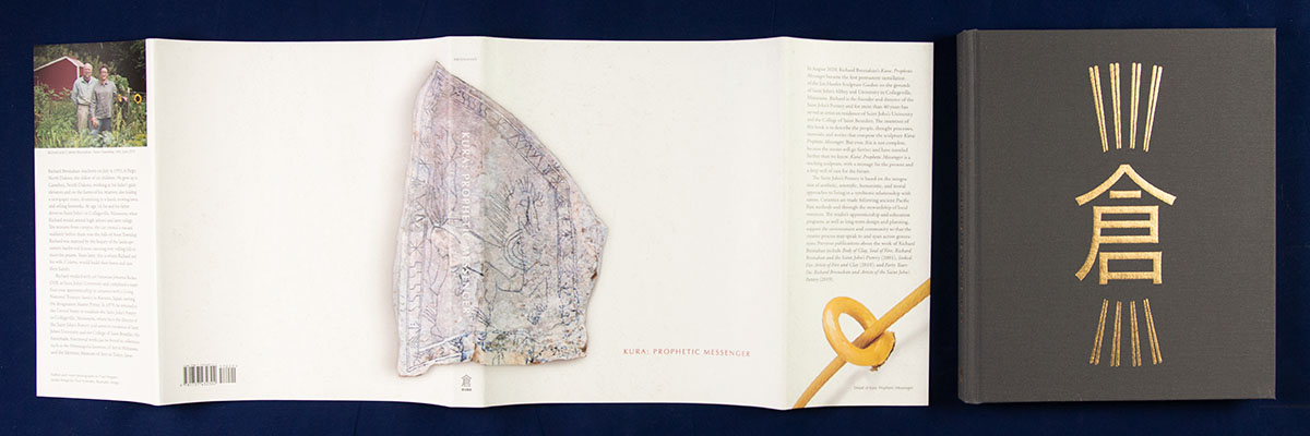
With the help of the Friesens, our chosen printer and binder, we hit on the idea of creating two versions utilizing the same interior—a so-called split run. This allowed us the economy of scale of printing and sewing 2,500 interiors while still offering a deluxe hardcover and a more economical softcover alternative. In addition, Richard knew he wanted a special limited edition version to use as a gift to donors and other key contributors to the project. So, there were potentially five covers to be designed for this book.
To simplify matters, we decided that the dust jacket and the soft cover would basically be identical. The hardcover would be foil stamped on book cloth-wrapped boards. The special edition would utilize the same unwrapped hardcover but in its own special box. More on that in a moment.
Hard Cover
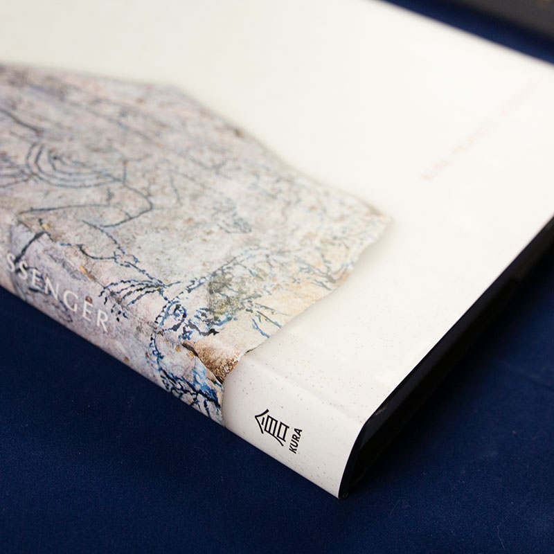
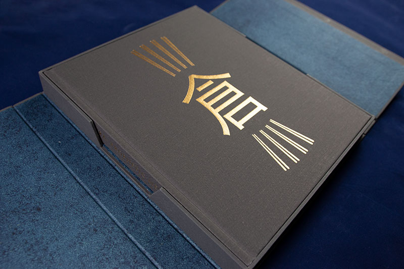
Given the color palette of the sculpture, a red roof on a white cylindrical enclosure with the blue sky as a background, I really wanted to utilize two pigment foils on the book cloth stamping. I also really wanted to integrate the concept of kura as a storehouse, or some sort of vessel. Preliminary designs assumed these concepts.

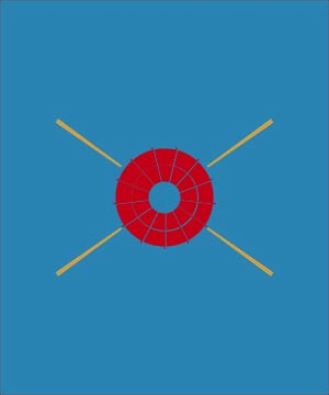


The version utilizing the simplified kura symbol and the four golden beams was chosen. However, it was later modified in favor of the more correct (if not quite as aesthetically clean) Japanese version of the symbol. This also became the logo for the new publishing company that the Bresnahans started for this book and their future undertakings.
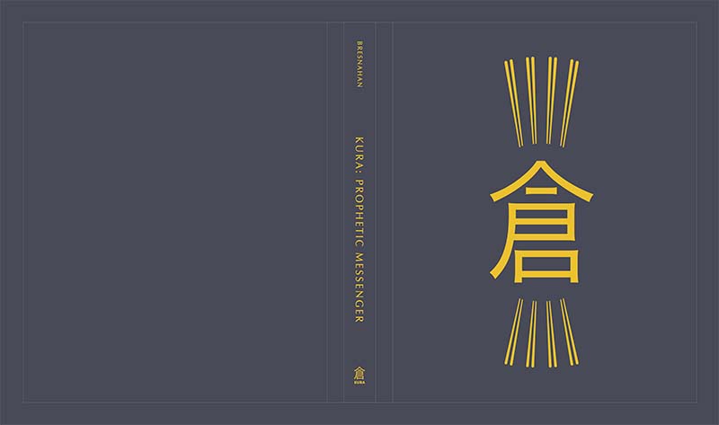
The idea of the pigment red and white foils was ultimately dropped, going with a single, dusted gold foil instead. The reason was pragmatic—the bindery didn’t feel comfortable with the reliability of the pigmented foils, and preferred using the metallic only. In the end, the gold is stunning … although I’ll always wonder how things would have worked with the three colors of foil stamps. Perhaps someday I can find out.
Dust Jacket / Soft Cover
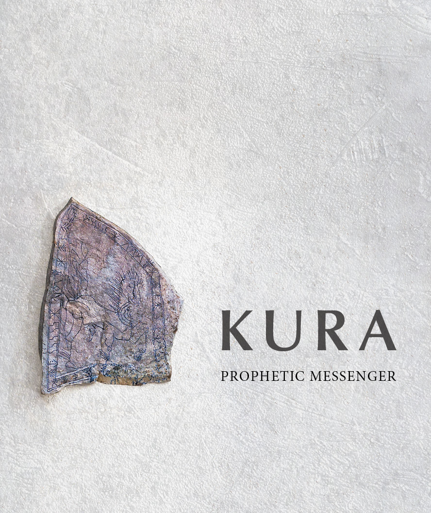
Clean and simple. That was the plan for the cover most people would see. Previous book covers from the pottery tended to feature a photo of one of Richard’s beautiful creations. I wanted to continue that natural idea but go bold by going more subtle—letting the Prophetic Messenger stone dominate. Utilizing the natural white space of the sculpture’s stucco exterior as background texture, I had my key visuals. It was just a matter of settling on the typography.
First Concepts
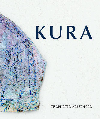
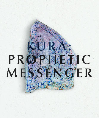
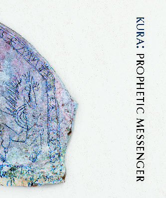
The initial ideas were very clean but suffered from two unexpected problems: first, the title of both the sculpture and the book is Kura: Prophetic Messenger; it is not a title and subtitle. So somehow, the words needed to have the same visual weight, despite “Kura” being so short and robust and “Prophetic Messenger” being much longer.
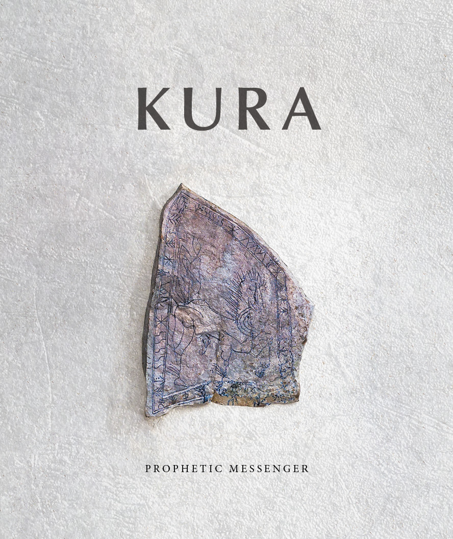
The second problem with these initial concepts was that the visual weight of the stone was too small—although good white space.
Second Concepts
Addressing these challenges, one thing was clear: I wanted the stone to wrap around the cover, creating a massive visual weight. As for the type … I tried a wide range of solutions. These visual sketches are fun exercises and a great way to understand actual space.
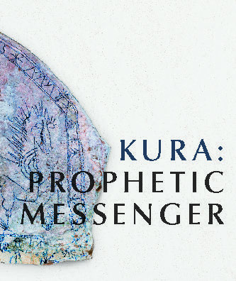
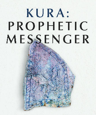
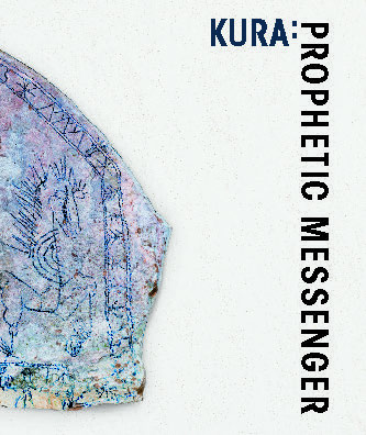
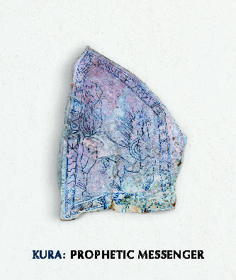
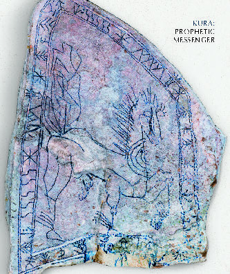
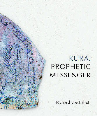
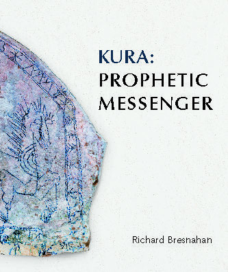
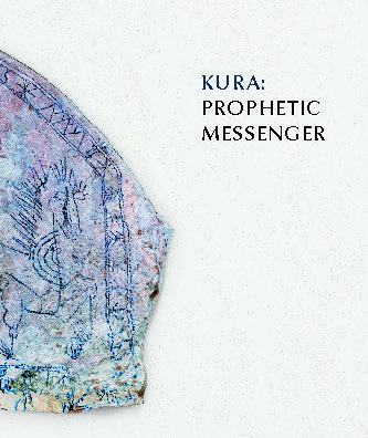
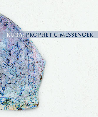
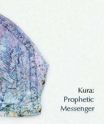
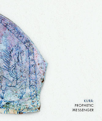

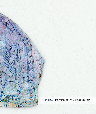

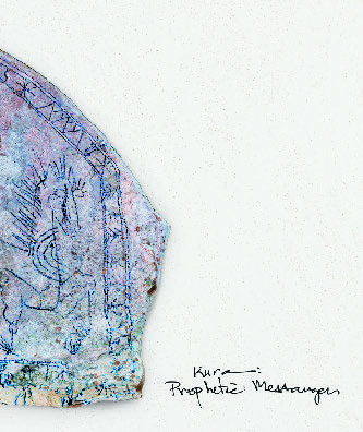
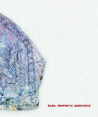
Ultimately, the decision was that less is more—so much so that Richard didn’t even want his name to appear on the cover—weight, with white space. And I could still utilize the red of the kura roof in the title text. Clever observers might notice that this is still an impossible photograph: Paul Wegner carefully photographed the stone, but then I cut it out and superimposed it on a different photo of the stucco texture. The effect is realistic but artificial—one of the subtle tricks that occasionally has to be employed to make the visual match what the mind’s eye sees.
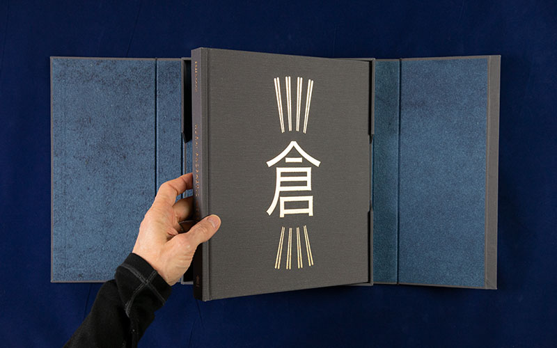
Special Edition
The distinguishing aspect of the special limited edition of the book is the box it came in. Stripped of its dust jacket, the hardcover edition of the book, with its dominant gold kura, was designed to be integral to the box.
After several discussions between Richard, Margaret, and myself, and including Duncan Campbell and Morgan Mahan at Campbell-Logan Bindery, we settled on an unusual design for the box. Rather than a traditional clamshell, this box would have a split cover like a French Door. Strong magnets hold the flaps together, allowing the book-in-box to stand on end.
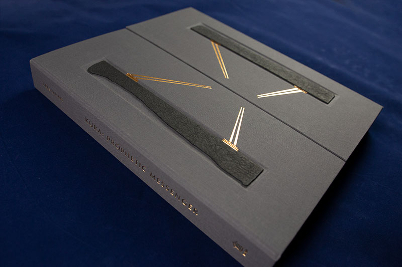
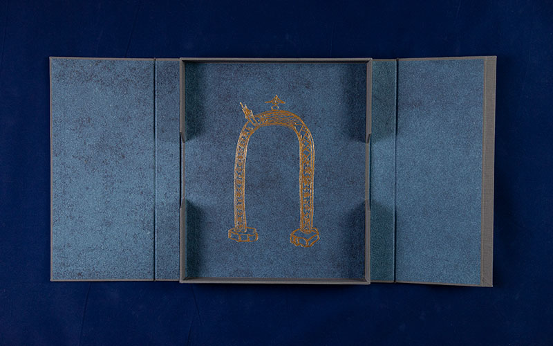
Inside, there are cutouts on either side of the tray to allow for the removal of the book. And that is where the surprise comes: behind the book is the archway through which the Prophetic Messenger passes. Taken together, the box cover, with the supporting stones and golden lines but no kura; the book cover, revealing the kura; and the back of the box, showing the arch, reveals that we are the ones walking the path.
The handmade indigo-dyed paper from Cave Paper which lines the box completes the metaphor Richard envisioned: “a Buddhist raigō, dyed indigo silk that is painstakingly inlaid with gold leaf, with imagery of the Buddha descending golden clouds with halo, attended by angels on beams of golden light. The unification of heaven and earth.”
The stones are laser cut to match the actual profile of the supporting granite columns of the sculpture and wrapped with textured kozo paper, giving a tactile feel, something like the rough granite surface of the sculpture’s stones. They are recessed in the cover to protect them, with eight separate stamping dies laying the gold foil on two different levels of the two box lid panels, making the box fully functional and aesthetically arresting!
I ensured that the book cover’s book cloth fabric and foil colors matched the box’s materials—despite being produced hundreds of miles apart and in parallel productions. The book wasn’t seen with the box until both had been completed!
Developing the Interior Layout
Generally, I’ve found that people underestimate the work that it takes to transform a manuscript (the edited but largely unformatted version of a book) into a typeset book. It is a process I enjoy doing, a unique problem-solving challenge every time. But I prefer to do it only once per project. This is why I generally ask for the manuscript to be complete before I get too deep into the design work.
In Kura: Prophetic Messenger, the details of the visual structure, the information flow within the layout, and the final organization and pacing of imagery were all to be determined in parallel with the completion of the writing and editing of the book. It turned out to be a wonderfully explorative process, allowing the design of the interior layout to inform the structure of the writing and vice versa.
Drawing inspiration from the books documenting the creation of the monumental fabric-wrapped environmental art of Jeanne-Claude and Christo, the Kura: Prophetic Messenger documents the conception and creation of the sculpture as much as the finished result. And similar to the transient nature of their work, the majority of the story of the kura is hidden inside—the book becomes essential to preserving and sharing this hidden story.
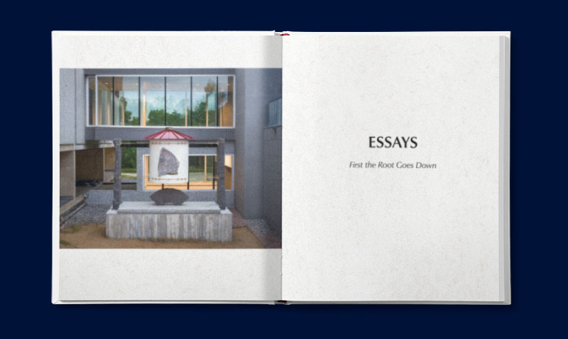
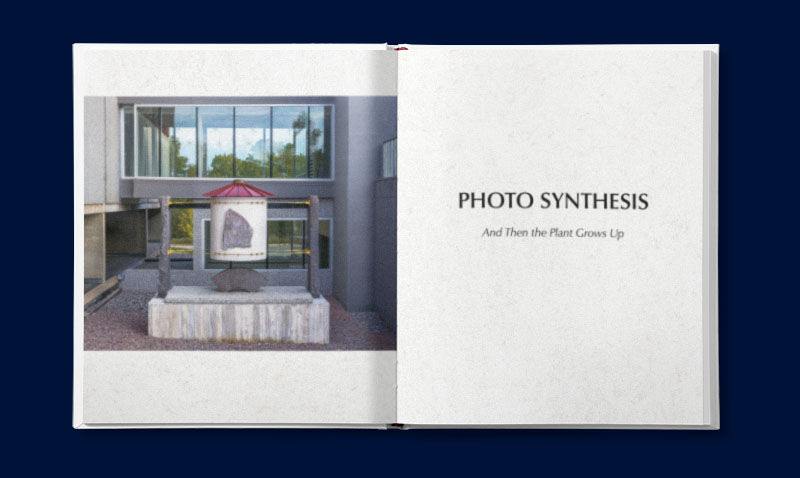
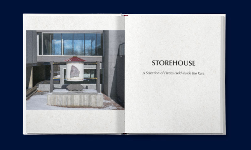
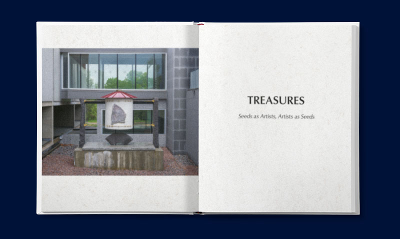
The structure that Margaret envisioned divides the book into four seasons, corresponding roughly to the year-long process of installing the sculpture: essays (summer), photo essays (fall), studio photos (winter), and a “catalog” of the 184 seeds and 168 artists (spring). Each would open with an image of the completed sculpture in the specified season. While the seasonal references were ultimately dropped as the chronological idea didn’t match the actual structure of the story, the four seasonal images, shot from identical vantage points by photographer Paul Wegner, were still used.
Typefaces
I’ll admit that using the Optima typeface would not have been my first choice. It isn’t bad, per se. It is just overused. Designed by the venerable Herman Zapf in the late 1950s, it is a sans-serif inspired by stone carvings with flared terminals reminiscent of a serif. Chosen in 2000–2001 for the Body of Clay, Soul of Fire book, the first book about the St. John’s Pottery, it has become the standard typeface for all the Pottery’s books.
Although the use of Optima was non-negotiable, I decided instead to utilize the font Classico from the URW Type Foundry. A slightly updated version, Classico is better suited to digital font usage in print, offering additional medium and extra bold weights. This allowed me to make a more balanced use of the typeface for both headings and captions.
This was paired with Adobe’s Garamond Premier Pro typeface family used for the body text throughout the book. Garamond is widely used for book typesetting because of its clean appearance and elegant paired italic. Adobe’s latest update offered a clean and unassuming pairing to the Optima/Classico headings.
Layout considerations
A 9.25-inch page offers a generous width to work with. Two columns are essential for the essays and other text-heavy areas. I quickly settled on a comfortable 11 pt type size in two 21p3 (3.54″) columns spaced 2p apart; this gave me a comfortable line length of about 53 characters. With 15 pt line spacing, the comfortable margins offered a 42-line page. Not that many pages were only text—nearly every spread in the book features at least one image.
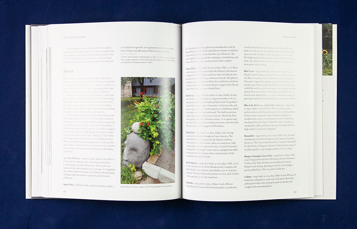
While the essays would drive the general text appearance, my initial focus was actually on the appendices. I was tasked with creating a “FedCo Seed Catalog-like” catalog of all the seeds sealed inside the kura and the artists who were involved or influenced Richard in this project.
Like a catalog, controlling formatting would ensure the reader didn’t get lost. It is also the key to automating the formatting as much as possible—I always use object, paragraph, and character styles in the software, but here, I also devised rules to implement nested styles.
Final Typesetting
The key advantage of the detailed work with the advanced layout development was that when the final manuscript was ready, most typesetting decisions had already been made. It was just a matter of implementing them. But it did mean replacing all of the text that had been done to this point. Styles to the recuse! I developed a checklist to ensure consistent implementation.
Photography
One of the challenges of being a book designer is that, if I do my job well, no one really notices it was done at all. A photo book, however, does get noticed. It was great to work with photographer Paul Wegner on the images of this book. His commitment and dedication to this project was inspiring.
Case in point: he wanted a better “spring” Kura photo. So, rain in the forecast? He grabs his gear—camera, tripod, and lights—and drives the couple hours from Minneapolis up to St. Cloud. Just to try to capture the one image he has in his mind. Amazing!
Photo Editing
In addition to taking many of the photographs himself, Paul was in charge of selecting the images we would use and adjusting the final choices to offer consistent color and tonality wherever possible. A total of 250 images appear in this book, so this was no small undertaking.
Based on his rough layouts and pacing, I created the final photo layouts, added captions, and handled the final rescaling, CMYK conversion, and output sharpening of all the images. Zervix’s LinkOptimizer and a little Photoshop automation to the rescue!
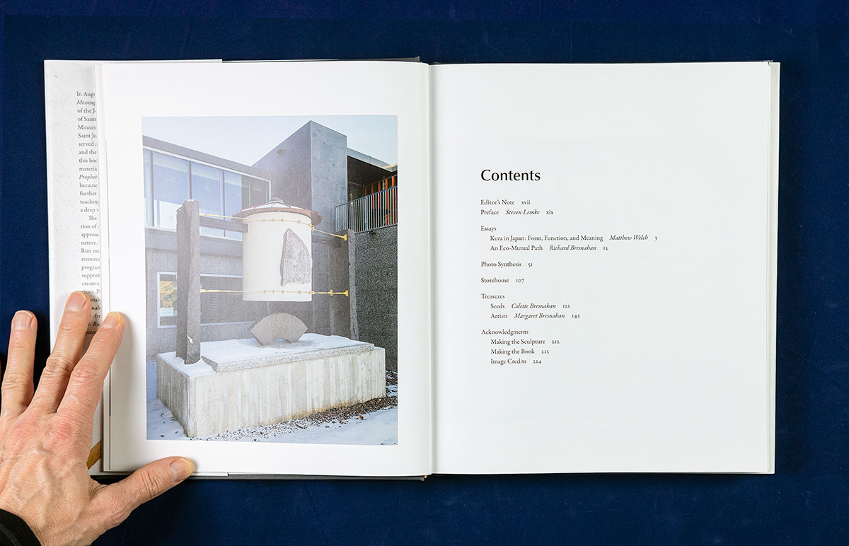
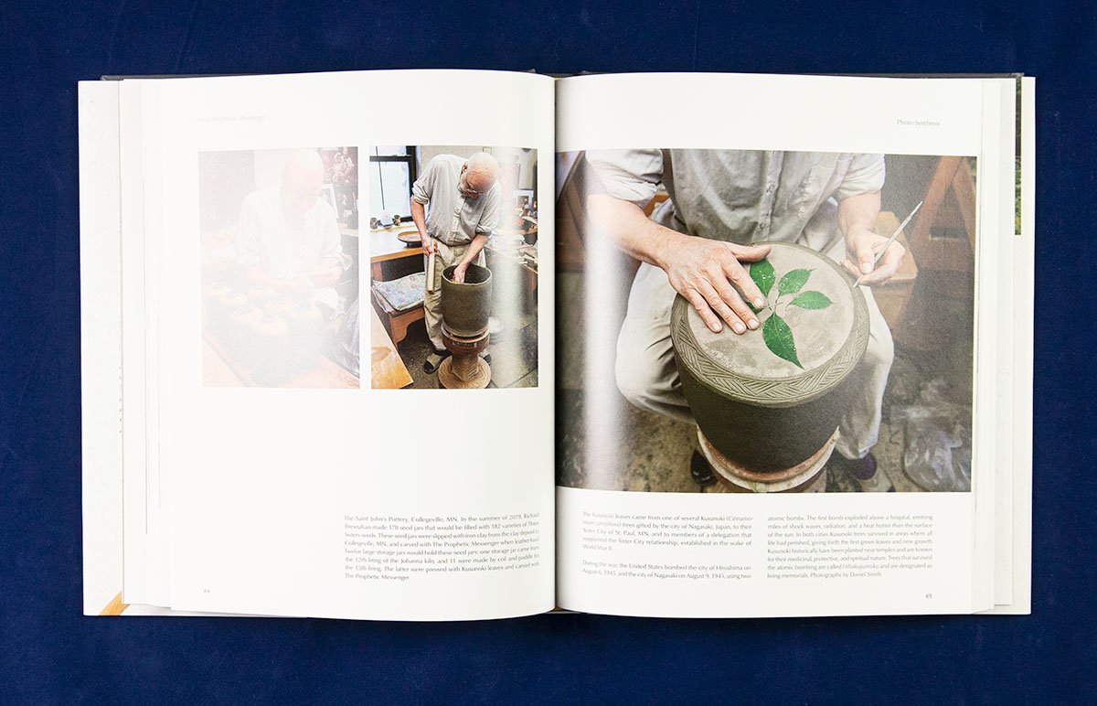
Photo composites
The sculpture project was meticulously documented, with photographs of nearly every step taken. However, there are a handful of images that we didn’t have that we really wanted to help tell the story. Fortunately, from my years in photography and previous work with technical documentation, I’m also a good photo compositor and retoucher when needed.
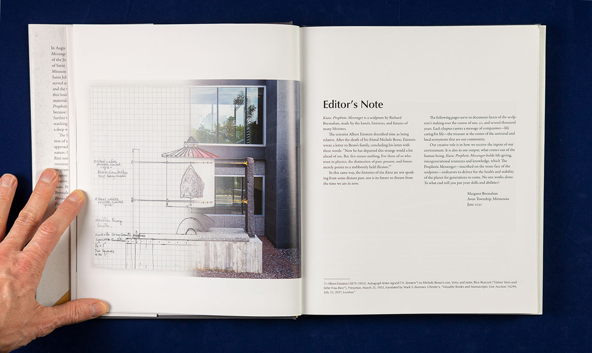
One example is the stone on the dust jacket and soft cover book. Combining two separate photographs, one of the stone and one of the texture, creates a realistic (if impossible) shot. Another is the melding of the initial sketch and the sculpture photograph that appears opposite the editor’s note: unrealistic but also very informative of the documentation process.
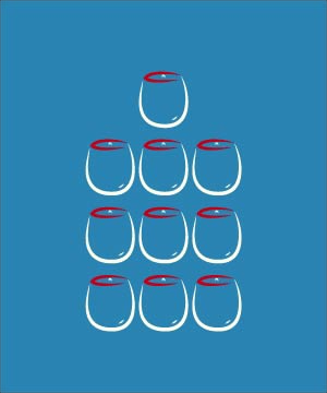
Less obvious is the photograph of the 178 seed jars that are installed inside the kura. This photograph, unfortunately, didn’t exist. Nor would it ever, given that the jars were sealed inside the Kura: Prophetic Messenger sculpture long before the book was started. But we needed this image to provide the context of this undertaking—no other available image really showed the full scope of the project.
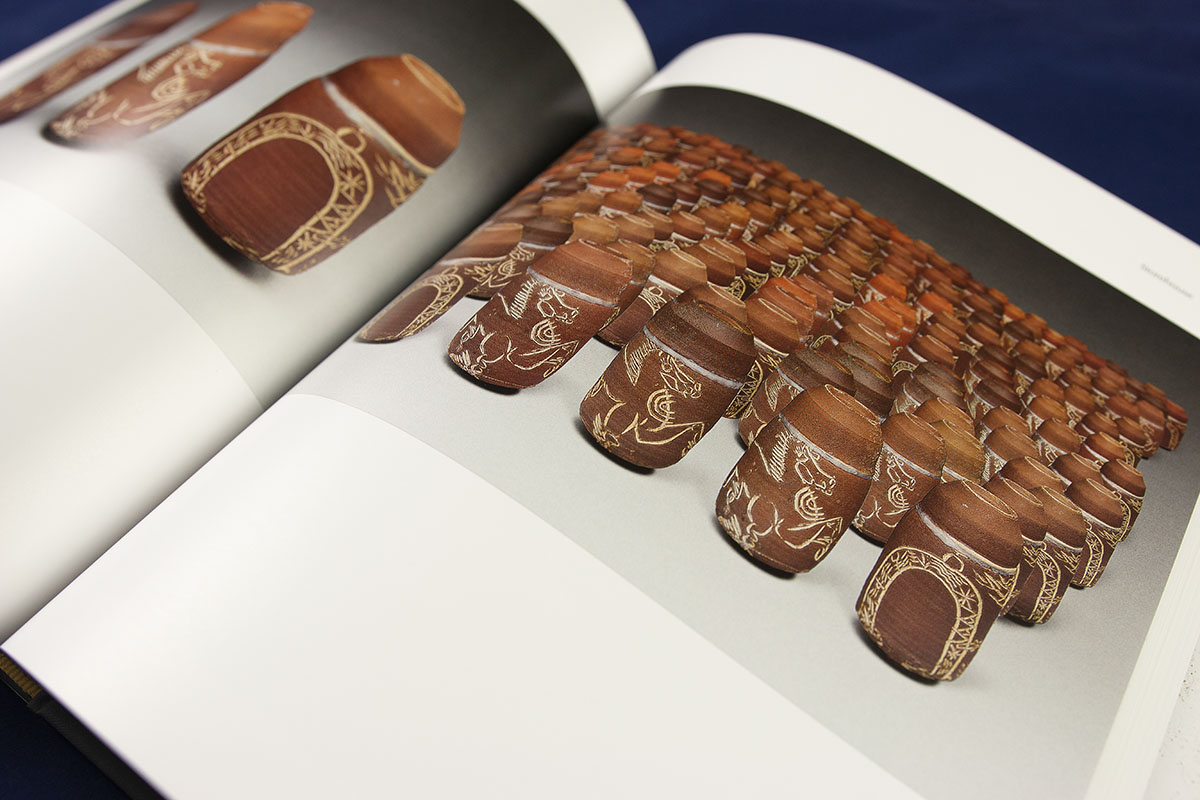
In this instance, the image is wholly manufactured. We had the studio photograph of three jars and two other pictures of single jars. With a bit of Photoshop magic, and a dose of patience, I created a composite simulating all 178 jars. We created this image with Paul’s help in adjusting the virtual shadows and lighting.
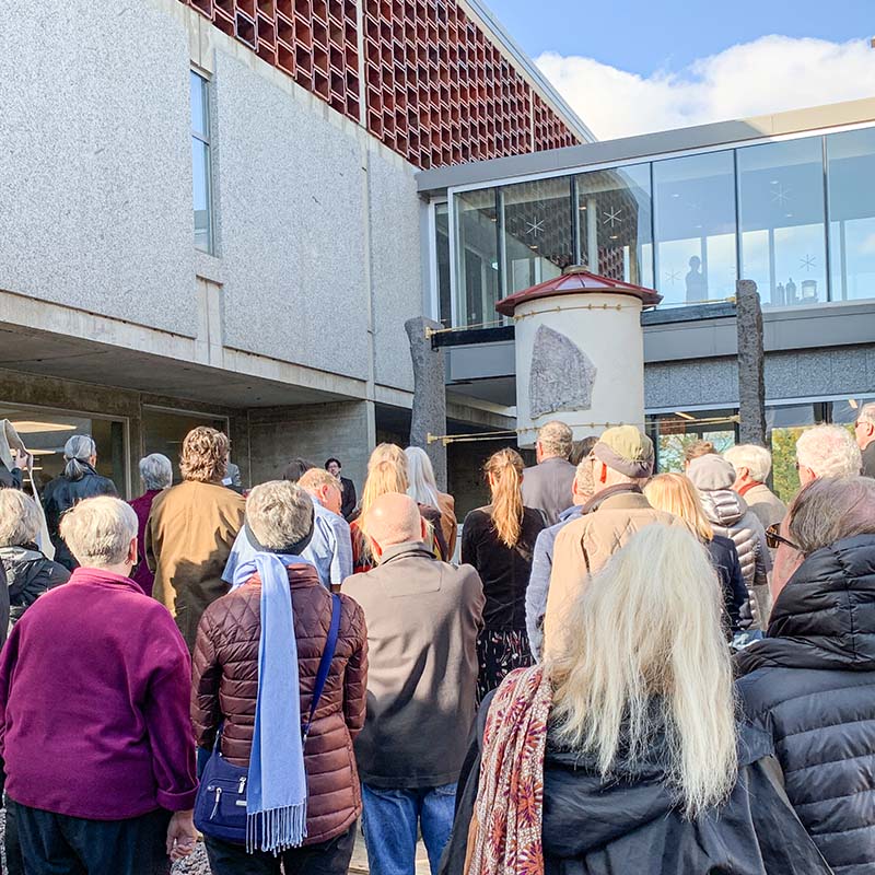
Reflections
This book is a milestone in my book design career. I will be forever grateful to the entire Bresnahan family for welcoming me in to help share a personal story and a professional triumph. A mere nine months elapsed from my first discussion over Zoom to the book launch party and dedication ceremony. Margaret’s careful planning of the writing and editing schedule, Paul’s tireless editing and preparation of the images, and my flexibility when possible (but holding fast when necessary) made things happen. And our regular Zoom conferences and discussions, weekly at times, ensured all challenges were dealt with efficiently.