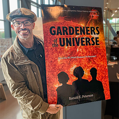
Author Ron Peterson’s second book delves into humanity’s future through an ancient alien species, the “gardeners,” who shape civilizations across the universe. Bestowing genetic gifts upon three children, the book explores pivotal decisions that humanity will confront over the next century.
As the designer, I skillfully encapsulated the essence of this thought-provoking story, which centers around the three gifted children destined to guide humanity’s future. The design mirrors the book’s exploration of profound ethical dilemmas and humanity’s potential over the next century, offering a visually compelling experience that enhances Peterson’s visionary tale.
“Paul was a wonderful help with my book, both in graphic design, book design, and general organizational and psychological support. He is super organized and proactive.”
RONALD PETERSON, AUTHOR
Design Challenge
- Design a cover that avoids the stereotypes of science fiction, while ensuring it is appropriate to the genre and connects with the target audience.
- Develop an interior layout to smoothly guide the reader through 48 chapters and six time periods.
Cover Design
The central purpose of a book’s cover is to promote the book. It is governed by marketing rules and must meet the expectations of the genre. At the same time, it needs to grab the reader’s attention and connect with them. The cover must look as great in a thumbnail image as it does on a shelf.
Creative Brief

When I met Ron, he was already well into his edits, and had created a working cover concept for early promotion of the book. We discussed his aspirations, the general plot, his perceived audience, his preferences, and comparable titles.
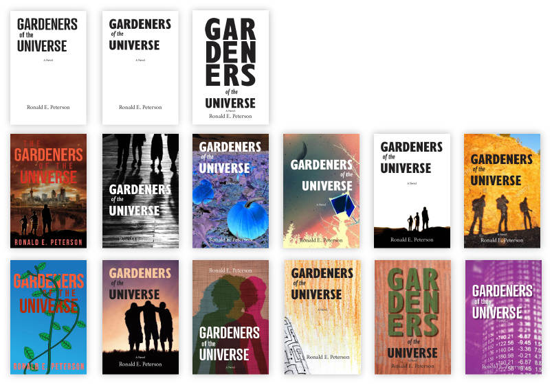
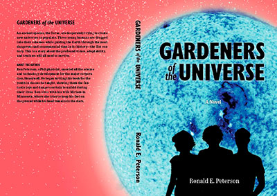
Ron was very clear that this wasn’t a “space opera,” and wanted to avoid the stereotypical “stary black space” cover. In his initial concept, we have the red background, the mechanized “probes” of the story, a comet, and three figures, all accompanying some very “unscience-fictiony” sort of typography. From that foundation, I began doing my research.
Design Exploration
An effective cover must capture a moment, a singular idea, or the emotion of the book.
The best designs are a result of a strong collaboration between the author and designer. After exploring ideas with Ron, we decided to use the cover to focus on the three protagonists. The novel explores their relationship to one another and their place in the growing universe. As an artist and former physicist, I deeply appreciated Ron’s use of color in the story. Color was used as the medium of communication amongst the ‘gardeners.’ It also highlighted his more terrestrial description of the central characters’ lives. Ron’s adherence to scientific accuracy reminded me of Andy Weir’s Artemis and The Martian. These factors weighed on my thought process as I created the initial concept covers.
First Round of Cover Concepts
I really enjoy when an author (or art director) comes with ideas during the creative brief, but is still open to exploring other possibilities. I usually start with pure typography to get a sense of how the title will fit into the space. I combine the words with sketches, rough collages, or image ideas.
Design Iterations
Based on these initial rough ideas, we discussed and iterated on a couple of ideas until we were both satisfied with the direction chosen.
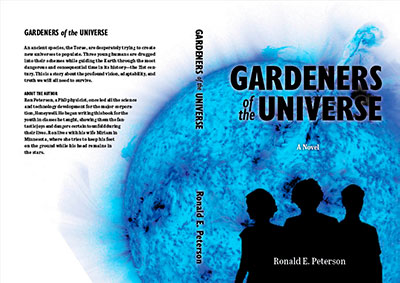
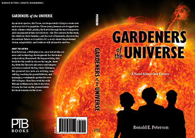
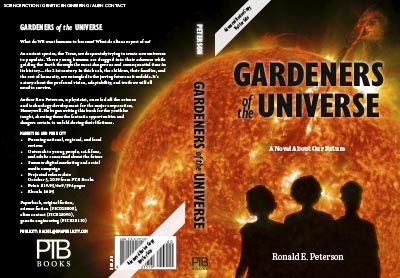
Ultimately, Ron liked the three figures locking arms and the yellow “sunburst.” I played around with this feedback. In the end, I chose to visually overlap the silhouettes to imply a closeness between the characters. To create the sun, I used an actual NASA solar image. Working this into full cover spreads in both “positive” and “negative” colors, we ultimately chose the reddish-yellow sun and, perhaps a bit ironically, the nearly black background.
I think the cold-blue star and white background was a very intriguing and non-conventional approach. It would have made a strong cover. But design strength is not the only consideration; in consultation with the entire creative and publicity team, I think Ron made the best choice in going with the reddish-yellow sun.
Finalizing the Cover Design
Before going to press, the cover underwent a few additional refinements. I perfected the “glow” of the cover silhouette. I also painstakingly adjusted the color to maintain the original RGB image’s vibrancy when printed in the CMYK color space used by the printer. After that, I added the final back cover elements, a front-cover review quote, and made adjustments for the final spine thickness.
Updating the Cover Design
When Ron decided to republish his novel with Calumet Editions, we decided a cover refresh was in order. Calumet suggested that seeing the protagonists’ faces would help promote the book.
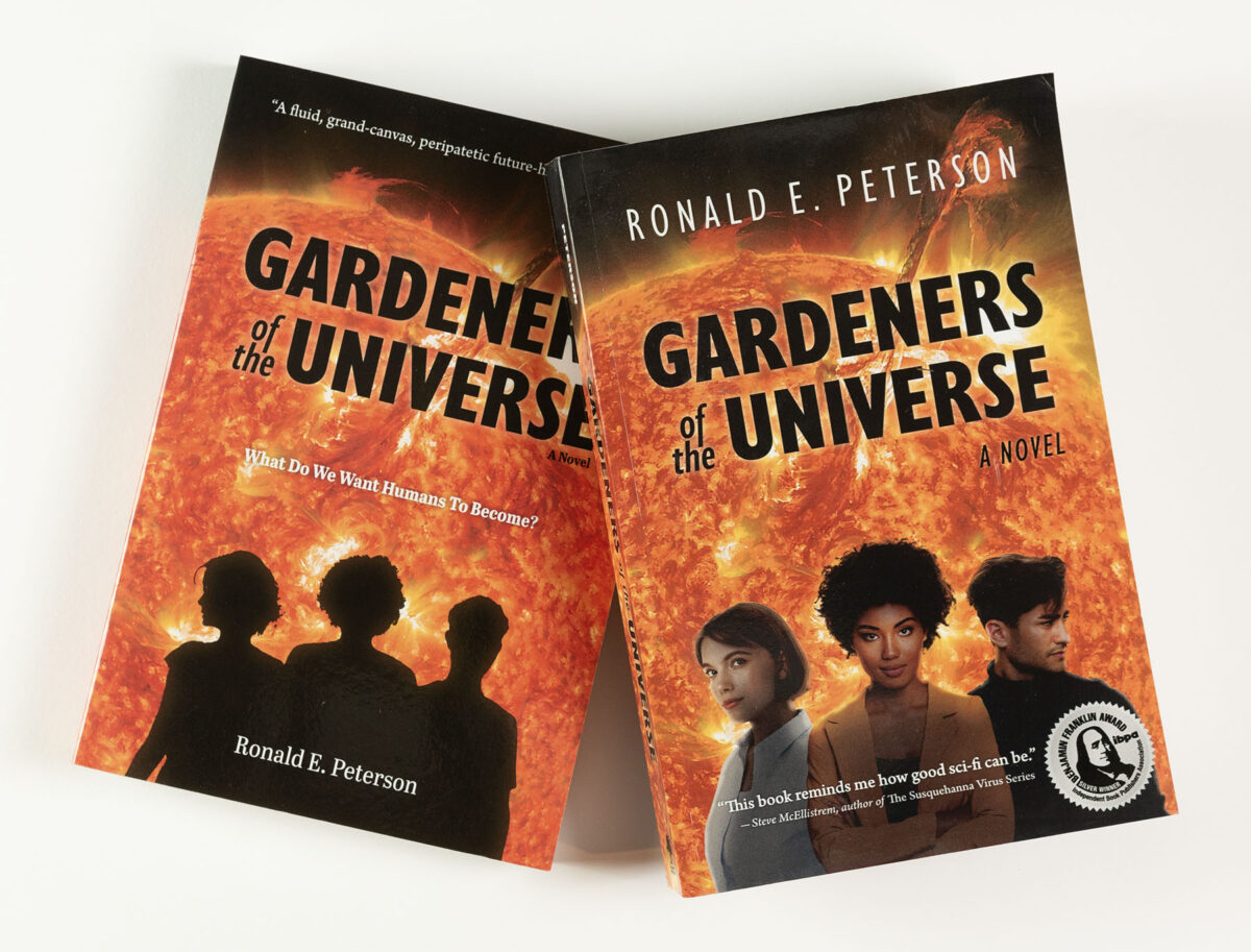
A great suggestion, even though it contradicted one of the author’s original “mandates” of only using silhouetted figures to allow the reader to use their own imagination. A good lesson for me to always push back on creative directions when I see a possible improvement.
I also took the opportunity to update the typography and feature the author’s name more prominently.
Interior Layout & Typesetting
While buyers may judge a book by its cover, readers judge a book by its interior. Or rather, they shouldn’t, because the interior should work intuitively and blend in seamlessly with the style, mood, and story.
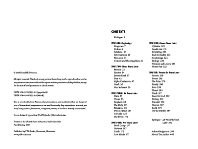
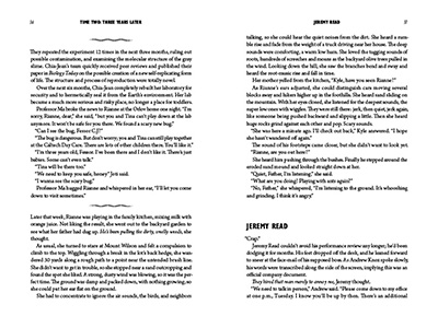
Gardeners of the Universe presented an interesting structural challenge. The book contains 48 chapters, including a prologue and epilogue, spread between six distinct time periods. Many of the chapters were quite short, yet the book is overall quite long (and therefore expensive, from a production standpoint). Dividers often broke the book’s text, and there are broadcast news reports and sections of autonomous data reporting by monitoring probes.
Run-in and Separation
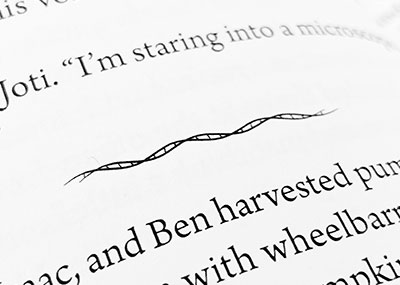
To solve this problem, I decided to run the chapters together, providing just a header and separation space. To separate the chapters, I created a customized divider line based on a DNA strand’s double-helix. This was exceptionally pleasing to create, and provided a subtle design element that enhanced Ron’s overall work.
Time Period Section Breaks
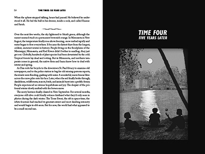
The time period section breaks called for a more elaborate solution: a black page with an illustrated depiction of a critical scene from the section.
The six illustrations for the section breaks represented another challenge. Ron wanted to utilize some of his own photographs. Some of the locations described in the book were places he had lived in, worked in, or visited. (At least the ones on Earth).
I needed to add characters to the images. I ended up incorporating stock elements into actual photographs, with a great deal of compositing, and back-and-forth iterations with Ron. To make the illustrations work, I then applied a mixture of pixel and vector effects to create greyscale sketches from each collage, effectively hiding most of the rough edges.
eBook Design
Because I knew that Ron was planning an eBook edition of Gardeners, I was able to build-in some of the eBook requirements while designing the interior of the print book. For a novel like this, a reflowable eBook is most appropriate—this allows someone reading the book to adjust font size and text/background color to improve the readability of their tablet, phone, or eReader device. Conversion is then a matter of exporting the ePub file format, and using ePub editing tools to tweak and fine-tune the output.
Fine-tuning is always needed: the automated exporters get you 80% of the way, but a good ePub always needs adjustment—images, page breaks, fonts and font-alternates, … Several versions are created which are optimized for both Kindle eReaders (Amazon) and other ePub based devices, such as Apple’s iBooks, Barnes & Noble’s Nook, the Kobo reader, etc.
To save the effort of running all of these separate eBook distribution agreements, Ron contracted with Bookmobile through his print book distributor Itasca to handle the eBook push to all the services.
Publicity
Advanced Reader Copies and Reviews
Early in the process, Ron knew he wanted help with the book’s promotion if he was going to have any chance of reaching beyond his immediate circle of friends. He hired Rachel Anderson of RMA Publicity.
With Rachel’s guidance, we decided to create two versions of the book:
- an “advanced reader copy” (ARC) to be used for reader reviews in advance of the publication (as well as final proofreading), and
- a final print run version for publication.
From his first book, Ron was already familiar with the short-run digital printer Bookmobile. He chose them to handle the printing for both the ARC and the final published version.
While a small run ARC is a relatively expensive proposition for a 410-page book, there is no better way to get potential reviewers excited about the book. With these ARCs, Rachel was able to secure several reviews, including a national Kirkus review and a shout-out from Publisher Weekly’s Booklife Report.
(Note: since COVID, most reviewers are now using digital-ARCs—usually a PDF of the book.)
First Book Launch
Every author dreams of doing a launch party. They are a great way to celebrate the official end of a universally long and sometimes stressful process for authors.
In fitting with his biology, evolution, and space themes, Ron decided to do his launch at the Bell Museum, a natural history museum and planetarium at the University of Minnesota.


