Finding Calm in the Whirlwind of Community Building
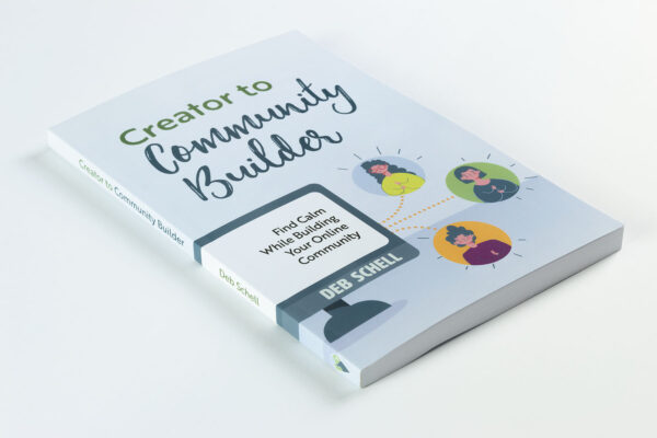
Deb Schell’s Creator to Community Builder design focused on a clean, minimalist aesthetic appropriate to a practical guide aimed at online business owners. The book required a design that balanced creativity with organization, reflecting Deb’s transformation from content creator to community facilitator.
The goal was to craft a light, bright, and approachable design that avoided fast-money implications, aligning with Schell’s brand while effectively communicating her narrative of overcoming community-building challenges.
“Paul spent time getting to know me and my vision for the book. His design perfectly fits the visual I needed to communicate to the reader.”
Deb Schell, Author
Design Brief
This book combines a straightforward checklist, backed by online supplemental worksheets and podcast interviews, with Deb’s calming philosophy and primarily targets women entrepreneurs.
Consistent with the author’s supportive and nurturing approach, this book could not have any “sharp edges” in its design. Inspirations include the works of Brené Brown and other community-focused authors.
Through our design kickoff meeting, Deb specified that she prefers light, bright colors and a minimalist, creative, and colorful style. The book’s design needed to avoid dark colors or imagery suggesting quick financial gains.
A failure of the design to connect with readers would curtail the sharing of Deb’s extensive experience to establish her authority in the field.
Creative Process
The book’s design needed to reflect creativity, calmness, and conciseness, focusing on practicality and organization.
However, balancing aesthetics and functionality was essential to engage the reader in this highly structured handbook. I pushed to find a way to use the author’s photographs to help soften and personalize our approach. Keeping the type friendly but proficient was also essential to the humanity of the design.
“The best part of working with Paul is his creative talent, flexibility with change, and compassion for the challenges that a new author experiences.”
Deb Schell, Author
Design Choices
For the cover’s aesthetic, I explored several different styles. After reviewing the concepts with me, Deb and I agreed on an adaptable stock vector illustration that conveyed the online community’s ideas while helping manage the art costs.
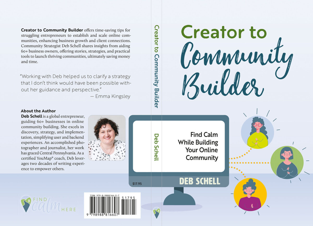
With the cover’s title, I wanted to mix the humanity of a clean brush script with a distressed mixed case sans serif. I integrated Deb’s brand colors, using color to help clearly distinguish the transition from ”Creator” to “Community Builder.” I wanted to keep the byline condensed, and opted to use the Artz wood-type-style font, which is nice and roundy and all caps.
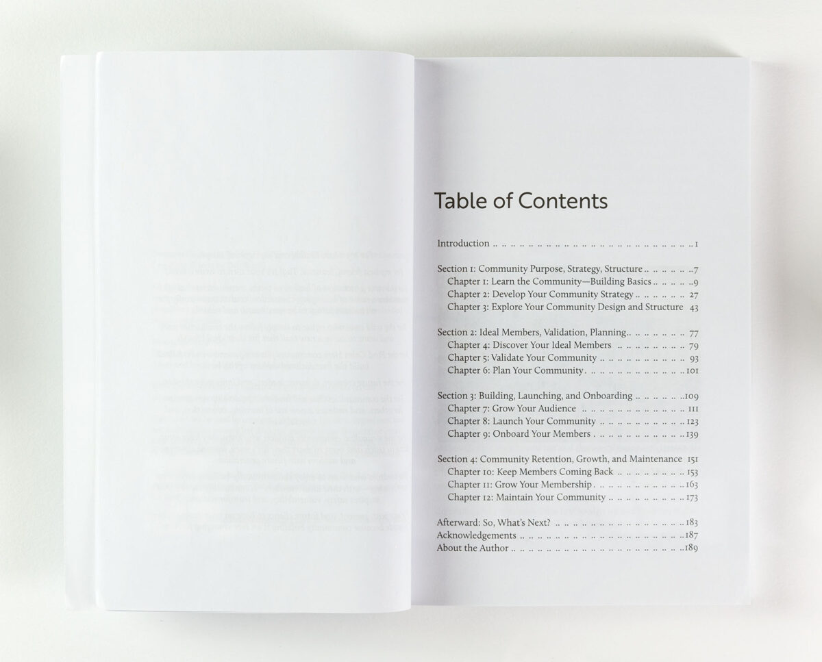
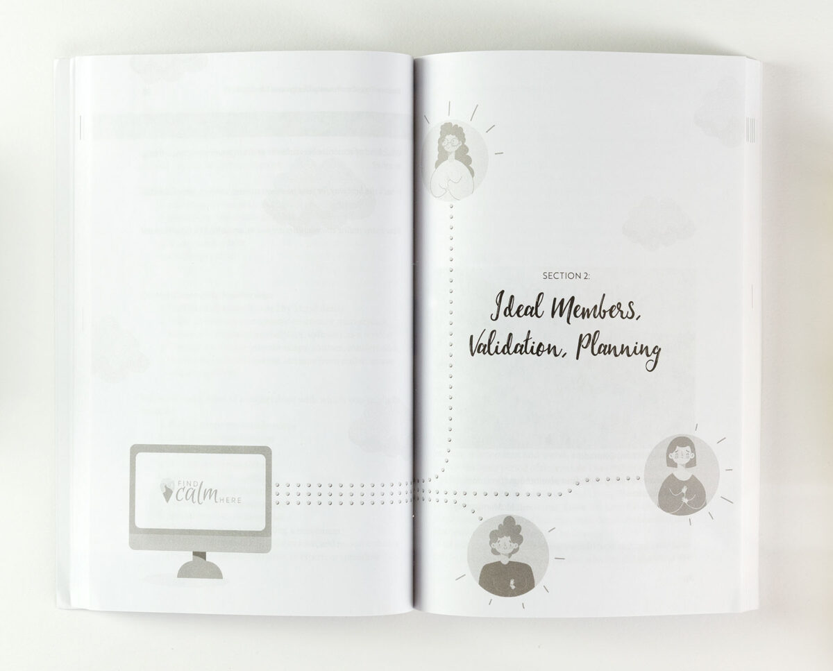
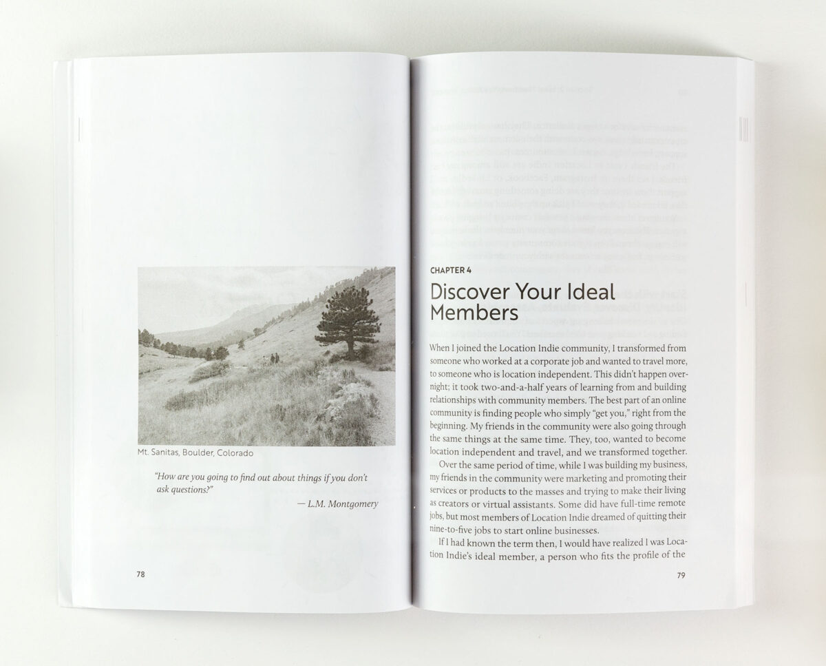
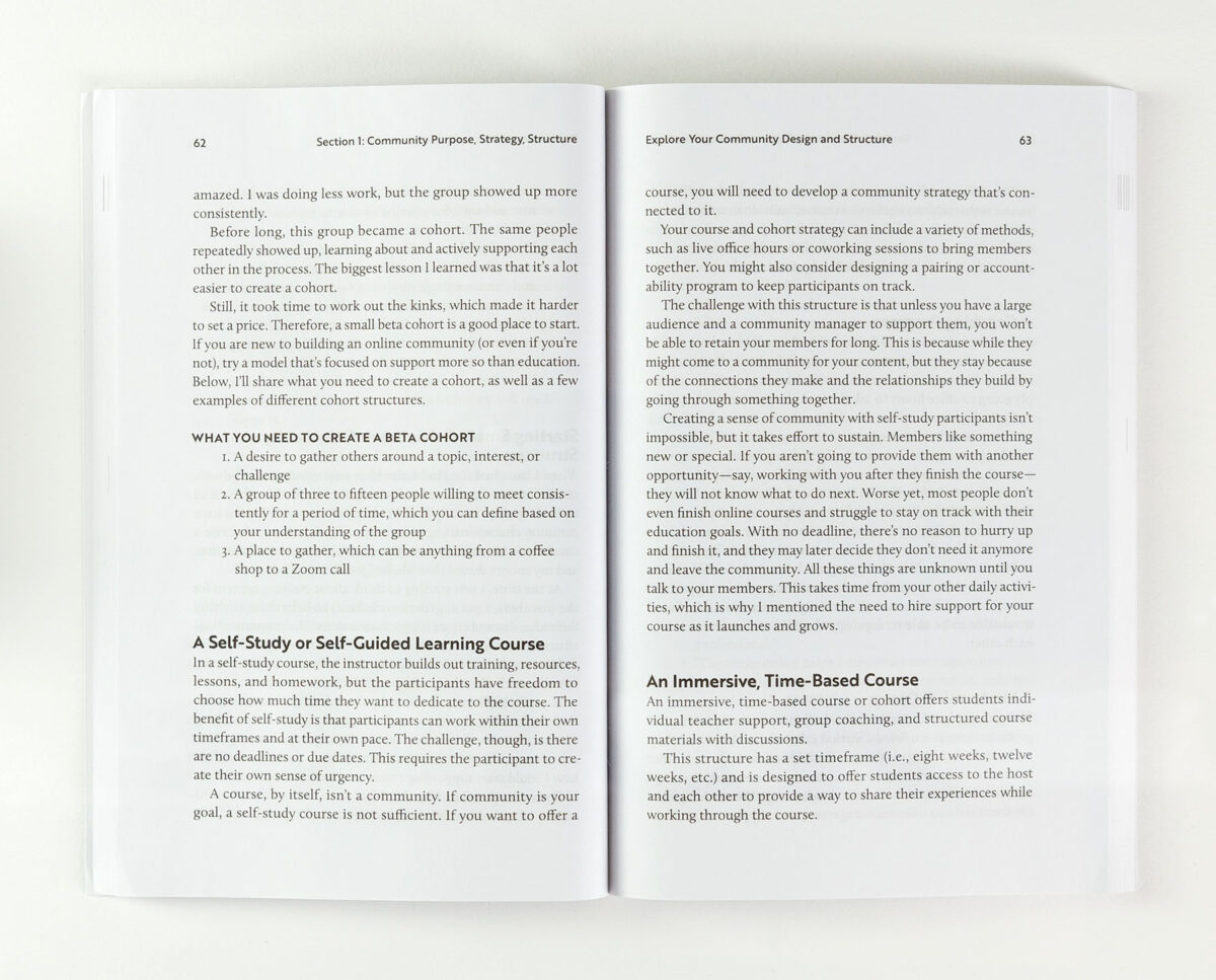
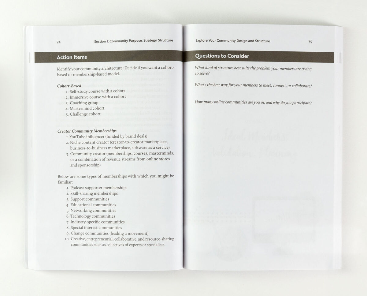
For the body text, Calluna “combines the charm of classic design with the clean-cut appeal of modernism” (according to the type designer), which is perfect for Deb’s approach to modern community building. I paired this text serif font with Brother 1816, a clean sans serif that works well in heavier weights for headings. Assertive but not heavy-handed.
The conclusion of each chapter included a snapshot, action items, and questions. These three sections are further expanded in a downloadable PDF workbook I also created to supplement Deb’s content.
We explored several printing and fulfillment options for the book, ultimately settling on print-on-demand. In the end, the quality was sufficient for Deb’s needs and helped her to manage up-front costs.
“Few people I’ve worked with have the generosity, compassion, and talent that Paul has demonstrated to me over the past year. He spent hours talking with me about the project’s cover design and what I needed to provide to work together. This book wouldn’t have been possible without Paul’s talent, support, and dedication to creating a quality book.”
Deb Schell, Author

