Fine Press Limited Edition Artist’s Book
Someone asked me once, “Why print a book in letterpress?” It is a fair question. Much of my commercial work is designed for modern digital or offset printing presses in a process which is both faster and (generally speaking) less expensive.
But I would respond that the project’s purpose dictates the medium. See, a printing press, whether modern or more antiquated like letterpress, is just a tool. And we all know that we should use the right tool for the job.
With this project, I wanted to use the full power of a book’s ability to control the reader, to slow things down, and allow for contemplation. The process of creating this unique work, and indeed the object itself, all share in this idea.
A book like this is tactile: you can see, hear, feel and smell the way it was created … the inks, the paper, the little “whoosh” of sliding it out of it’s slipcase. So, too, for me is the process.
But to be clear, I’m not a luddite; modern technology was integral to the creation of this book, even if it was actually printed using equipment that wouldn’t have been out of place 100 years ago.
Preliminary layout was accomplished with Adobe’s InDesign, as were initial typesetting tests and line length determinations. Imposition was handled with an InDesign plug-in, and thumbnail production guides were also essential to keeping track of the process. Photoshop was essential to the image processing.
Photography
The project starts, as most do, with the content, the photos themselves. The original Isolationproject started as a photography exhibit (viewable on my artist website, www.paulnylander.com). Challenged to find the underlying themes in my work to that point, finding the “artist within” as fellow photographer Don Mendenhall would explain, I discovered this idea deep within myself.
After solo exhibits in Madison, Wisconsin, and a video I narrated of an expanded version of the work, I set it aside. It wasn’t finished, but I didn’t know where to take it next.
Photogravure
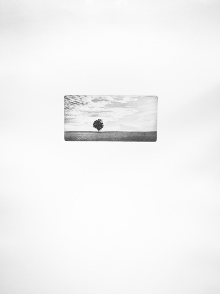
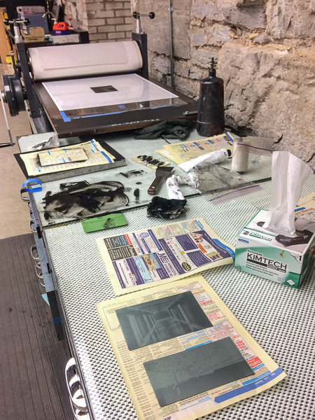
That next step would come several years later, in Minneapolis, after a chance encounter that exposed me to the world of modern photogravure printing. I talk about this technique more over at www.paulnylander.com, but suffice it to say here that it is a slow, methodical, difficult process that is equally as beautiful and revealing. In it, I finally found a way forward with Isolation.
Design
While mastering the technique, I set out to design the book. What might have started as a catalog of a photography exhibit had now grown into a much larger project, a object of artistic expression in its own right. Being about isolation, I sought to offer the images in an intimate, and isolated, way. White space would be critical. And like the video, I wanted to make sure the narrative wove itself into images. Unlike a gallery exhibit, a book was the medium of choice to control the pacing, to guide the viewer through my thought process.
Preliminary design took place in the digital realm, and a first inkjet version of the book was created. I settled on the 10 x 15 page size very early on. For images that were still intimate but viewable at a normal reading distance (nominally about 4 x 6), the 10 x 15 page size provided plenty of white space—two to three inches side to side, depending on orientation, and at least the same vertically, even allowing space for the text. And it worked well with the available parent sheet paper size, accounting for grain direction and such.
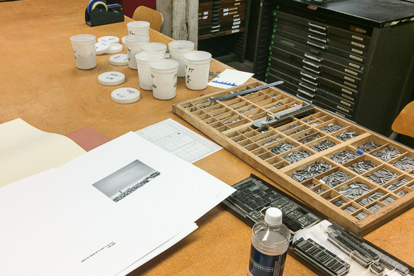
One technical challenge is how to handle the text. And where to place it. One feature of photogravure printing is that the plates typically are debossed into the dampened paper as they are printed. This deboss is visually and tactically pleasing on the front side of the sheet, but it less so on the back side. So I experimented with versions of binding that would “hide” the back side of the sheet but still allow the book to lay flat, such as the glued drum-leaf binding.
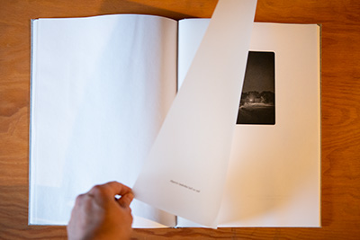
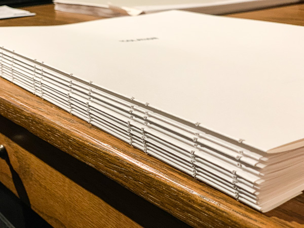
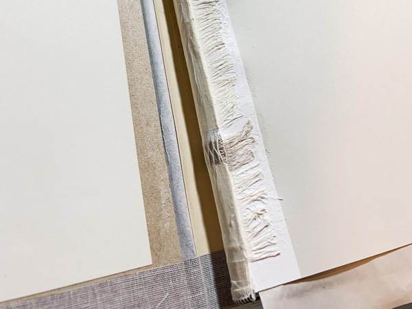
The initial tests were not positive, with the 15 inch glued spine distorting to easily. No, I needed to have a sewn spine, and I knew to achieve the look and functionality I wanted, it needed to have a rounded back. So to solve the “problem” of image back sides, After a lot of thought and testing, I decided to embrace the limitation and not attempt to hide it. I restructured the book’s design to incorporate a translucent sheet interspersed with the regular opaque printing paper.

Production
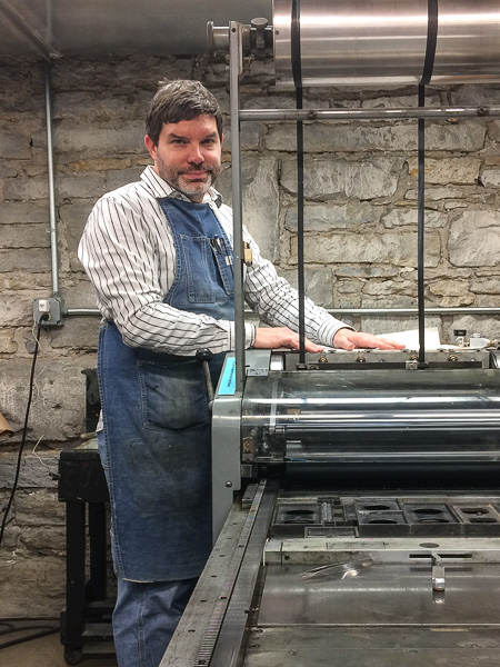
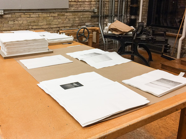
With the printing solved, it was only a matter of several weeks of production work to actually print all 17 plates and 18 pages with text—typically a day in production on the etching press for each image, and three or four pages per day on the letterpress printer.
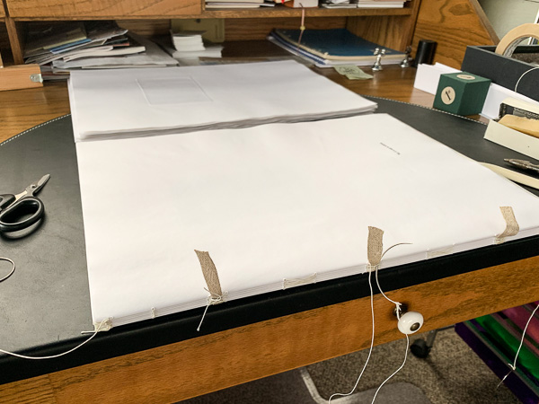
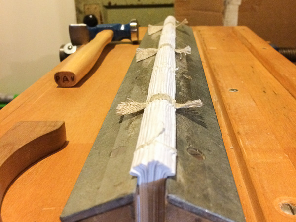
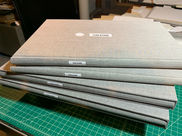
The binding process, again entirely hand done by me, would also push my skills. First was deciding on materials, and after searching through catalogs of book cloth fabrics and dozens of swatchbooks of paper for the end sheets, I arrived at a sufficiently just-warm-of-neutral color to compliment the inks I had settled on. Color matching two different types of printing inks (etching for the photogravure, stiff litho for the letterpress) and the other materials was essential to my sense of the presentation of this work.
Cover Design and Construction
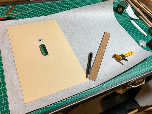
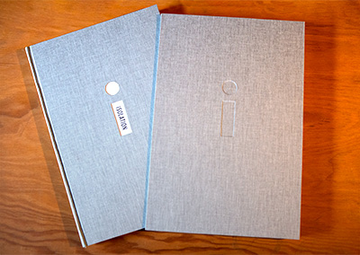
The cover itself, properly called the case, was its own challenge. I wanted to provide something bold on the cover, but also echo the sense of isolation inside the book. So using a two-piece laminated structure, I embedded a letterpress name plate underneath a carefully cut out lower case “i.” This required a rather tricky step of partially building the case with a 20-pt piece of archival cardstock glued first to the fabric, cutting out and wrapping the “i,” gluing down the name plate from behind, and then covering that with an 80-pt book board, and finally pulling the turn-ins around the whole sandwich. I created a matching deboss on both sides of slipcase.
I hope this detailed look at the design and construction process for Isolation has been insightful. As I mentioned earlier, I encourage you to take a look at my artist’s website, www.paulnylander.com for more about the images themselves.
While the fine press process called for in this project isn’t appropriate to every book I design or create, I hope I’ve conveyed a sense of the attention to detail which I bring to all of my projects—regardless of the printing and binding technique.

