A Children’s Picture Book with Fine Press Roots
In this children’s book, award-winning author John Coy shares the story of the only major waterfall on the Mississippi River, St. Anthony Falls, as told by the waterfall as it witnesses changes over time, from Woolly Mammoths and nomadic hunters thousands of years ago to the cultivation of crops and eventual appearance of European settlers. Although Minneapolis’ “Mill City” modern history is tied to the power of the waterfall, the story of human interaction goes back much, much further.
“… his attention to detail and organizational skills were consistently on display; and the result has garnered immediate accolades.”
Shannon Pennefeather, Managing Editor, MN Historical Society Press
Coy and the editorial team at the Minnesota Historical Society Press tapped wood engraver and letterpress printer Gaylord Schanilec to create the illustrations for this story. I had the honor and pleasure of assisting in the creation and printing of the illustrations, type, and binding of the fine press edition, as well as designing and typesetting the trade edition of the book.
I encourage you to visit my project blog to see the full story of the technical and artistic journey.
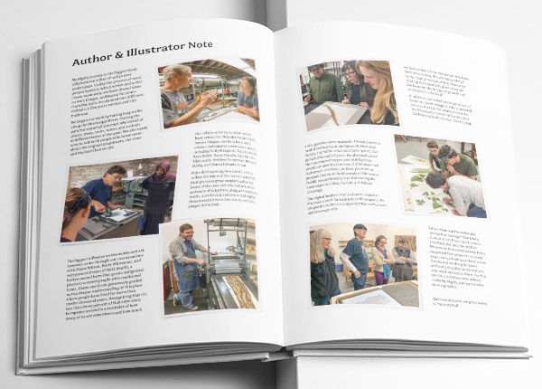
Back in June 2015, I was at the Minnesota Center for Book Arts, smitten with letterpress printing. I asked the then director Jeff Rathermel if there was anything I could do to help out around the shop to become more involved—oil presses, sort type, whatever. As it turns out, there was a project he thought I might be interested in, for which MCBA had been asked to provide an intern to help out. A few days later, at the Minnesota History Center, I first met Coy and Schanilec; little did I know My Mighty Journey would become the focus of my life for the next five years!
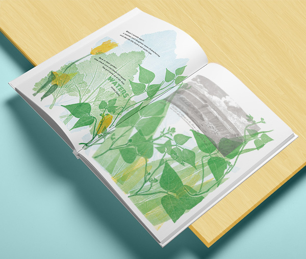
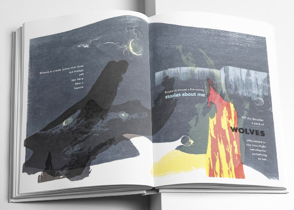
Breaking with his recognized style, Schanilec wanted to let the river and its surroundings speak for itself—each of the illustrations in this book incorporates printing blocks made from materials gathered from along the fifteen mile stretch of the Mississippi between the Twin Cities. Fallen cottonwood bark and roots, driftwood and weather-worn cedar posts, century-old bricks dumped in the river, and million-year-old fossil-encrusted limestone were all sanded down and reinforced to make type-high blocks, then inked and printed in a Vandercook cylinder letterpress. Production printing took place at Schanilec’s shop in east St. Paul—very near the origin of the falls.
Cover Development
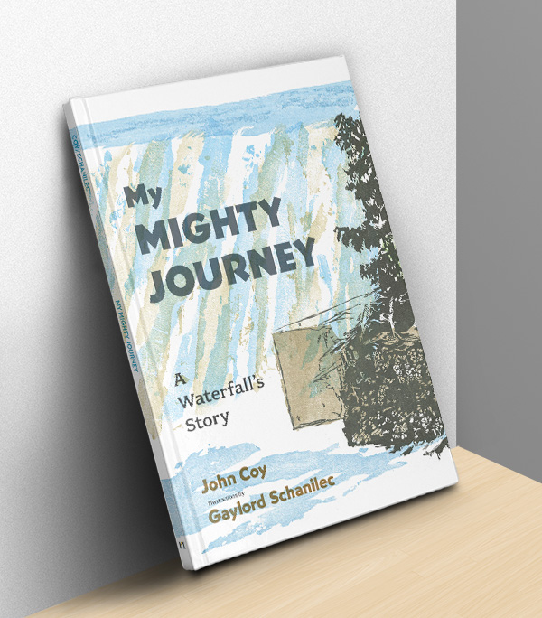
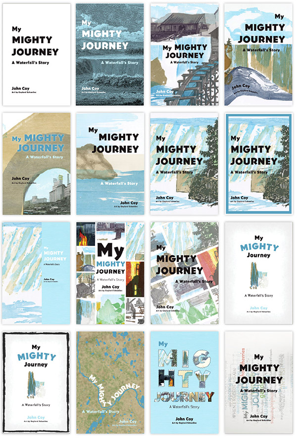
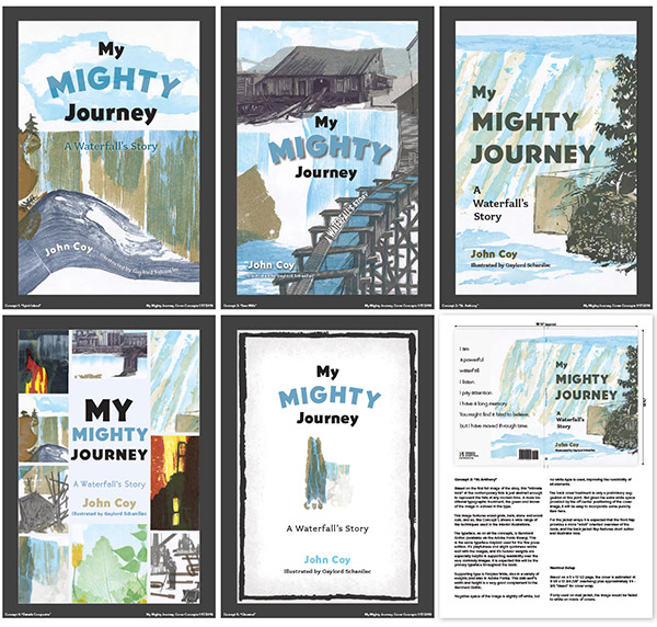
For the cover, Schanilec was adamant that he didn’t want to create another separate illustration beyond the 16 already appearing in the book. So, I was challenged to either repurpose one of the existing images or develop a new complementary image.
For the first round of cover ideas, I started with the type to get a sense of how the title and other cover elements would work together. Since we had already decided on an oversized 9 x 13-1/2 page to accommodate the entire original images, I had a lot of space to work with. But I also knew the cover still needed to work at thumbnail size for online sales. I played around with some of the illustrations from the book and explored several other concepts for the look and feel.
Bearing in mind this is a children’s book but also one that should appeal to adult collectors, we settled on direct use of one of the interior images, preserving a more traditional than fanciful look.
A second round of concepts refined this idea further, and for each of these five, I also developed a back cover concept and a written explanation of the visual pros and cons of each design. This allowed the team to come to a consensus around one final design.
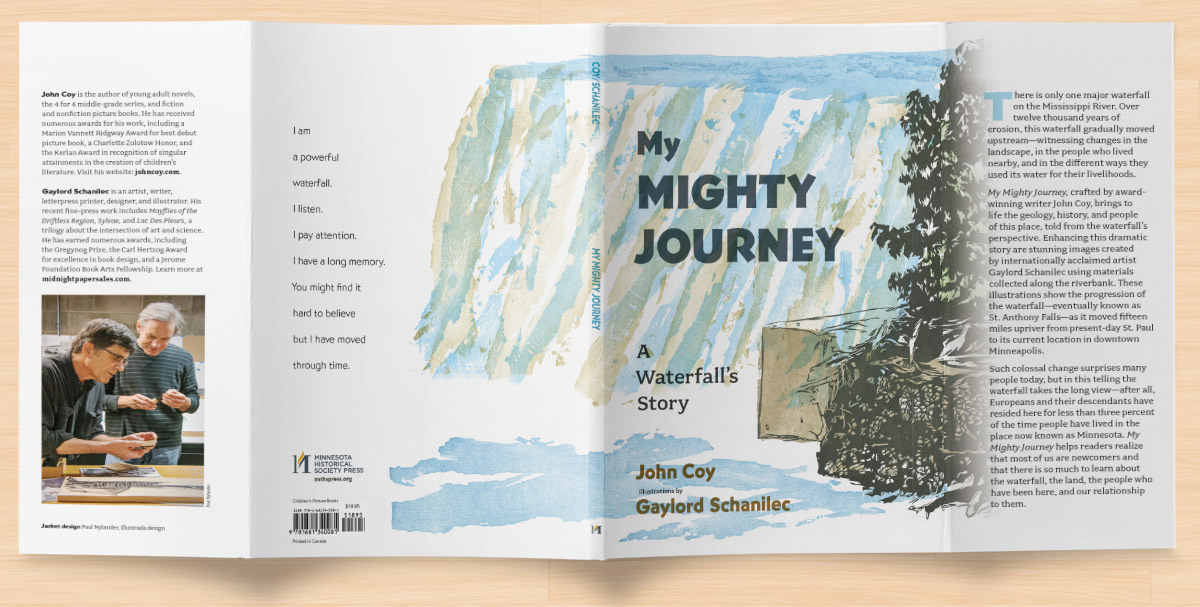
For the actual bookcase, we had hoped to use a fabric or paper wrap over te cover boards for a truly beautiful classical look, with a foil stamp deboss and wrapped in a printed dust jacket. Ultimately, the budget didn’t allow for this, and we opted for a printed cover matching the jacket design.
The cover was fully fleshed out to include a dust jacket with flaps, one of my project photos of Coy and Schanilec, and a nice blurb introducing the project.
Interior Page Layout and Typesetting
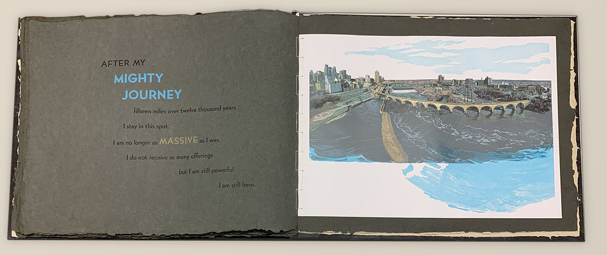
In the fine press edition, its original 18 x 24-inch images mounted on oversized sheets of handmade grey paper sit opposite the text. This makes the book an impressive (if somewhat unwieldy) four-and-a-half feet wide when opened. But the text and images are separate, as shown below in the book’s final image.
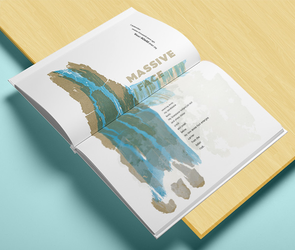
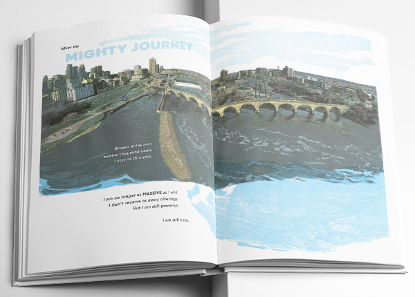
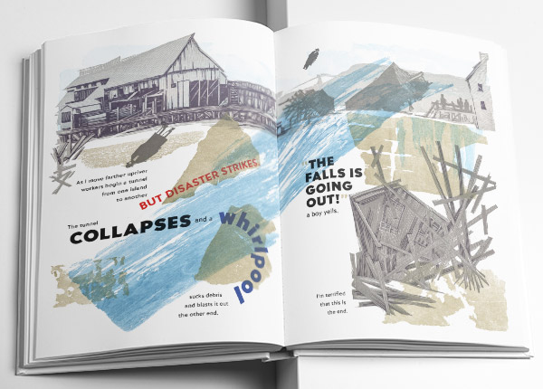
We set the text in metal type of various sizes and colors using ATF Bernhard Gothic. However, for the trade edition of the book, I needed to incorporate the type into the images. I chose to stick with the beauty of the Bernhard Gothic and tried to incorporate the spirit of our hand typesetting.
In some images, such as the final spread (a lavish full-width wood engraving composed of five different color blocks), this was straightforward, with the text easily nestling into the negative space along the left side of the image.
For others, it became a real challenge—but the good kind of fun challenge that a book designer absolutely lives for!
Each page spread was handled individually and acknowledged the character and mood of the image—moving from a relatively sedate and ordered natural flow early and late in the story to a wild and chaotic design during the industrialization of the waterfall.
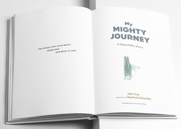
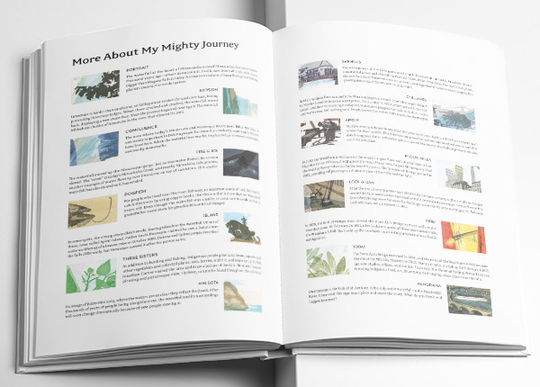
In addition to the 32 pages of images (16 spreads), the book also included front matter, such as the dedication and title page (notice that I repurposed one of my favorite cover options), and back matter of additional information intended more for the adult readers.
This massive project includes an unimaginable amount of work by a huge number of people, and I truly consider myself fortunate to be able to create the trade edition of this book.
I encourage everyone to check out this truly marvelous book.
“Paul has been doing incredible work at MCBA with his support to Gaylord Schanilec. Incredible craftsmanship, dedication and attention to detail!”
Jeff Rathermel, Executive Director at MCBA