I first met publisher Nancy Avery through the Minnesota Bookbuilders group, an informal organization dedicated to the craft of book production. A part of the Yes International Publishers press for years, Nancy has taken over the operation after the founder, Theresa King, was unfortunately unable to continue due to an illness.
As a tribute to her years of service, Nancy had collected Theresa’s unpublished poetry, and was working to produce a volume of the work. She was trying to design the cover herself. During the Bookbuilders monthly critique conversations, she would bring in her ideas, and the group would suggest some changes. To her credit, Nancy is a bright lady, and a quick study. She would dutifully follow our suggestions. But unfortunately the cover ideas just were not converging into anything that seemed befitting of the project.
That is when I offered to help out.
Cover Development
The original cover Nancy envisioned was a full wrap landscape photograph, with type set over it. She had several of her own photographs, tranquil nature landscapes, all of which were very nice. But all of which lacked a visual anchor. One of the “rules” of cover design is removing the extraneous; everything on the cover should be there for a reason. And with these photographs, I didn’t see the reason.
The other challenge here is the length of the title, Child of Dawn Mother of Twilight. It is fairly long and it includes an implied pause in the middle, between Dawn and Mother, but lacks an explicit comma. I suppose I could have insisted that we insert one, but I liked the challenge of working without that crutch!
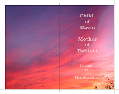
As I typically do, I started with the type-only studies on a blank cover, and explored some large, bold ideas—very Amazon-thumbnail friendly. Based on Theresa’s poems, I imagined a contemplative, thoughtful mood was appropriate. Quiet, as seen in Nancy’s original cover images. But not stiff, or formal. This is poetry of a very dynamic woman who had a life of helping others.
Although I was initially drawn to a photographic cover similar to Nancy’s original thought, in the back of my mind I was also wondering about going even more minimal, imagining the quiet power that comes from the quiet and stillness of small type and generous white space. Not every book can pull it off, but I wondered if this one might be able to. So I began to explore ideas.
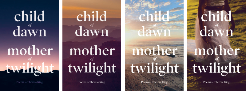
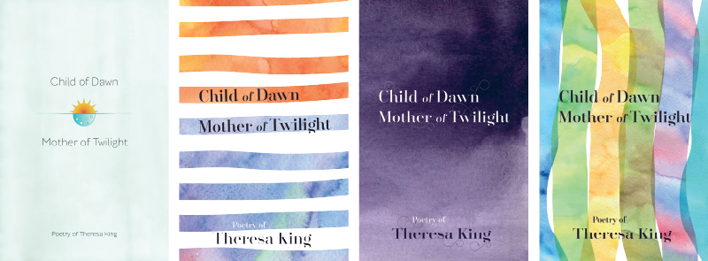
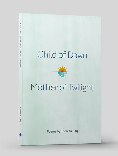
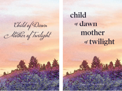
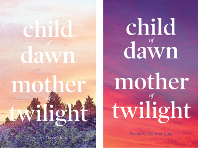
In assembling the cover concepts for review, I considered a number of different photographic treatments, as that was where Nancy was originally thinking. Then a few alternative concepts. Any of these could have worked, although some were certainly stronger than others. Nancy picked two to continue to explore, I adjusted a few things, but in the end we settled on the quiet cover with the watercolor wash and the sun/moon symbol.
Automated interior tools?
In addition to the cover, I wanted to do the interior for her. Coincidentally, we had both been present at a presentation on workflow tools at another bookish group, the Minnesota Publishers Roundtable, and I was itching to test out a couple of tools we had heard about which simplify book interior work. I wanted to see how well they could be made to handle poetry instead of just straight prose, and this was a perfect project for that exploration.
You see, the layout of a book of poetry is quite different from prose. Line breaks are important, and the textual reflow built into most tools is actually a weakness. Indenting is often used for pacing and relationship. Page breaks must be honored, and page length must be balanced for the entire book, to ensure no poem stanza is broken across pages, if at all possible. Perhaps ironically, poetry actually lends itself better to the other side of my professional life, old-fashioned handset metal letterpress type.
Interior style
Suffice it to say, the automated workflow tools, which are built on an ebook/html core, failed miserably in setting a book of poems. There just isn’t enough control over the typography. It was a worthwhile exercise, but I was definitely sticking with InDesign for this project!
In matching the interior style to the cover, I used the title font, the wonderfully friendly font Modernica by type designer Javier Quintana Godoy of Latino Type Foundry. This is contrasted with the Warnock Pro body text, Adobe Originals’ Robert Slimbach clean and conservative text typeface. The 5.5 x 8.5 page size made things tight, but fortunately Theresa’s poetry didn’t have any long lines, and I was able to give the reader generous margins and white space, while still avoiding the need to break any of her lines.
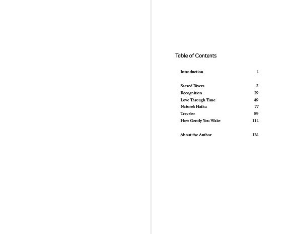
Structurally, the poems were grouped into six sections, loosely by topic. We decided that it would be sufficient for the table of contents to just have the sections, and not list every poem. In addition, Nancy wanted to include several poem fragments from Theresa’s writings and notes. These were untitled and short. Although Nancy initially sprinkled these throughout the book separated by only divider lines, I felt that this would be confusing to the reader, appearing to be continuations of the poems, rather than separate thoughts.
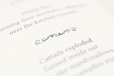
In the end, I grouped these small fragments at the end of each section under the heading “Musings.” They are further differentiated from the other poems by being centered, instead of left justified as the titled poems are, and are the only place where I utilize a divider line—a customized illustration I created to reflect the sun/moon or dawn/twilight motif.
These subtle choices are almost imperceptible to the average reader, but subconsciously work well to provide just enough differentiation to realize that something has changed. Subtle details like this are definitely not possible with the automated tools I had experimented with early on, and are never going to come about with a template-based workflow.
Interior images
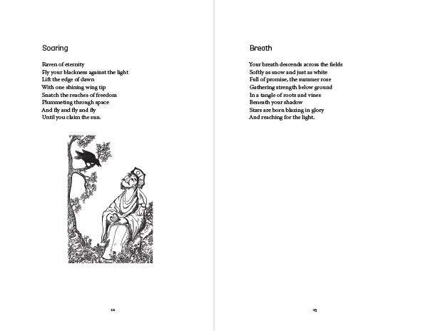
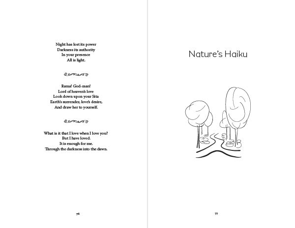
The other non-templated addition is the use of several images, drawn from cover art of books Theresa had published over the years. Nancy had sprinkled them throughout the book and had picked several to serve as accompaniments to the section breaks.
The issue I faced was that some were line drawings, some were greyscale versions of color images, some had a lot of detail, others were very simple. To work together as a collection, they needed to have a common style. Unlike the photo-composite images created for Ron Peterson’s Gardeners of the Universe, the lowest common denominator here is line drawings.
I have several techniques and tools for manipulating and simplifying images in Photoshop. But Photoshop is, in the end, a photography program and it doesn’t really like to make images of black lines on a white background. So, utilizing techniques more akin to woodblock carving or pen-and-ink drawing, I decided to redraw all of the images we would be using in the book.
To save time, this was done digitally, essentially tracing the originals, adding line texture where necessary for levels of grey. I did this on my iPad using an Apple Pencil and Adobe’s Fresco application—which works in a native Photoshop file, but which supports vector layers and vector drawing pens.

Final Interior
The last section, a single epic poem, bears mentioning, as it was a formatting challenge. Each verse was numbered, and just long enough that I could accommodate two verses per page ifthe number didn’t need it’s own line. Using a few formatting tricks, I was able to leave these as separate lines in the regular text flow of the manuscript, but have them appear visually to the left of the first line. The poetry preserves the same margins as the remainder of the book.
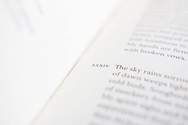
So in the end, the solution to this typographic challenge satisfies the book interior design rule, “good design looks intuitively obvious one you see it.” And this certainly would not work in a reflowable ebook, or in any tools based on an ebook/html workflow. It remains one of the reasons, for now at least, why a typesetting is a better choice than a template or an algorithm: as long as the reader is a human relying on intuition, the designer must be able to anticipate the needs of the reader.