What was life like for your ancestors 2,000 years ago?
“Paul is an experienced veteran. He tapped his expertise to make excellent suggestions, ask probing question and even took the initiative to make little adjustments. Each of these little things came together for a very satisfying end result.”
David Koehler, Author
What do you do when you want to tell your family story? Not just a couple of generations back, but really tell the story, over two-thousand years worth of history? As any genealogist knows, unless you happen to be related to nobility, finding records going back more than five or six generations is challenging.
Author David Koehler knew there wasn’t any nobility in his family tree; his German ancestors were likely peasants. Most people were. So rather than tell his family story, he decided to set out and tell everyone’s story—the story of everyday people.
And so begins David’s story, and many years of research.
David came to me on the referral of another designer who had started working on the project, but wasn’t able to complete it. And that is fair—not every team of creatives can work well together. As it is, David’s thorough, methodical and careful nature is very compatible with my own detail oriented, perfectionist tendencies. We hit it off right away.
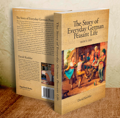
With the manuscript complete, edited to his satisfaction, David already had some ideas for the cover. We sat down together to review some image ideas for the book, and both quickly fell in love with the painting of “Celebrating Peasants” by an unknown artist sometime in the 18th or 19th century. It would be the anchor for our cover.
Cover Development
The colors and the energy of the animated characters were clearly apparent, fitting with one of David’s key lessons: the middle ages weren’t all gloom, plagues, and death. But how to make this image work best for the cover, especially in light of the rather long title David had chosen?
I created three variations, all utilizing the preferred Garamond typeface David selected. As a rule (and out of self-preservation) I never share covers that I’m unwilling to work with. All three of these had different strengths—from more designerly on the left, to bolder on the right. In the end, for the relatively academic nature of this book, I think the compromise of traditional text-over-image of the middle was a good choice.
For David’s cover, there are a couple of subtle creative elements to enhance the finished result: a German manuscript, and a special ligature. The excerpt of illuminated manuscript, in German, from the Walters Art Museum’s collection of “Saints’ Lives” serves as the background texture.
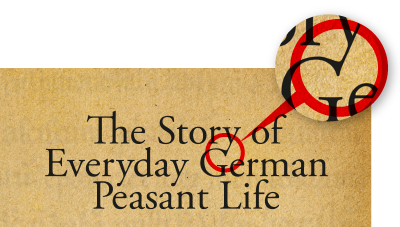
Details differentiate a good design from great work, and ligatures are one such opportunity. The ligatures, such as the “Th” are often built into a well designed font. But the typography, especially of a cover, can sometimes lend it to more unique combinations. After all, a title isn’t just a group of words, but a piece of illustration in it’s own right. The “y-G” link is just such an element. Almost imperceptible, but the clear sign of something that doesn’t come from less attentive design.
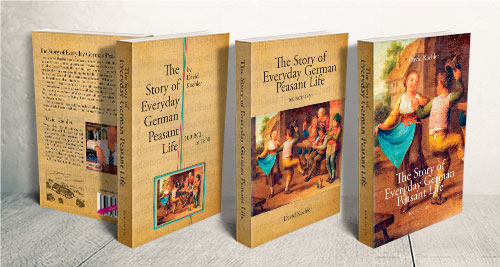
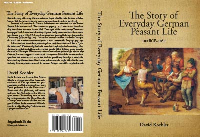
But Don’t Ignore the Back Cover
For physical sales, the oft-neglected back cover is the second most important part of a book’s physical marketing. That said, there is a fairly standard set of requirements: book synopsis or marketing copy, author bio and photo, publisher insignia, and barcode. I like to make sure they are visually integrated with the cover and well bridged by the spine.
That stark divide between spine and back cover helps the legibility of the smaller back cover text, and is hidden when the cover is wrapped around the actual book block.
Interior Layout & Typesetting
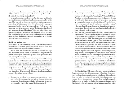
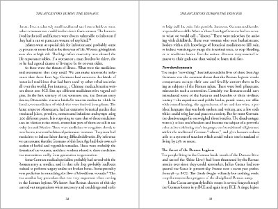
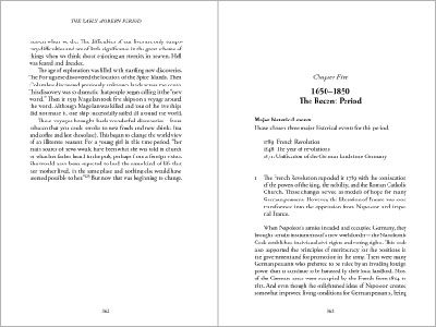
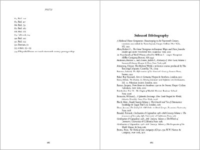
A well designed interior layout and typography should enhance the book, complementing the style of the writing, and guiding the reader through the story—even a non-fiction historical reference work such as this. Every book has a story, because I believe every author is a story-teller. Way-finding elements, such as tables of contents, image credits, and other reference and bibliographic material are common to a book such as this one. All must work as an integrated system, at the same time useful to the reader, but never getting in the way of the reading.
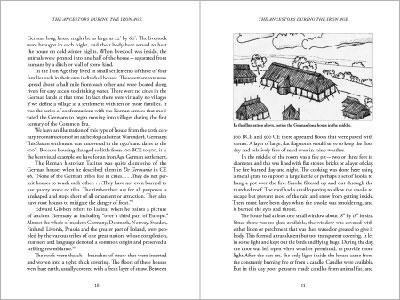
Interior work is something often neglected by first-time publishers. Fortunately, an avid reader and collector himself, David understood the advantage of a well designed and typeset interior. For The Story of Everyday German Peasant Life, I needed to incorporate 165 images—photos and drawings, some in good shape and some . . . in need of some work.
“Working with Paul on my book project was a pleasure. He listened well, asked good questions, and then told me exactly what he was going to do and exactly how much he would charge. We connected perfectly in each of our meetings. I think the excellent communication laid the foundation for producing a professional-looking book.”
David Koehler, Author