Frank Advice for Entrepreneurs Pitching Investors

With his “six principles to pitch investors,” author and entrepreneur Kelvin Johnson breaks down the barriers between entrepreneurs and the “sharks”—their investors.
Design Objectives: Business founders preparing their initial stage investment pitch are the intended audience for this business book. Designing for action-oriented executives short on time, I made the book easily digestible and immediately actionable, focusing on real-world examples and itemized checklists.
Creative Process
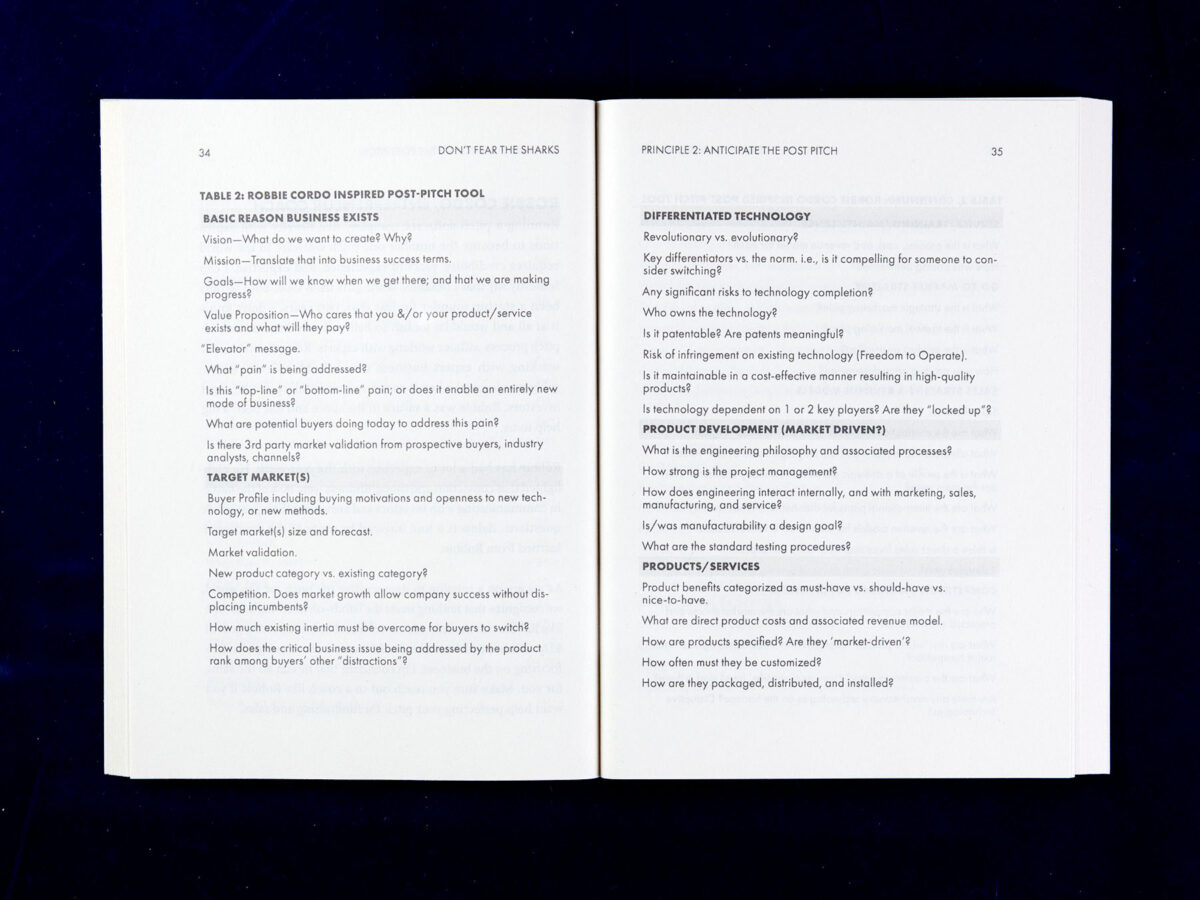
Building a successful layout requires a systematic approach to the content—clear tabular lists of questions, structural headings and subheadings, and visually engaging pull quotes—with enough flair to engage readers while leading them through Kelvin’s systems.
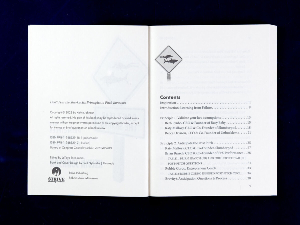
The cover development centered on the theme of a swimmer plus a shark (the marine animal), something Kelvin preferred. I presented six options of the two dozen concepts I explored, including photographic and illustrated ideas, to see what would click with the author and publisher.
Collaboration and Feedback
I worked with the author and editor/project manager LaToya Taris-James for the cover concepts review and several editing suggestions to make the tables and checklists more effective.
Design Choices

As a handbook, the cover needed to imply action while also being engaging and provocative. I picked “business blue” as the primary color, which aligned nicely with the blue ocean theme appropriate for sharks. The road sign’s yellow was precisely the accent I needed to attract attention and balance the blue sky and water.
The road sign utilizes the Interstate typeface, standard for U.S. road signs, and a complementary use of Futura PT for the subtitle and interior headings. I set the byline in Bufalino bold, a condensed typeface, to balance the other cover elements visually. The interior is presented in Warnock 11/16 with paragraph spaces instead of indents to help lengthen the book.