Crafting a Unique Book Cover

Patient began from a distinct starting point: the author, Akshay Rao, sought a fresh cover for his book, rejecting the generic design provided by his publisher. His narrative, resonating with NPR listeners and New York Times readers, required a cover that mirrored its reflective, witty, and insightful examination of the medical world’s absurdities.
My design led us to balance charm, quirkiness, and poignancy. We steered away from a critique of healthcare to revel in a humorous memoir that tells a true story with a loving nod to those within the system who genuinely care. In this collaborative effort, we reinvented the cover to reflect this essence, resulting in a softcover and dust jacket that invite readers into a story of healthcare and healing, supported by a cohesive marketing suite.
“Paul listens, asks questions, interprets and shapes the conversation … then translates that into visual art.”
Author Akshay Rao
Design Brief
- Unique Conceptualization: Beginning with a unique challenge where author Akshay Rao disliked the original cover provided by his publisher, the project demanded a fresh, creative approach.
- Target Audience Understanding: The design was tailored for an audience akin to NPR listeners and fans of P.G. Wodehouse or David Sedaris, appreciating wit and creative nonfiction.
- Balancing Multiple Themes: The design objectives included encapsulating charm, quirkiness, and poignancy, reflecting the book’s tone which is not just about healthcare criticism but a humorous, real-life story.
- Rebranding with Sensitivity: The cover and subtitle were revised from “A Health(s)care Story” to “A Humorous Memoir of Healthcare and Healing,” aligning more closely with the author’s intent and the book’s essence.
- Versatile Design Creation: The task extended beyond the cover design to include a softcover and dust jacket version, updating the interior title page, and generating additional marketing materials.

Process Showcase
Every project I work on is unique—the book itself and the space its premise idea inhabits. The particularly unusual starting point for Patient is that the author already had a cover from his publisher. He just didn’t like it. After meeting with Akshay Rao and discussing his project, I had to agree.
As a professor of marketing, author Akshay Rao had already published several academic articles when he decided to write Patient. This project was more personal. Based on a referral, Akshay reached out to me to design a new cover and a variety of marketing assets to support the book’s promotion.
He knew his audience: NPR and Public television listeners, people who might enjoy P.G. Wodehouse or David Sedaris. People who would enjoy a clever turn-of-phrase and appreciate a creative nonfiction story of the absurdity of our medical system while also recognizing and respecting the participants in that system who care about their charges.
During our design brief meeting, we discussed the competing goals of being charming, quirky, and poignant. Even the title is a play on words—the patience he was encouraged to have by doctors while, as a patient, he waited to learn his prognosis.
But this isn’t a book about the evils of healthcare in America. It isn’t a call to action. Through our collaborative discussion about the look and feel of the cover, we ended up changing his subtitle from “A Health(s)care Story” to “A Humorous Memoir of Healthcare and Healing” to better reflect his intent—to just tell a good story. A story that just happened to be accurate and featured the absurdity anyone who has experienced the healthcare system already knows well.
My task was to create a cover that reflected that idea. Both a softcover and dust jacket version. And as an add-on service, update the interior title page and create additional marketing collateral to support the book.
Cover Design
My starting point in this project is the cover the author didn’t want.
Aside from feeling quite generic stock-photo-ish, the original concept was unambiguously about healthcare. The typefaces for the title and subtitle were harsh and angular—creating tension. The combination worked to make the reader uncomfortable, even anxious. (The incongruous lowercase byline didn’t help.)
To their credit, given the initial subtitle, A Health(s)care Store, the design made sense. It just wasn’t the way the author wanted the story to feel. This disconnect is why I suggested that, as part of the design, we also rewrite the subtitle.

Akshay was open to either illustration or photographic imagery on the cover, and we agreed a minimal look would appeal to his audience. But also a nuanced design, something working at multiple levels—desirable for any cover, but especially so here.
As part of the design brief, I try to understand what the author and publisher think is the book’s essence. We talk about this until I think I understand what is beneath the superficial themes and obvious elements.
Initial Concepts
When I present initial ideas, I like to meet to reveal the concepts and see the raw, initial reactions. (This also helps avoid the problem of over-thinking and design-by-committee.) Initial concepts are often rough, and meeting allows us to discuss the ideas.
In my process, I consider typography first, including looking at how long the title and subtitle are, what other textual information needs to appear on the cover, and what fonts convey the mood I’m trying for while also giving the necessary presence to help sell the book. With a sense of what space remains, I begin to look at imagery that complements the message.
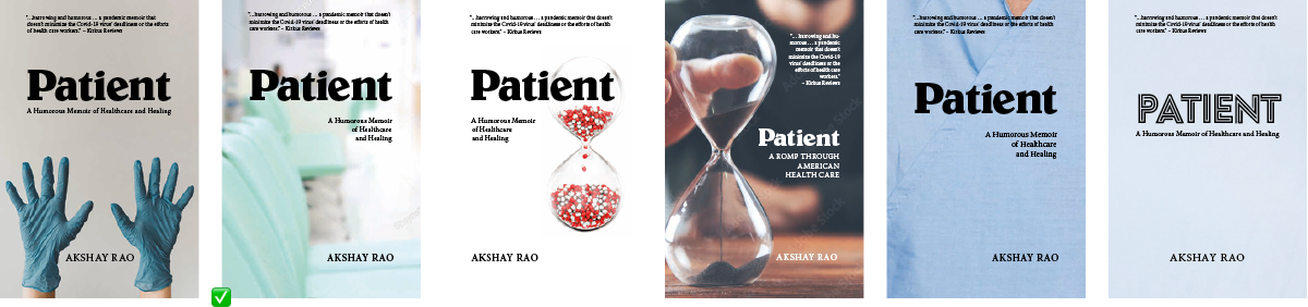
I presented a dozen different initial concepts—a lot, but I wanted to try several ideas: the more directly visual, such as a hospital gown or the hospital gloves; and the more conceptual, a waiting room, the hourglass.
After reviewing these, we quickly winnowed it down to a few favorites.
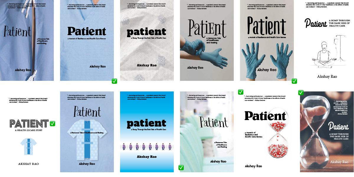
The discussion about cover concepts is always a fun process. Working together, we discover the limits of the initial design brief. And sometimes, we uncover truths about the book that the author hadn’t even realized. Akshay preferred the type treatment of #2 and #11, did not like his initial idea of the line art meditation on an IV (#6), and was intrigued by the pill hourglass concept.
“I had a lot of difficulty choosing from the various options Paul presented because they were almost all terrific!”
Author Akshay Rao
Subtitle Refresh
Although editorial isn’t usually my job, I always try to help where I’m needed on a project. While clever, the original subtitle, A Health(s)care Story, didn’t set the right mood. So, as part of the concepting, and using our design brief discussion as a basis, I also came up with a couple of alternate subtitles to try based on the author’s marketing copy: A Romp Through the Dark Side of Health Care, A Memoir of Resilience and Health Care Heros, A Humorous Tale of Healthcare and Healing. We added A Romp Through American Health Care as another candidate.
Through our discussion, we eventually set on A Humorous Memoir of Healthcare and Healing to strike the right balance of information and tone.
Revision and Finalists
At that point in the process, I sent him his “finalists” and let him think about them more. Looking closely, you’ll see that these are not exactly the same as the initial concepts—I’ve already started incorporating elements from our discussion as part of the refinement process. Design is often about subtle differences.
Any of these covers could have worked—as a cover. However, since each conveys a different message, only one will be the best choice in practice. Through our discussion, although I may select images and type and ensure the layout consistently exhibits sound design principles, I believe that when the process works right, as it did here, we have created the custom cover collaboratively.
Completing the Cover
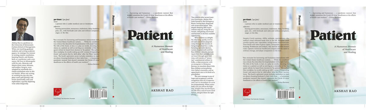
The front cover is only one piece of the complete cover work. As often happens, I was given several disparate chunks of marketing copy, testimonials, reviews, author bios, headshots, etc. From that collection, and based on our choice for the front cover concept, I selected the elements to use to complete the front cover (including the review excerpt) and create the spine and back cover, as well as mock-ups for promotional use.
As with the subtitle revision, my editing skills were called in again to help with the marketing copy appearing on various forms of the book.
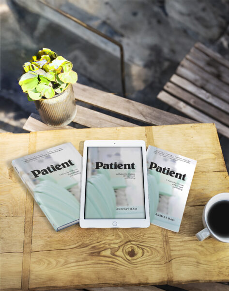
Since this book was to be released simultaneously in softcover, (dust jacketed) hardcover, and ePub, three versions of the cover needed to be created. The dust jacket, in particular, can be tricky because additional text is required to fill the flaps.
I wanted to use the front cover image as a full wrap, so this required that I apply a little Photoshop magic to extend the stock photo to the back cover and, in the case of the dust jacket, onto the flaps.
All are part of the comprehensive design service!
Marketing Materials
A book does not sell itself, no matter how well it is written, edited, and designed.
To help promote awareness of the book, Akshay planned to run several digital and print ads in places that his targeted audience was likely to see and hear—an NPR radio spot, public television programming sponsorship and newsletter, playbill ads for the orchestra and theater, local and national news outlets. He also wanted promotional bookmarks to give out, postcards as a “leave behind” for events where he spoke, etc.
Oh, and a website, too.
We kept things simple, favoring the book cover image, the title and subtitle, and space permitting the Kirkus review and “definition” text.
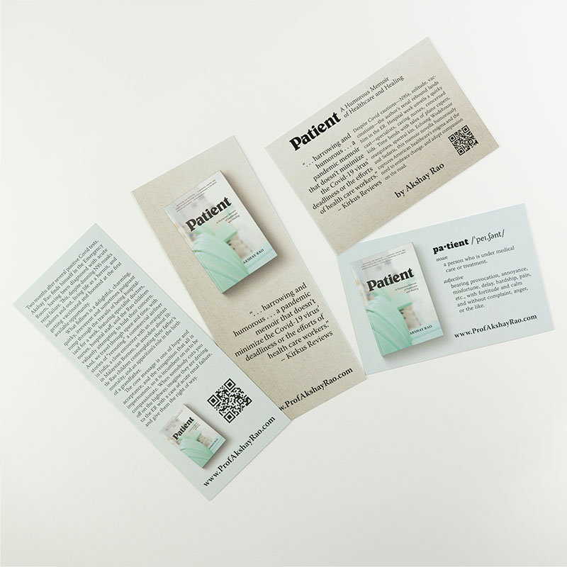
Tracking Codes
The most complex part of this extensive marketing campaign was keeping track of the results of the various marketing channels. For the digital world, this means tracking codes—those extra codes added to the end of a website URL link that indicate what piece of marketing the link comes from. For the print pieces, I set up QR codes with embedded trackers.
All of this feeds back into the website and its Google Analytics console—a complex tool that provides way more detail than most people care to think about. But for a professor of marketing … Akshay was like a kid in a candy store.
“I thoroughly enjoyed working with Paul and will continue to use his services whenever I need to.”
Author Akshay Rao