Innovative Book Design for Evocative Memoir

To bring Amy Hallberg’s Tiny Altars to life, I crafted a design that delicately balances femininity and depth, mirroring the memoir’s journey through personal and societal narratives.
This design complements Amy’s storytelling with a thoughtful blend of soft colors, engaging typefaces, and a symbolic dollhouse theme. It also serves as a beacon for her professional work as a writing coach.
“Thank you for a thoughtful creative collaboration and a truly beautiful book.”
Amy Hallberg, author

Project Spotlight
In this exciting project, I partnered with author Amy Hallberg to craft the sequel to German Awakening, her first memoir. Designed to extend beyond the personal narratives of her first book, Tiny Altars delves into family stories that explore systemic societal hierarchies and personal biases.
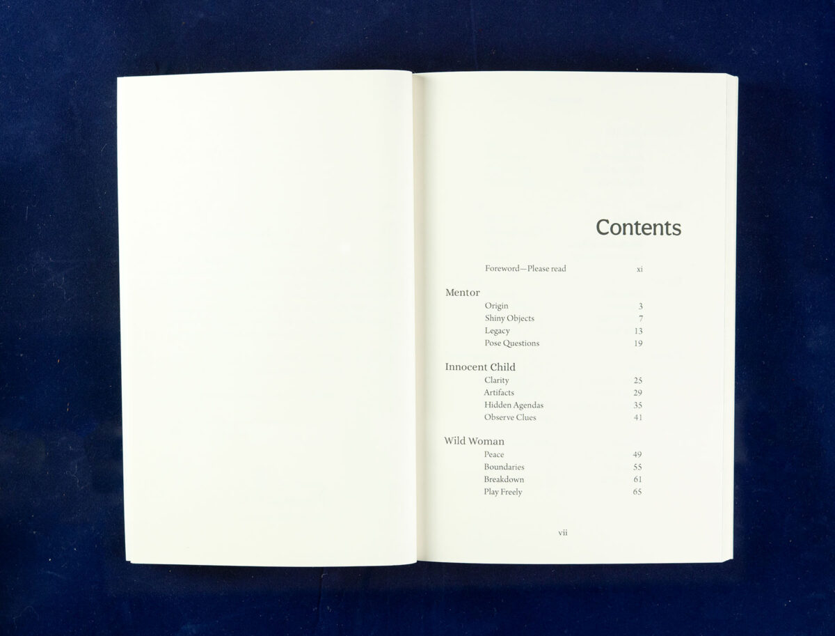
This engaging sequel also doubles as a practical tool for Hallberg’s clients in her writing coaching practice, showcasing her forty-nine archetypes for character development, each corresponding to her book’s chapters.
Amy’s vision required a collaborative design approach.
My role was to refine her initial ideas, creating a visual identity that resonated with the book’s dual purpose. The challenge was to produce a design that complemented the content and served as a functional reference for aspiring writers.
Every detail was meticulously crafted to align with Amy’s vision, from the book cover to the typesetting and preparation of production-ready files for print and ePub files. The result is a thoughtfully designed sequel that beautifully marries insightful content with practical application, perfectly capturing the essence of Hallberg’s work.
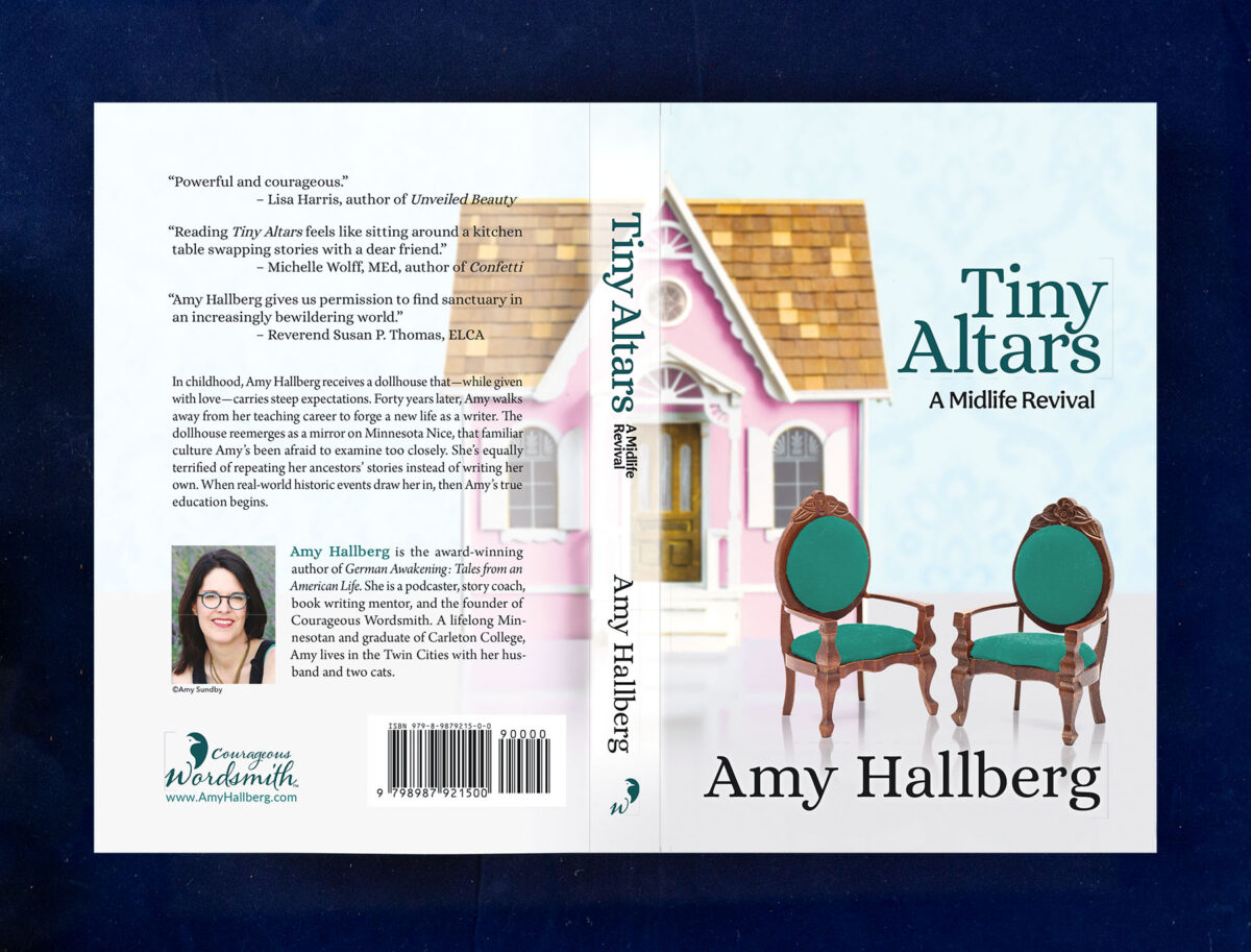
Designing Tiny Altars: A Delicate Balance of Femininity and Depth
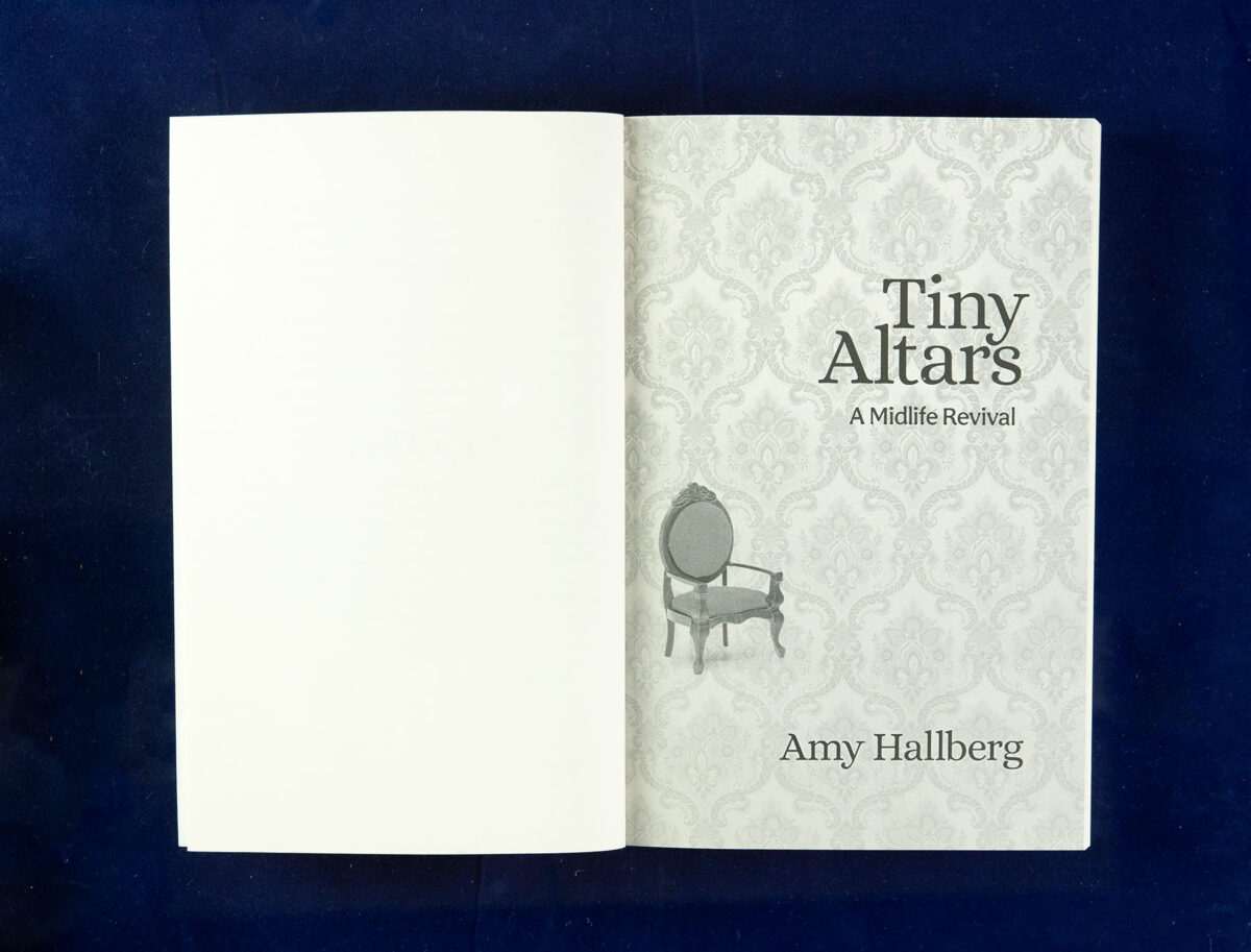
In designing the softcover, ePub, and audiobook cover for Amy Hallberg’s Tiny Altars, the objective was to resonate with an audience of white, midlife women, likely writers, offering support without overpowering them.
Our collaborative design briefing revealed key thematic elements, including the title’s layered meanings. Amy desired a design that complemented her first book while moving away from its visual elements—no birds, animals, or colors symbolizing the German flag like red, yellow, or black. She envisioned a design that embodied femininity without delicacy, incorporating motifs like crushed velvet, dollhouse furniture, and floral patterns.
As we navigated through various concepts, a unifying theme emerged: the dollhouse, a potent symbol in her narrative, became the focal point of our design. This “tiny altar” tied the visual elements together and perfectly captured the essence of her storytelling.
Design Insights: Crafting the Visual Harmony of Tiny Altars
The design journey for Tiny Altars was a collaborative process of refinement. The final color palette—a harmonious blend of pink dollhouse, green chairs, and pale blue wallpaper—resulted from numerous iterations. Achieving the right balance among these hues was challenging, yet the result perfectly resonated with the author’s vision.
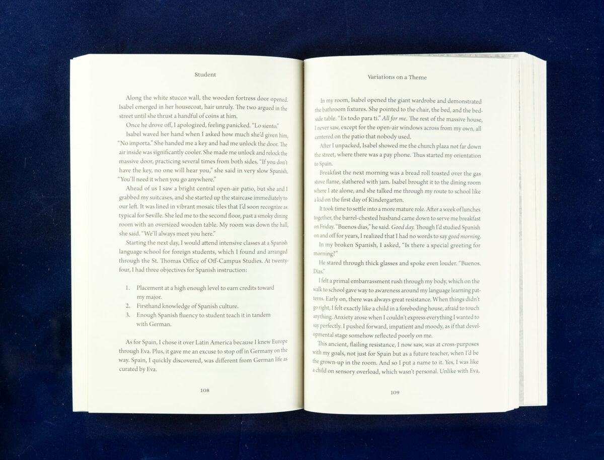
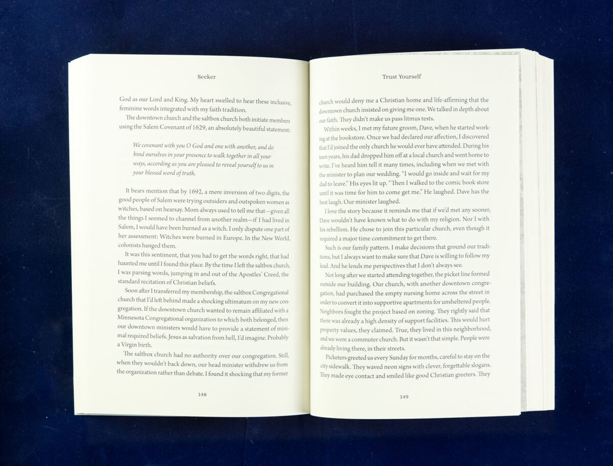
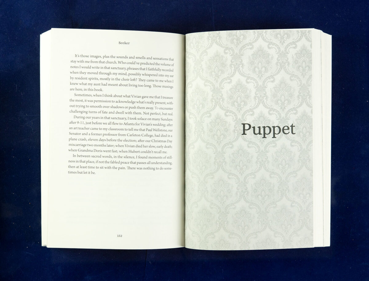
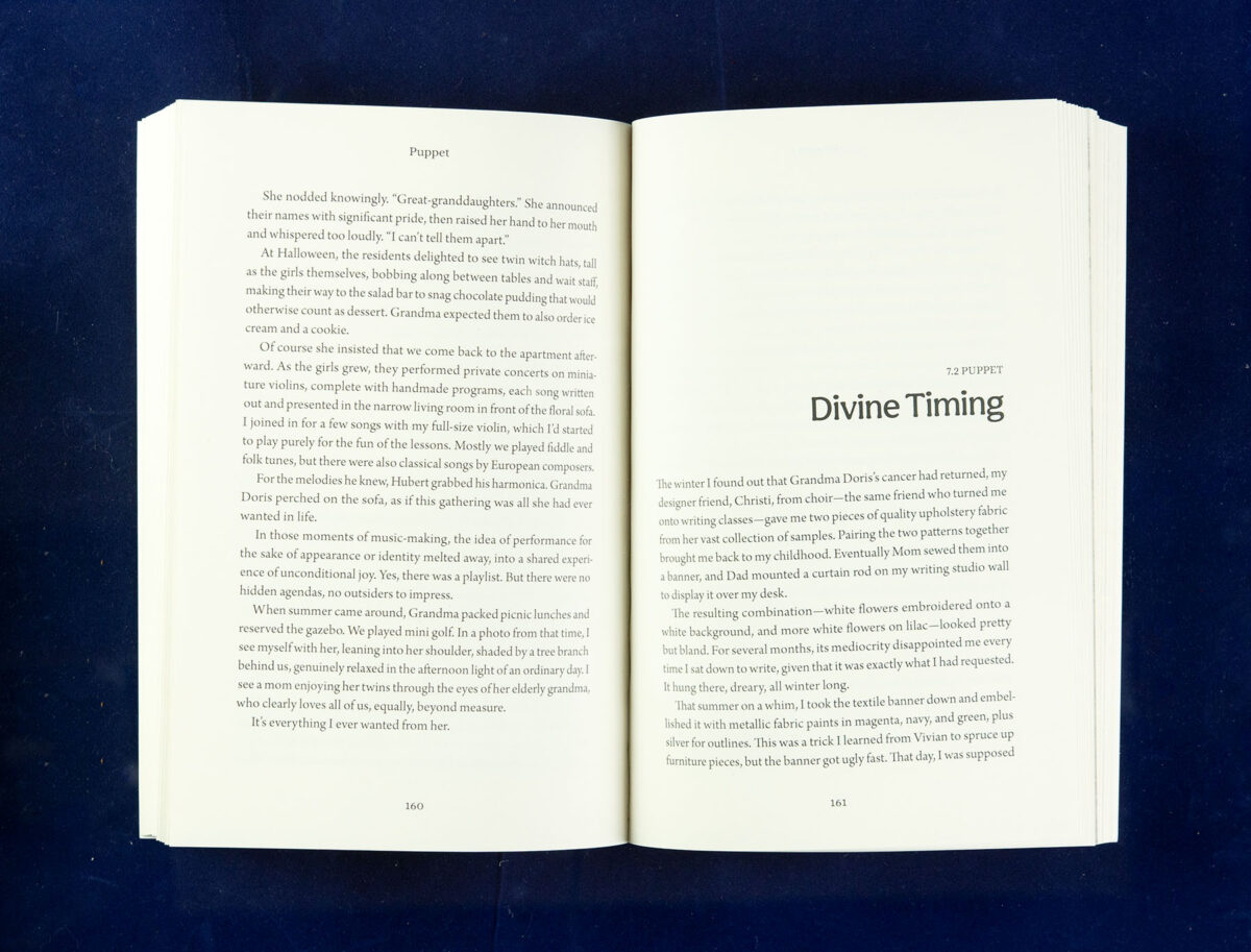
In crafting the interior layout, I chose Arno for the text. This font delivers a lower x-height and softer appearance than my usual Warnock, ensuring readability and aesthetic appeal. The title and section headers were set in Alice, a welcoming typeface with an elegant touch. At the same time, the subtler Aesthet Nova was used for subtitles and chapter headers to avoid an excess of embellishment.
This design project, closely aligned with the editing phase, ensured that the book’s visual and textual elements were in sync, solidifying the book’s look well ahead of the marketing timeline. The result is a design that captures the essence of Amy Hallberg’s narrative and creates a lasting visual impact.
Collaboration & Feedback: A Synergistic Partnership in Tiny Altars
The final form of Tiny Altars was a testament to the power of collaboration. Amy Hallberg and I engaged in dynamic discussions, challenging each other to refine our ideas and designs. This back-and-forth process strengthened our working relationship and brought depth and precision to the project.
Completing Tiny Altars was a bittersweet moment, marking the end of a fruitful partnership. The final product was a true reflection of Amy’s vision, evolved and enriched through our collaborative efforts, surpassing the initial concepts to achieve something uniquely resonant.