Beware the Ghost Stories in the Woods
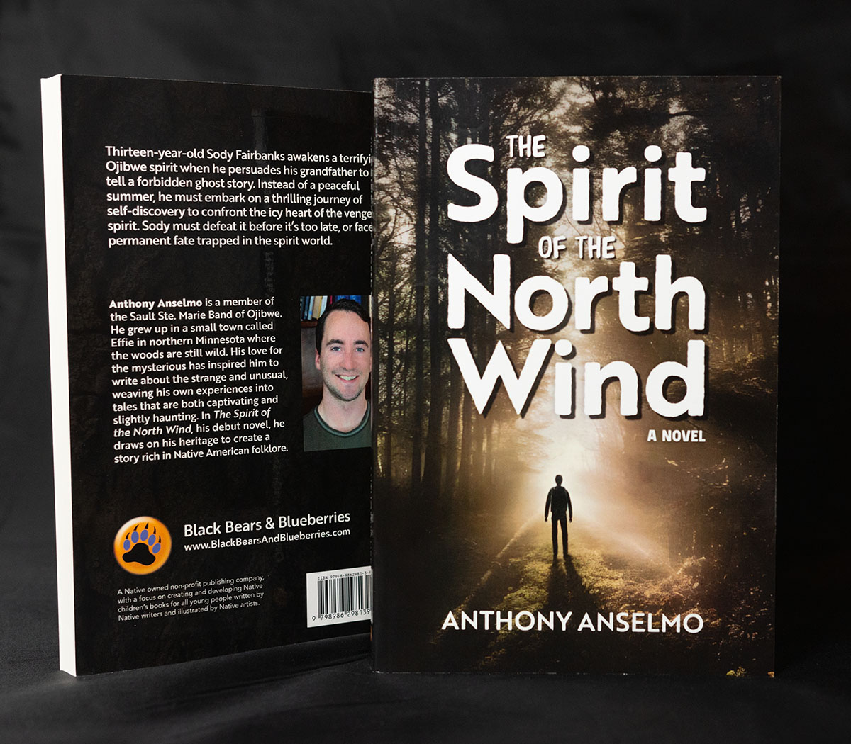
In this story, author Anthony Anselmo takes us into his Northern Minnesota youth’s wild woods and folklore. Targeted at a YA audience, this book pulls readers old and young in with the dangers of campfire ghost stories, supported by my spooky (but not too scary) cover and playful interior design details.
Creative Brief
This story is a twist on a contemporary coming-of-age story, with the protagonist ending up in a parallel reality. I was tasked with creating the cover, matching the interior design layout and typesetting, and preparing production-ready files. The author also gave me a cover art idea to riff off of.
The publisher, Black Bears & Blueberries, has a long tradition of picture books for children. With this story, a young-adult/middle-grade fiction, they ventured into new territory, presenting new challenges for production and design but with the same ultimate goals of presence and readership targets.
Design Process Cover/Interior
Cover Design

Designed to appeal to young adult readers with a blend of mystery and thriller themes. Based on the author’s concept image (which we didn’t have rights to use), I explored stock and some stock-based generative concepts to bring out Tony’s visual intent: a foreboding but alluring call forward featuring a roughly thirteen-year-old male character.
While the story is about the protagonist’s journey, true to many indigenous stories, it is also about that young man’s place in society and the presence of his culture and tradition in his life. Surrounding him. For this reason, an identifiable face-forward cover seemed inappropriate, and I opted instead for a small but identifiable silhouette.
Typographically, I explored several concepts with varying levels of playfulness. After a discussion with the author and publisher, I refined the concepts to the final version, which has a nearly monochrome image and blocky distressed type, but in regular title case—all caps, typical of this genre, felt too heavy.
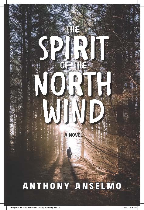
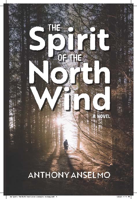
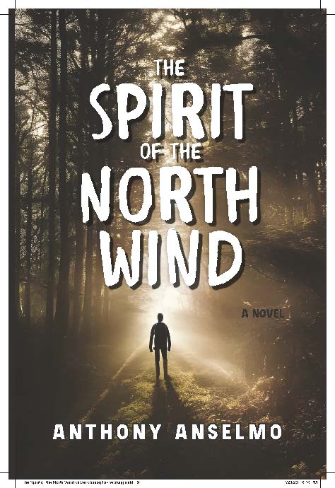
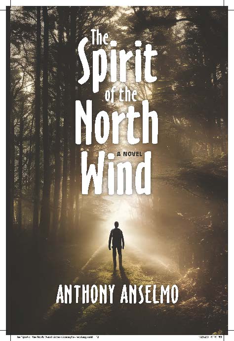
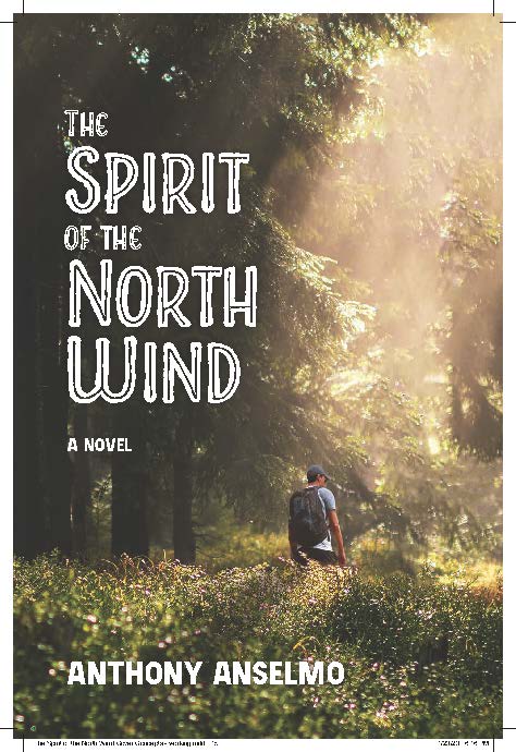
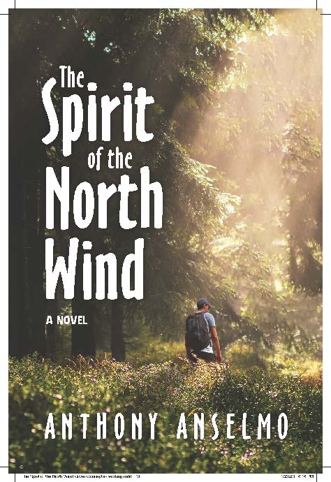
Based on a discussion with the author and publishers, we ended up combining the illustrated version instead of the photographic (a very good choice), along with the boldest type treatment, to create the final cover. I further refined the details of the image and type to create the final cover shown earlier.
Interior Design
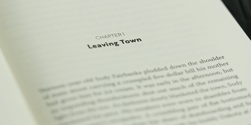
With the book’s aesthetic determined by the cover, the interior layout quickly followed suit. Friendly, but also clean to help carry Tony’s story.
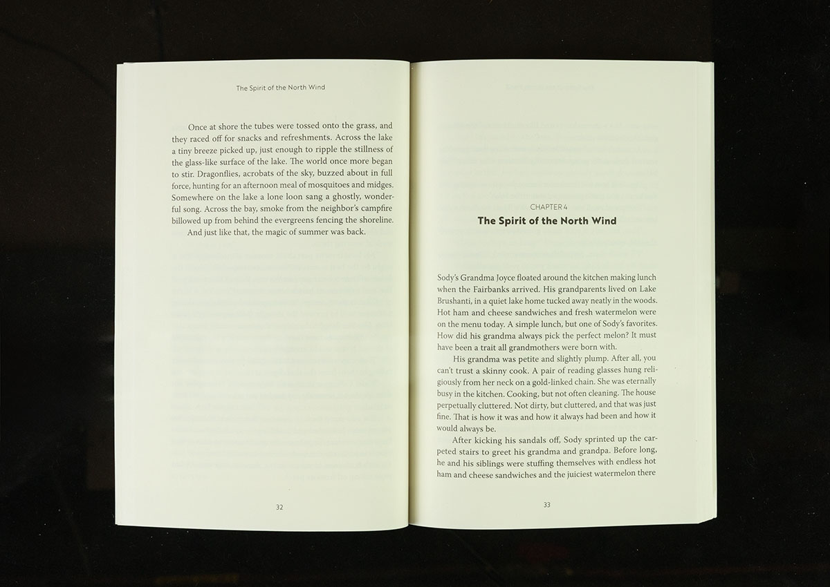
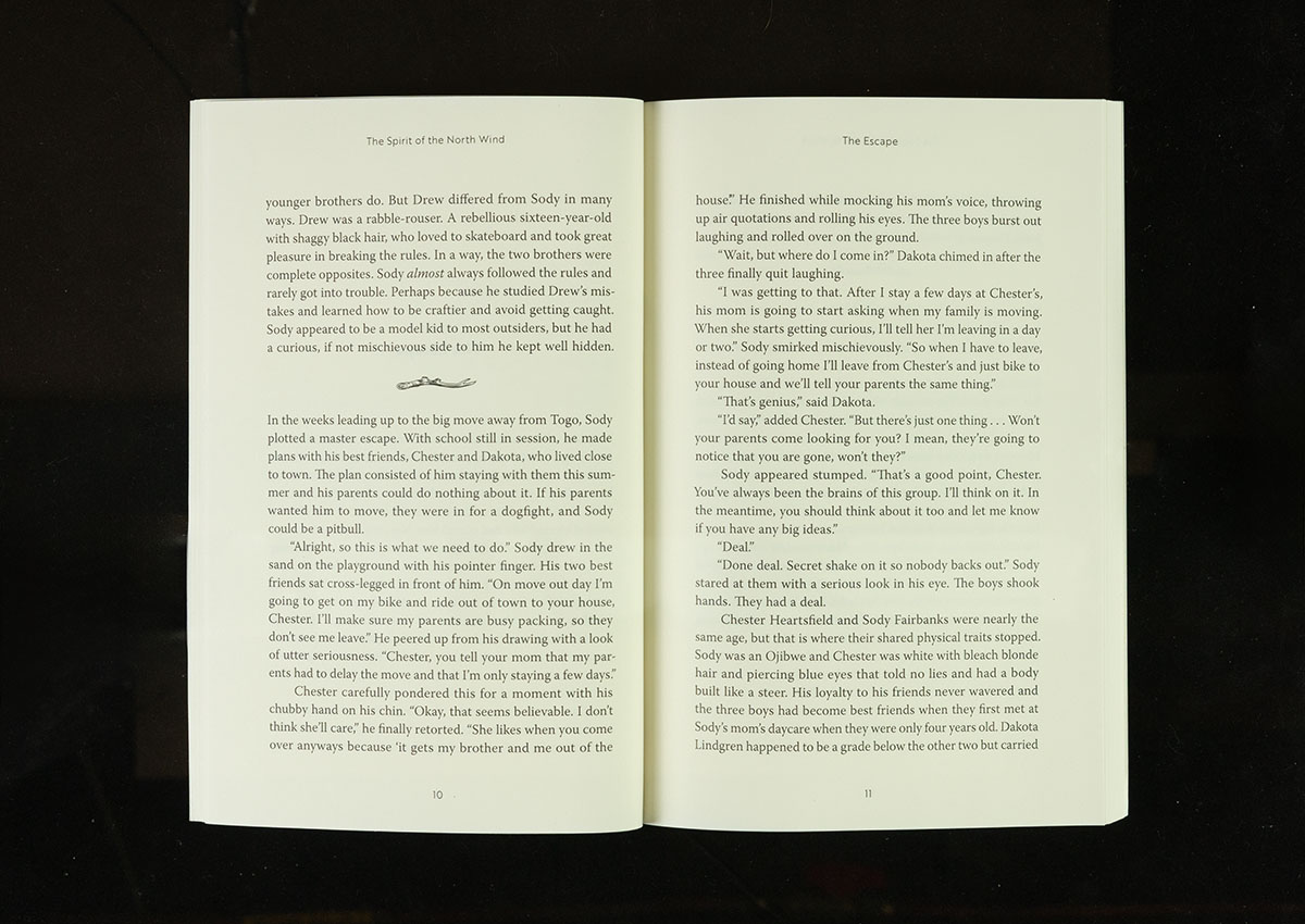
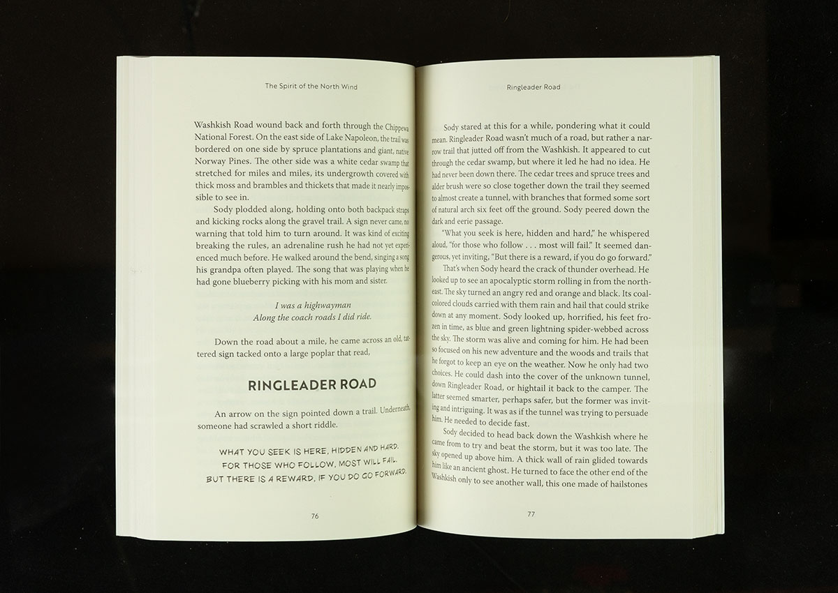
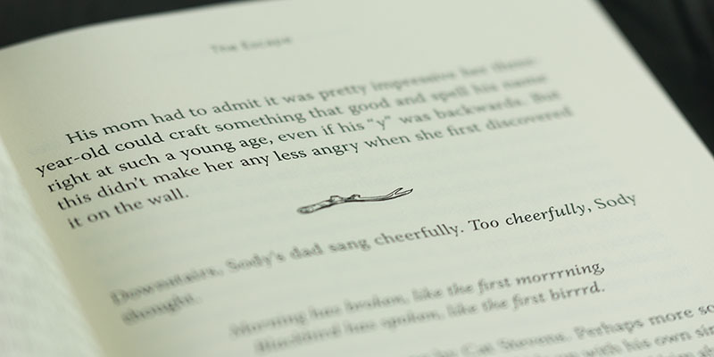
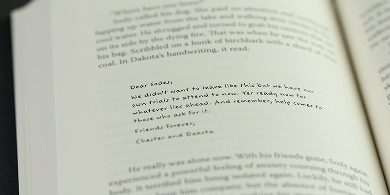
Notable additions include a custom divider line—an illustrated branch I created—reinforcing that most of the story takes place in the woods. In addition, I used some unusual font treatments for specific handwritten and hand-carved signage that appears in the story. It doesn’t occur often, but it is that little extra to help reinforce ideas of the story.
Sure, the book would still work without these additions. However, these little details are the differentiators that help a book stand out in a crowded market.