Color Relativity: Creating the Illusion of Light with Paint
The effective use of color requires understanding that its appearance depends on the colors around it. That is to say, color is relative.
In this book, master painter Kami Mendlik encapsulates her personal technique, an approach honed over years of sessions with students. Instruction is wed to dozens of her captivating and award-winning impressionistic landscape paintings.
“Having Paul on my team was truly key to the success of my book.”
Kami Mendlik, Artist and Author
Creative Brief
The bar was high for this project—part art book, part instruction, and all exacting!
Kami’s goal was to document the techniques she used to create her award-winning paintings. Techniques she has taught to students across the country since founding her school, the St. Croix River School of Painting.
We knew from the beginning that the economics of this project would be a challenge—as it is with any limited-run hardcover book. There are a lot of moving parts: production includes comprehensive editing, complex design, and exacting printing and binding. And Kami didn’t want to make any compromises on the quality of the book.
During our initial meetings she showed me a dozen books by other painters. From expensive coffee table art books to mass-produced instructional technique books. Each held a piece of the puzzle, but none was exactly the right template for what Kami wanted to hold in her hands: not just a catalog, but more than a how-to full of images. The book needed generous white space, visual room for the reader to breathe. And it also needed to capture her personality.
Design Challenges
- Support students by creating a comprehensive reference.
- Guide readers—students and patrons alike—through Kami’s unique process.
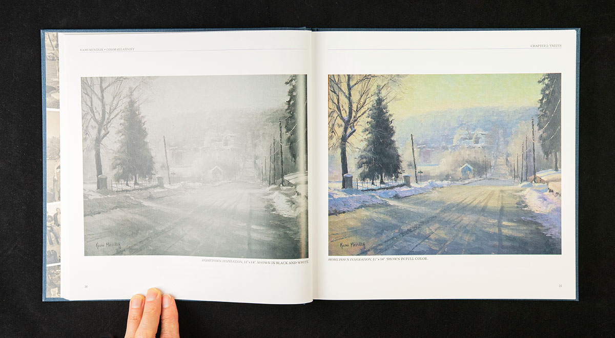
- Reproduce painting color and tonality accurately.
- Create a large format 11 x 11 inch hardcover book with dust jacket—larger than many printers can produce.
- Create a design that justifies the necessarily high price tag of the production.
Cover Development
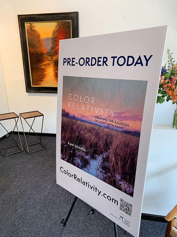
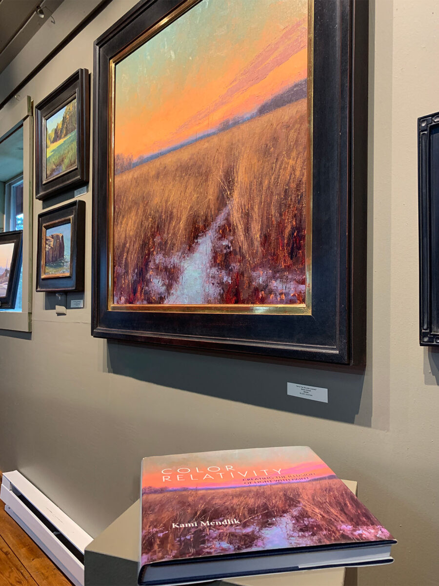
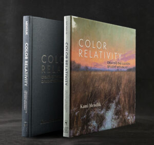
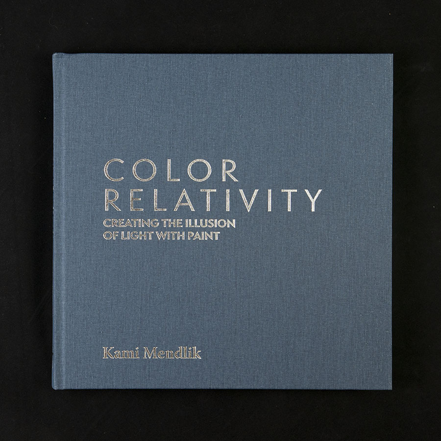
Based on our discussions, I created several concept covers for Kami’s consideration. She was okay with adding words over her art but she didn’t want anything cropped. Many of her beautiful paintings would work, but in the end she decided her image Into the Silver Lining really wanted to be the cover. The original was 24 x 24 inches, a good starting point for a square book.
Dust Jacket
We worked to shorten the main title and added a descriptive subtitle, to aid readability and layout. The title sat comfortably above the horizon line of the image, and Kami’s name nestled among the winter grasses of the scene. The rest of the text was positioned to flow within the composition, rather than compete with it.
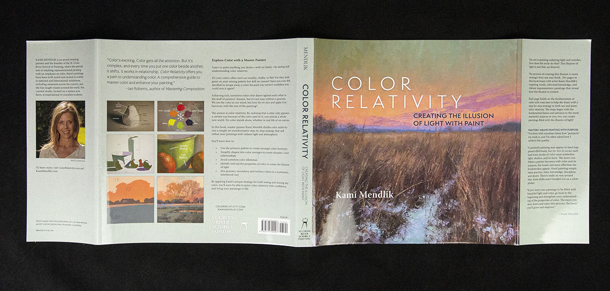
Front cover established, I worked to build out the balance of the dust jacket. Chock-full of quotes, descriptions, and sample images, the back cover and flaps serve to build anticipation of what readers will find inside. For the non-image areas I scanned the back side canvas of one of Kami’s painted color swatches. All part of the service!
Hard Cover & End Sheets
A dust jacket means there are actually two covers to the book: the jacket and the case wrap cover over the book boards. Kami opted for a book cloth cover in navy blue, foil stamped with silver.

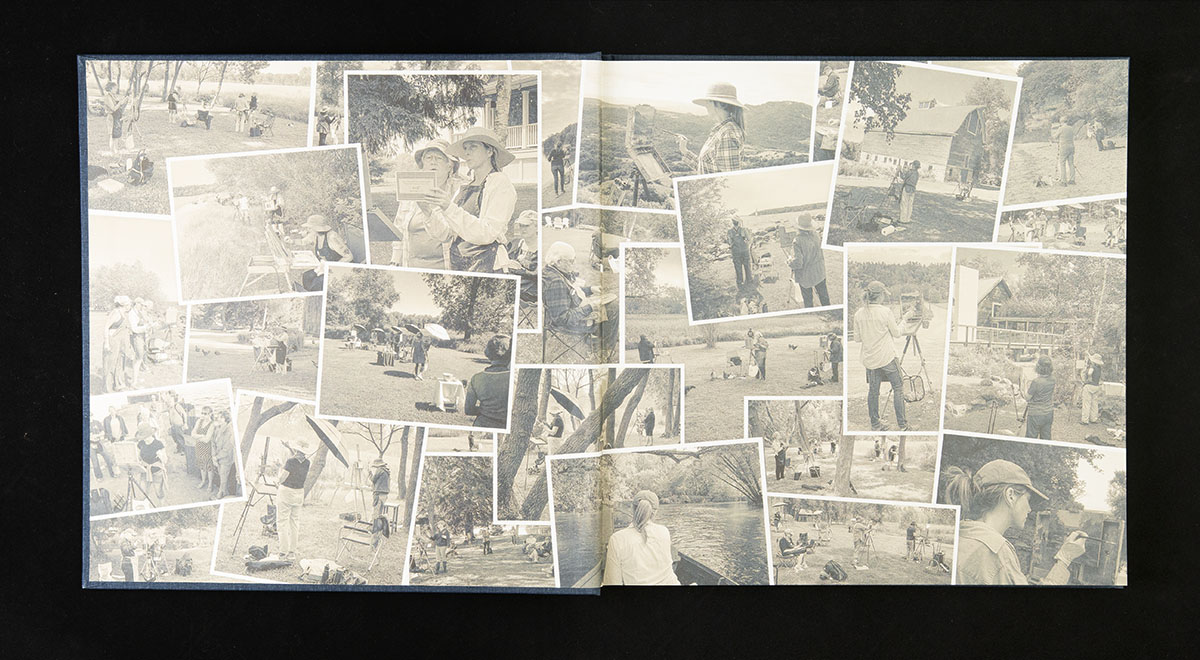
End sheets, the pages that hold the book block into the cover, are added during assembly. These functional elements can be plain white, a solid color, or optionally printed. As a finishing flourish, we decided on the printed end sheet, and I created a blue/brown duotone collage as a tribute to many of Kami’s plein air classes.
“Not only is he an exceptional designer but Paul’s calm, yet inspired, personality was a delight to work with. His level of care, devotion, and professionalism to the project was evident from the beginning through completion. His ability to balance practicality and creativity in a productive manner equated to a successful and brilliant result.”
Kami Mendlik, Artist and Author
Interior Layout
The interior needed to be both elegant and functional—to showcase the artwork and serve as an instructional book.
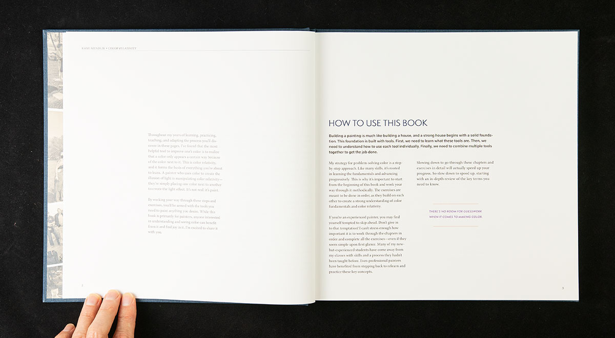
With the large 11 x 11 inch page size, I opted for a nominal “2 + 1/2” column grid: two columns plus a narrower outside sidebar. Images and quotes could extend into the sidebar for extra emphasis. The text could span the columns as needed for headings and key points.
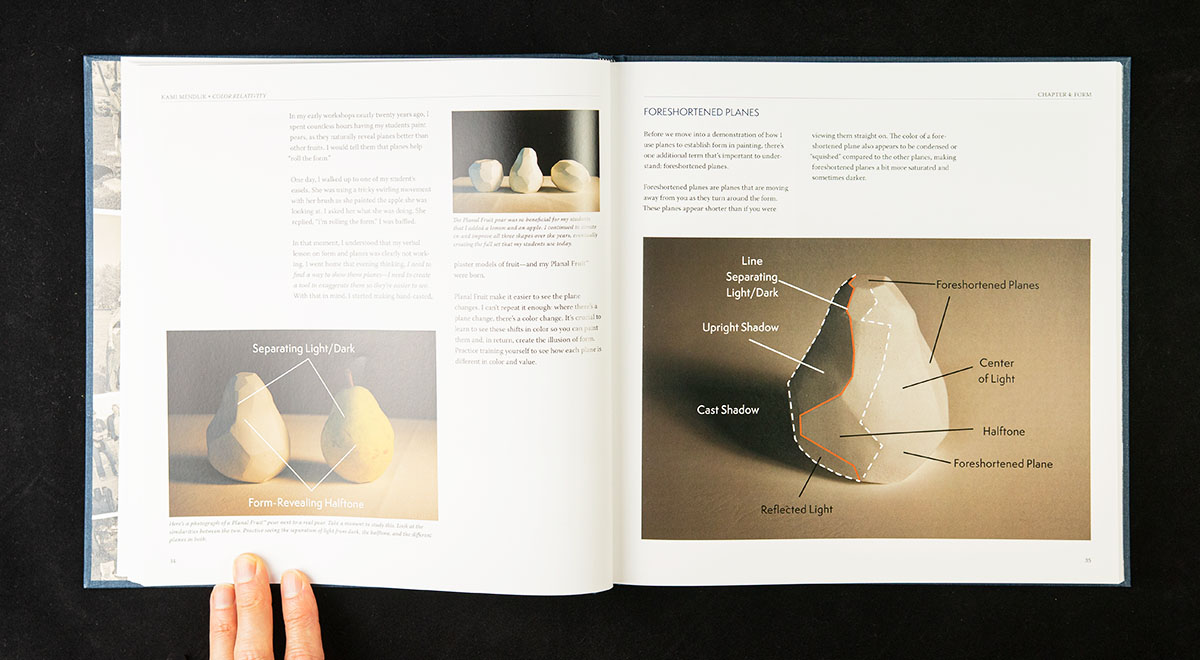
Then I created two alternate systems to manage the different types of content: two equal columns to manage image-related instructions.
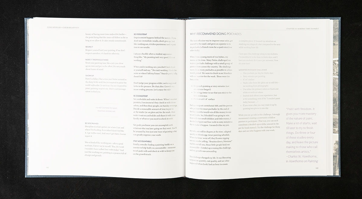
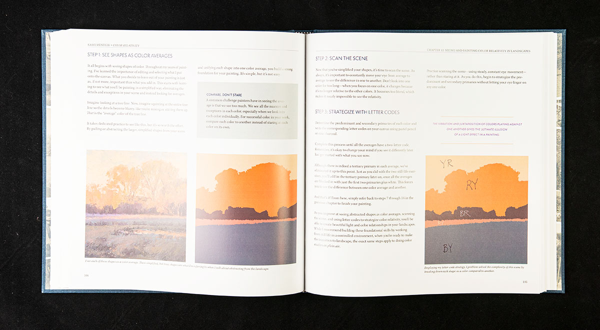
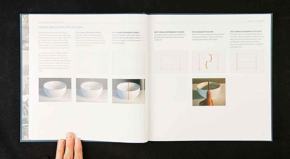
For the exercises, I limited each step to a single column with three equal columns, letting the bottom be ragged between the steps. White space is good, and this structure provided an intuitive, easy-to-follow layout.
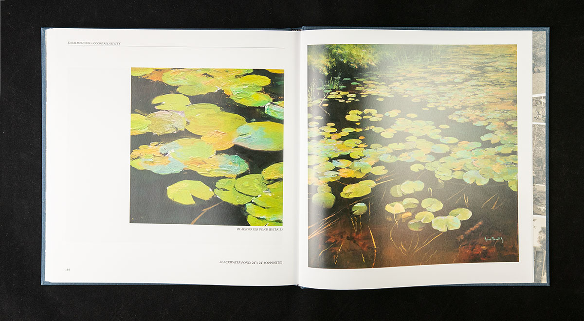
The goal of all book designs is to serve readers. A complex book such as this relied on lots of design elements. The gallery section, for example, followed another layout system.
“The design was an integral part of my vision, and he helped make my vision a reality on each page.”
Kami Mendlik, Artist and Author
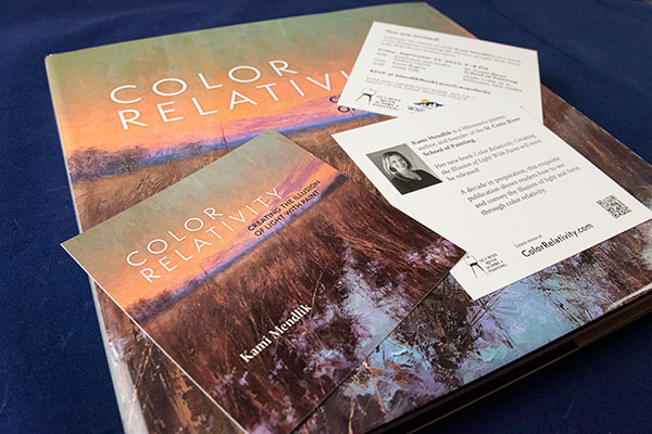
Promotional Materials
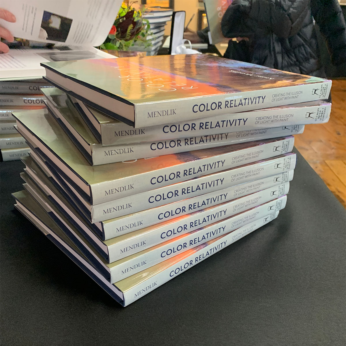
In addition to her extensive mailing list (of students and admirers), Kami tapped associate John Kaul to create an advanced promotional video for social media, spoke on several podcasts (including The Artful Painter ep. 72, Savvy Painter, and Art School Live with Eric Rhoads) prior to and immediately following the launch, as well as hosting a presale gallery party, a book launch party, and gallery signings.
I helped create announcement cards and signage for her presale gallery party and book launch gala: miniature versions of the book’s dust jacket on one side of a square announcement, with event details on the flip side. What a beautiful way to connect with potential buyers!