Preserving the Idea of the Original
Marking the tenth anniversary of Isolation, this newly crafted trade edition reimagines the original photography exhibition with a vibrant twist. Compact in size yet rich in content, it features select new images and thoughtful edits, breathing fresh energy into the fine art edition. The design stays true to the minimalist theme, elegantly using expansive white space and a striking black & white palette to captivate and engage.
Honor the Original
Throughout the evolution of Isolation, I’ve always kept the intent of the original photography in mind. That sense of needing to be isolated, while also needing other people—as subjects and as viewers—has always been the central idea I continue to explore in my work.
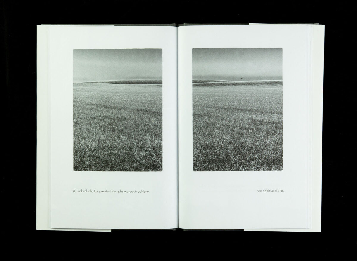
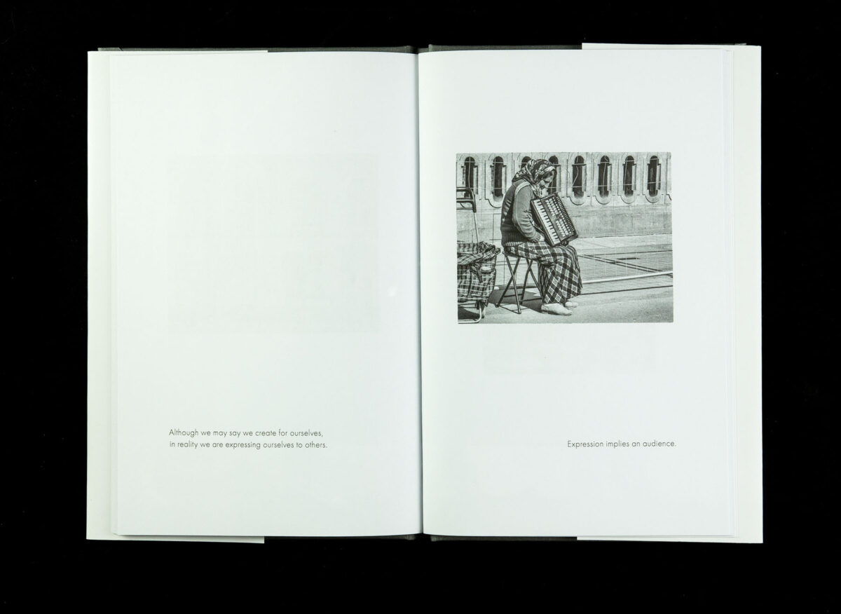
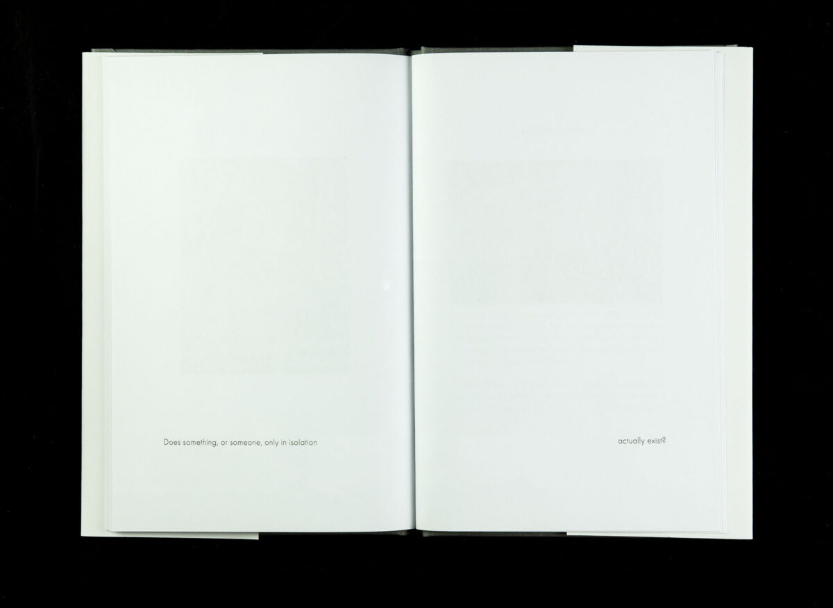
The stream-of-consciousness poem accompanying the images is intentionally paced very slowly. Each image is presented individually on a spread, with several spreads containing only a fragment of thought and no image at all. The book remains an intimate and very personal idea.
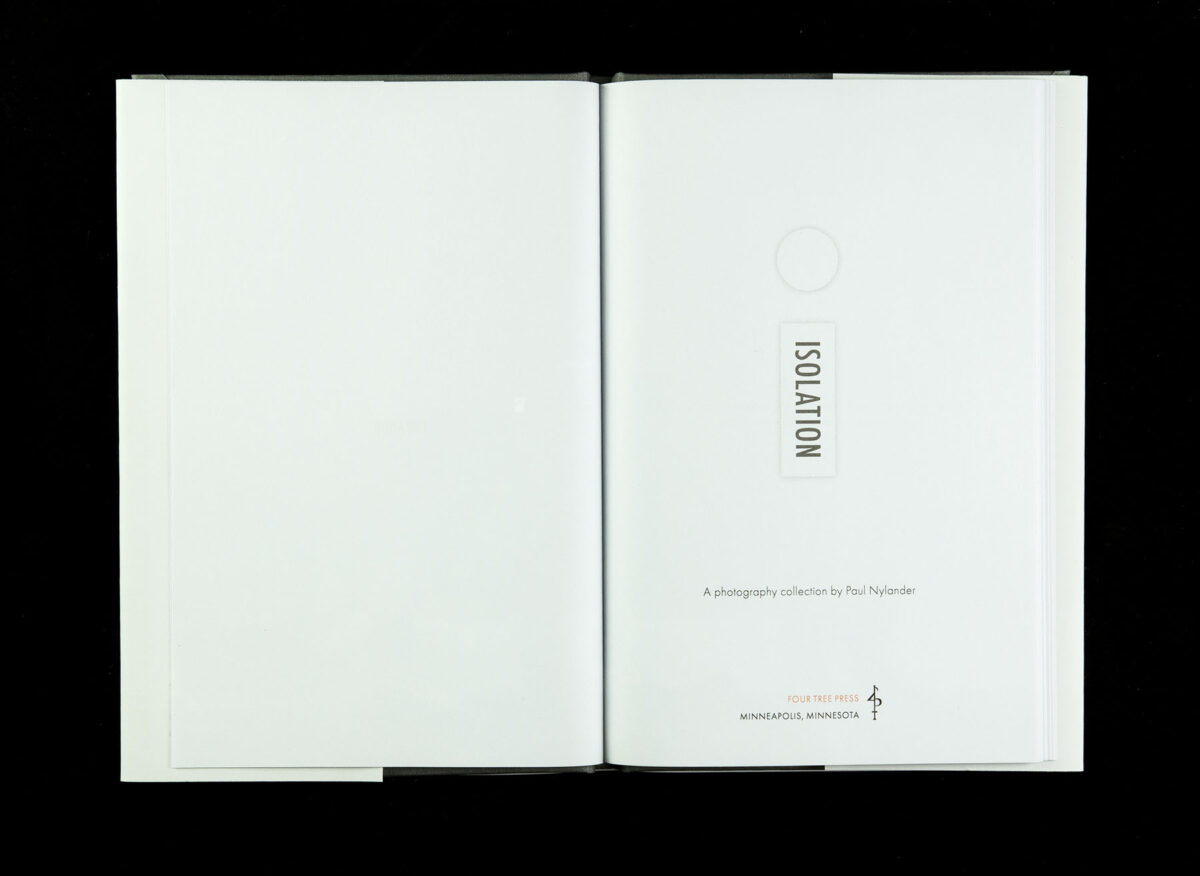
Typographically the original fonts of the fine press edition and general aesthetic were preserved. Generous white space punctuates the sense of isolation throughout the book.
Updates for New Format
This new version is also a technical exploration. Like the fine press edition, I’ve used Isolation to explore what is possible with a radically different print medium: print-on-demand. The book is digitally printed and bound as orders are received, eliminating the need for physical inventory.
This also allows me the freedom to make the book available to a wide audience, through both online sales channels and, at least in theory, traditional brick & mortar bookstores—access that would not be practical for me as a new indie publisher.
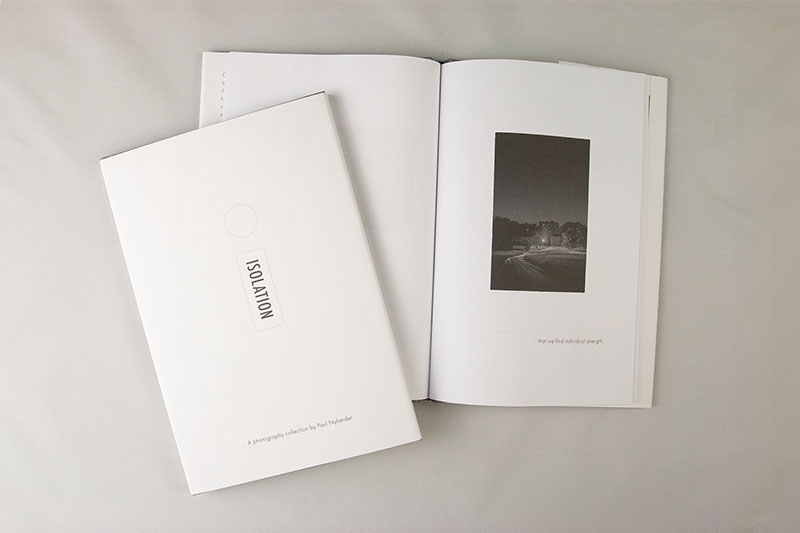
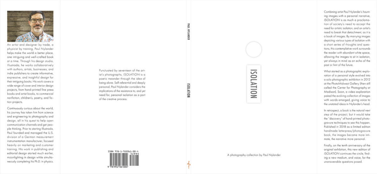
There are, however, tradeoffs. First and foremost, the size. While the original was an extravagant 10 x 15-inch book with a slipcase, this new version is a mere 6-1/8 x 9-3/16, albeit with a dust jacket. The odd size is the largest that would allow me to use the “digital cloth” option (see below).
Images are still presented individually, although now I let the text appear on both the left and right pages along with the images (in the original they were separated, text on one page, images on another, although physically on the same sheet). And the images are smaller than the original photogravure prints, but larger relative to the page size.
The cover art on the dust jacket mimics the idea of the fine press edition’s complicated inlay. Unlike the previous edition, I added a brief description to accompany the addition of the ISBN barcode on the back of the jacket.
Digital Cloth?
The actual cover of the book—more properly the case—utilizes this strange option in IngramSpark’s offering, the so-called “digital cloth.” Removing the dust jacket reveals a grey cloth-looking material wrapping the book’s case.
It isn’t book cloth, but a vaguely textured surface printed to give a reasonable impression of cloth. With a slightly waxy feel, there is no doubt that it is an imitation. But not a terrible imitation.
I’d happily use it again for another project, save for two shortcomings: first, there is no option to print anything on the front cover. Second, and even more egregious, is the horrific gold printed serif font on the spine. There were no options for font, color, or size in the book’s online configuration screen. An oversight that I sincerely hope the production folks at IngramSpark figure out how to reconcile in the future.
Functional, yes. And even tolerably intriguing, save for the spine treatment, which is not something any designer would have chosen.