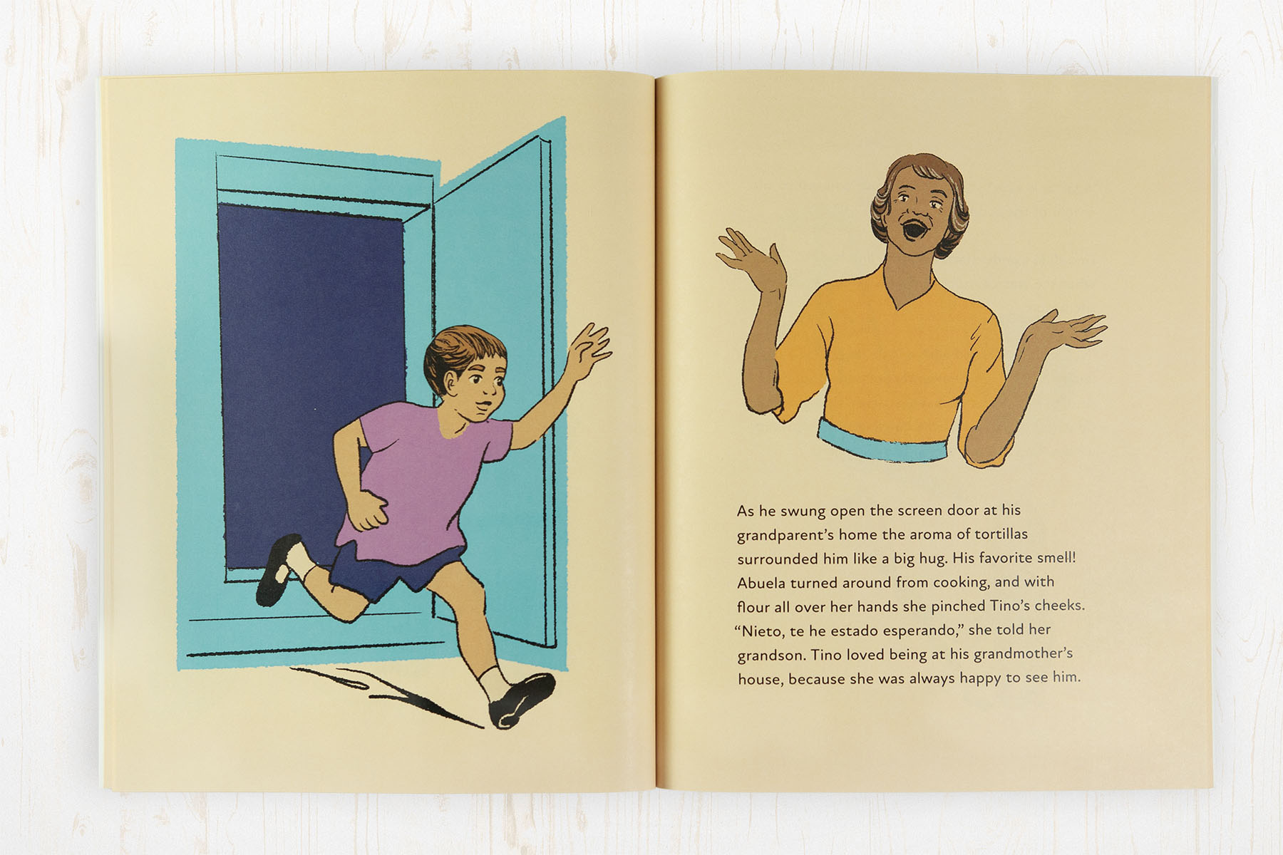
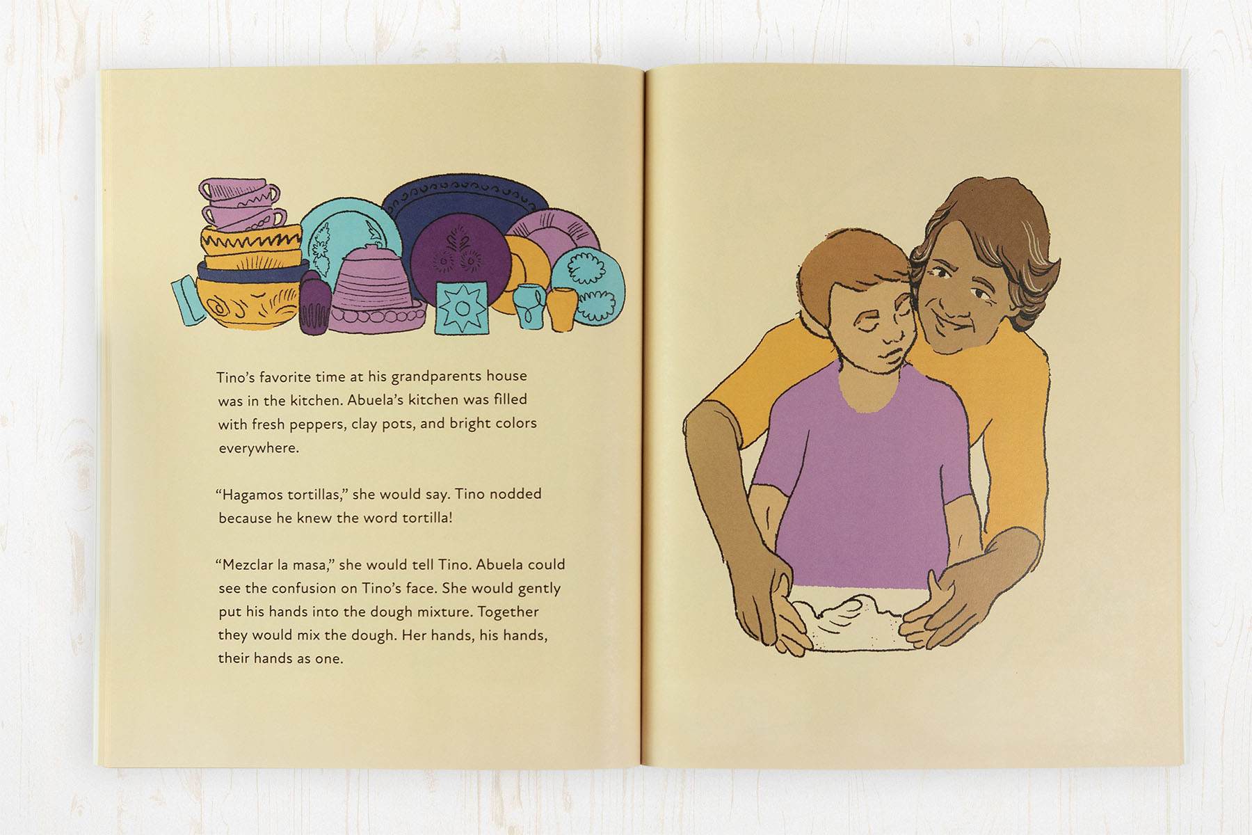
Working with Dakota and Ojibwe author/publisher Tara Perron and African American and Hawaiiana illustrator Simone Alexa to create a multigenerational book about a Mexican grandmother who only spoke Spanish and her grandson who only speaks English … is definitely a multicultural book project experience!
Creative Brief
As one-third of this creative collaboration, my job was to ensure the book was visually engaging as well as readable and accessible. As with all the picture books I’ve designed, my goal was to make the interaction between text, images, and the physical book itself seamless and enjoyable for children—and their caregivers.
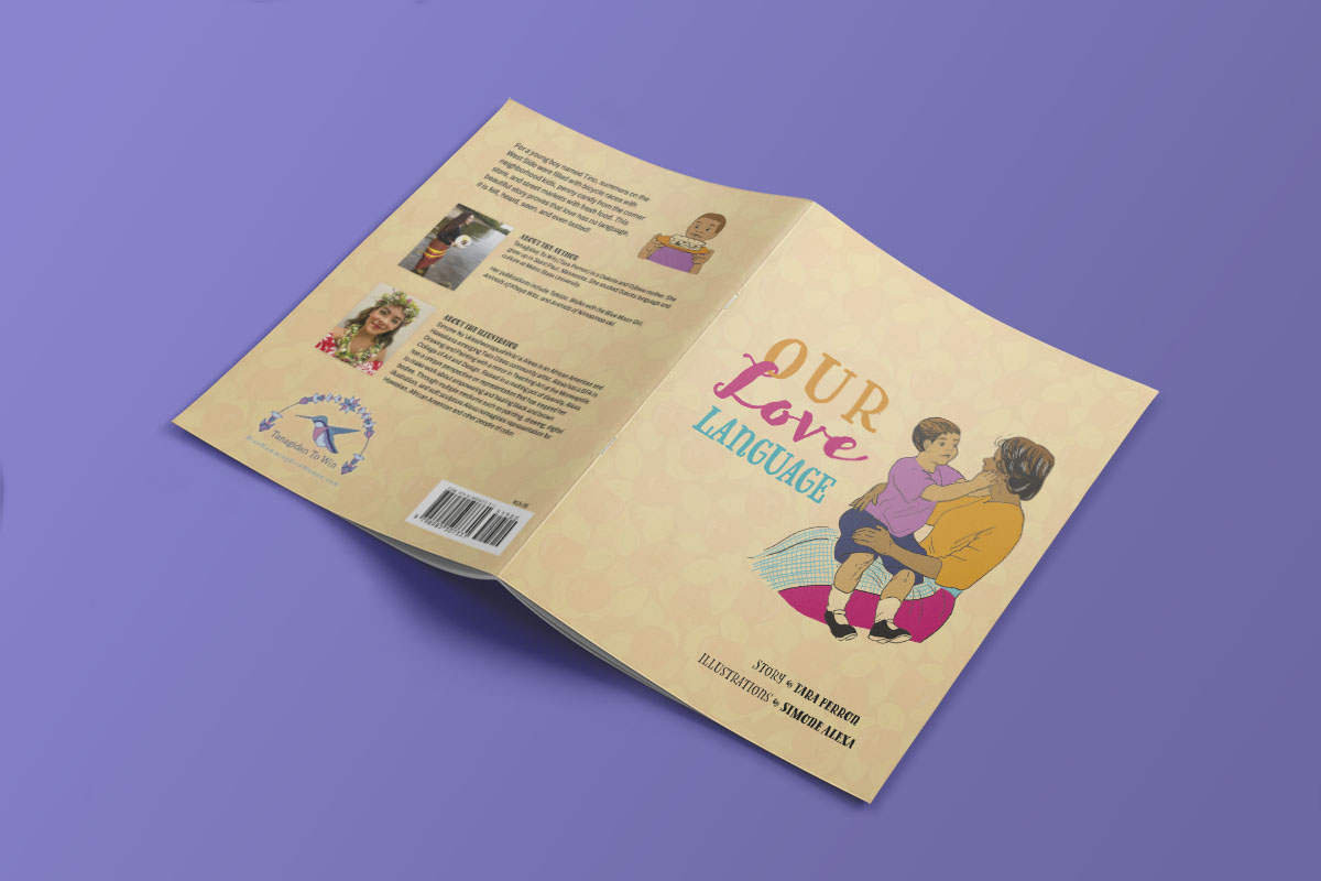
We discussed size options and settled on an 8 x 10 POD softcover as the best solution for the publisher’s needs—to be able to provide an affordable book in her own store and make it available through online retailers.
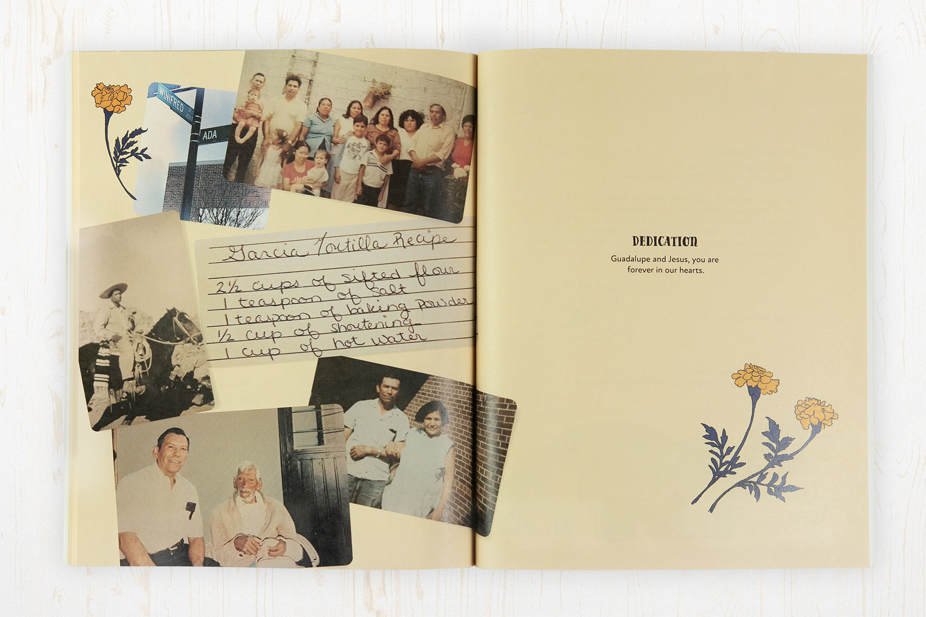
As an additional bonus, Tara wanted to include several family snapshots and the handwritten recipe for tortillas.
Design Process Cover/Interior
As the designer of a children’s picture book, I am responsible for the overall layout, including the placement of text and illustrations, choosing fonts, and deciding on colors that complement the artwork and narrative tone of the book.
To aid the illustrator, my first step was to create a preliminary version of the book. I set the text to provide a sense of space, but otherwise, the pages were blank. I’ve found that this helps to give a sense of available space on each spread, especially with illustrators new to book illustration, while also framing our discussion about page bleeds, safety margins, and image resolution.
Since illustrator Simone was working in Procreate, she could import the samples and work directly over the suggested layout, saving time and effort.
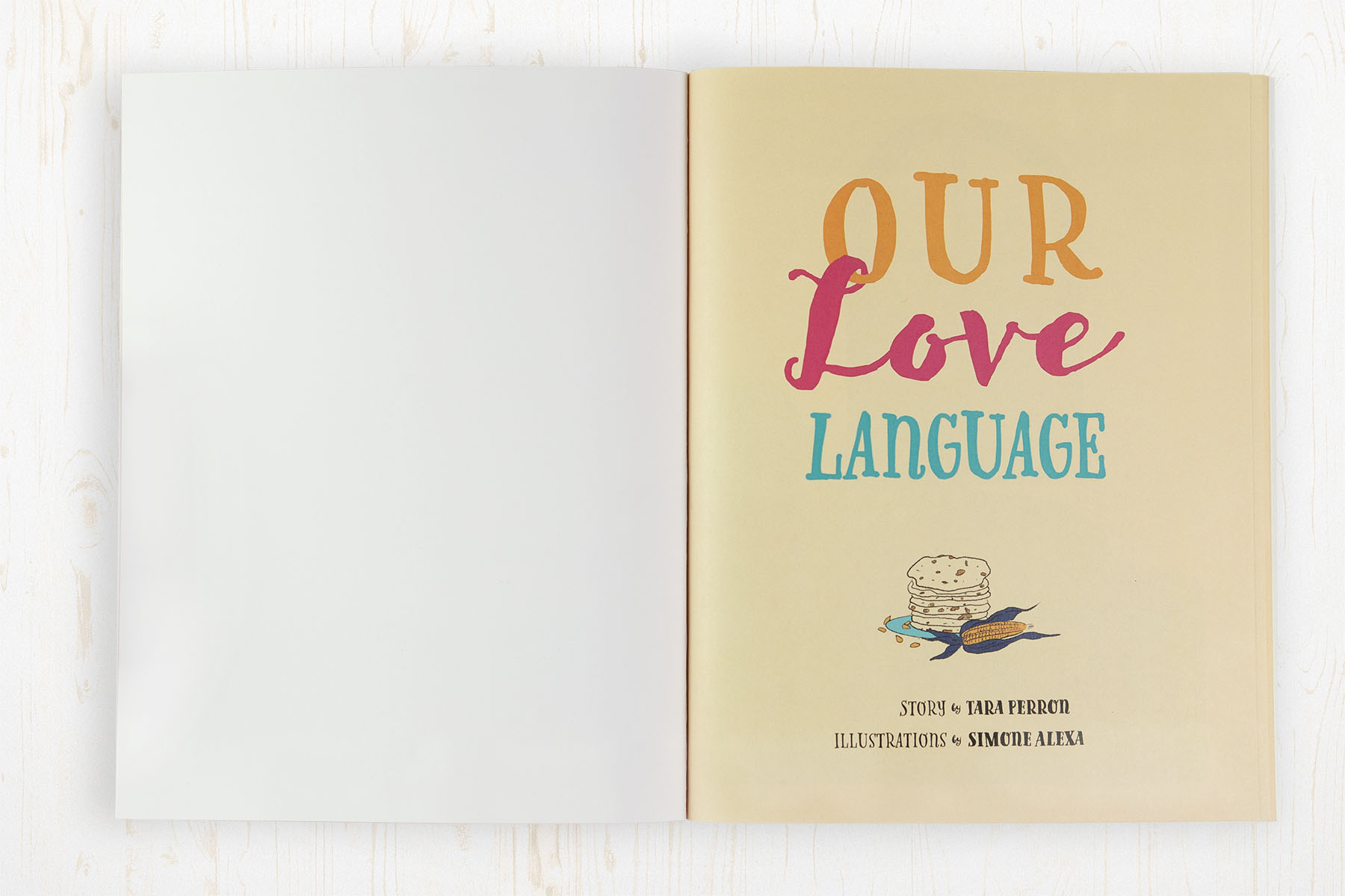
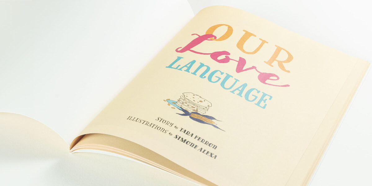
The typefaces were chosen to embody the personal nature of this story. These handwritten-style titles were complimented by a clean sans serif font for the body text, making it easy for early readers and adults reading along with the children. Otherwise, my visual styling was driven as much by the illustrator’s style as by the story’s text.
While children’s books are straightforward, and the result here succeeds in its clean and intuitive feel, it is crucial to remember that “simple” is not always easy.