Creatively Solving the Self-Publishing Realities
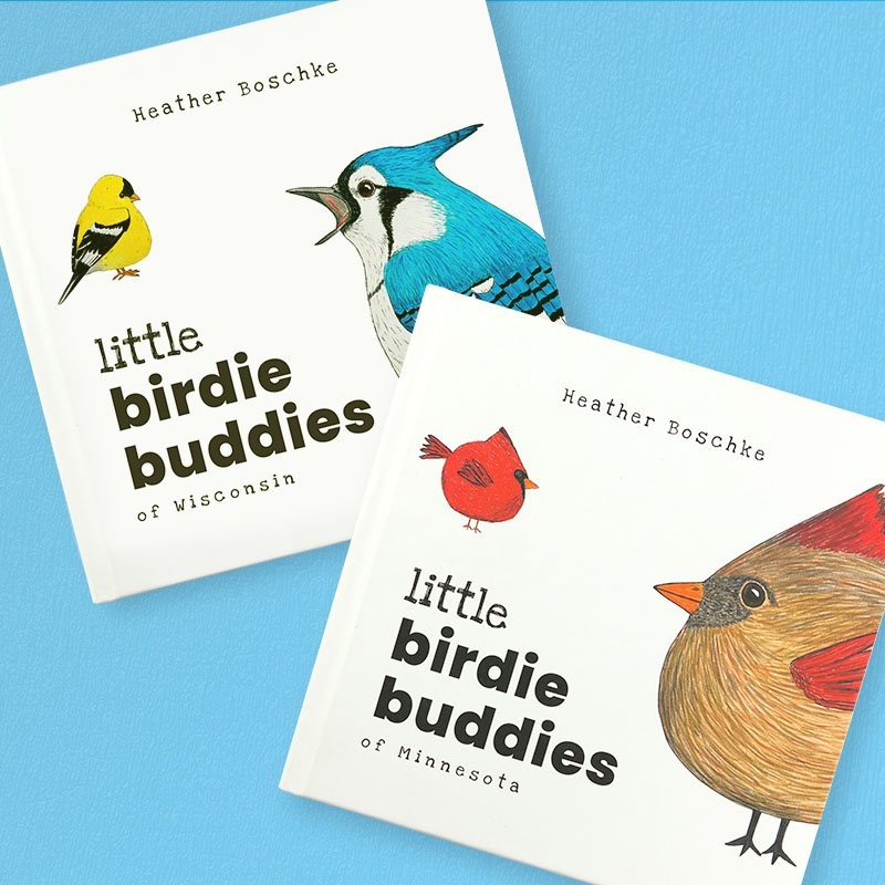
Explore the creation of Birdie Buddies, a captivating series of children’s picture books by author-illustrator Heather Boschke. In this collaboration, I worked alongside Heather to bring her imaginative “Buddha Birdies” from concept to a polished publication tailored for 3rd–5th graders. My role was instrumental in transforming her vibrant illustrations into a cohesive book design, navigating the complexities of self-publishing along the way. This project resulted in a delightful series of books that captivate and expand young readers’ imaginations, marking the beginnings of a great friendship in children’s literature.
“Paul exceeded my expectations in what I had for a book designer. He was a true partner in every sense of the word and a wonderful educator on the self-publishing process.”
Heather Boschke, Author-Illustrator

Project Overview
Author-illustrator Heather Boschke’s vision for a children’s picture book, Birdie Buddies, targeted at 3rd–5th graders, was vividly clear yet needed expertise to translate from concept to reality. With an existing product line based on her ‘Buddha Birdies,’ Heather sought to expand into the children’s book market, an endeavor requiring careful consideration of sales and marketing strategies impacting production and design.
Heather’s journey from concept to print was rich in ideas. Still, she lacked the necessary experience in actualizing them in a publishable format. She needed a collaborator who could refine and materialize her cover and interior designs and navigate the intricate landscape of publishing options and production decisions.
I provided comprehensive design and production assistance, taking Heather’s initial concepts and elevating them with professional typesetting and layout, ensuring consistency with her artistic style. My expertise in exploring and evaluating various publishing routes—including self-publishing and print-on-demand options—played a crucial role in successfully realizing Heather’s vision.
This collaboration led to not just one but two books, with the potential for more, marking a successful partnership in bringing a unique children’s book series to life.
Layout Design
Heather’s style wanted a clean, bright, and inviting appearance, appealing to curious young readers and the adults in their lives. The book cover needed to be engaging and attention-grabbing to stand out in the crowded children’s gift book market. The feeling needed to be playful throughout the book.
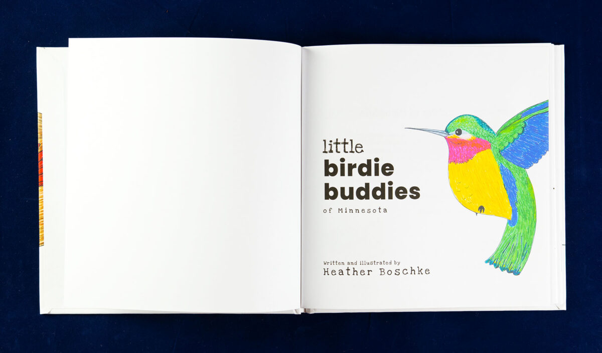
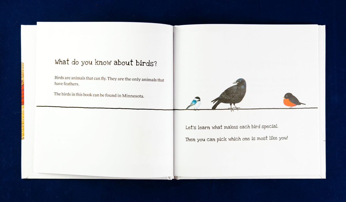
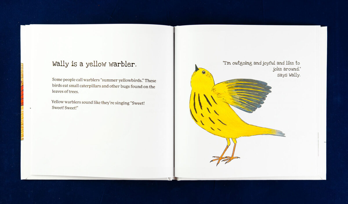
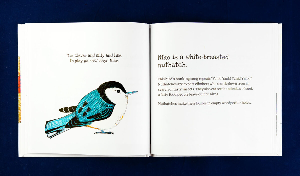
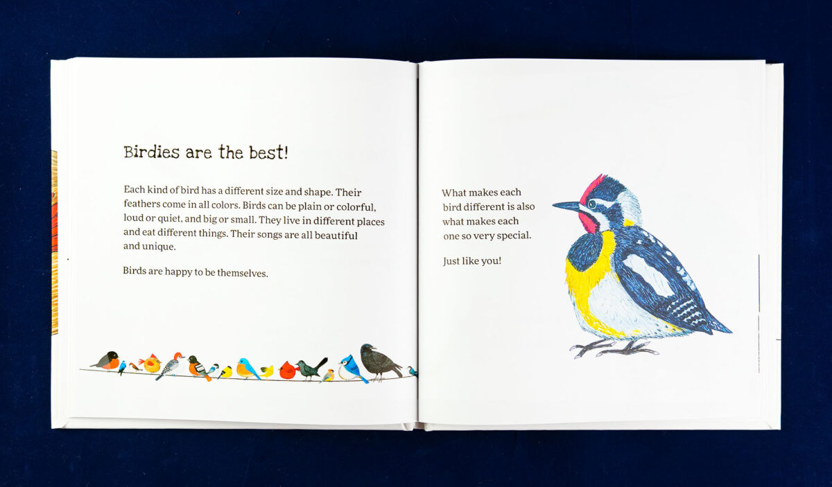
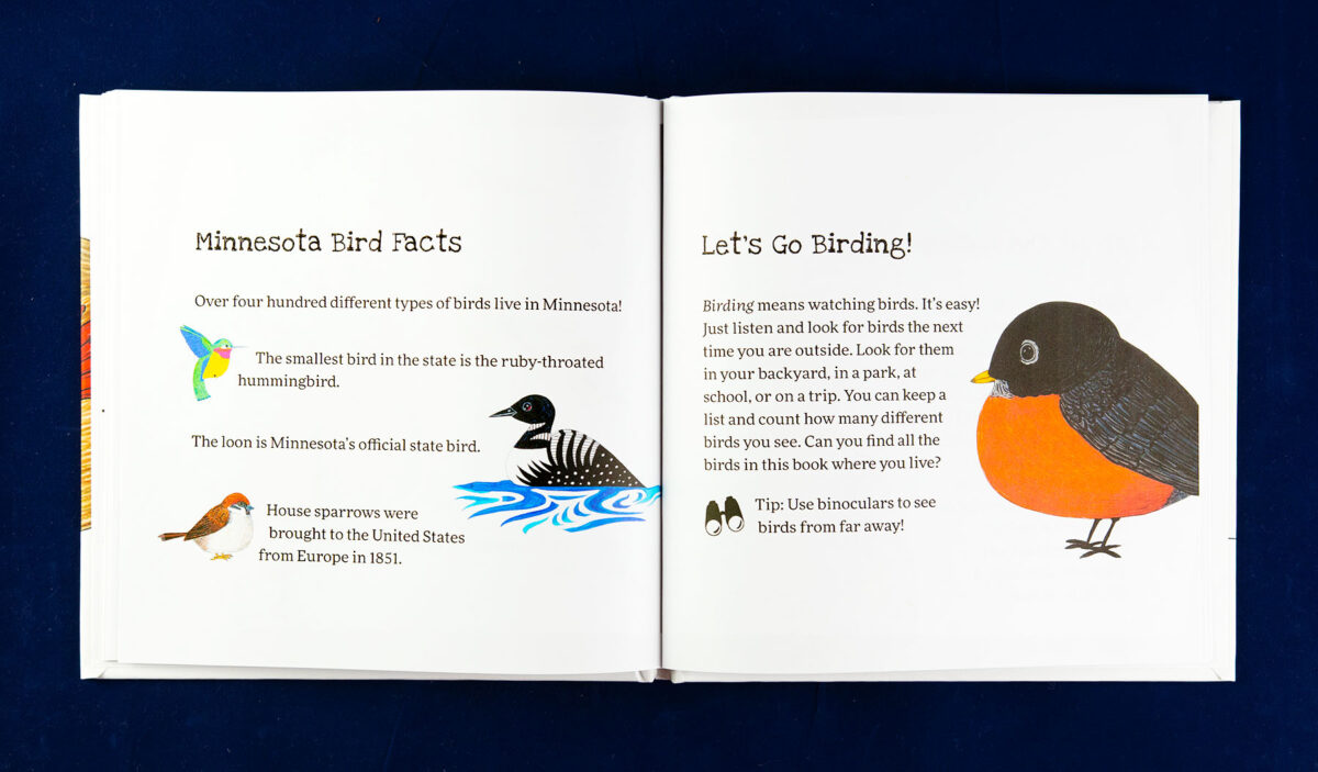
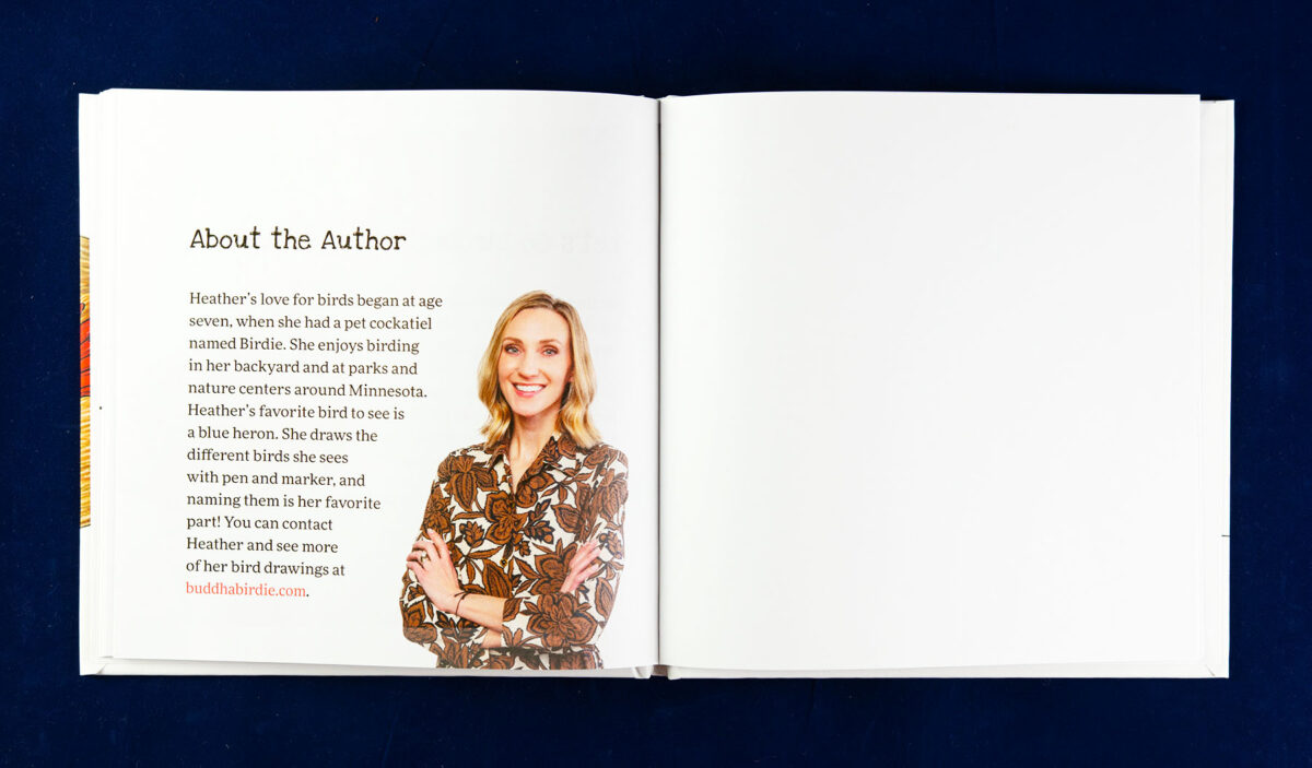
With eighteen species of Minnesota birds to feature, each with a two-page spread, this book was targeted at forty-eight pages. This page count includes a title page, copyright notice, dedication, a short introduction at the front; the thirty-six pages for the featured birds; followed by an encouragement to go birding, and an about the author in the back.
I tightened up the typography, opting for a playful slab serif font for the bird quotes and titles. This title font contrasts with the descriptions’ open and very readable serif face. It was essential to the author that we avoid gender associations or specifications, so placement of the birds would be random, as were their names—other than the pneumonic of starting the bird character’s name with the same letter as the bird’s species name.
I started with the interior, working out the basic layout of the featured bird pages. There are two basic layouts, with several variations to work the text around the unique shape of each bird.
In the feature pages, the birds were all shown about the same size as each other. But in the pages where the birds were interacting, we agreed it was important to keep the relative sizes of the birds correct. While not a strictly science book, we still wanted to maintain factual accuracy where appropriate.
“Such a joy working with you, bringing these birdies to life!”
Heather Boschke, Author-Illustrator
Wisconsin Edition
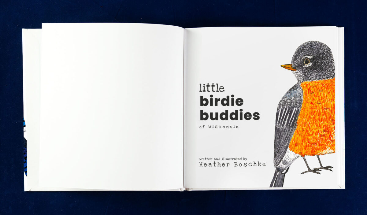
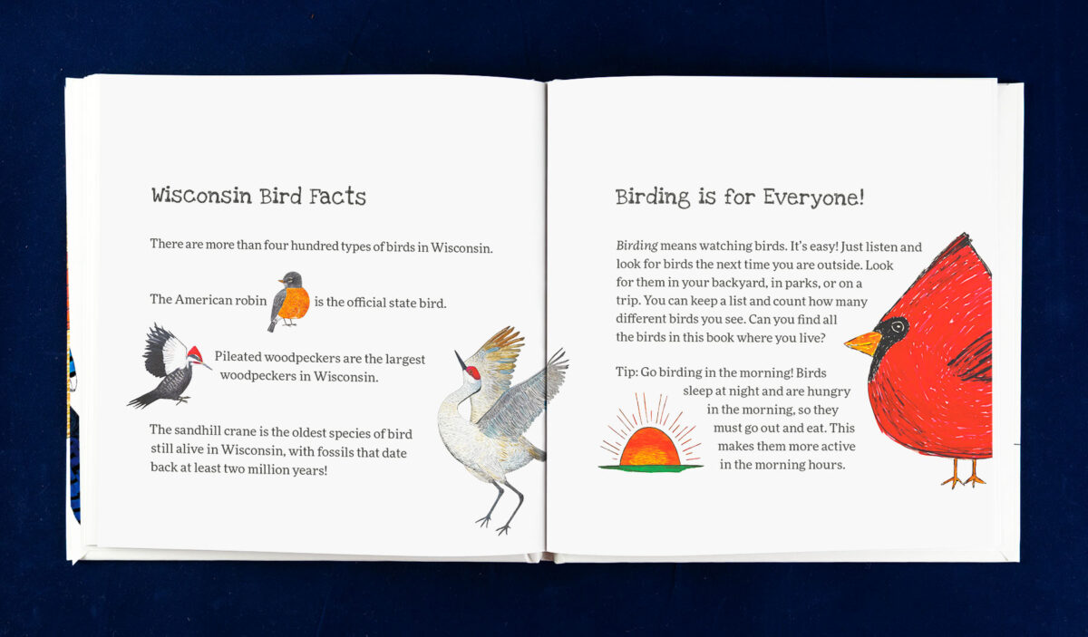
Creating the Little Birdie Buddies of Wisconsin based on the Minnesota edition meant reworking the layout with all new images and text. Heather’s drawing style has also begun to evolve, as has the layout—including some cross-spread elements and adjustments to text size and placement in the supplemental content.
Cover Design Quickly Followed
The cover idea came together quickly once I established the interior style. Independently, we knew that Clara and Clarence, her cardinal pair, would be the cover birds of her first book. They were her first drawings to take off and had become a mascot for her business.
I presented three cover variations, but I really wanted to make sure at least one of the birds on the cover was large and bold to help draw attention to the book. The author’s original idea, while clean, was too quiet. I feared that if she ran with it, her sales would suffer.
Heather agreed, and other than minor tweaks, this initial proposal was the final version of the cover.
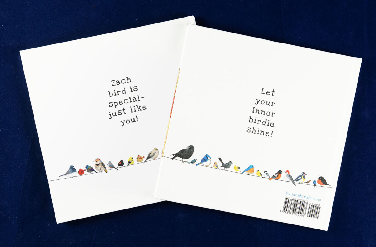
“The cover he designed for my book blew me away!”
Heather Boschke, Author-Illustrator
Managing the Project
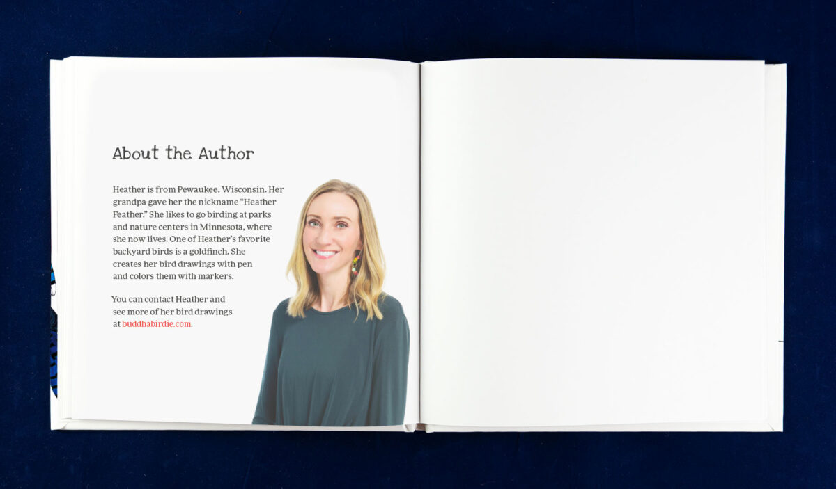
Heather is a high-energy, high-detail person. It made for an exciting combination with my curiosity and willingness to explore possibilities. We often talked as I worked through the details, such as the ordering of the birds and the choice of her headshot for the author page.
Production Costs and Inventory
A challenge for publishers creating color books, especially hardcover children’s picture books, is the relatively high production cost. Printing and storage are topics I will discuss with every client, no matter the size of their operation. However, with the small quantities (< 1,000) a new publisher will likely need, it is especially tricky.
After discussing her sales plans and goals, Heather admitted that trade bookstores were different from her target sales channel, at least initially. Direct sales through her marketing would be primary, and sales through personal connections to boutique gift shops would be a channel she would work to develop. Being available online was also important.
This sales and marketing question is critical in the design process. It affects what we can do from a production standpoint and the distribution options available. But for many of my self-publishing clients, it is not an easy choice; it involves that dreaded word compromise.
Heather and I challenged each other to understand and compare the options for self-publishing authors. I’ll admit I learned and grew in the process, as did Heather. Together, we evaluated a variety of different publishing/print/distribution solutions as the project began to coalesce: GumRoad (digital only), PorchLight (bundling and bulk order sales management), LuLu (POD printing and eBook distribution), a variety of commercial printer/binders (both domestic and overseas), and POD print & distribution services such as IngramSpark and KDP.
To manage initial risk, we decided that IngramSpark, a print-on-demand solution with extensive distribution, would be appropriate to start. This decision forced a few difficult compromises but ultimately allowed Heather more flexibility in how and when she rolled out her promotion efforts. It meant giving up on the printed end sheet idea, accepting the limited paper option available, and sizing the book at 8.5 x 8.5, the largest square size POD printers can create. However, this solution was flexible and scalable; she soon added a short dedicated print run for her direct sales while maintaining the POD version in distribution.
Ramping up the second book for Wisconsin birds, Heather started with the same strategy: POD first to gauge interest and build sales.
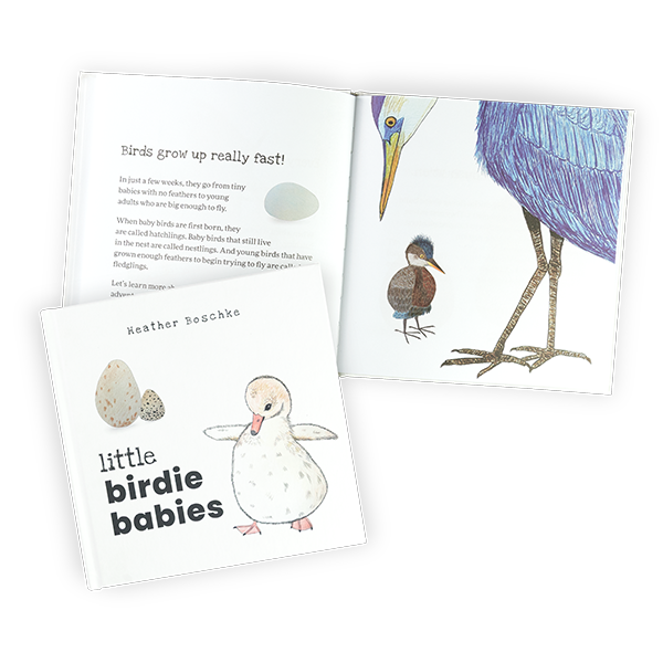
The strategy worked. Within a couple of months, Heather had already decided to add a dedicated print run to have books in inventory. And a few months later, we were back at it again with a Wisconsin version of the book—new character names, illustrations, and several new bird species. The following year, she added a third book, Little Birdie Babies, and has plans for a fourth to come in 2025!
“It was also apparent how much he cared for me and my book. I never felt like I was a number … he helped create an end product that I am truly in love with. I can’t wait to work with him again!”
Heather Boschke, Author-Illustrator

