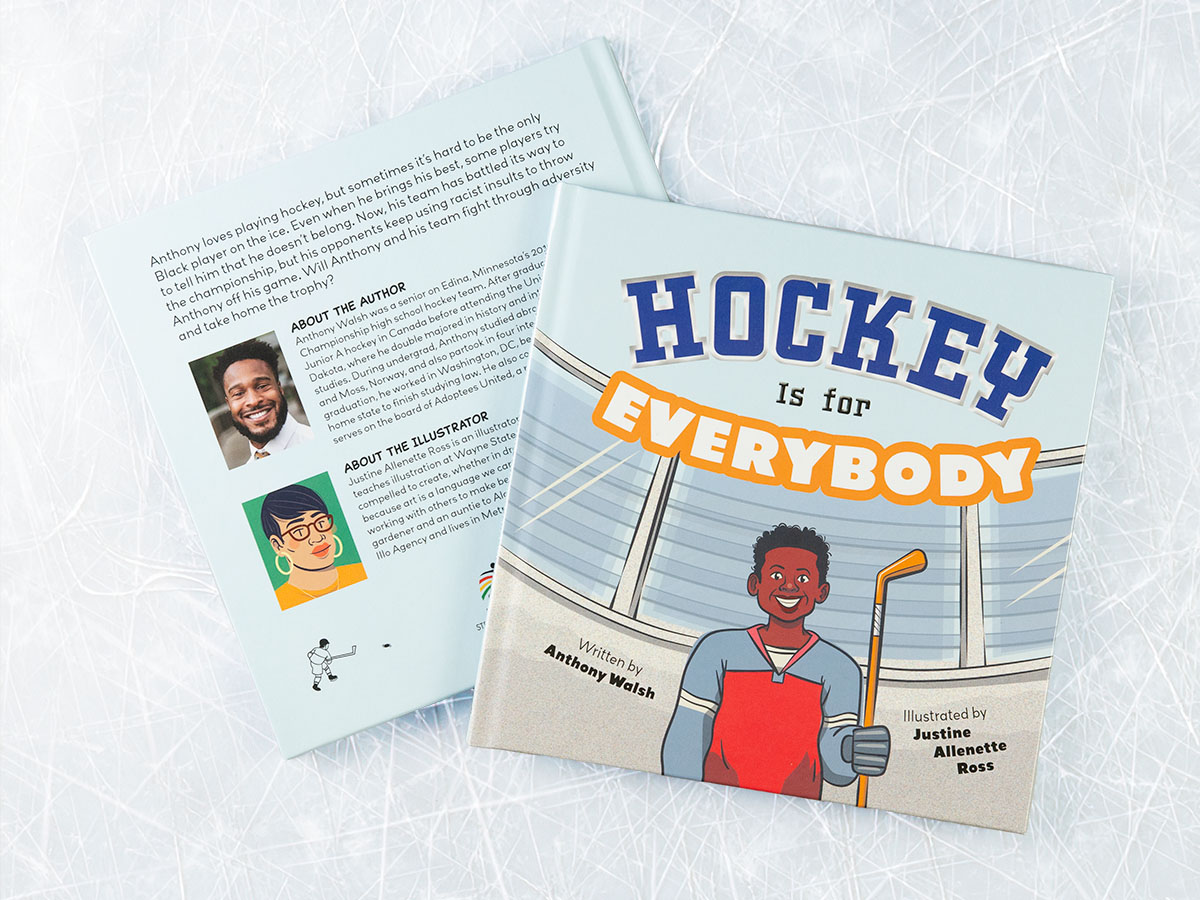
Illustrated picture books are great fun to design. Not only do I get to be more playful with the typography, I also get the pleasure of working together with an illustrator! Justine Allenette Ross is an accomplished illustrator who hails from Detroit, where she also teaches illustration at Wayne State University. She is represented by the Illo Agency.
Design Challenges
- Pivot to preliminary coloring book version to meet event deadlines.
- Update artwork size and position for story pacing.
- Re-set cover type for a more professional look.
- Adapt to hard cover case wrap from original soft cover plan.
Preliminary Layouts
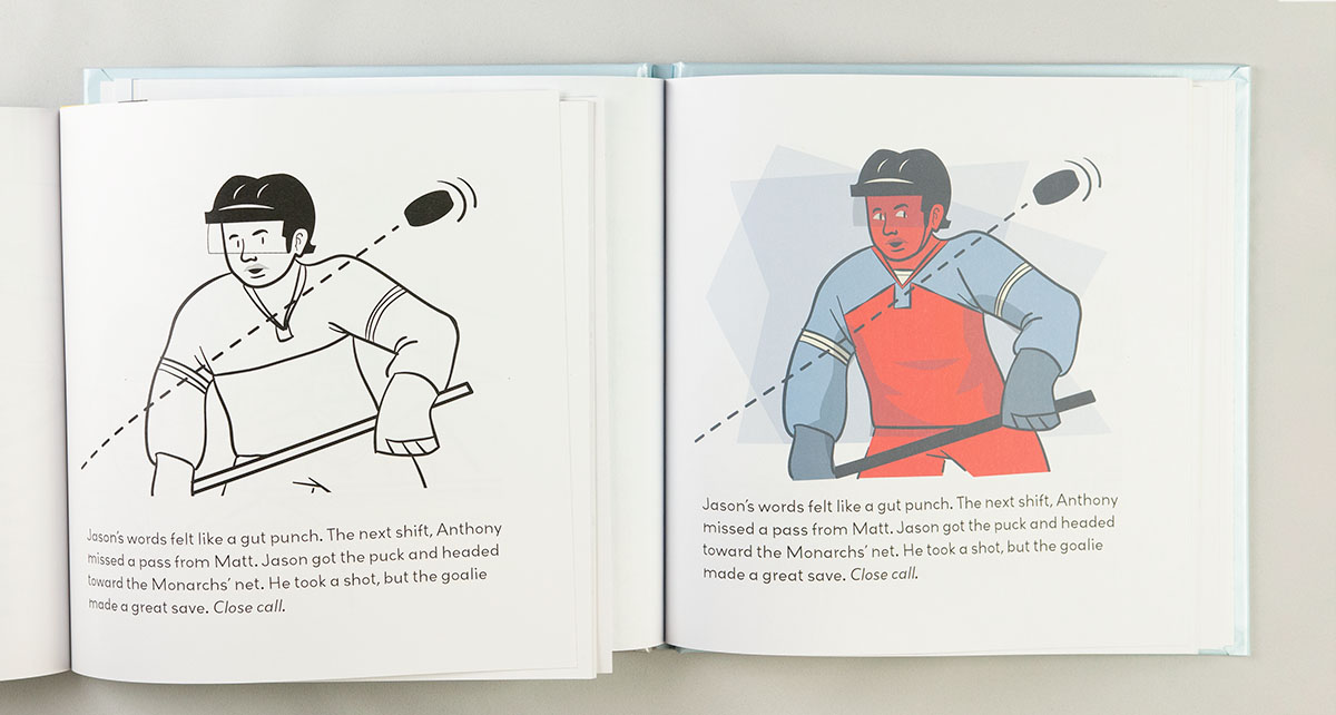
Whether I’m working with a new illustrator or a pro, I like to provide some typographic guidance for the interior. By creating “blank” layouts—text only—for the illustrator, I can give them a sense of available space on each page spread. This helps them visualize, and hopefully better utilize, the available space.
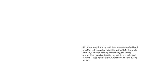
It makes my work easier because (theoretically) the space is already allotted for the type. Plus, it gives us a chance to make sure we’re on the same page when it comes to page size, bleed, and resolution. So it is a win-win!
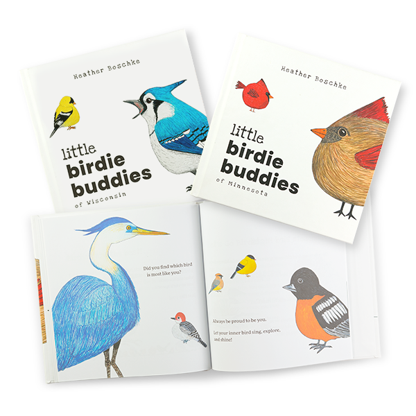
Coloring Book
Delays happen. An overly optimistic editorial and illustration schedule, combined with delays in discussions of a possible agreement with the NHL, pushed our original timeline back. We knew we were not going to have enough time to create and print the final book in time for Strive Publishing’s Junteenth event. Unfortunately, we would also miss Strive’s brock-and-mortar bookstore grand opening.
So the decision was made to pivot to a coloring book based on the preliminary illustrations.
As a sort of “rough draft,” the coloring book allowed a closer look at the text, typesetting, and images. I made several tweaks to the original art to better match the narrative and layout needs.
Final Images
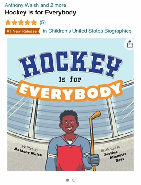
Cover Typography
Transitioning to the final book, the first step was updating the cover. Justine provided a preliminary title treatment even before I joined the project. This was “approved” and appeared on the coloring book. While comic fonts can work, it was decided that this title was too amateurish for the final. Good call!
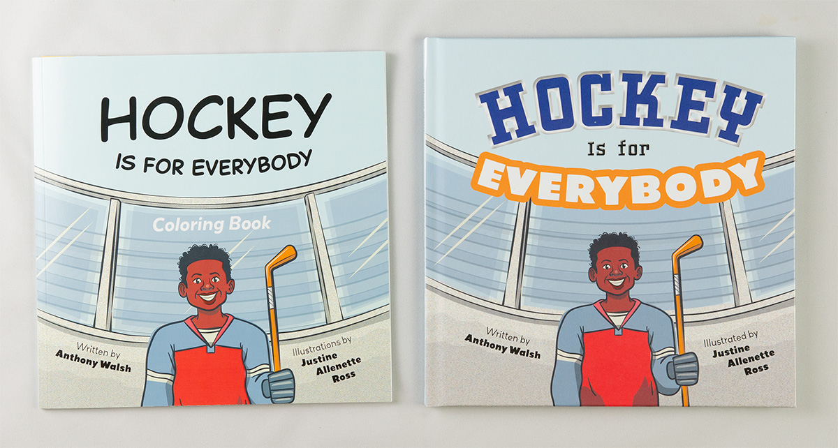
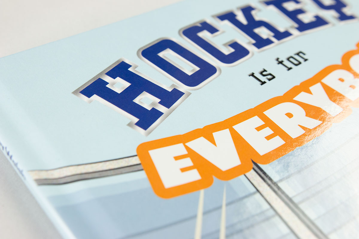
Jazzing it up was great fun! A collegiate/sports font for “Hockey” was used with some border embellishment. And more approachable lettering for “Everybody” with a bubbly orange outline, to contrast with the generally blue covers and tie in with the warmer colors on the title character.
The effect was originally created in InDesign. But I transferred it over to Illustrator to tweak and improve the rendering, before reinserting it into the layout in InDesign.
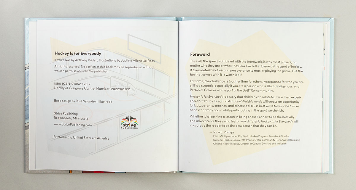
A Note about “Is”
Even if you are a careful editor, the capital “I” in the title may bug you. It drove me nuts. But, yes, per the Chicago Manual of Style, this is the correct title case capitalization. Still, we went back and forth on this several times, whether or not to capitalize the “I.”
The jarring effect is unfortunately accentuated by the fact that “Is for” is the only part of the title expressed in mixed lower case. And that decision was because keeping the title all caps was too strong, too angry.
It is all about balancing. And compromise.
Case Wrap Adaptation
Updating the cover was also an opportunity to reposition and extend the art for the case wrap cover. Technical detail, but a cover image that wraps around a hard cover book needs to extend quite a ways beyond the flat cover. This is to allow for positioning uncertainty, as well as the visible images on the edges and inside cover.
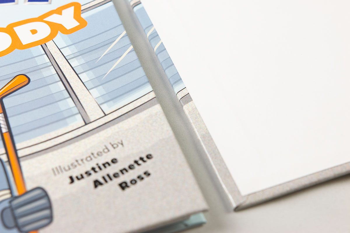
The original specification had been for a softcover book. So none of this “extra” image actually existed in Justine’s art. Fortunately, because it was layered vector art, I could extend the edge art to accommodate.
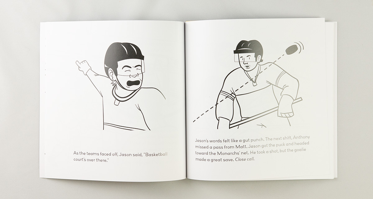
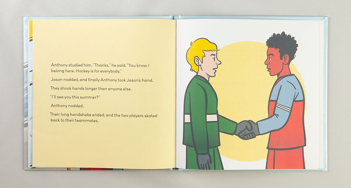
Interior Art
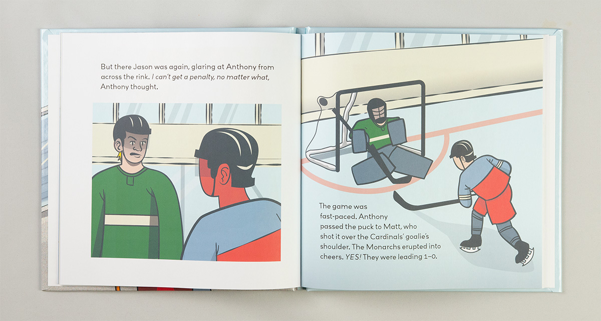
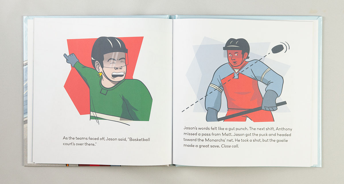
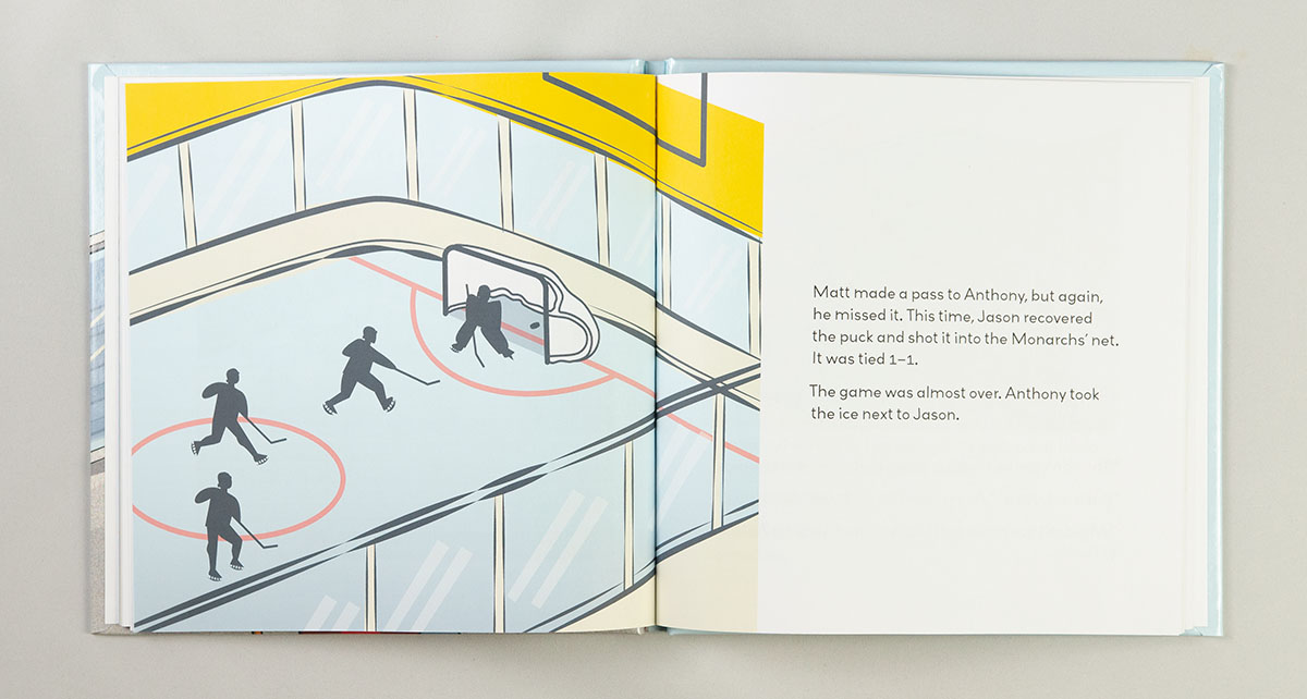
Within a few weeks, we had the final illustrations approved and in hand. Justine was kind enough to provide me with layered vector art. Layered digital files make it easier if I need to tweak the position of things in the illustrations to accommodate the final layout and type.

Publicity
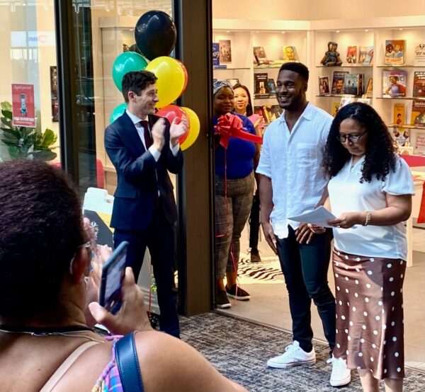
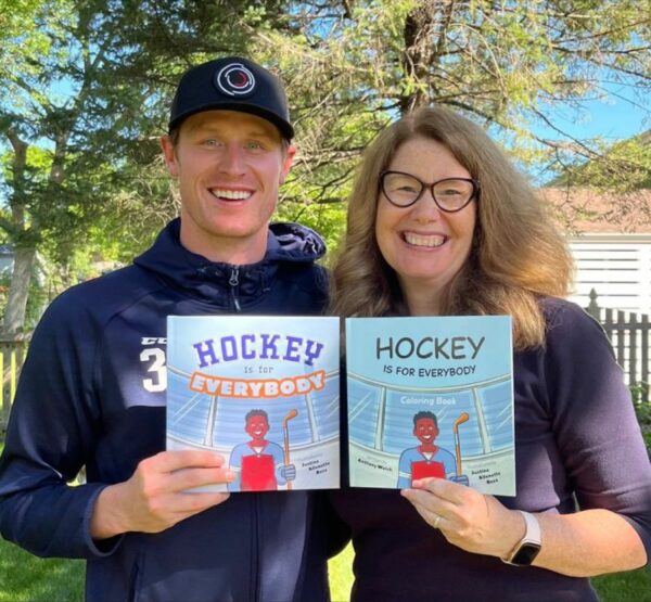
Author Anthony Walsh has ecstatically embraced the idea of face-to-face book promotion. He has been asking reader to post pictures of themselves with his book on social media. He attends book readings and signings at events around town all summer. He is a machine when it comes to promotion, so I hope to see great success for both him and Strive Publishing!