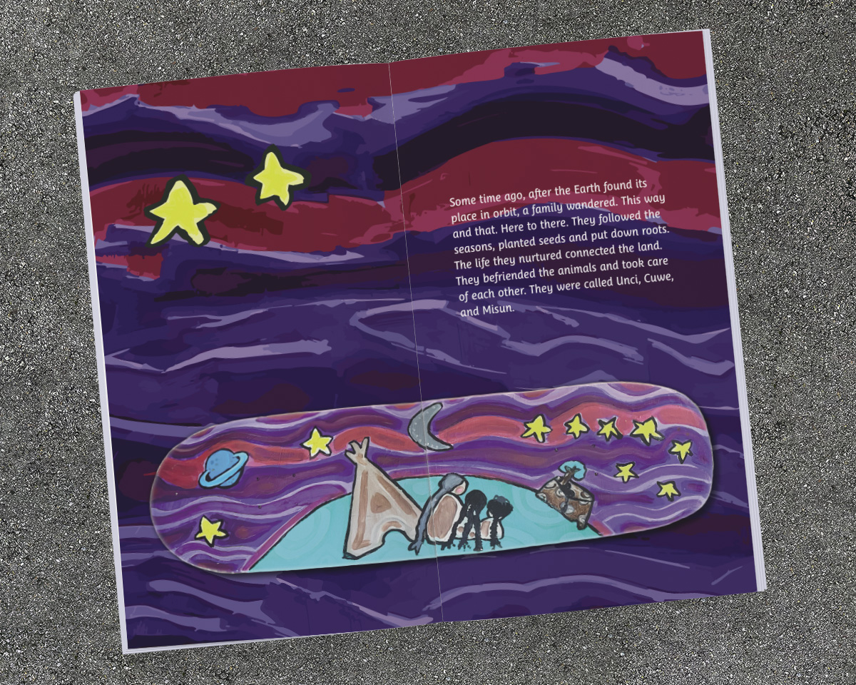
A Picture Book with a Grandmother… and Skateboards?
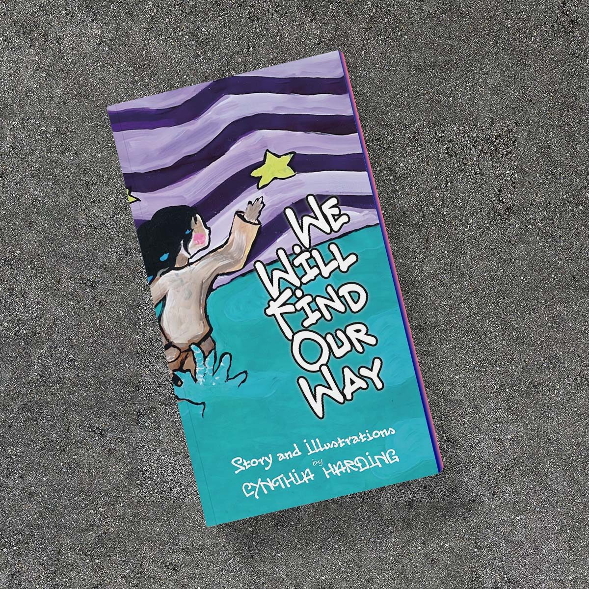
Unusual for this children’s middle-grade picture book project, the especially unique art drove the dimension of the book!
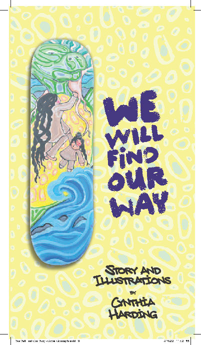
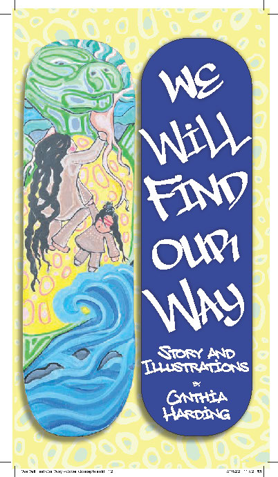
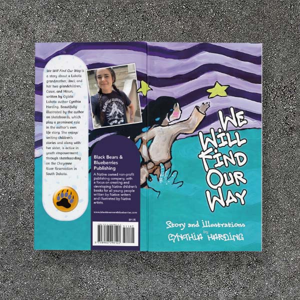
Created by author Cynthia Harding, all illustrations for this book were painted on repurposed skateboard decks. Skateboarding is integral to Cynthia’s world, and the way she eventually found community. So skateboards are her canvas is natural.
However, the approximately 4:1 aspect ratio of a skateboard is not at all natural for a book! (For reference, a typical 6 x 9 trade book has an aspect ratio of 1.5:1.)
This isn’t the first time the art drove a project’s size (see My Mighty Journey for example). But I knew this book was going to be a fun challenge!
Design Challenges
- Accommodate the skateboard art, both vertical and horizontal
- Incorporate middle-grade level text in a way that engages kids
- Prepare for both print-on-demand and production run soft cover
- Repurpose art for front and back covers, title page, and back matter
Choosing the Size
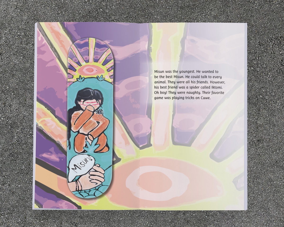
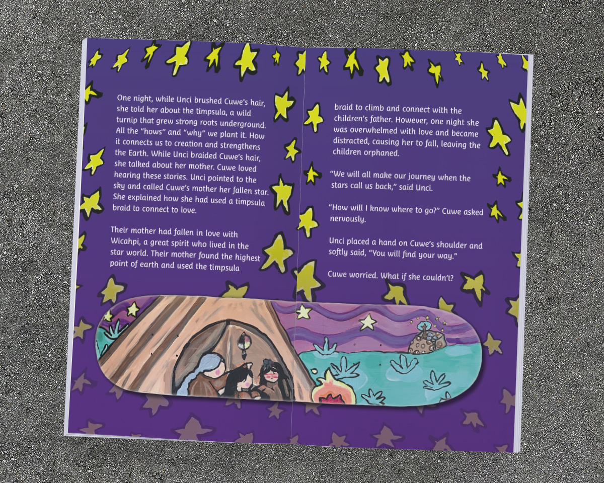
Since the artwork had originally been painted on skateboard decks, I knew right away that the book needed to have a more extreme aspect ratio than was typical. With one exception, each spread had only one skateboard. And most of those were vertical. Although there were also four horizontals to accommodate … so I couldn’t go too extremely wide or tall.
The publisher was pressing for a square 8.5 x 8.5 book, as we’ve done together previously (the Nenaboozhoo Series, for example). This is driven by our experience with a book conversion we had tried earlier, adapting a landscape format book for Amazon KDP’s print-on-demand option—which is limited to a maximum width of 8.5 inches. The first attempt at 6-2/3 x 8-1/2 didn’t sell as well as they hoped, and we ended up rebuilding the book with an 8.5 inch square page. Rightly, they were not interested to repeat that experience.
But I knew a vertical book was going to work better for this art. And for a given size, vertical formats already appear larger than their horizontal counterparts. So I pushed for a page size that was about twice as high as it was wide (2:1, or square when looking at the open spread of a book). After discussing mockups of 5 x 9, 5.5 x 10, and 6 x 11 (the maximum height POD can handle), we settled on the middle size of 5.5 x 10.
Extracting and Repurposing the Art
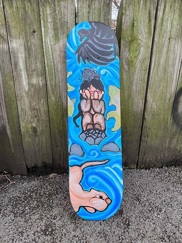
Cynthia did a great job photographing her art: good lighting, no glare, very little distortion. But I still had to isolate the skateboards from their photographed surroundings. Photoshop to the rescue. For visual books, I actually spend quite a bit of time in Photoshop to clean up and retouch photos of art, remove backgrounds, and generally make images print-ready.
In this case, I had to isolate the skateboard, clean up any edge problems and correct for a slight distortion.
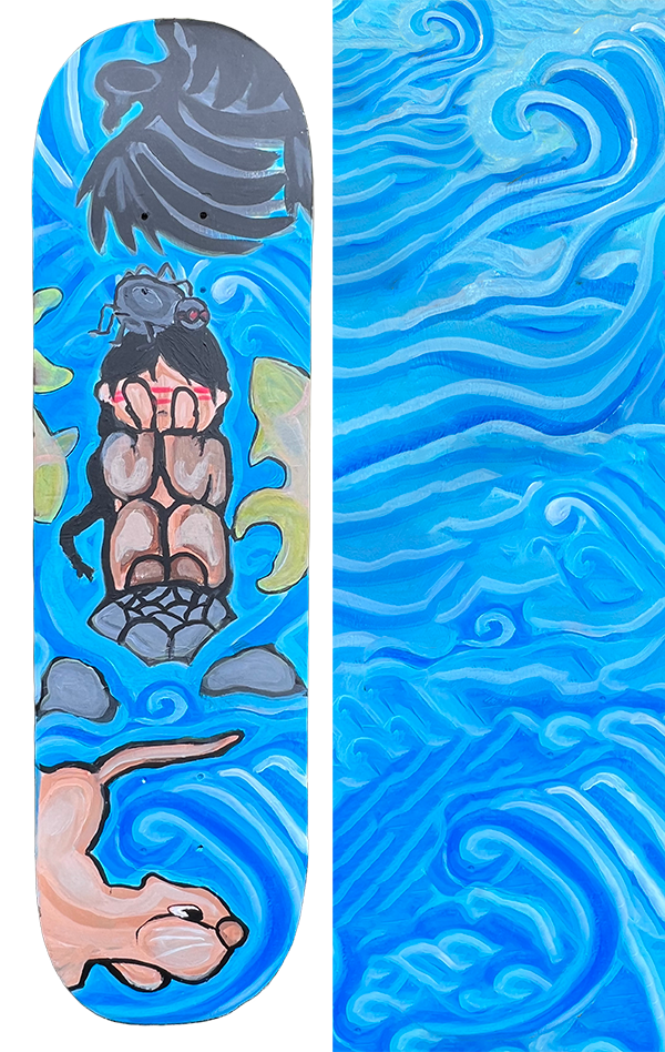
There was just so much color in Cynthia’s work, I hated to just place the boards on a plain background. So, for several of the images, I also manipulated the image to create a new background texture element, something which is based on her art, but sufficiently simplified so as to complement, not compete, with the original.
These texture elements wold be used as backgrounds to her images, to the text, and for other parts of the book. In the end, I created six new background textures, four new digital patterns, plus the cover art—essentially creating a custom toolkit for flooding the book with color and art, all based on, and honoring, the original fourteen illustrations.
CMYK Conversions
The other stumbling block was converting the vivid colors from the photographs of the art into something close, but which could be reproduced in conventional CMYK printing. Although not as critical as the color reproductions in an art book (such as Sam Zimmerman’s Following My Spirit Home), I still try to do my best.
In this case, however, Cynthia used a number of colors that were simply out of gamut, and unreproducible in CMYK printing. Vivid blues are especially tough.
So in many cases, I hand tuned the CMYK conversion to make the printed colors as vivid as possible, favoring the energy of the images over strict color accuracy. Hand of the designer, it is something that can only be handled on a case-by-case basis.
Cover & Title Page
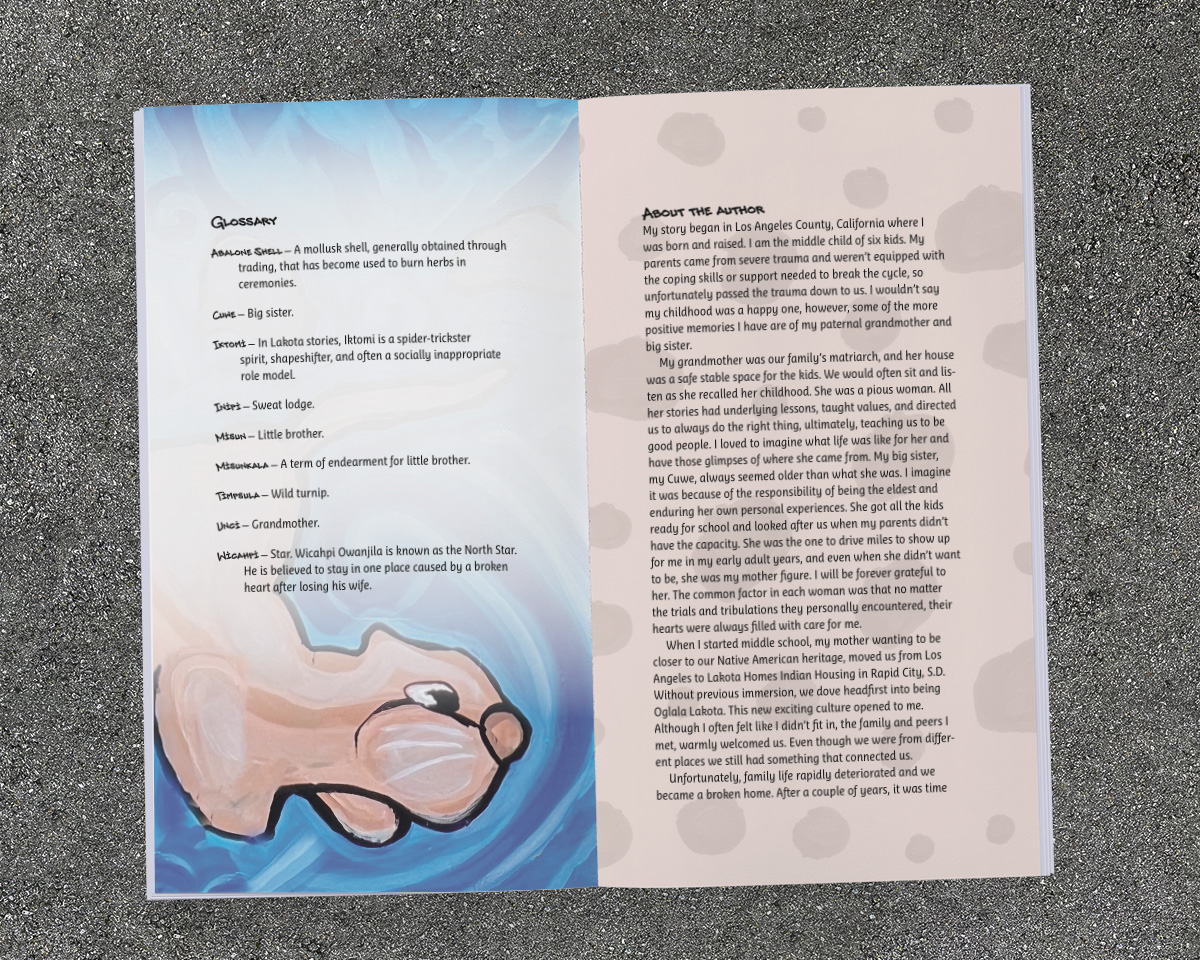
While Cynthia provided the illustrations to accompany the story’s thirteen pages, I didn’t have art for the cover. Or the title page, glossary, artist statement, and colophon in the back of the book. These would also depend on some creative extensions of the original art.
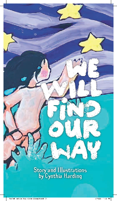
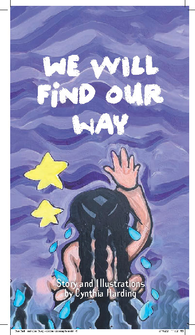
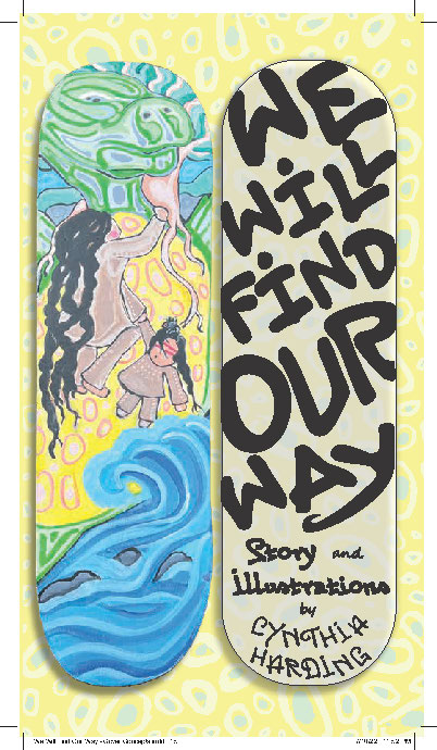
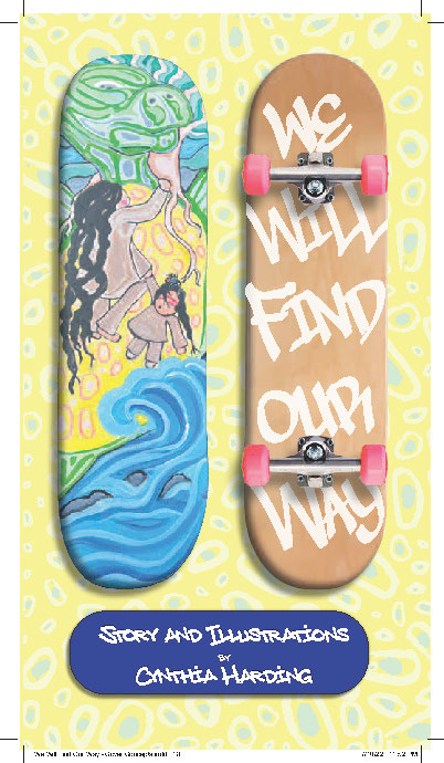
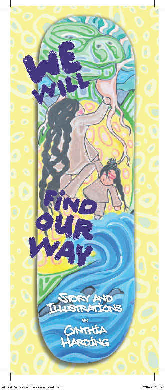
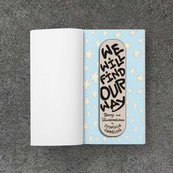
After a quick discussion—publisher, author/artist, and designer—we settled on the preferred image to use on the front cover, with the suggestion of incorporating the graffiti text. This was a good image to use, because it offered the ability to wrap the image around and create the back cover. And, as a bonus, I repurposed one of the unused cover concepts for the title page.
Typography & Interior
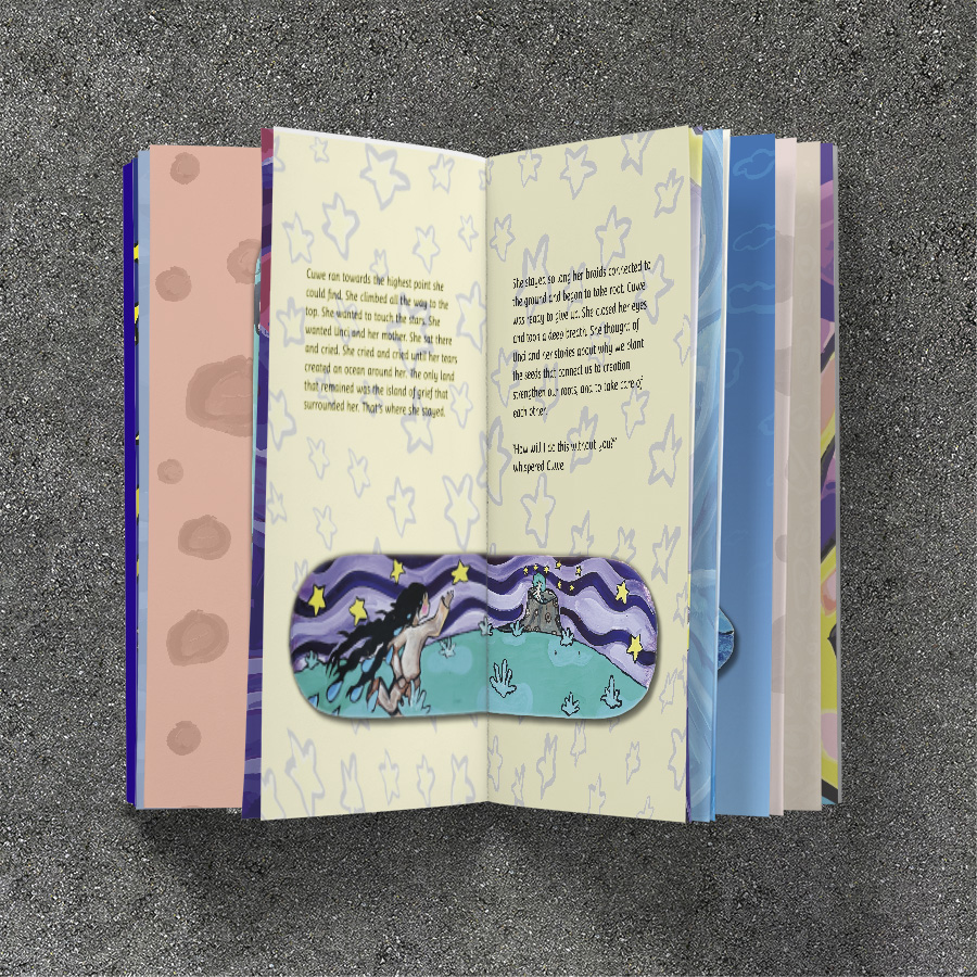
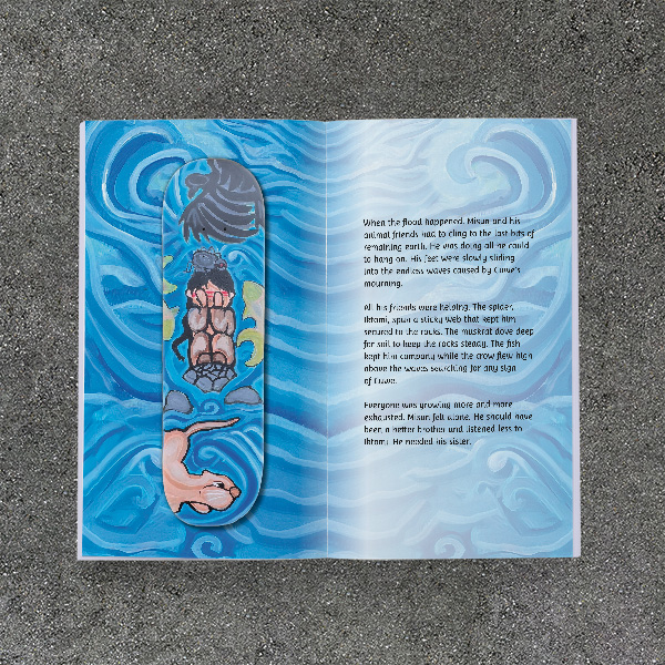
As a middle-grade picture book, the type needs to be clean and readable, above all else. I chose the Ayita typeface, set in 14 pt. for the story text, and 11 pt. for the back matter.
I like to integrate the text into the images as much as possible. This needed to be a book full of color and energy. While the main illustrations would always be set apart from the text, building matching background textures allowed everything to visually tie together—and make each page turn a new surprise!