Preserving the Traditional Stories for Generations
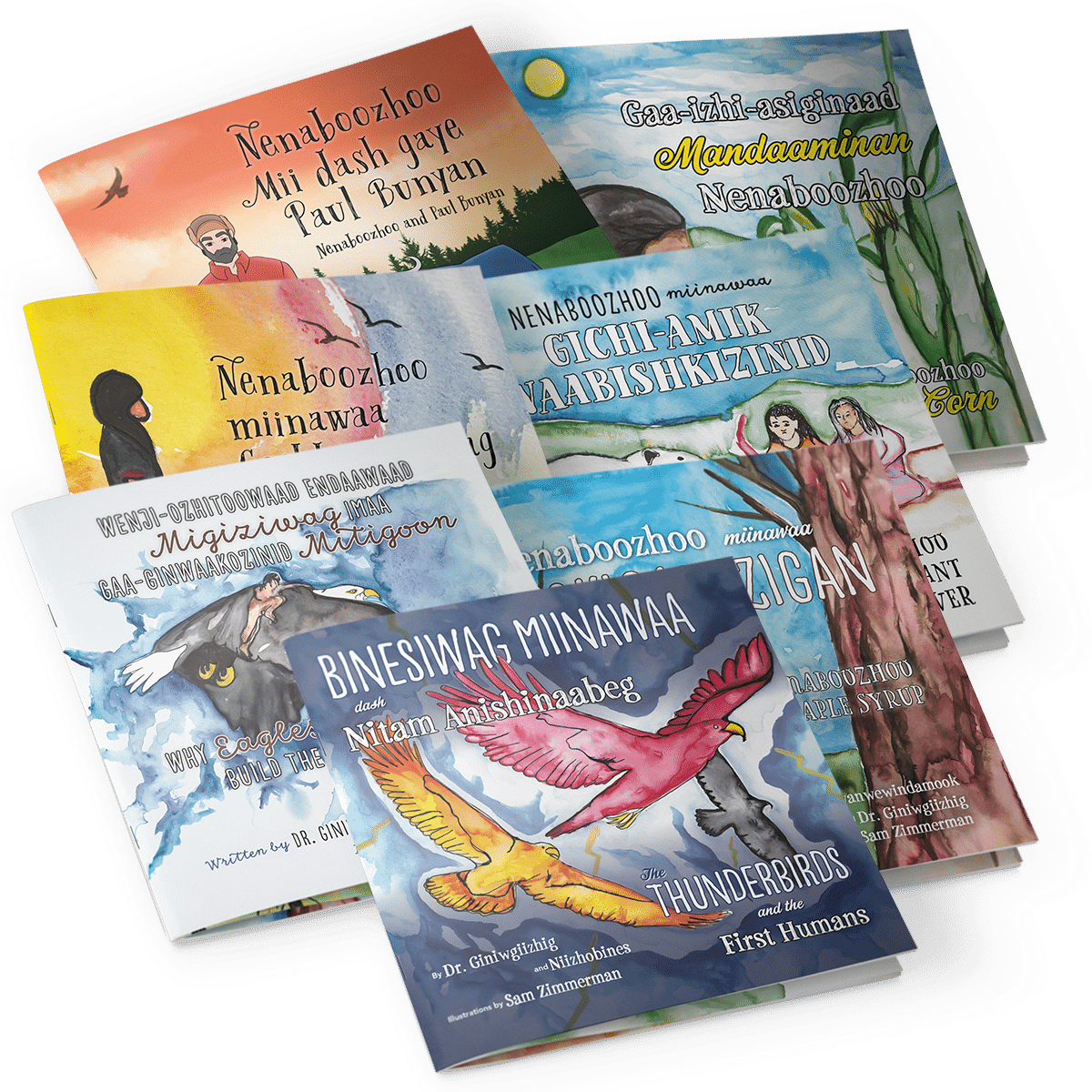
Preservation of the stories is the goal of author and Red Lake School District administrator Giniwgiizhig in creating this series of Ojibwemowin children’s books. Thirteen in total, I had the honor of working again with the folks of Black Bears & Blueberries Publishing to create seven of these bilingual Ojibwemowin-English books, incorporating the work of three different native illustrators. It was an exciting challenge to work on so many books simultaneously, making each book distinct, melding the typography to the illustrations.
Project Brief
The collection is a series of original stories from the Minnesota Red Lake School District #38 Indian Education Curriculum Project.
The series of children’s books would all be fully illustrated, prepared for a soft cover printing. The books would have an initial print run with JS Print Group (the publisher’s preferred printer), with the intention of uploading for print-on-demand with Amazon’s KDP print service when back listed and to aid in widespread distribution.
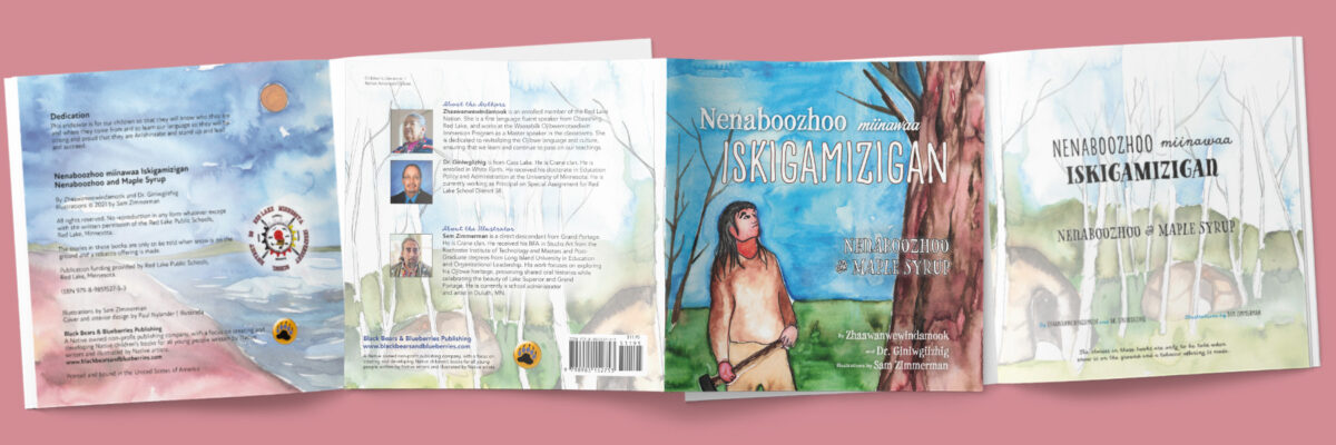
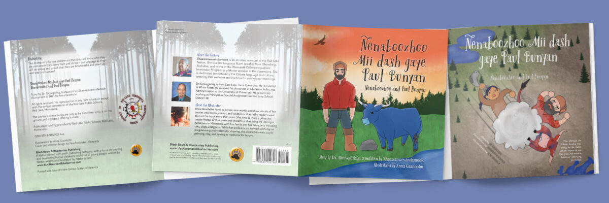
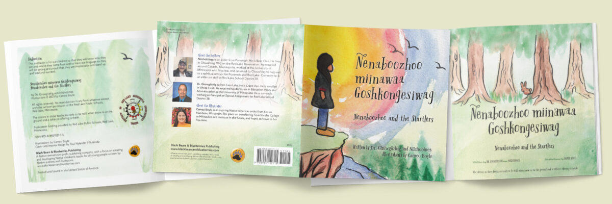
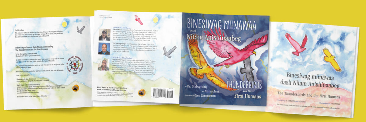
To meet print specs in both versions, we again decided on a square 8.5 x 8.5 inch format as done with previous books with Black Bears & Blueberries—8.5 inches being the widest width that KDP can accommodate.
Illustrations for the seven books I was working on would be from three different illustrators. Two worked in small format watercolor for this project, so I would also be handling the original art and scanning each illustration. The third artist worked digitally, using the Procreate drawing application, and so was able to send me layered Photoshop PSD files to work with.
While each book would be distinct, there were some common elements to the series—publisher information, and cultural notices in particular would appear the same in each book. As with any series, I wanted the books to feel distinct, but also seem like they were part of a set.
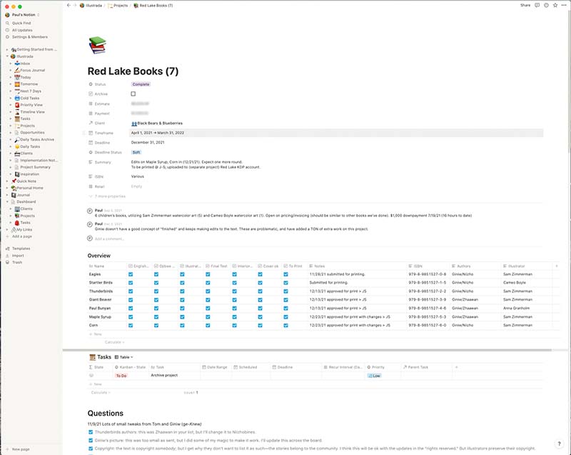
We were waiting on the text and translations to be completed, as well as the illustrations, so there was not a definite time frame for the project. But I knew I was looking at something that would be spread over several months. Keeping track of all the various moving pieces of this, and other projects I was working on in parallel, would require me to up my game in terms of project management. I ended up implementing a new tracking system in Notion which really saved my sanity.
Working With the Art
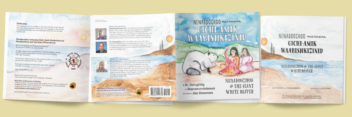
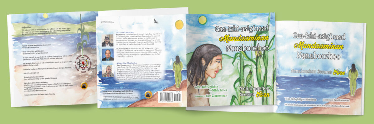
Several of the books had specific front over art created. For the others, I repurposed art from the interior for the cover. But in every case, I needed to come up with art for the title page, colophon (back page copyright), and the back cover. These three areas are commonly overlooked in specifying illustration requirements—understandably, as they are each more about the text. But I feel it is still importantly to visually integrate these pages into the rest of the book wherever possible, instead of just using some sort of solid color fill or other visual crutch.
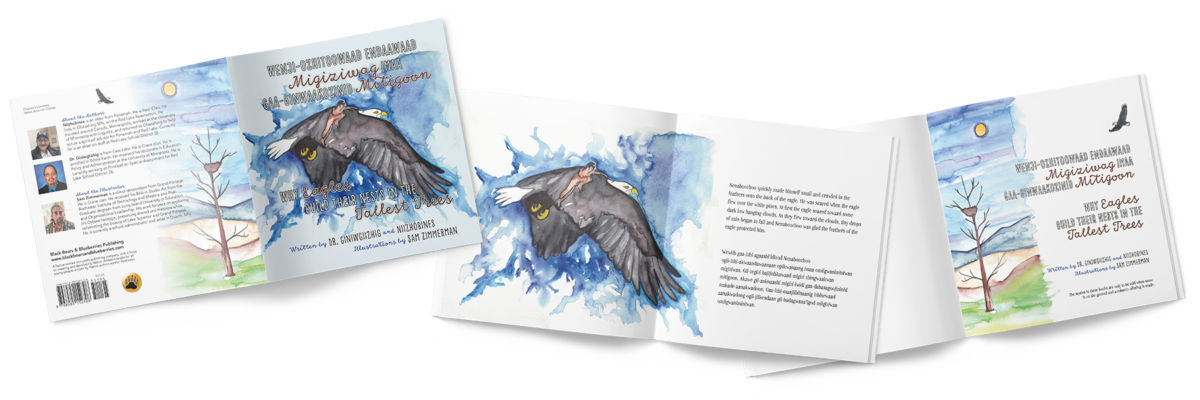
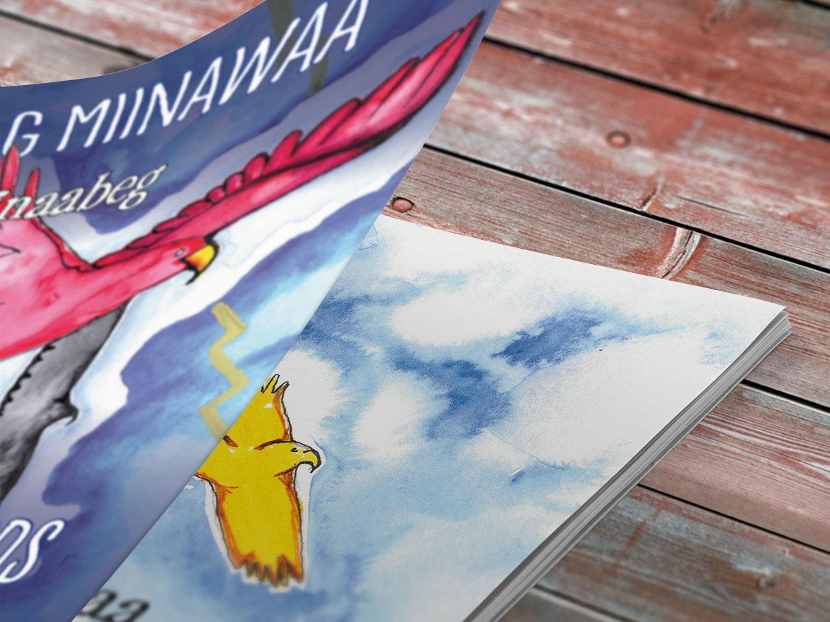
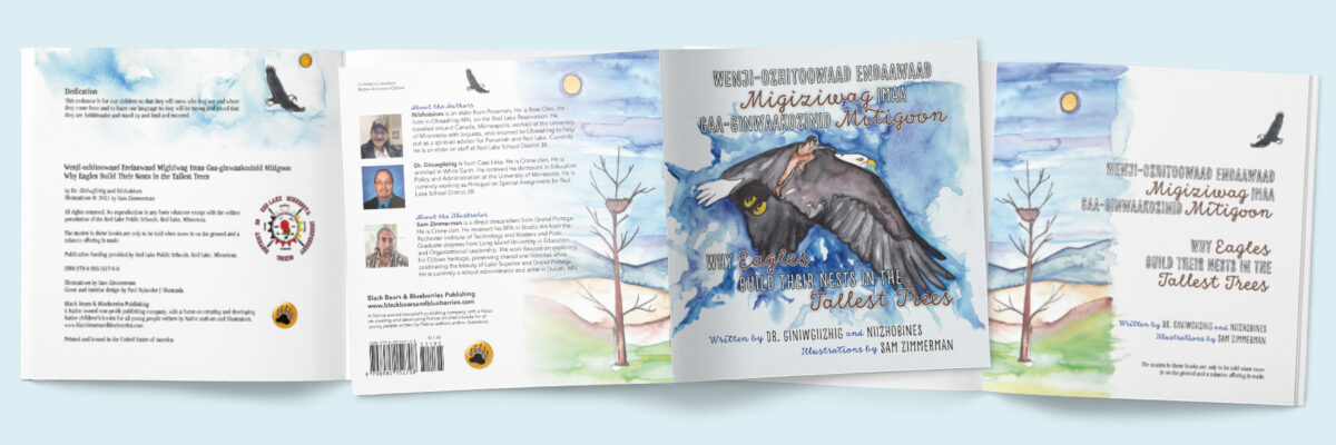
Digital manipulation of even the scanned painted art is quite common—see how the sun moved (an image flip) and the small eagle was placed differently in the back cover version and the title page version of Why Eagles Build Their Nests in the Tallest Trees?
It takes time, and a careful hand, but when done right can be used to great effect to enhance and better integrate the imagery and type. In several cases I was able to extract small elements from the original art—a bird or some other visual element—and repurpose it as a visual accent elsewhere in the book. This honors the illustrator’s work, while also providing visual balance and excitement.
Two Steps Forward …
Iteration is the word I would use to characterize this project. For each book, I started with a manuscript in English, and usually with an initial translation into Ojibwemowin. This set the pacing for each of the books. As illustrations were completed, I was able to start building the interior layouts.
In several places, I ended up breaking the text differently than was originally planned. In two instances, I even added a pair of pages. This was done to keep an appropriate visual balance on the pages, and avoid the problem of text over-crowding.
In creating a children’s picture book, I like to integrate the text into the images as much as possible. While the issue of space available for the text can be a challenge in any children’s book, it is doubly so in a bilingual book. And even more so if one of the languages is Obijwemowin—a very descriptive language that, owing to the double-vowel structure for the written language, tends to appear much longer in type than the English equivalent. Not always the case, but more often than not.
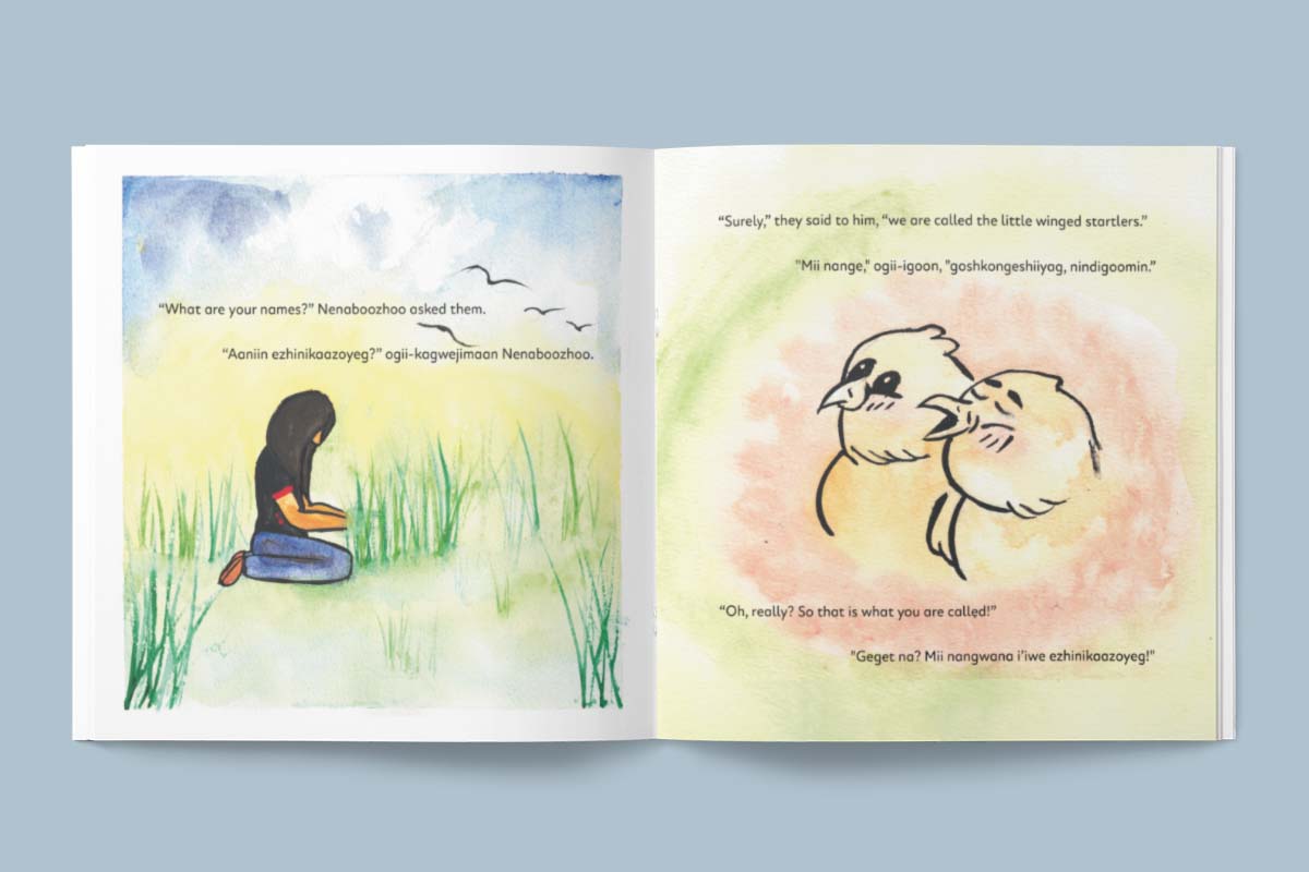
Because the language is more interpretive and descriptive than English, I have also found there to be many more rounds of edits to the Ojibwemowin. This can be tricky—changing words, or even punctuation, can alter how the text flows on a page. But by and large in this project the text had a page of its own, and so the edits were all easily accommodated.
Elements Common to All Books
The elements that were basically the same in all the books—the back page colophon (copyright notice), and the title page—were actually where I was able to have the most fun with the illustrations. None of the illustrators were tasked with creating art for these pages, so I put my digital collage skills to work. Between these, and constructing the front and back covers, I could really have some fun with the art!
Reflections
The work that goes into creating these seven books—totaling 216 pages with 117 distinct illustrations, not counting the seven covers and seven back covers—is daunting. Good thing we just dove in and didn’t dwell on the entire scope!
There were a lot of moving parts. In part because of this project, I began to develop my own project management and tracking system, based on the Notion platform. This was an invaluable tool for keeping track of notes and project decisions, as well as the status of each of the books in its various stages of edits, design, review, and production.
While I will always be an advocate for advanced planning, sometimes it helps not to overthink the challenge ahead. Especially when working with good, committed folks who share the goal of creating memorable books!