A Book from the Reader’s Imagination
Mary McKay had an idea for an unusual book, and she needed help turning her vision into reality. Inspired by a sketchbook she found at local art supplies store Wet Paint, she wanted to create write-in book with inspirational ideas that a child would illustrate and complete themselves. But something special enough that it would become a lifetime keepsake.
“Paul is inspired to do this work. He ‘cherished’ my work but kept a very level head when I was heading to la la land. This part of Paul is priceless.”
Mary McKay, Author/Publisher
Project Brief
Mary’s professional work was as an ESL teacher for young adults. She knew firsthand the struggles kids and young adults could have. Her goal was to create something that helps young people to see that they have a story to tell, and to feel confident in telling their own truths.
Mary did her homework, and came to me with a clear view of how this book should work, and several aesthetic ideas for incorporating her Welsh heritage. What she didn’t know was how to turn it into reality.
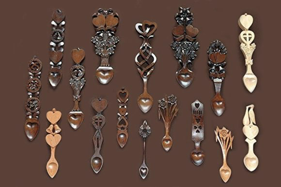
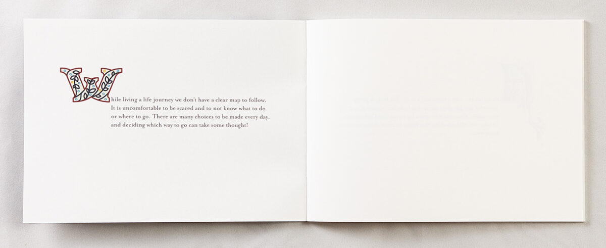
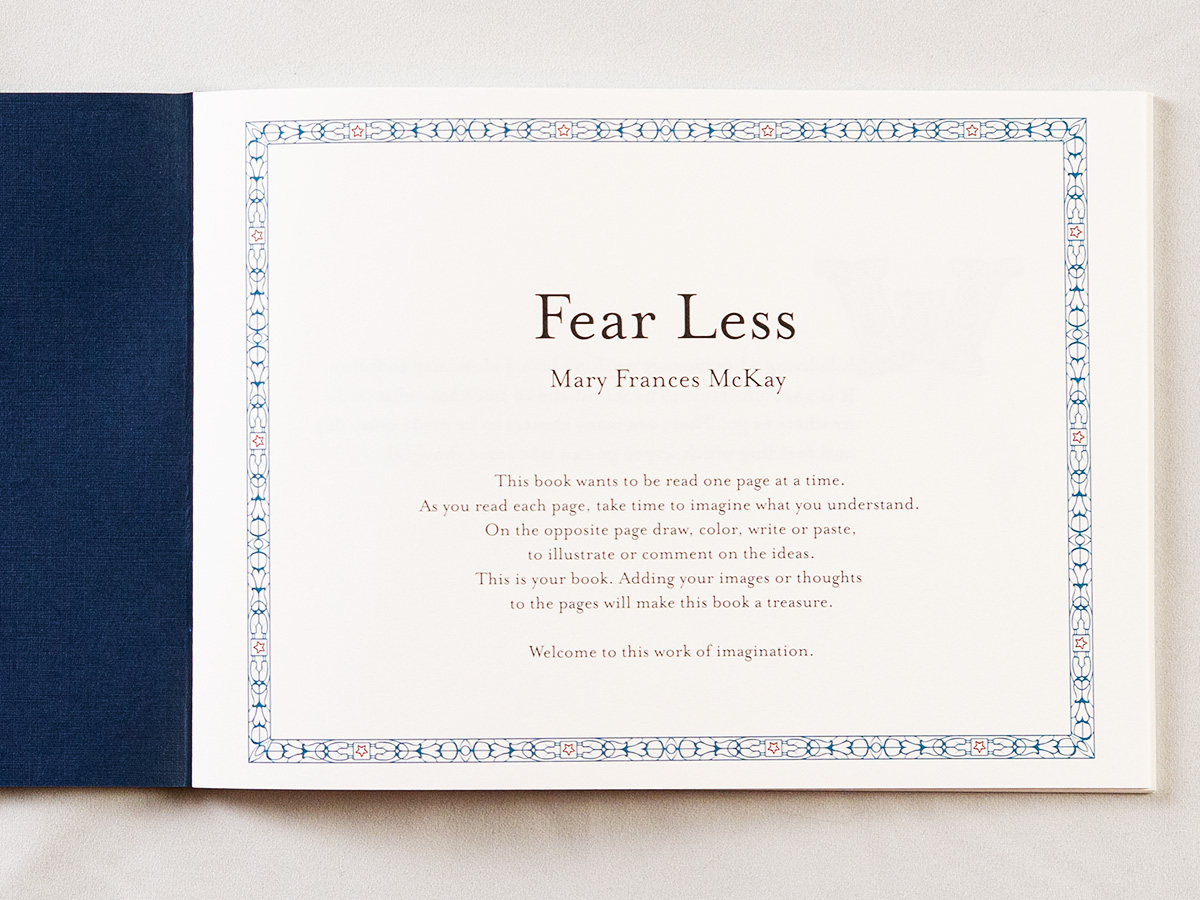
The flow of the book would be simple: text on the left hand page, with a completely blank right hand page for the reader to add their own thoughts, colors, or images. She imagined some way for incorporating a sort of simple geometry adornment of the text, inspired by Welsh love spoons (geometrically simpler than the ornamental Celtic designs). And she wanted to include colorful “illuminated” initial capital letters (“drop caps”) for each page.
It was important that the book maintain a balance of playfulness and elegance. The pages should inspire the reader, but not dictate what they should add to make the book their own.
The initial production run plan was for a mere 50 copies (we ended up increasing that to 100), which she intended to give away. A passion project if I’ve ever seen one!
“Illuminated” Initial Capitals … on every page
The balance of conceptual work of a book’s design usually weighs heavily toward the cover. For novels, memoirs, and other text-dominant books this is certainly the case. The cover’s design tends to dictate the aesthetic for the interior. Children’s picture books, on the other hand, are the other way around: the cover is only more work than any other page because its importance tends to favor more rounds of review and revision.
In Fear Less, this balance was more like a children’s book, because of the unique ornamental nature of the interior pages. The cover is no less important, but its design tends to be dictated by the dominance of the interior’s aesthetic. So the cover and the interior were developed in parallel.
I began by researching illuminated initial capitals. The monochrome entries that my friend Marsha Micek had worked to painstakingly catalog from the Maywald Collection was a great starting point (a great article by Stephen Heller on the recutting of a sample of these letters). But color was to be very important to this book, so research in hand, I began pouring over stock illuminated letter illustrations.
Or initial concept was to have a different letter style, with a different color palette on every page. That proved to be too chaotic. So instead we settled on one color scheme, and a handful of different libraries. None of the stylized letters are repeated in the book, although styles certainly are.


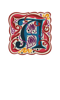
I decided to pair this with the somewhat funky font Mrs. Eaves. Based on the clean eponymous font by John Baskerville, Mrs. Eaves is Emigre’s Zuzano Licko’s attempt at a revival. (Mrs. Eaves is named for Sarah Eaves, Baskerville’s live-in housekeeper and later wife). I’ve always enjoyed the Mrs. Eaves font, but it is a typeface that needs to be taken in moderation—perfect for this sort of design.
Cover Development
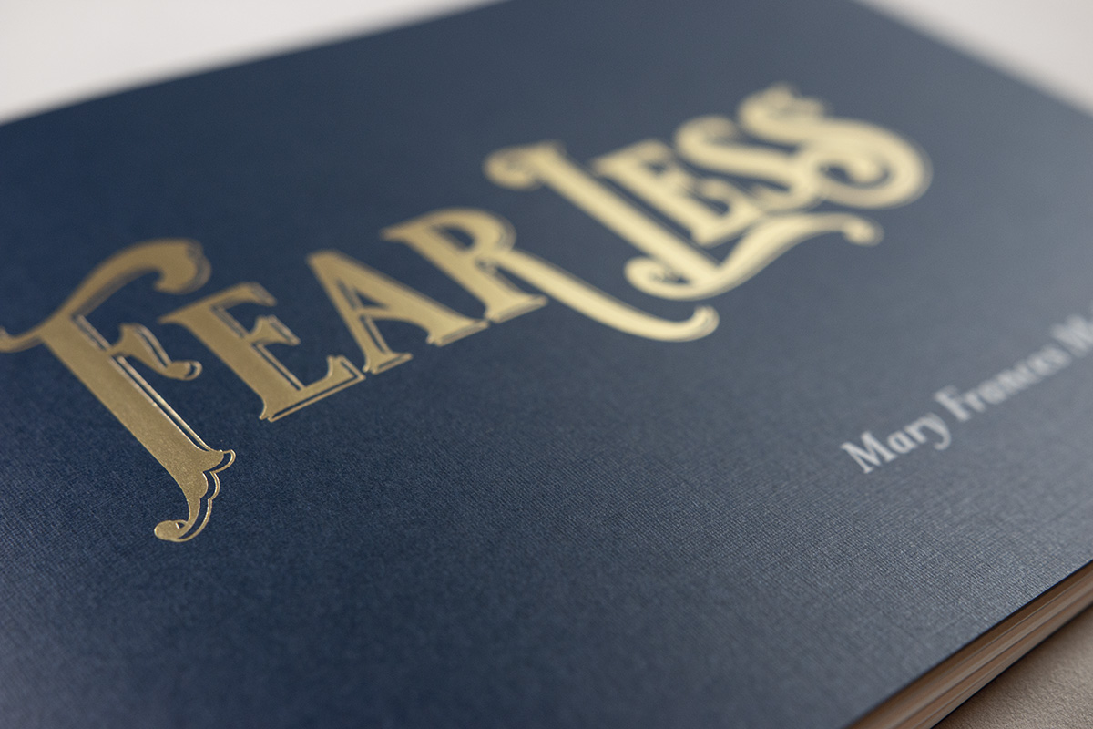
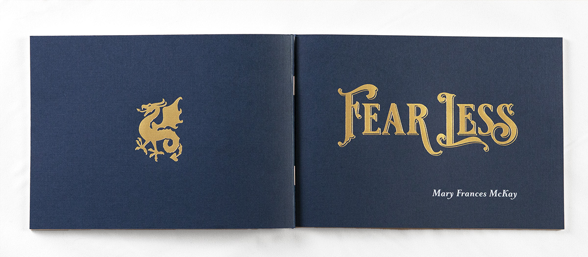
The initial caps set an aesthetic for reserved but very present ornamentation. The cover needed to continue this. But instead of repeating the initial cap idea, I opted for a full script cover … debossed in gold foil on a dark blue field. The typeface Royal Signage by Tobias Saul, distributed by Heritage Type, served as a solid basis.
In early tests, Mary quickly discovered she preferred the title Fear Less to her initial thought of Fearless, as its instructive nature seemed fitting to the nature of the book. The playful nature, however, and ambiguity between “fear less” and ”fearless,” were certainly not lost on us, either.
After modifying the base letterforms to better suit a prominent title, a couple of iterations quickly brought us to the straight baseline version of the final design. Mary insisted that the words not touch, to make sure this distinction was always clear, although I hedged this a bit by playing with the “r” of “fear” and letting it swoop under the scripted “L” of “Less.” I used a thin shadow line to give the type added depth.
To finish off the front cover, I opted to have Mary’s name printed in white—one of the great advantages of working with Smart Set and their 5-color digital press. More on that in a minute.
The back cover presented us with a perfect opportunity to bring another visual element into play. The icon for Wales, and certainly its sport teams, is the Welsh Dragon. While not wanting to use that dragon directly, we both really liked the idea of a medieval dragon. Again drawing on stock illustrations as the starting point, I modified and adapted the illustration to create the final version, again suitable for foil debossing in the same matte gold as the front cover.
The cover material was chosen from a selection of open stock options from local paper supplier Anchor Paper. From a handful of options that fit the bill, Mary opted for the Neenah Classic Linen 80T in Patriot Blue. The subtle linen texture works great with the foil stamping to provide just the right amount of texture to help showcase the gold.
Framing the Instructions
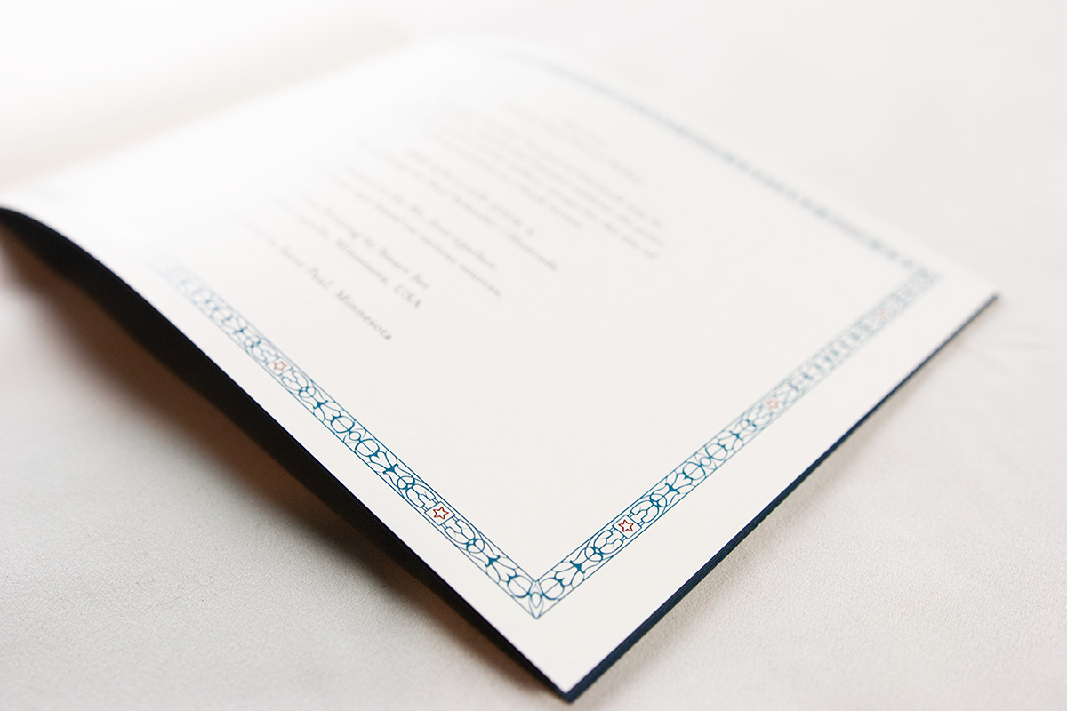
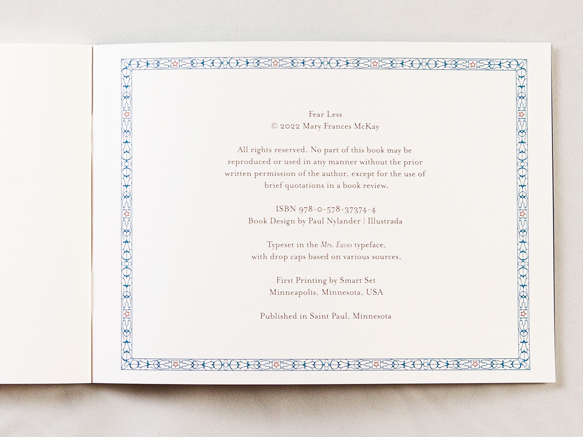
The two remaining pieces of the puzzle came together nicely. First, we needed some sort of instruction for how to use this book. Originally Mary didn’t want this to appear in the book itself, fearful that it would interrupt the beauty of the reader/writer’s own work. So we were planning a separate card to insert into the book.
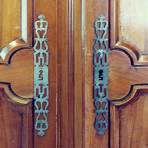
To make the card distinctive, I created an interwoven border patterns, based on the door handles that Mary had originally suggested as an inspiration for the book’s aesthetic.
In the end, we opted to incorporate this border pattern and the instructions directly into the book on the title page. Then, because I liked it so much, I also used it for the colophon page—now the border frame could serve as bookends to the interior of the book.
Production
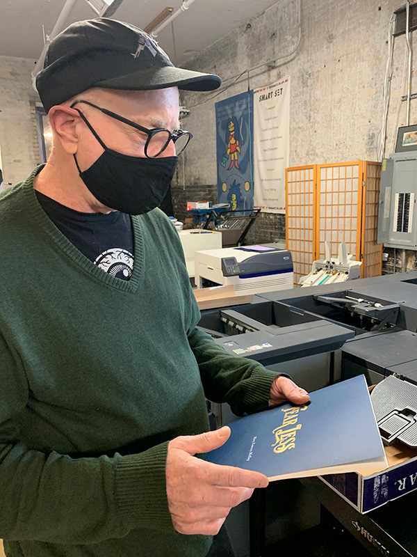
Just as the authors, artists, businesses, and publisher rely on me as the book designer to turn their concepts into reality, I, too, rely on the work on printers to turn my ideas into physical objects. I love working with different printers, learning about their specialized equipment, discovering their individual strengths.
In the case of Fear Less, I knew I was going to need someone extra special. The reason is the unfortunate economics of very short run books: the work required to create 50 or even 100 books is dominated by the set up: for printing the covers in white on one machine, then foil stamping the front and back on another; for color printing the interior; and then for merging the two together in an odd size.
I turned to Kevin Brown and Molly Ruoho at Smart Set, a certified B-Corp printer in Northeast Minneapolis. While this is neither the biggest nor the smallest job Smart Set has handled, nor the most complex, I knew their hands-on approach to work would benefit this particular project.
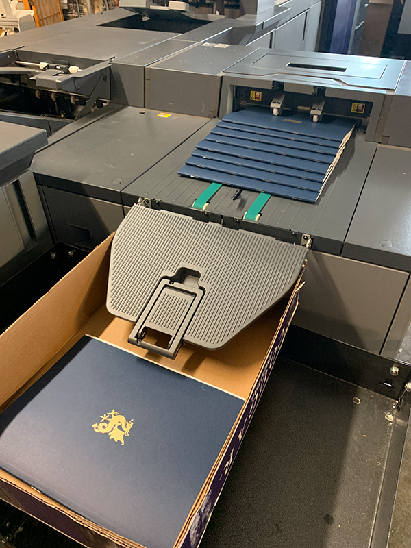
With Kevin’s help, we were able to splurge a bit with the elements like the gold foil and white printing, while saving by using a simple saddle-stitch square-fold binding. It ended up being most economical to print the books oversize and trim them down… unfortunately waste is part of the game. At least I can trust that Smart Set will definitely recycle the scraps.
Field Testing
In marketing, we talk about “target audience.” And as a designer, I spent a lot of time wondering just how a book, its cover and layout, will connect with readers.
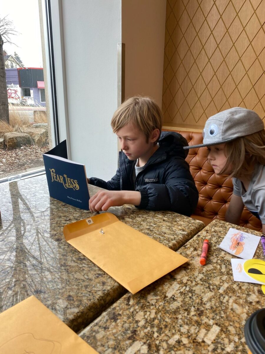
But at the end of the day, it comes down to how does each reader connect with the book. Mary was eager to test this out with Ben, a creative 9-year old who was in part the inspiration for the project. A fancy book that he is supposed to write in? At first, he didn’t quite know what is expected.
As his mother explained it to Mary, she told her son, “It’s like in [The Lion, The Witch, and The Wardrobe, when in] Narnia, Aslan gave the children gifts. They did not understand at first,” but had to learn how to use their treasures. As Mary explained it to me, “that again was the call to grace of this whole project.”
Other feedback Mary received only further reinforced the validity of her concept and our execution of this unique book: “I just want to keep touching it. Those decorative letters are sensational.”