A Special Commemorative Anthology
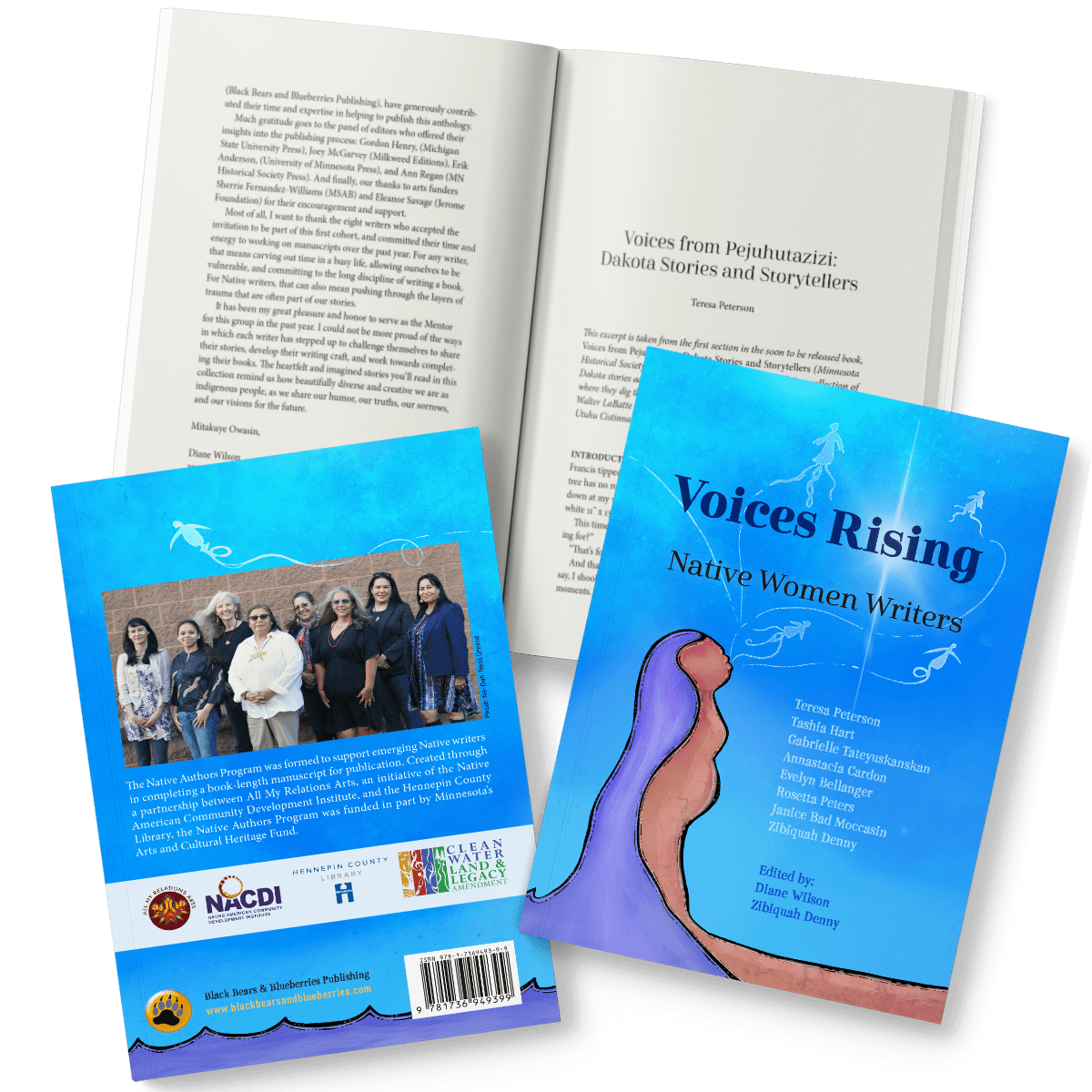
When Black Bears & Blueberries Publishing approached me to work with illustrator Tashia Hart to design an anthology of Native women writers organized by Diane Wilson, I jumped at the chance! Honoring the work of this power group of writers in the first Native Authors Program with a beautiful book was an absolute pleasure of a project.
Project Brief
This limited edition book was created to both honor and acknowledge the completion of the first Native Authors Program as part of All My Relations Arts. To quote program mentor Diane Wilson‘s introduction, “The program was a response to the underrepresentation of Native authors and books in publishing as well as in literary grants and awards. The Native Authors Program was formed to support emerging Native writers in completing a book-length manuscript for publication.”
As Thomas Peacock of Black Bears & Blueberries Publishing explained to me, they were tasked with a 80–100 page 6 x 9 book soft cover (perfect bound) book, black & white interior and 9 author/editor photos. They hoped to tap artist and one of the authors, Tashia Hart, for the cover art, if she was available. The book will be a single 1,000 piece run, printed locally (ultimately with Bookmobile), to be given away at events.
One of the great things about working with this publisher is that they give clear guidance on what they need, and then trust me to take the idea and create a beautiful product.
Cover Development
I love working with illustrators to create covers. And I especially love it when I can coordinate with them before they create their art. This allows me to guide them as to the space available and any typographic plans I have.
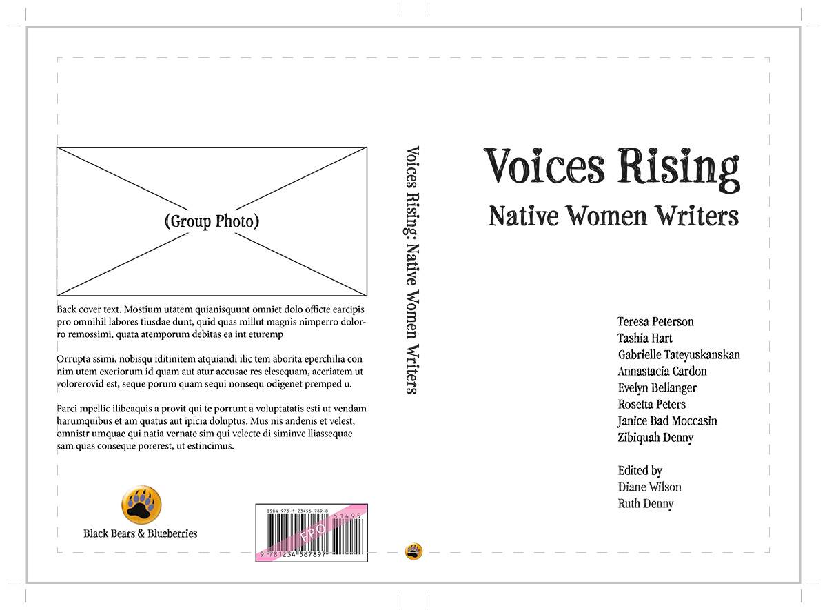
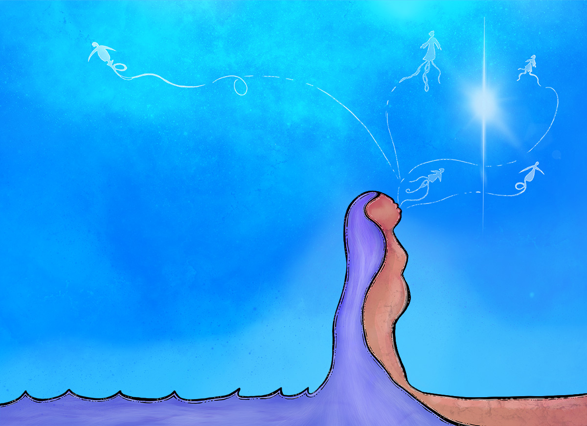
To complement Tashia’s art, I decided to use Stanyan typeface by Richard Kegler, founder and lead designer of P22 Type Foundry on the cover for the list of authors and editors. It’s a hand-drawn serif typeface that is a fun balance of formal and informal, which complemented Cabrito, the titling typeface I used in both the interior and cover.
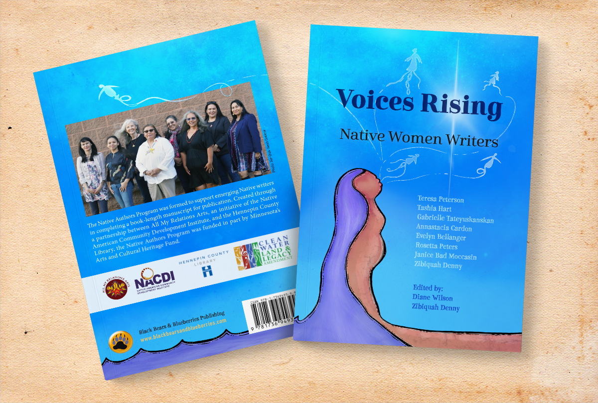
Layout & Typesetting
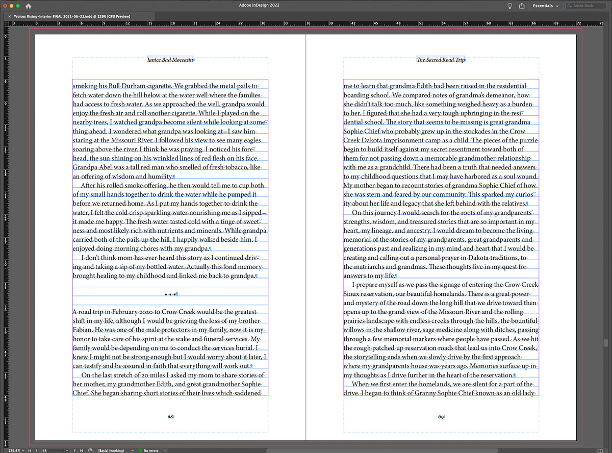
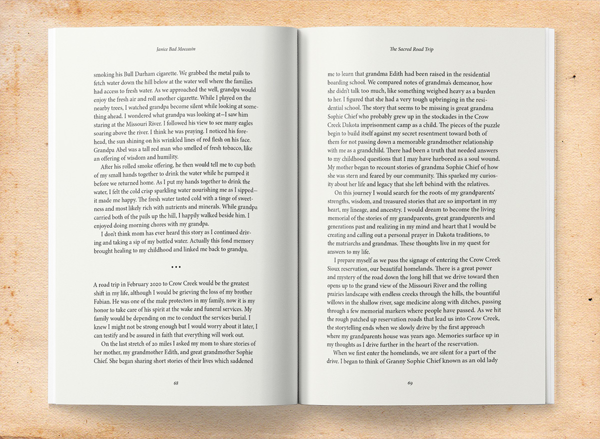
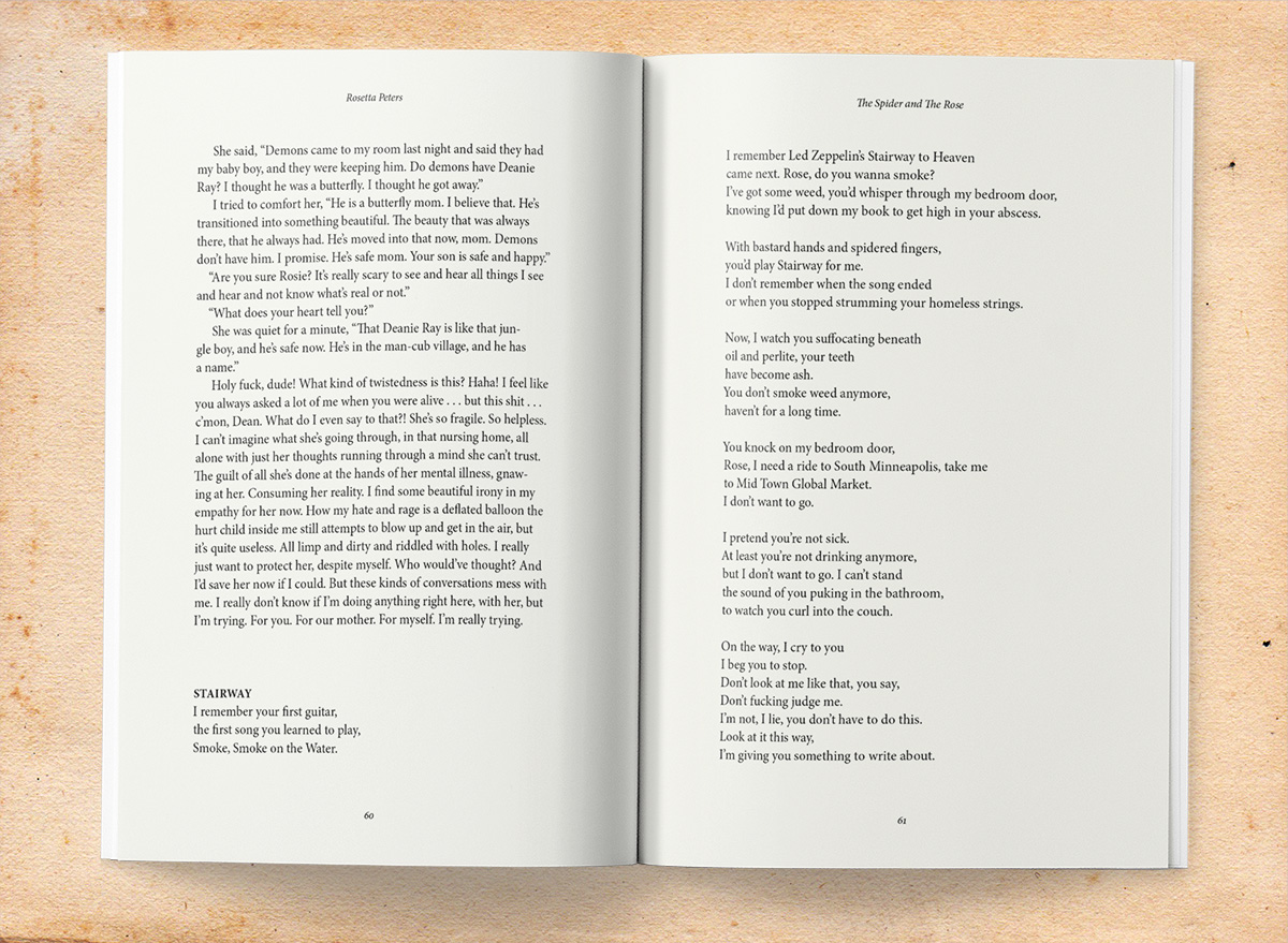
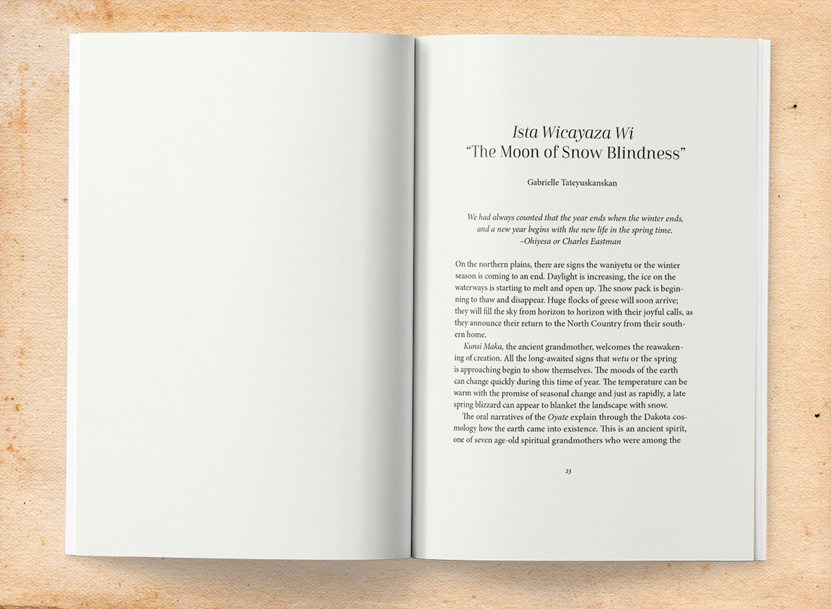
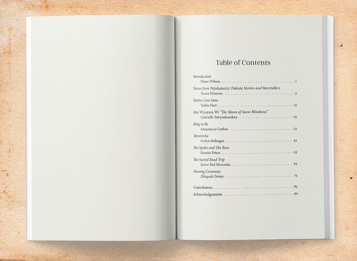
As a collection of prose, poetry and short narratives, but no images aside of the author photos, layout is fairly straightforward. Design includes the chapter opener and body text pages, and styles for each chapter’s introductory summary and poetry. Front matter includes half-title and title pages, copyright, dedication, and a table of contents. Back matter includes the authors section and a larger than normal acknowledgments section, owing to the various granting and coordinating organizations involved with the group.
I chose to keep a fairly traditional layout for the 6 x 9 page, based on a 35-line text block set in Minion Pro, a typeface by Adobe’s Robert Slimbach. Running headers of author and title for the included work in Minion’s eminently clean italic. As usual, I utilized a baseline grid to ensure front-to-back alignment of text lines for a very clean result.
Because the book is “only” text, the typeface choice plays a larger role in it’s visual spirit. With the body in the traditional Minion, I wanted to complement them with a little flair. Chapter titles were set centered in the elegant and modern Cabrito, designed by Jeremy Dooley from Insigne Design. The result is clean, fresh, and eminently readable with just a touch of attitude.

