Photobook: Beauty in Plain Sight
Contemporary photographer David PZ Wong features a chronological display of his work in the two-volume set, Beauty in Plain Sight. The first volume features stunning black & white images taken on various film cameras from 1962 through 1997. The second volume explodes with color, as David explores his subjects utilizing the iPhone camera. Featured photos span from 2013 through 2019.
Design Challenges
- Avoid the look of consumer-driven templated covers and layouts (offered by so many online services).
- Color correct images to deliver accurate color representations of photographic works, despite the limitations of CMYK printing. Alter colors to mimic the vibrancy of the originals.
- Provide production assistance with the printing process. Coordinate with printer to achieve the ‘right’ shade of black to mimic the original darkroom process and toner coloration.
Creative Brief
I consider all authors to be artists. For many of the books I create, the author’s art is in their writing. As the “visual” artist in the project, I then have the task of helping the writer to bridge the divide between words and images. We work together to craft the cover that sets the tone and establishes a strong connection with the reader.
When working with another visual artist, this process changes.
As a photographer, David understood visual composition very well. Despite this, he was not experienced in adding text to images. Nor was he fully prepared for the limitations of CMYK printing compared to the photo prints used to display his work. He also wanted more than a one-off photo book of the sort you get with a template-driven consumer product, such as Blurb or Shutterfly.
David discovered Bookmobile printing services, who recommended he contact Illustrada. As a photographer and book designer, I was in a perfect place to help him understand the possibilities and create the best possible result.
Cover Development
First Round of Cover Concepts
David’s initial idea was a typographic cover—text only. As a designer, I revel in the beauty of typography and rarely get to do a type-only cover. However, in the case of a photography book, the cover naturally favors the artist’s photography. It is what most readers would expect.
I created four basic design concepts for the cover for review, including one which was image based. Each concept included several variations, resulting in a dozen or more in total.

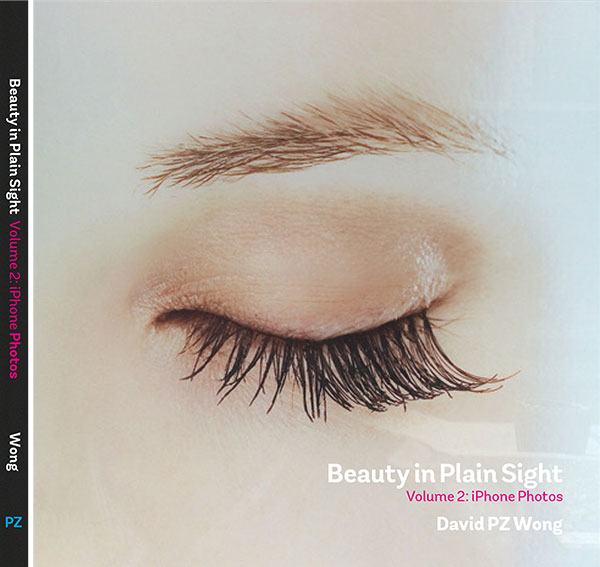
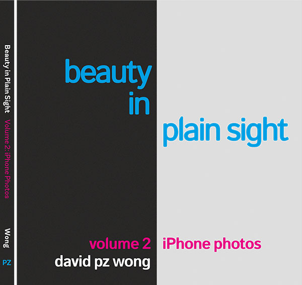
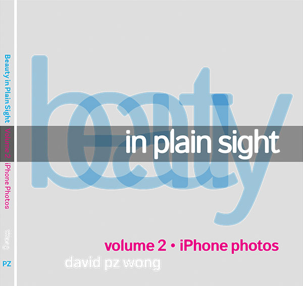
Image of various proposed covers. I love looking back on the original proposals after a project has finished. For some, I wonder what I was thinking. For others, I think they were interesting ideas and may relegate them to the Gallery of Misfits and Miscellany.
Design Iterations
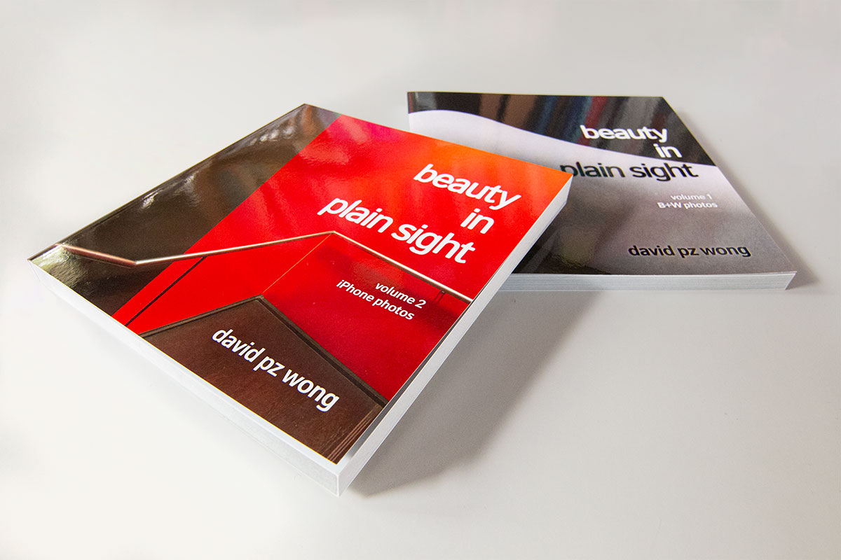
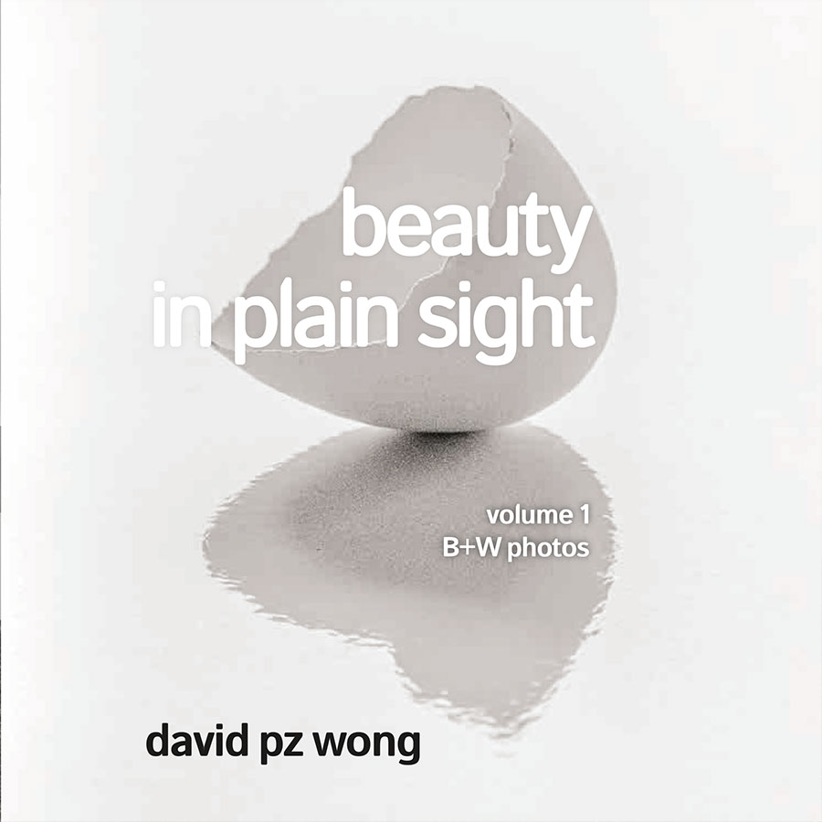
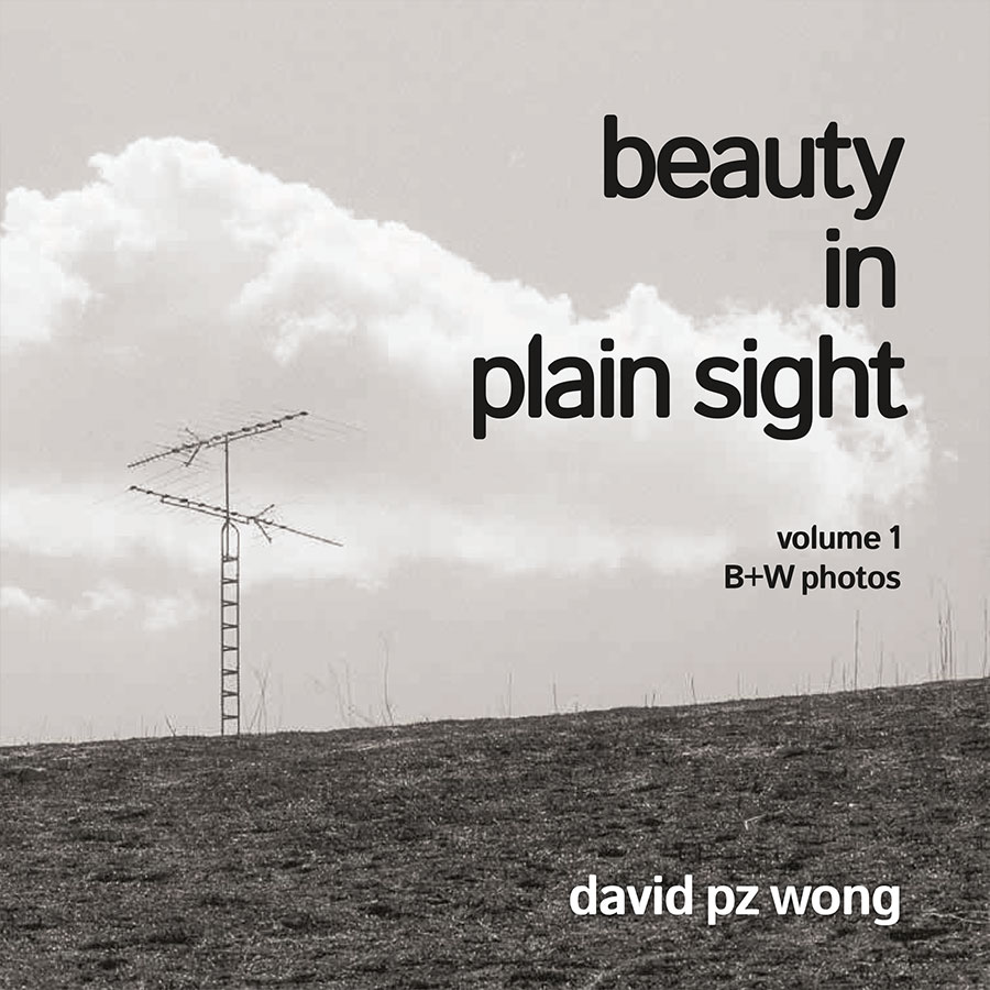
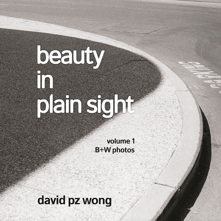
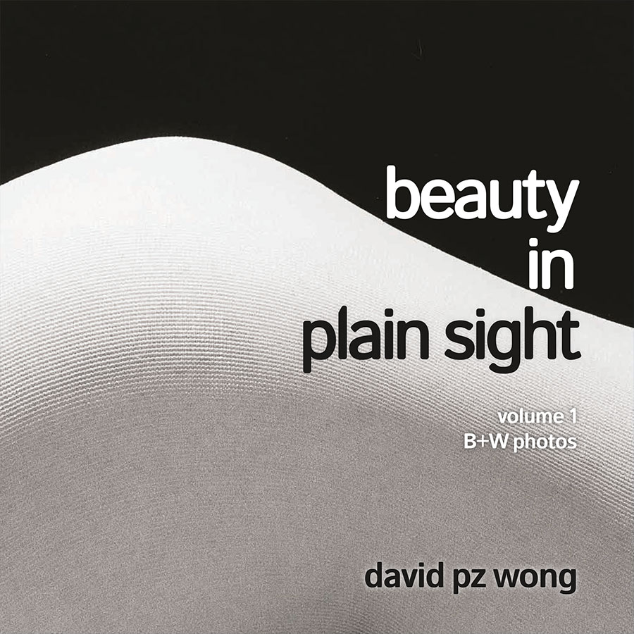
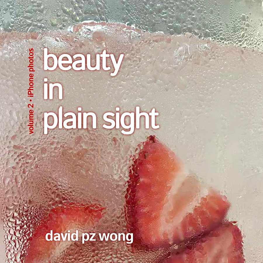
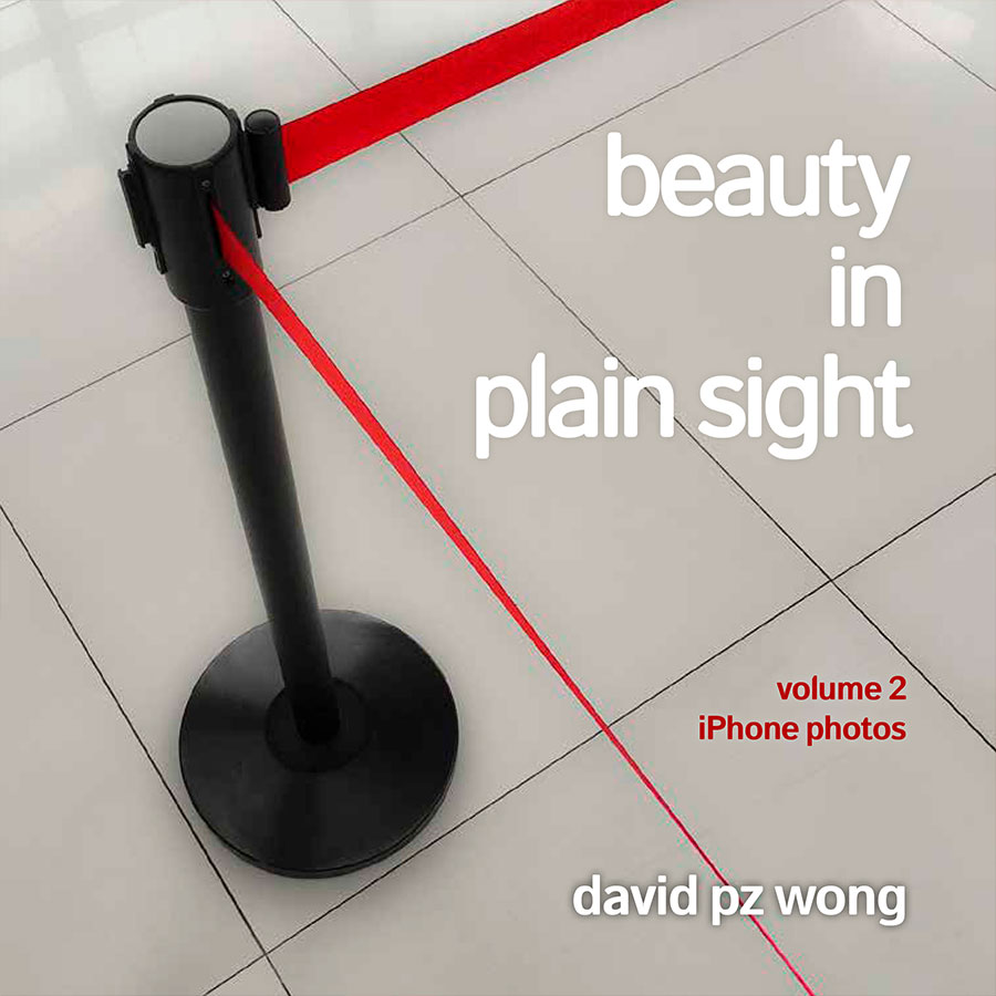
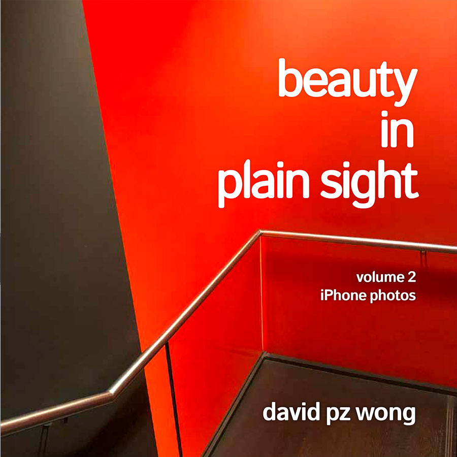
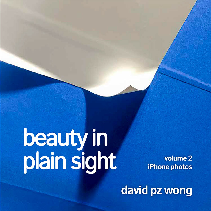
Based on feedback, I encouraged David to use full-bleed images on the covers—favoring abstract and out-of-context imagery as he does, we had so many great options. We tried several variations before settling on the two images used.

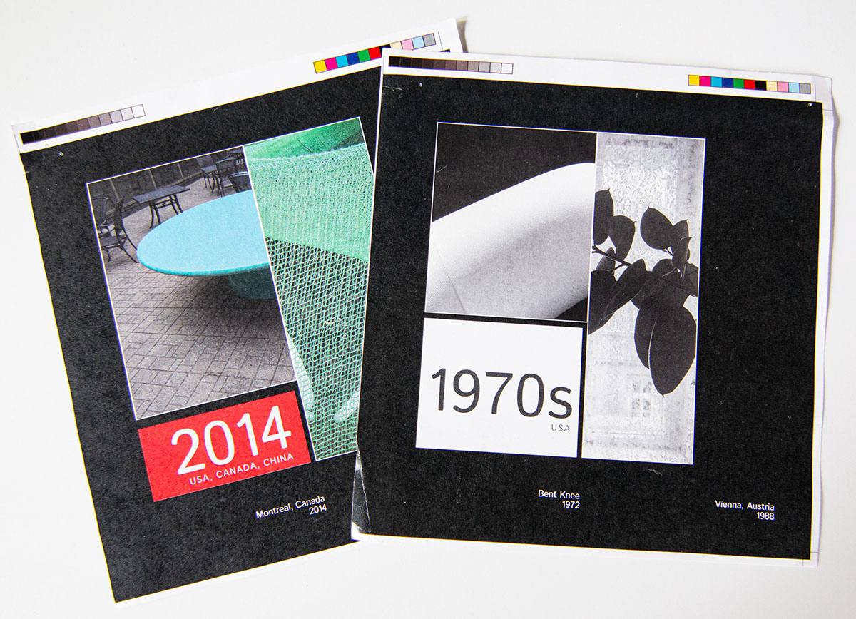
Several of the second round image cover concepts, considering both the black & white and color volumes.
The square shape of the book meant that the images required cropping. The images were “larger” and more decontextualized than they would appear in their respective books. This provided another exciting dimension for the reader.
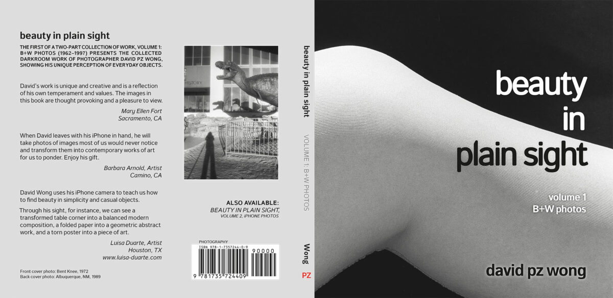
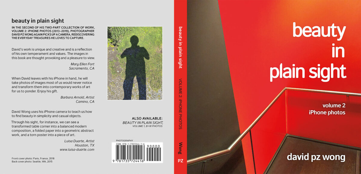
Back Cover
A consideration of cover design is how the front cover will wrap to the back, and what to do with the spine. In this case, the spine could contrast/coordinate with the back, but provide a clean look when both books are together on the bookshelf. Note how David’s style continued through to his “author photo”—both self-portraits of his shadow.
Interior Layout & Typesetting
Author’s Preferences
David had given a lot of thought to what he wanted his book to look like and had some strong ideas about what he wanted to see. He had considered many photography collections during his research. He settled on a 7-1/2 x 7-1/2 square format, the modern sans serif font, the idea of one image per page with uniform sizing, accompanied by a simple caption.
Basic Structure of Interior
Since the books are almost entirely about the images, the layout was straightforward.
I created a basic structure to position and size the images (see the “Fun Fact” in the sidebar). David provided me with the images at the correct size and resolution. He tagged each image with the correct metadata for the caption—year and location.
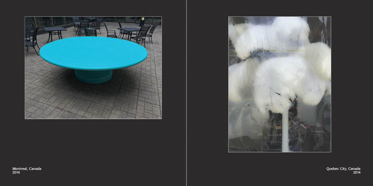
Each page consists of an image and its caption. The captions, generally a location and a year, are justified to the outside of the page. This forms a regular visual anchor in the lower corners of each spread.
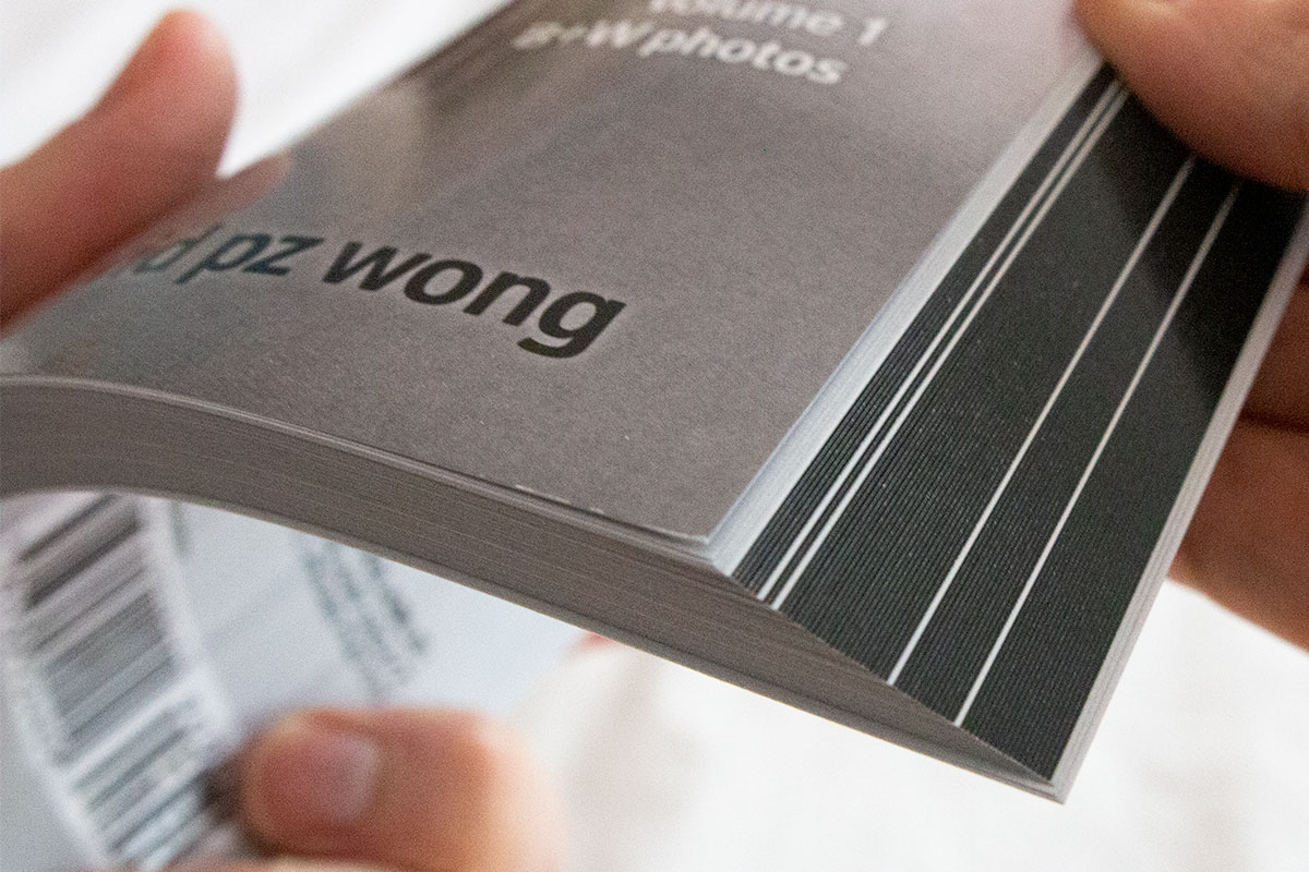
A very thin white line surrounds each image to help the darker images separate from the dark grey page surround. This line also ensures a visual break to avoid direct comparison of an image’s “black” with the page “black.” This was important for both the color and “rich black” B&W images.
As an added subtle detail, I created the page surround using only black ink, whereas the images are a slightly warmer rich black. This allowed the blackest areas of the photo to be “blacker” than the page—mimicking the effect of using a black mat in a framed version of a B&W photo—the photo is darker than the mat!
Section Dividers
The books start with a title page and a statement by the artist. There are no page numbers, nor any table of contents. As there are also no chapters, I used section dividers to demark the different time periods of David’s work.
To visually connect the two books, I used the same page structure for both volumes. However, the dividers change between the volumes. For Volume 1 (the Black & White photos), I used a soft grey, mimicking its cover. For Volume 2, I used a vibrant red to match the color of the cover in Volume 2.


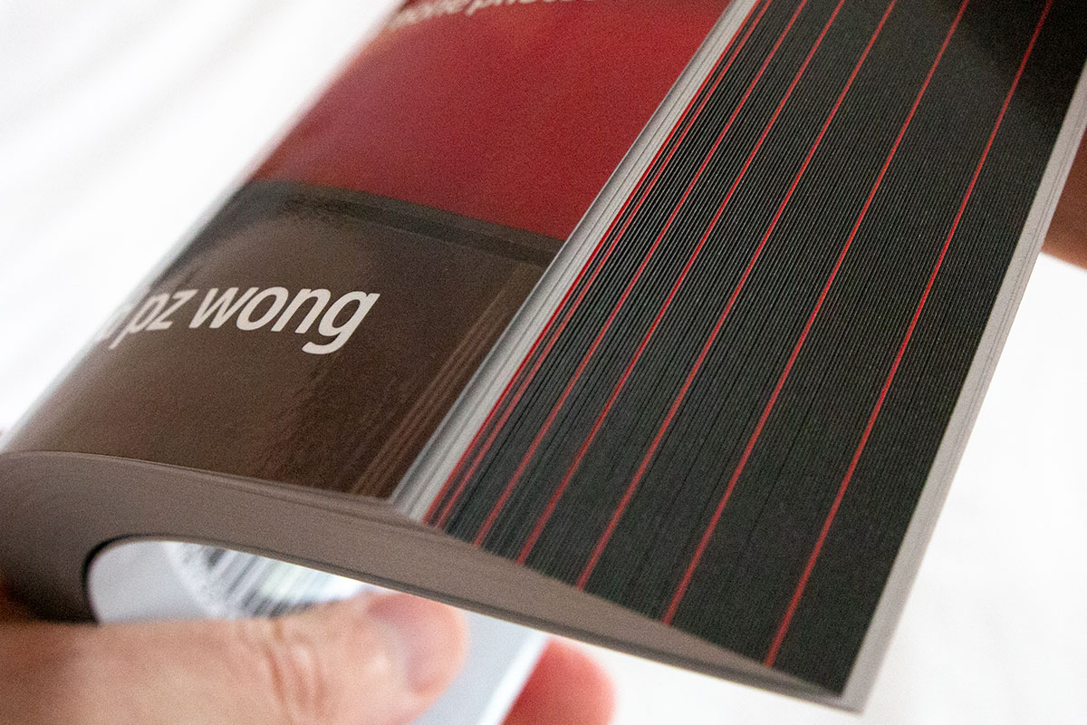
Fanning the books (an advantage of softcover!) shows the effect of these accent color section pages between the otherwise black edged image pages.
The books conclude with a short acknowledgment and colophon at the end.


Image Preparation
The complex machinations required to prepare a digital image for print are an example of “part art, part science.” For an image-heavy book such as Beauty in Plain Sight, this can easily take more time than every other part of the production process.
Digitizing Images
The first step of image preparation is to obtain the images in digital form. The images for the second volume were already in digital form. But the B&W photos would need to be scanned.
Is it better to scan the prints or the negatives? Generally, scanning the negatives is better. The downside is that this requires more reprocessing to replicate what was done originally in the darkroom. Since these are David’s photos, and he was already familiar with the digital photo editing tools (in his case, Adobe Lightroom), we agreed it made sense to scan negatives and reprocess the images. Despite the pandemic, David found a shop to handle the work on our schedule.
Image Adjustments
Then came David’s edits. And tweaks. And adjustments. This was a challenging process for David, as he was not using a color-calibrated workflow. When he adjusted the images on his screen to be exactly the way he wanted them, it was impossible to tell how the same image file would look to me or the printer. Through a series of technical discussions and sample prints, we worked toward getting the images “as close as possible.”
As David further tweaked a few of the photos and changed the sequence of some of the images, we completed several additional rounds of edits.
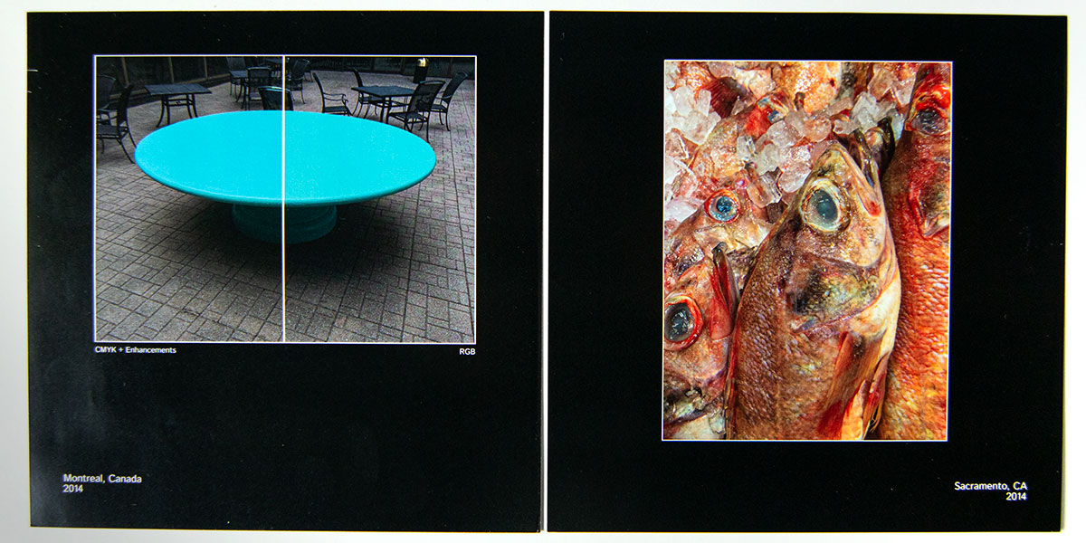
The Challenges of Four-Color CMYK Printing
Digital four-color CMYK printing cannot replicate the full range of colors or tonality as it appears on an RGB computer monitor. The Cyan-Magenta-Yellow and Key (black) are reflective. They depend on the paper and pigments, and the color of the light itself, to reflect the color of the images to the viewer. Whether it is glossy or matte, coated or uncoated, the paper finish also changes the appearance of the colors.
It is best to let the printer’s own processing software handle the conversion to CMYK in most cases. Not every printer is capable of this. Bookmobile is, and they do an excellent job. Still, many of David’s color images are incredibly vibrant, and he pushes the envelope of the available color space. To accommodate this, I hand adjusted several of the images, doing a manual CMYK conversion in Adobe Photoshop, and altering colors to better mimic the original’s vibrancy. It is a balancing act.
Printer dependencies also hamper the reproduction of the tonality of the images. Shadows tend to print too dark; highlights tend to print too light, making the printed images more contrasty than one might expect from seeing them on screen.
When preparing the images for print, I created a custom profile for Adobe Lightroom to handle the bulk image adjustments. Then I used Adobe Photoshop to perform image-specific adjustments.
Production Assistance
What Color Black?
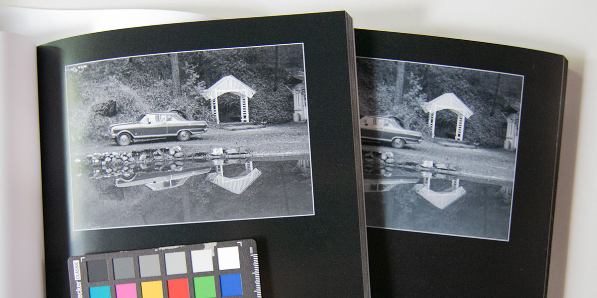
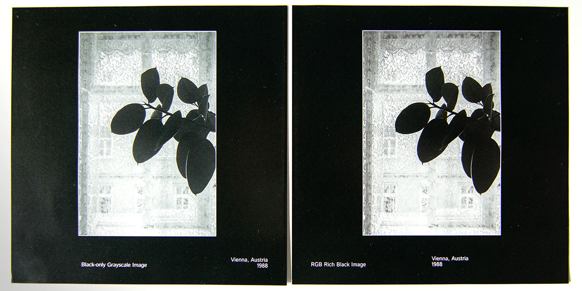
With one entire volume of Black and White images, David’s project had additional challenges for CMYK printing. Now, you might think B&W is easier than color… that is, until I ask the simple question: “What color of black do you want?”
I devoted a blog article the topic of black-only vs. rich-black. In the end, we chose the depth of rich blacks.
By using a rich black, we could mimic the tonality David wanted to see in his black and white photos. Although this was still shy of the tonal depth of the original darkroom prints on a side-by-side comparison, it still produced rich, sharp images, but without the costs associated with an offset print run that would have been necessary to create a deeper duotone.
Printer Tests, First Round
David initially considered using Bookmobile, but chose another printer he felt better met his needs. We asked the printer to run some test prints, knowing the challenges we faced in replicating David’s version of the images. I created a special set of images that included additional testing areas—tests of shadow and highlight adjustments, CMYK and RGB color references, etc.
Success! Everything looked reasonable, and I was pleased that my adjustments were working. So we proceeded to process and prepare the rest of both books.
Unfortunately, this printer didn’t control its color calibrations very well. When it came to running a hard proof of the entire book, all the images had a pronounced blue cast. It was especially noticeable in the B&W images.
David patiently waited through this whole process, simply demanding that the images look the way he expected them to look. My lesson learned to “trust, but verify,” especially if a printer doesn’t have a calibrated profile or color standard they are using.
The printer recalibrated things and ran some more test pages for us. But in the end, they decided they just were not comfortable holding the “neutral” rich black we were seeking. I’ll give them full credit for admitting their mistake and taking responsibility.
Switching Printers
David was now in the awkward position of having a book but no printer. Fortunately, Bookmobile was happy to take on the project.
I readjusted all the images to match their print requirements. I hand-tuned several color images to try to boost the apparent saturation—deep blues and teals are especially tough for CMYK. Bookmobile ran test prints for us, which were perfect, as were the hard proofs. The finished results were flawless.
Black-only (left) and rich-black tests at Bookmobile. Despite their advice, the rich black did look better. 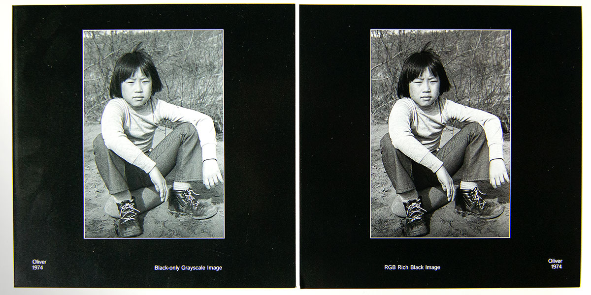
Results
Although a photobook seems like a simple project on the surface, the many technical hurdles involved with Beauty in Plain Sight made this a challenging project. From contract to final delivery, this project took eleven months—in the middle of the pandemic isolation. Seeing the world through David’s eyes was a pleasure, and working with his photos to create a powerful retrospective was extremely rewarding.
Using rich black for the B&W images was the right decision for this project, despite their challenges.
“[Paul] is both knowledgable and meticulous; I learned a lot from him.”
Author David PZ Wong