Strive Publishing’s First Young Adult Novel
“Paul’s book design and graphic design skills are matched only by his patient and generous spirit.”
Mary Taris, Founder of Strive Publishing
A teacher by trade, Mary Taris’ goal in founding Strive Publishing, is to become the “leading publishing company in providing contemporary African American stories.”
We met through a mutual acquaintance in the Midwest Independent Book Association (MIPA). “Children and young adults especially,” she explained to me, “need to be able to see themselves in the stories they read, not just in a historical context, but here, now, today.”
It is a mission I applaud. One not just of bringing more diversity to publishing, but bringing a sense of contextual normalcy. I asked her, “How can I help?”
As she was discovering, starting a new publishing company is really hard work. Mary knew her first novel, the young adult fantasy work by Ricardo Peters, would be her launchpad. She had a preliminary cover, designed by her son, illustrator Jermaine Taris, and needed help getting over the finish line.
The eBook conversion was top of mind, as Mary planned to use the use the eBook to (inexpensively) boost recognition for the publishing house. But we needed to revisit the cover before getting too far. After all, we need a final cover for the eBook just as we do the print book, and as the single most important marketing decision in a book’s life, the cover had to pop.

Cover Development
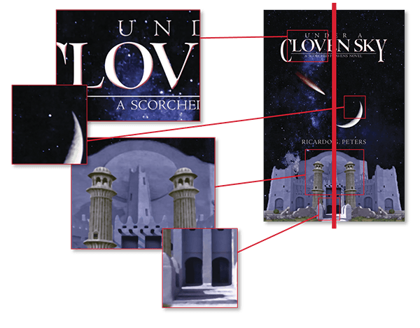
While solid in concept, I had a few concerns with the cover Mary brought me: overall, the cover was far, far too symmetric and static; the title weight too thin to carry at small (think Amazon thumbnail) sizes; the moon image composited in “revealed” stars in the moon’s shadow; odd distortion of the columns in front of the twin entrances; and the shadows were all wrong for the moon’s location.
We tried to work with it, but the upres’ed castle graphic suffered from overall fuzziness and, ultimately, had to be abandoned.
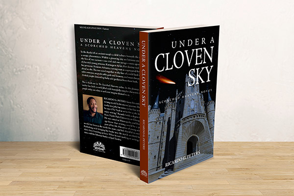
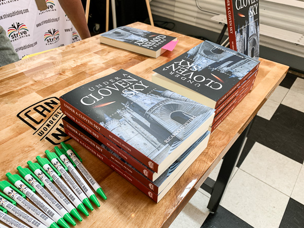
As I said, the concept was solid. I mood-boarded several conceptual ideas, ultimately settling on a resketched version of a dramatic, asymmetric wide-angle shot of a castle entrance that you see in the final cover. The moon was dropped, but the sense of moonlight was still present. The dynamic balance of the cover image was then enhanced by the right-justified title type, while keeping the series title and authors name centered.

With the front cover settled, the decision to use a contrasting spine (drawing color from the comet’s tail) and back cover followed suit. We ran several tests at Bookmobile, the printer for the initial run of books, and settled on a matte laminate to minimize fingerprinting and scuffing, and further soften the night scene.
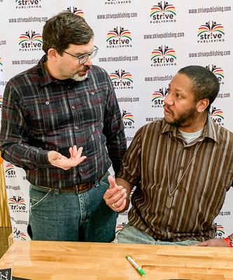
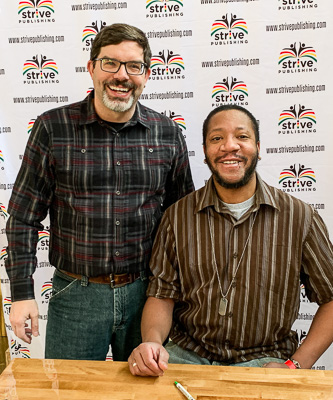
Suffice it to say, Ricardo really enjoyed the cover, and was eager to finish editing work on the second book in the series, and dive into the third.
Converting to an eBook
Based on typesetting by Beth Wright, my conversion to an eBook for Amazon Kindle, Google Play, Apple iBooks and others was fairly straightforward … just a matter of setting up both the internal and external table of contents links, correcting any typographic translation issues, and making sure the book works in the included fonts as well as generic reader-specified fonts.
This was a fun project, both helping Mary get up to speed with the production side of book publishing, and getting to work with such an energetic group of people. I sincerely look forward to our next chance to work together!
“Paul Nylander is a Book Designer with an eye for detail and a commitment to excellence.”
Mary Taris, Founder of Strive Publishing