Born in a Red Canoe
“From early ideas for cover design to the final product, Paul worked with me, listened to my ideas, and provided multiple designs for discussion and consideration.”
Katharine Johnson, Author
Creative Brief
With some preliminary ideas in mind, and a nearly finalized manuscript, Katharine approached me about designing her third book: a young adult magical realism novel. We needed a cover that would really grab readers in this age range. One that conveyed the mysterious and magical qualities of the story, without going full-on fantasy.
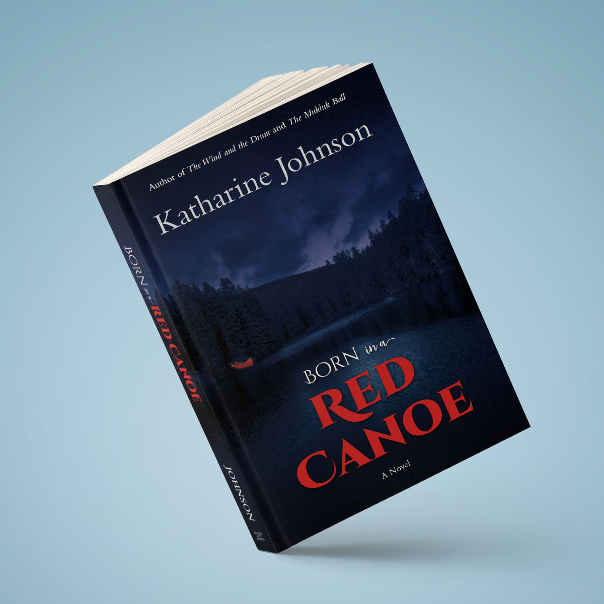
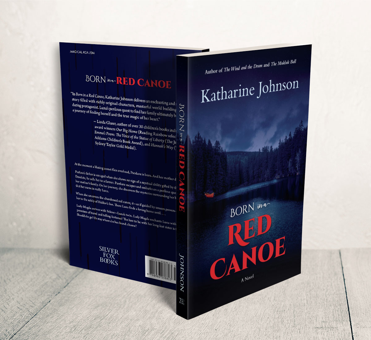
Katharine felt strongly that the cover should feature a literal red canoe. The canoe becomes a vehicle to transport the protagonist to what she seeks, a home and family. But the canoe is also a metaphor in the story, representing the womb and child birth. Red representing both blood and strong, conflicting emotions in the story.
The story takes place following the 1835 Halley’s Comet, in the northern forests of Minnesota. The story presents a pre-industrial, isolated but otherwise non-specific culture, punctuated by loneliness and grief, yet with a hopeful sense of searching for meaning.
Stylistically, Katharine wanted to stick to realism, steering clear of anything cartoony or op-art oriented, nor anything leading toward surrealism or anything too abstract. We discussed the features of a number of covers she liked, as well as several she didn’t like. Clean, inviting, but mysterious, seemed to be traits Katharine identified with.
Cover Design
While the literal red canoe is an obvious fixture, it was important that it not be too obvious. It is a balancing act. I considered a number of typographic options and visual ideas—from pattered abstraction to photorealism—before settling on the look that Katharine and I agreed best spoke to the story.
“Paul’s covers illustrate the heart of the story as well as catch the reader’s eye and get the book pulled from the shelf.”
Katharine Johnson, Author
Interior Layout & Typesetting
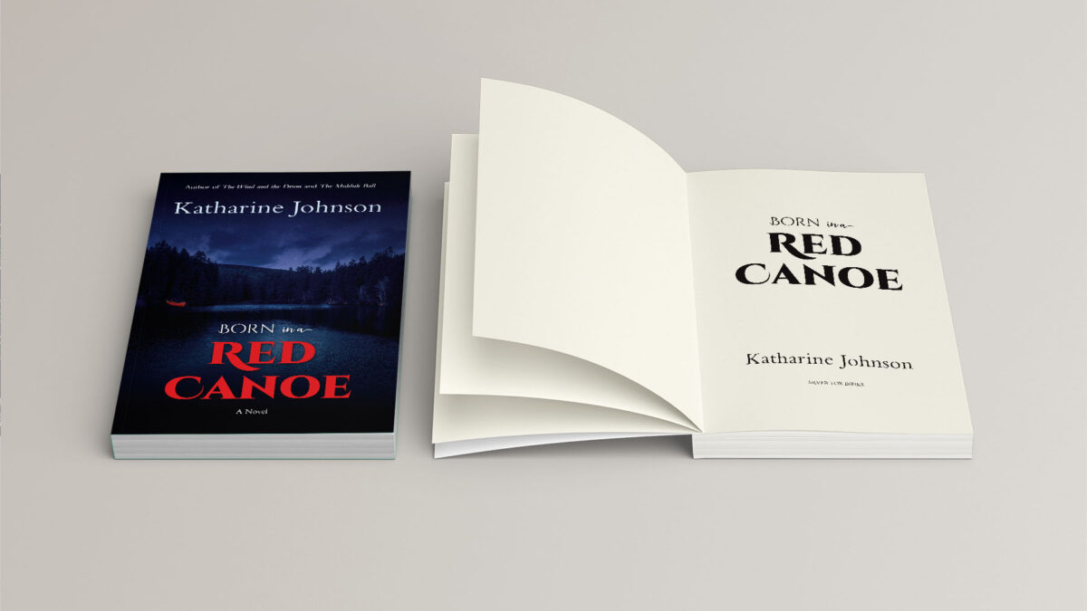
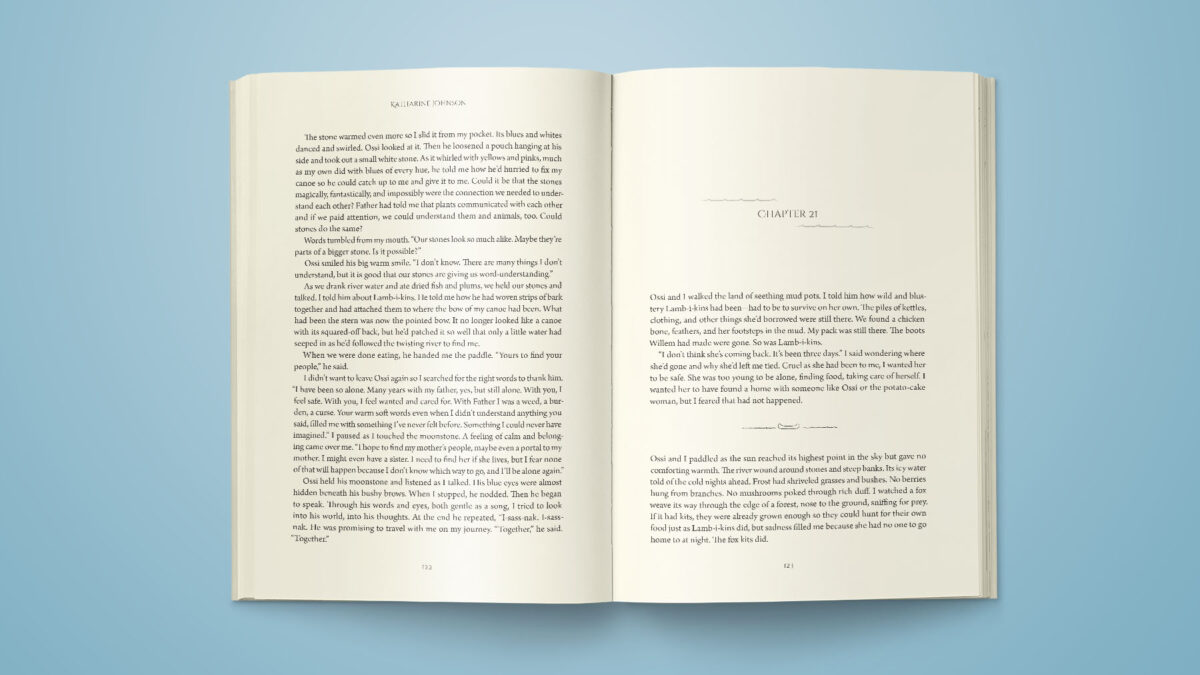
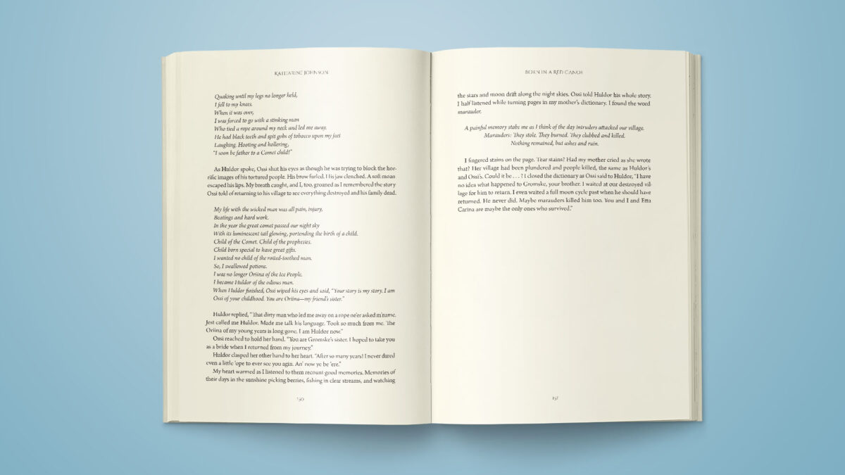
Typically, I start with the cover design and then proceed to the interior. Especially for a novel, such as Born in a Red Canoe, the interior composition is fairly straightforward: chapter opener pages, text pages, and a handful of special formatting. Simple design means that the style of the interior becomes critical to visually convey the feeling of the book.
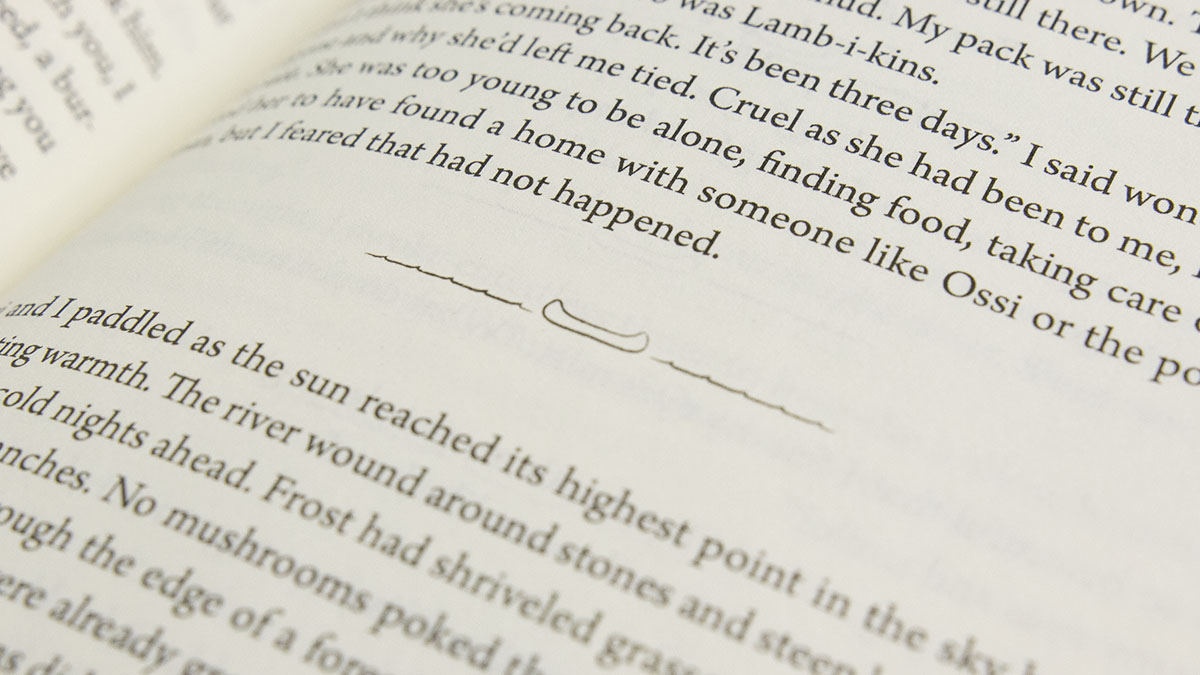
I developed a customized canoe divider line for pauses in the text. Combined with cover stylistic elements, I developed an interior look and feel that was both true to the content and consist with the cover.

“Paul’s designs complete the book by reflecting the story and inviting readers. Without reservation, I recommend him.”
Katharine Johnson, Author