Art: Following My Spirit Home
Creating a book for another visual artist is both challenging and satisfying. The accurate representation of color must be balanced with the practical limits of production; the artist’s intent must be honored, but so must the reader’s need to understand and appreciate what they are seeing.
In this stunning visual journey, artist Sam Zimmerman shares his thoughtful and intensely personal views of his rediscovery of the natural world and his heritage, found in the lakes and forests of northern Minnesota.
“I don’t know what we would have done without you guiding us in so many ways.”
Betsy Peacock, Publisher
Design Challenges
- Substantial look and feel
- Accurate color
- Integrate both English and Ojibwemowin descriptions and stories
- Maintain quality through entire production
Project Brief
I was introduced to artist Sam Zimmerman in late 2020. Virtually, of course. By that time I had already done a few children’s picture books for Black Bears & Blueberries Publishing, and would do a few more, including working with Sam on several. But this project would be different—for all of us. Featuring fine art work, this book would be presented in a larger, hard cover format.
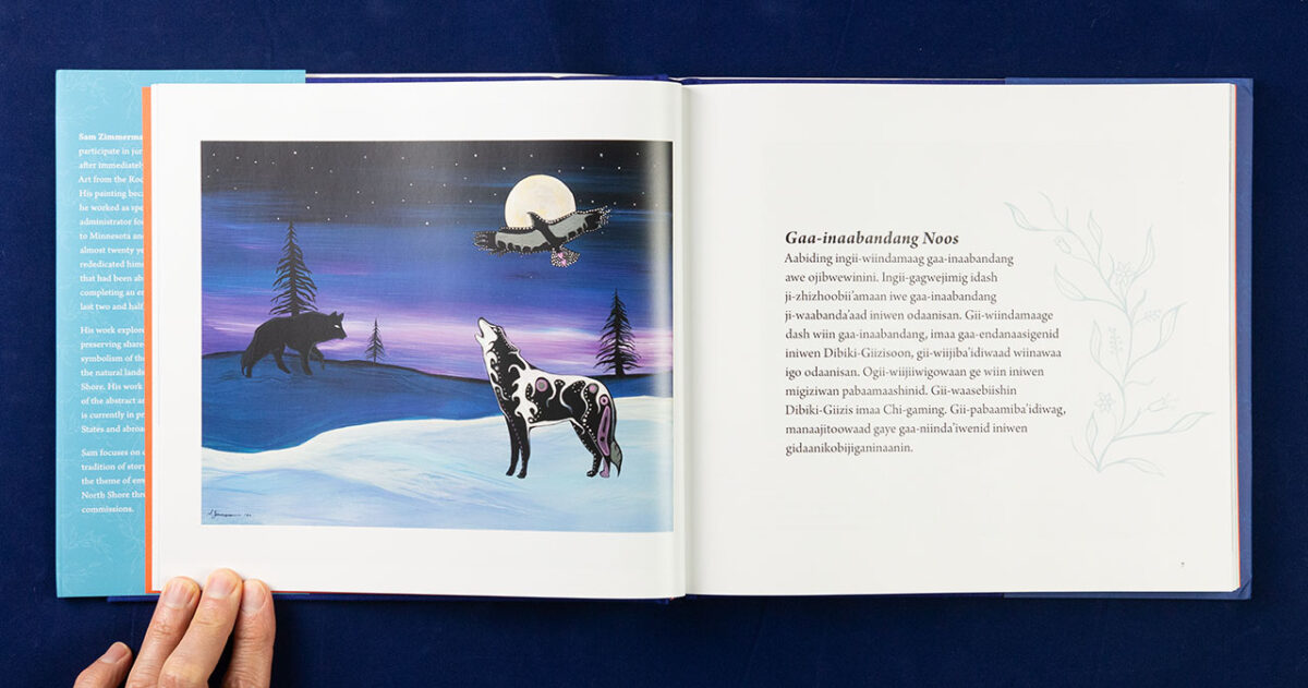
The plan was to create a coffee table art book featuring Sam’s colorful paintings, including short story vignettes to accompany each piece. In addition, several of the stories were to be translated into Ojibwemowin. Production work was funded, in part, by grants that Sam had received, which gave us a bit more flexibility.
Fortunately, Sam had already been working with a company to scan his art work—so quality of images was never a question. As often is the case with paintings, size was an issue—reductions would be required as most of Sam’s art was midsized, in the 18–24 inch range, with some smaller and some larger. But certainly all larger than any reasonably sized book would accommodate.
We felt something in the 10–12 inch range would work well, and would be a reasonable compromise on cost and scale. This project was scheduled at the beginning of the production/supply chain crunch, so it was also a scramble at times to define what we needed and what was practical/possible for the book printers. In the end, 10 x 9 seemed to work best.
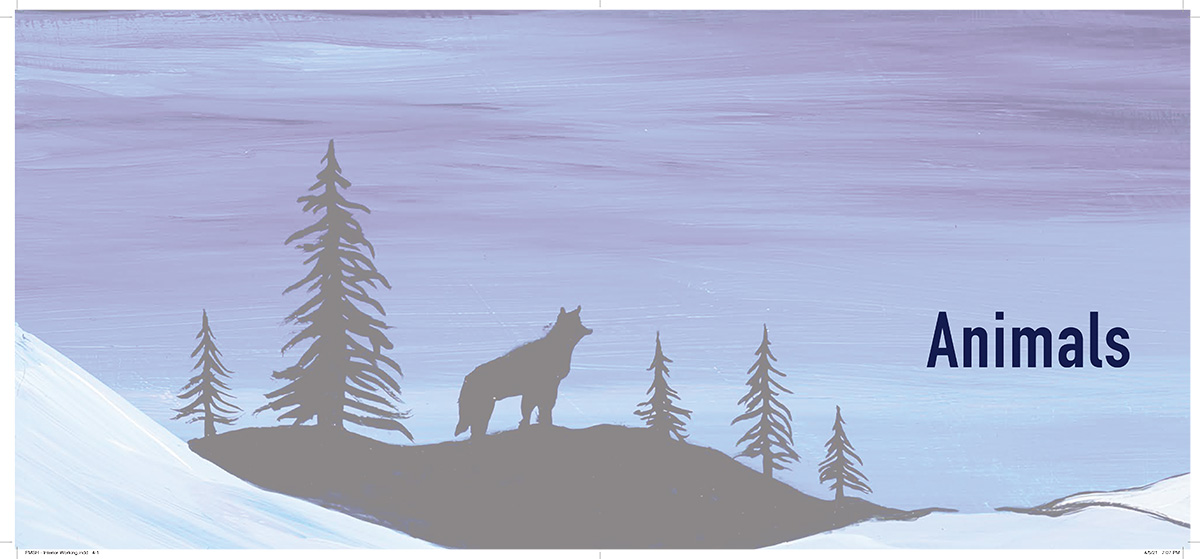
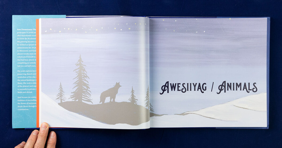
The book was to be arranged in five chapters, each with a theme—animals, birds, bears, She Dances, and family.
As is always the case for publishers, anticipating demand is difficult under the best circumstances. And releasing an art book during COVID made it all the more challenging. Unlike smaller books, which can reasonable be produced through a print-on-demand service, specialty books require production runs, with the price per book changing dramatically in the short run range, with the cost per book for 500 being significantly higher than 1,000 or 2,000. The quantity needed was completely unknown in advance.
Developing the Look & Feel
Advance marketing can help with the “unknown quantity” problem. And that requires, at least, a cover. However, I actually prefer to start with the interior if I can. Especially with an image heavy book such as this (just as the Kura book), it helps to really work with the content, giving me the opportunity to get to know it.
The basic process starts with roughing in the interior layout to get a sense of the scale of the book. Then I come back out to develop the cover. And once that is fairly final, bring the cover’s aesthetics back into the interior. It gives the artist room to absorb what we’re creating, and offers time for adjustments to the design while it is still relatively easy.
Start With the Art
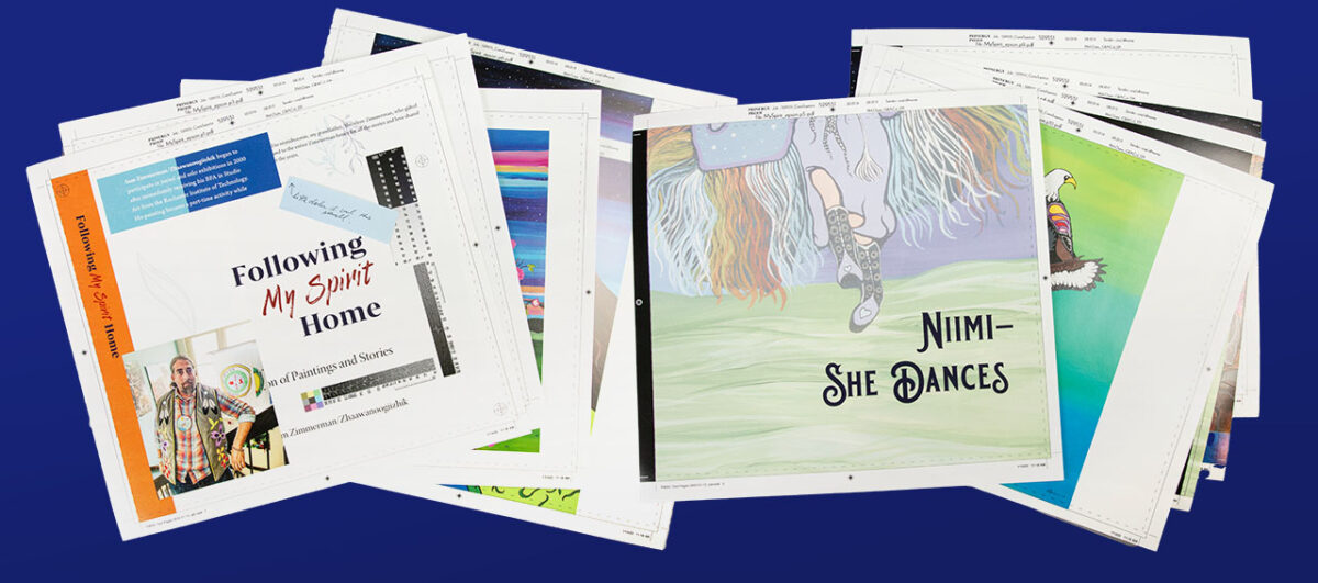
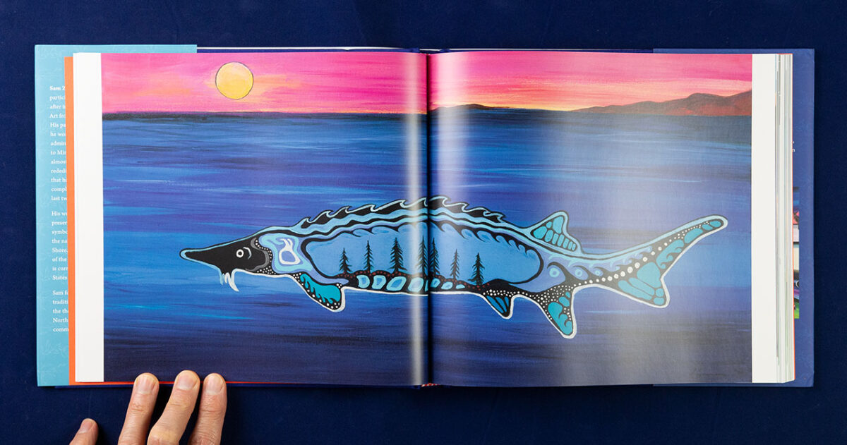
With the seventy-or-so pieces of art already scanned in, I was able to get a sense of the scale and color palette that Sam was working with. We discussed how he wanted his work presented: whether full-bleed and cross-spread images (extending to page edges, or crossing the gutter between two pages) were allowed. We settled on a 10 x 9 inch format as a reasonable compromise for the wide variety of aspect ratios in his paintings.
Combined with a preliminary version of the text, I created several pages of provisional layouts. I wanted ample white space to balance the powerful imagery, and avoid crowding the text. I also wanted to create a clear visual break to divide the five sections, but something that retained Sam’s art, settling on a screened back detail from a painting in each section.
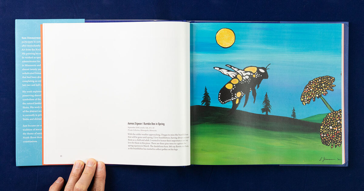
Changes would happen once the interior was finalized—such as only including one image per spread. But by and large the look and feel of the interior was established with this first round.
Continue With the Front Cover Design
With so many great images to work with, it was obvious from the start that the cover would be largely image based. Sam with fine with my incorporating text into the image itself (not all artists are), so I set to work on creating several concepts and variations.
Typically, I’ll start with the typography. I use one working set and try various images with it to see what feels right. Then I pick one of the image ideas, and try several typographic variations. How many of these experiments I show to my client depends on how well I think they can understand the options. Ideally, I know my client so well that I only need to present one option! But that is rarely the case this early in the process. But too many options is overwhelming.

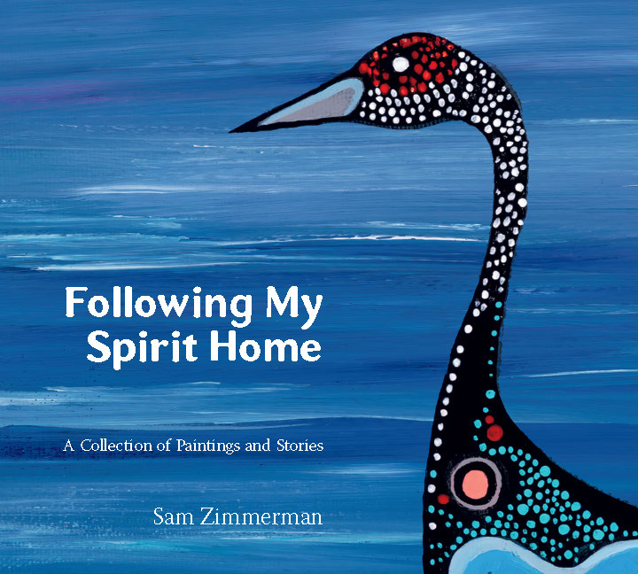
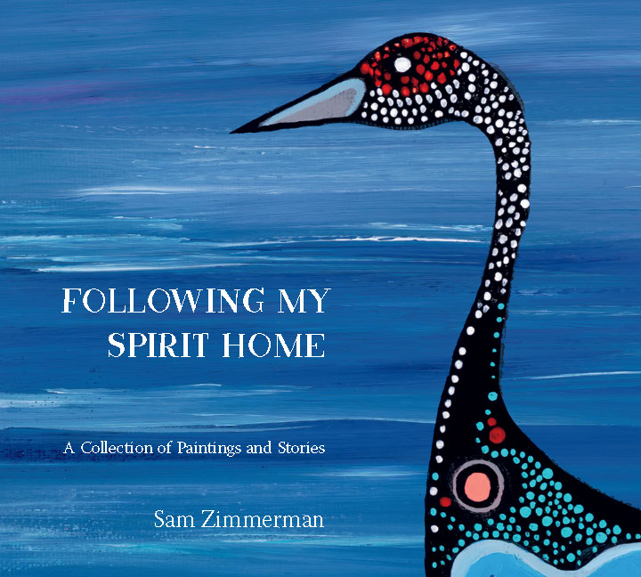
My only steadfast rule: I never show anything that I wouldn’t accept as a final decision!
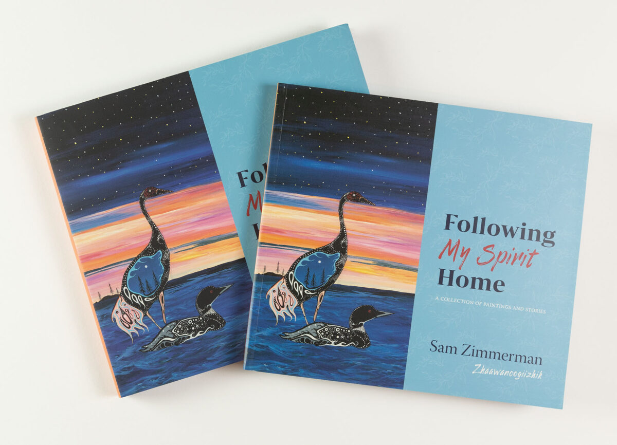
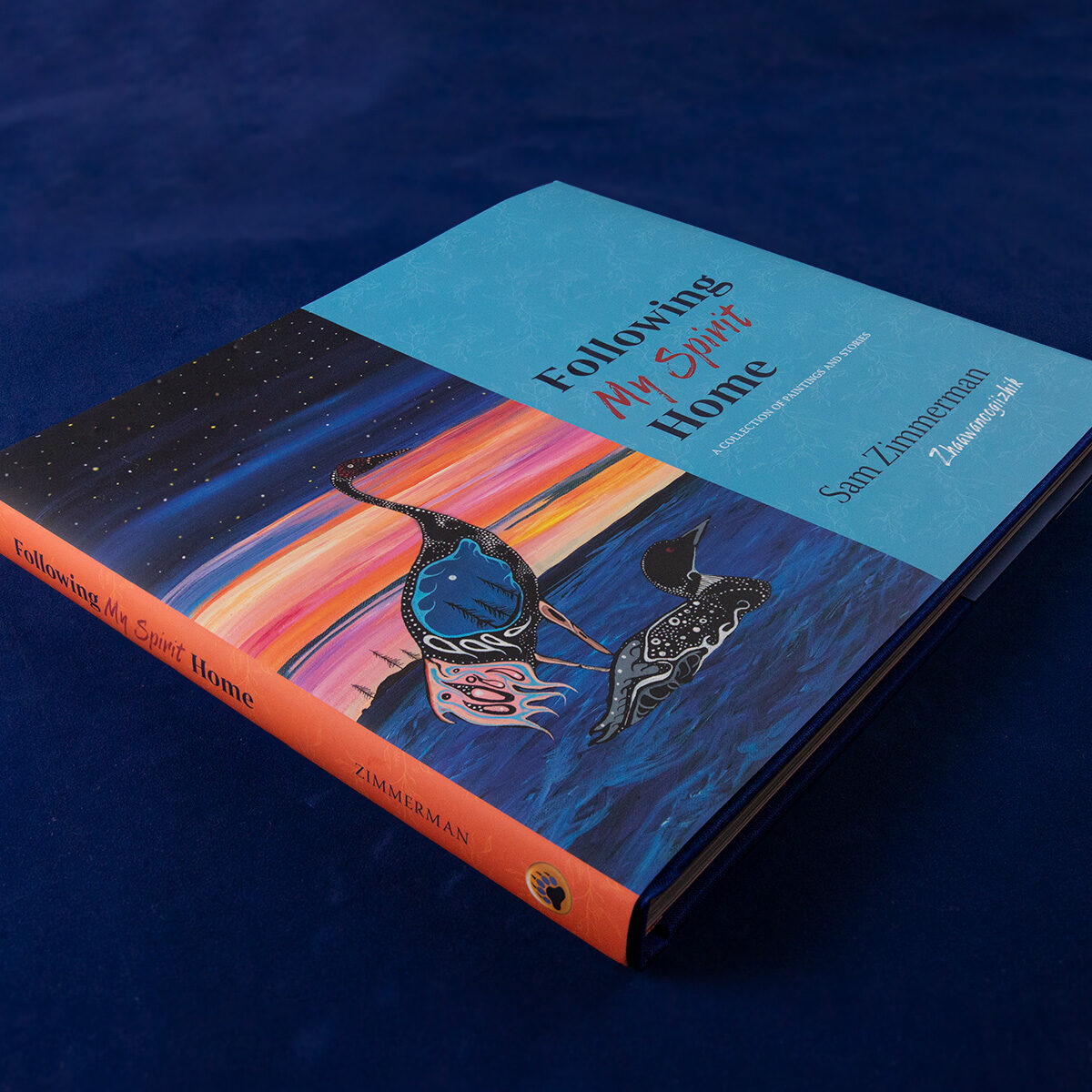
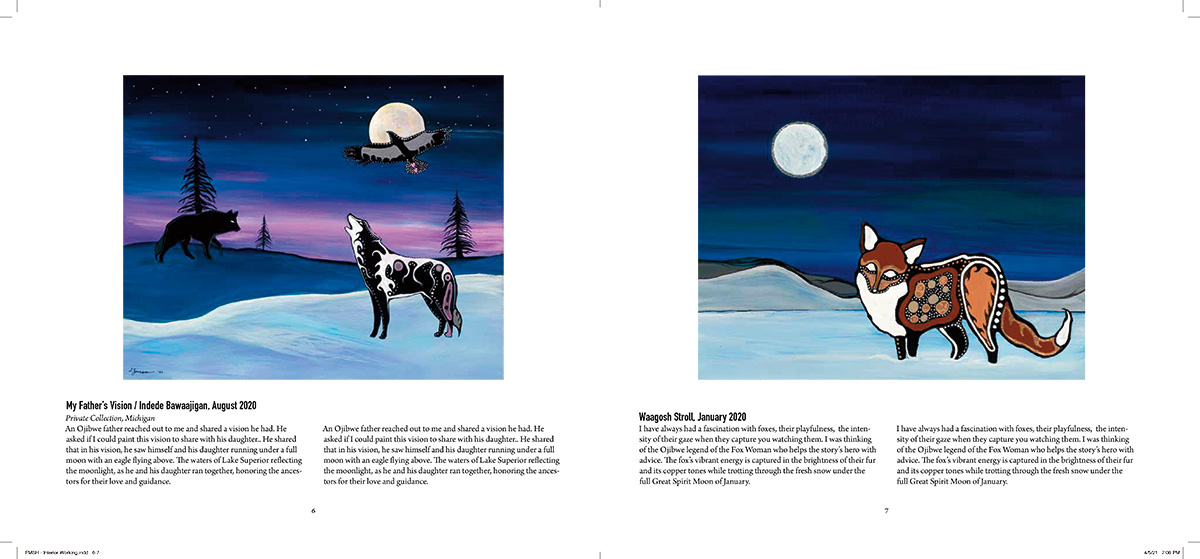
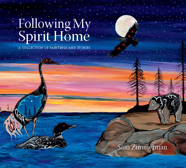
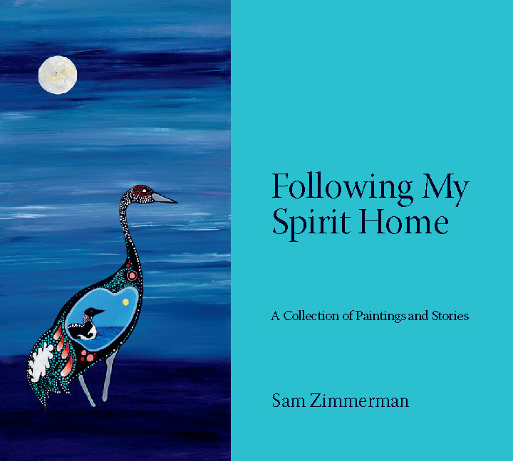
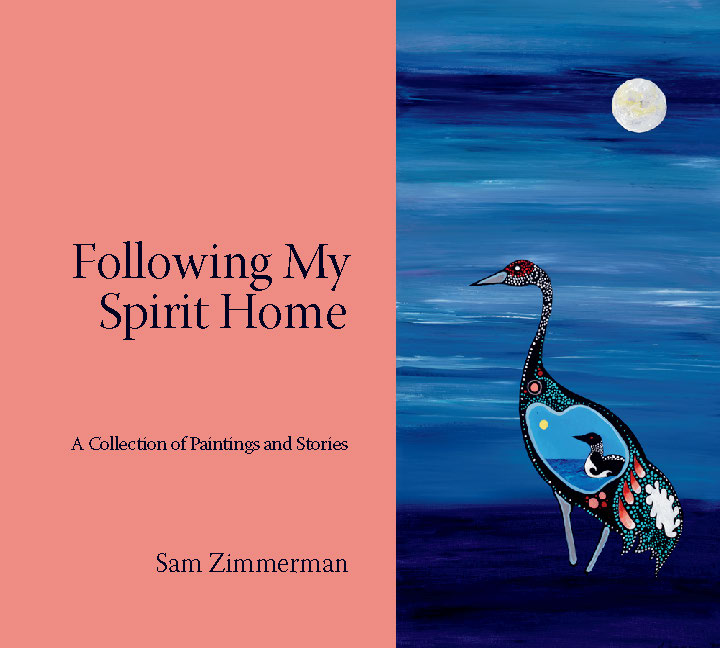
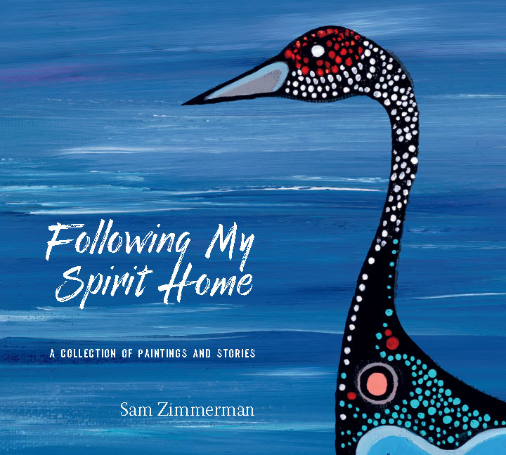
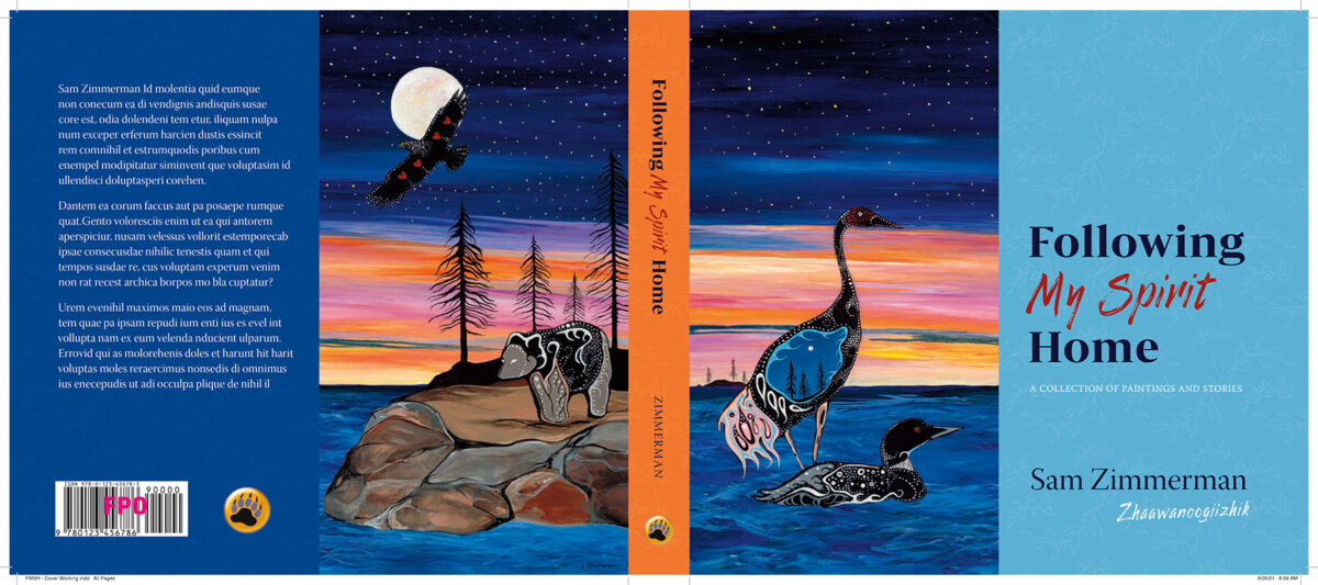
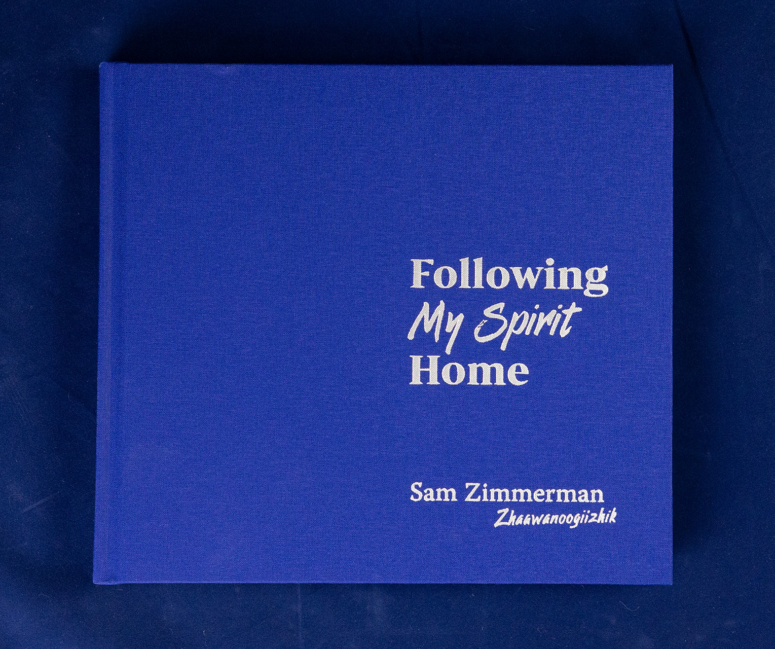
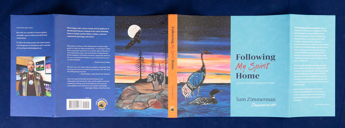
It ended up that I needn’t have bothered with so many variations; after meeting to discuss the pros and cons, Sam definitely wanted to use the image of the crane, mallard, eagle, and bear (the first one above). As Sam says in the book, “This piece celebrates my own journey home, focusing in my family’s clan, the crane.” Like much of Sam’s work, this was deeply personal and full of multi-layered symbolism.
The problem is that this particular image wasn’t actually very well suited for placing text. In the concept version, the title is a bit uncomfortably tight in the upper left, and the artist’s name was partially obscured because of the variations of color behind it. And alternate placement were not really possible—the only other white space is dead center and neither appropriate to the art, nor comfortable for the design.
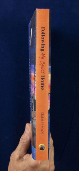
By combining several of these concepts together, I was able to create something that honored Sam’s wishes, but still created a visually compelling and engaging cover. Splitting the image across the front and back covers also solved the problem of what to include on the back.
Eyeing Production: Test Prints
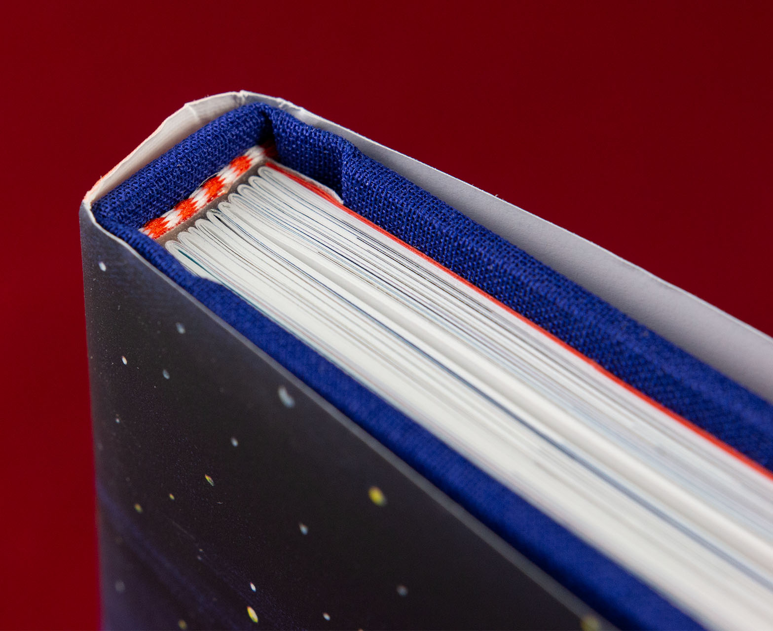
With the design fairly solidified, I turned my attention to the practical details of how the book would actually be produced. After soliciting quotes from several printers, we settled on Corporate Graphics here in Minnesota. Availability of materials was already becoming a concern, but they worked with us to identify and source the right materials for the look and feel we wanted to accomplish.
In addition to selecting the particulars of the job—paper weight, end sheet and end band colors—the folks at Corporate Graphics we also accommodating for my request for color-correct test prints. I’ve found this to be a vital step when working on projects requiring color accuracy. But it is a tricky proposition: I must ensure that I have a solid color management system in place on my end, and the printer must ensure that their inkjet sample pages really represent the results we can expect off of their offset printer.
Sam’s work is characterized by his use of rich colors—colors that are not always correctly captured even by the best of scanners, and only become more muted and muddy if not well handled for the conversion to CMYK printing. Even the best of printers lacks the dynamic range of a screen version, so ensuring that darker areas don’t block up or fill in with ink is also a part of this image preparation process.
Test prints are also a chance for the author/artist to get a first look of what their book will really look like. Although inkjet test prints lack the crispness of offset printing, they definitely give a fairly good sense of the color and an absolutely accurate look at layout. Sam and I had a great discussion as we went through these prints together, page by page.
Still, in my experience, even the best test print still leaves some gaps between the screen and the final prints. This is where experience comes in, and more than just a little faith that the printer will always work their best to do the right thing.
Finalize Interior: Touch-ups and Tweaks
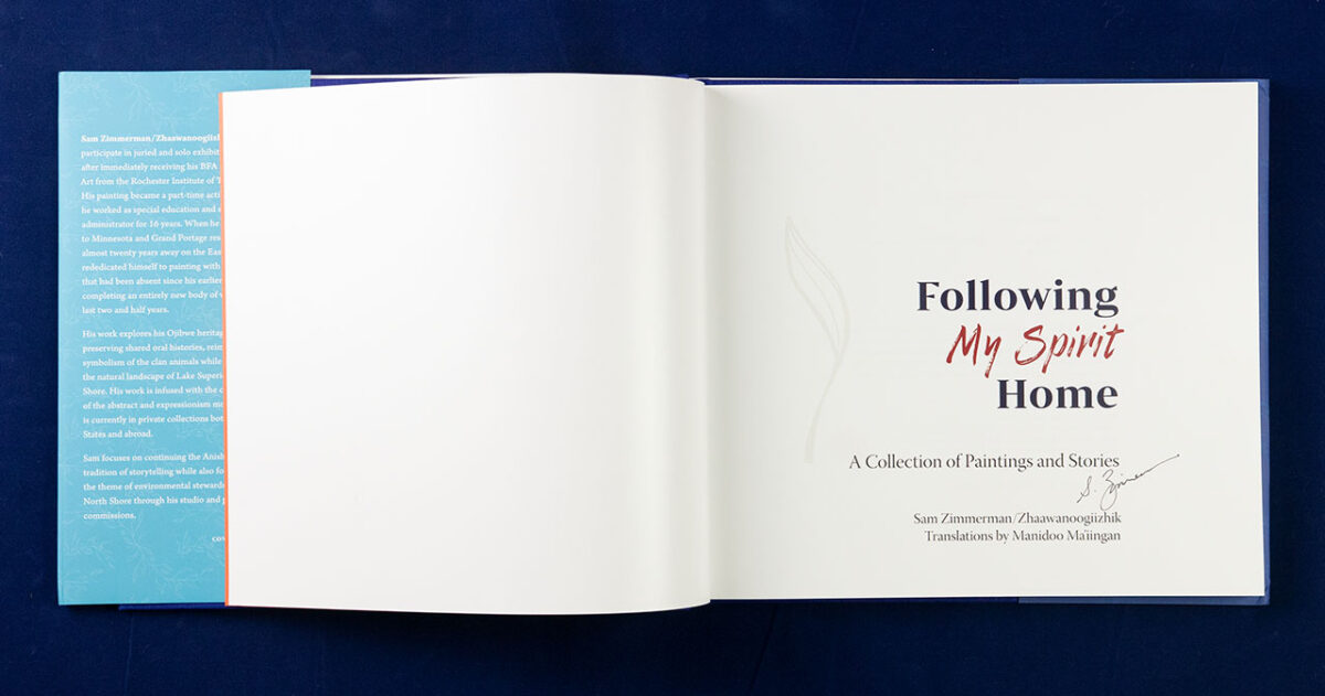
Printed test results in hand, editorial edits completed, and all design decisions finalized, it is time to bring everything back together and create the final version of the book.
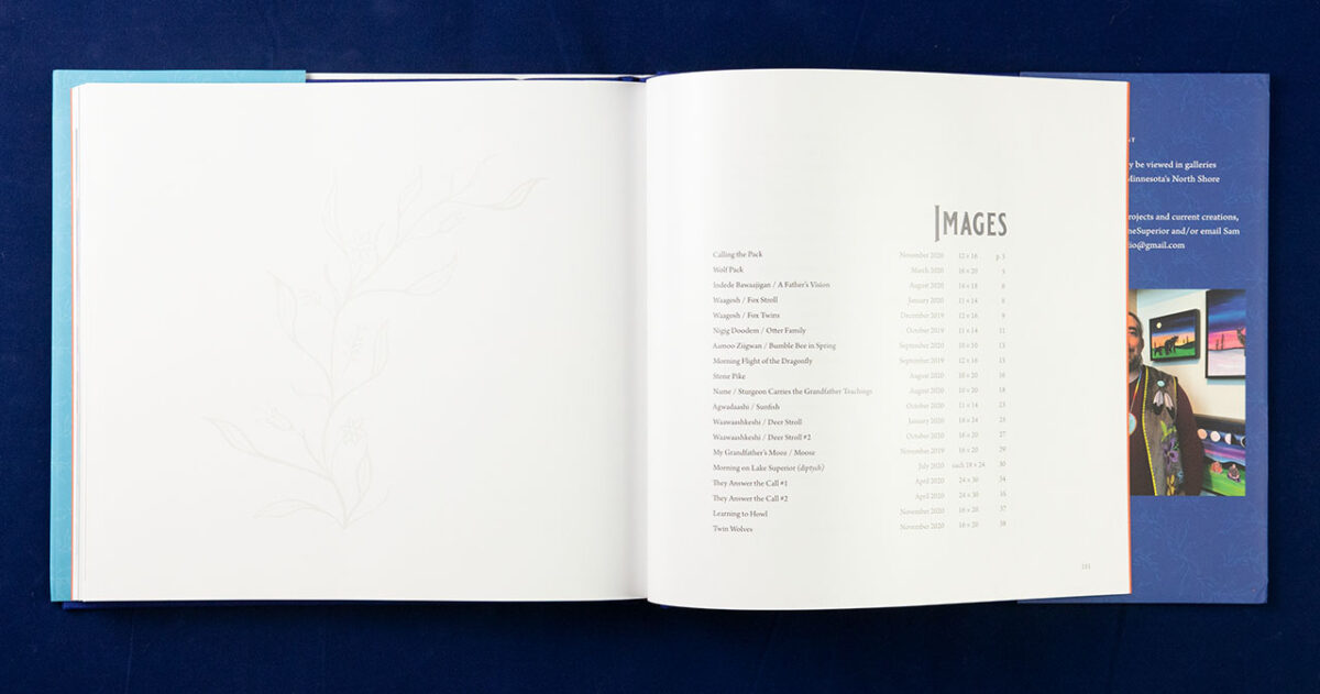
By this point in the process we had finalized on a presentation for the text, both English and Ojibwemowin. To finalize the imagery, I would need to do a little finessing in Photoshop to ensure everything was of sufficient resolution for crisp printing, and in some cases expand image areas slightly to allow for the area to be trimmed when images were run full bleed. Front and back matter are finalized—including adding a helpful table of images as a catalog of Sam’s work.
Cover Details: Dust Jacket, Foil Stamping
To finalize the exterior, the cover design needed to be expanded to incorporate the flaps necessary for the dust jacket. In addition, an alternate design of the cover and spine were created for the foil stamping. And commercialization details such as the bar code are added.

Softcover Edition
When the Minnesota Historical Society Press decided to republish Sam’s book, they made the decision to bind it as a softcover to keep the book more accessible to consumers. Although the interior essentially stayed the same, this change required some minor adjustments to the cover design. Because French Flaps were not in the cards, everything that was on the flaps now needed to reside elsewhere in the book—adding an “about the author” page at the very end of the interior, and reworking the back cover endorsements.