A Photo Memoir and Study in Ecology
“Paul Nylander was just the pleasant partner I needed to bring my book to its best fruition. He listened patiently and saw my vision. He took over with his considerable expertise and attention to detail, yet always respected my wishes as the author.”
Holly Jorgensen, Author
Enchanted: Reflections from a Joyfully Green and Frugally Rich Life is a testament to author Holly Jorgensen’s dedication. Over ten years in the making, this book chronicles Holly’s life through her dedication to live simply and close to the earth.
You can imagine that, thinking about her book that long, Holly had some definite ideas about things she wanted to see in the completed project. Her energy and ideas were wonderful; but I’m thankful that she also gave me room to play around—such as the typography with the chapter titles which utilized the Sherlock typeface (later rereleased as Baker Street) by Kimmy Kirkwood of Seattle based Kimmy Design. Body text in Warnock Pro by Adobe’s Robert Slimbach.
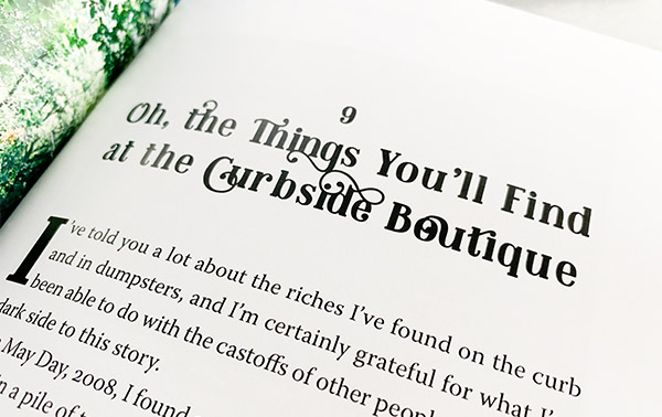
It is the Special Details
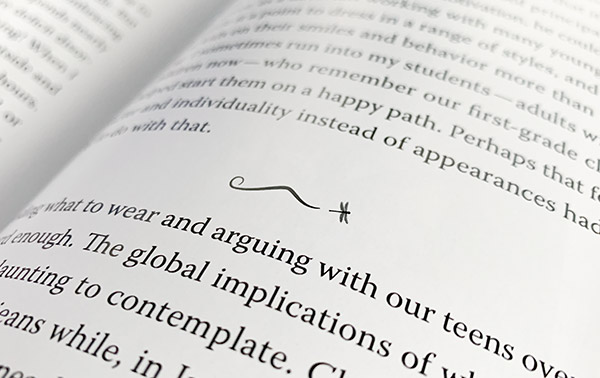
Divider lines, those pauses in the text’s narrative, are a personal favorite for print books. For Enchanted I used Holly’s dragonfly motif to create a little extra flourish. Nothing too complicated, as I don’t want to interrupt the reader, but also an element to tie into the cover.
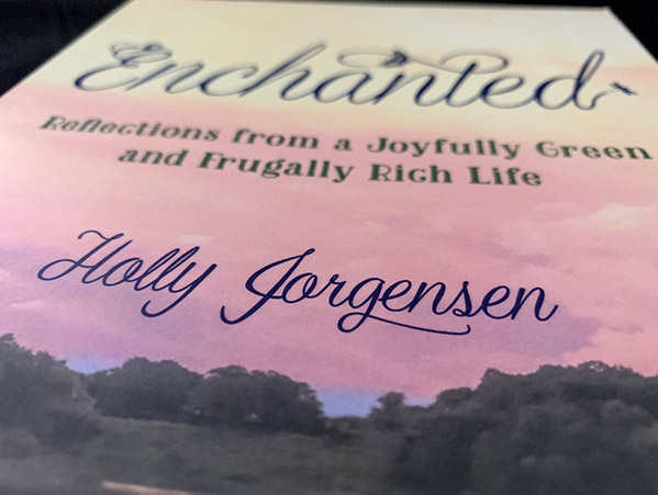
And speaking of the cover, we see Sherlock for the first time in the subtitle, but the title is set in a variation of the Graceful Script by Indonesian design studio Artimasa.
Holly’s name on the cover was a particular challenge. Neither Graceful or Sherlock seemed appropriate, but I didn’t want to add a third font on the cover, and visually overload things. So I created a hybrid of her actual signature and the Graceful font—taller, with her distinctive “J” and mismatched double-l, and swashed-g.
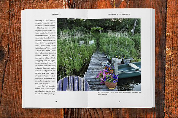
The photo is of course one of Holly’s, looking off the dock at her home on a particularly colorful day, and wraps around to the back cover. Getting the colors just right—not too bright, but not too pastel—took several tries, and I’m grateful to the prepress folks at Bookmobile for getting it right.
Interior Design
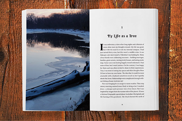
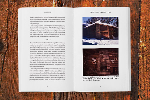
The interior is full 4-color printing, with photos on nearly every other page. As happens with these kinds of projects, I ended up spending a lot of time retouching and adjusting photos. Fortunately, Holly has a good eye and had printed many of the photos herself already. But adjusting them for a 4c, as opposed to photo-paper, printing did take some extra work—as did many of her older snapshots. But in the end, it was worth the time and effort, as the book is simply stunning to look at, and great fun to read.
Launch Party
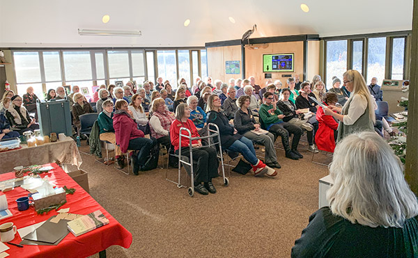
It was standing room only at her launch party. Despite still getting over the flu, Holly was in true form for her friends, neighbors and enthusiastic supporters. Readings, hot cider, singing, and a few door prizes—collectible items Holly personally reclaimed at the “Curbside Boutique.” Zero waste!
“As I was going over my book the final time before printing, I saw one thing I’d have changed—framing a picture so that my mother’s quilt showed up a bit more. But I didn’t want to bother him to make yet another last-minute change. Yet when I went through the printed book, there it was—the quilt as I had imagined it. Paul had come to know my book so well that he read my mind.”
Holly Jorgensen, Author