“Paul’s help with interior design for my book was a godsend. He is thorough, precise, and well-versed in all things book design.”
Roseanne Cheng, Author
Design Challenges
- Extract and retypeset the print book and eBook.
- Create a structure and flow that matches the author’s conversational style.
- Make a book I wold want to read and recommend to clients.
Creative Brief
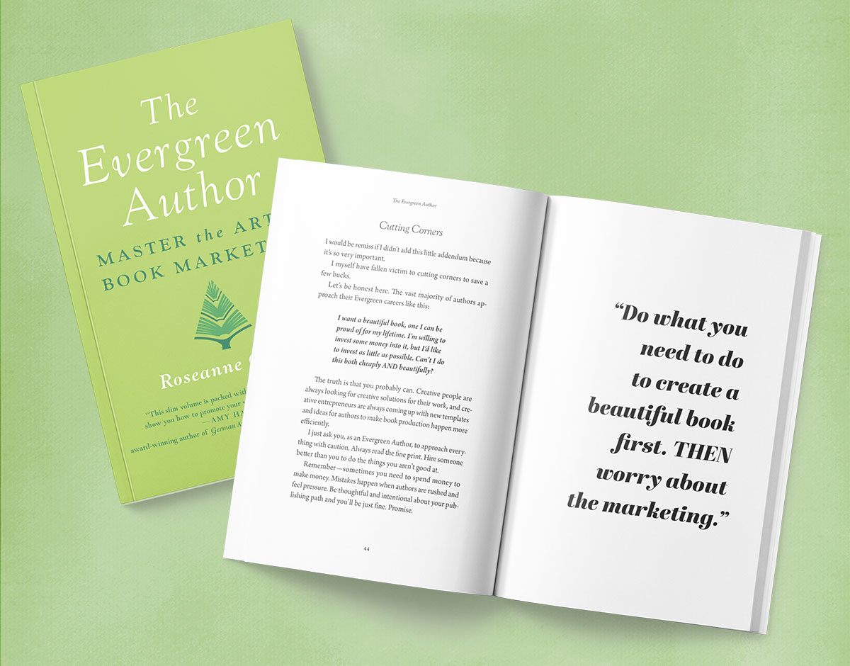
Late 2020, book marketing guru Roseanne Cheng had just launched her fifth book, The Evergreen Author. It set down, in her characteristically conversational tone, a real life approach for authors to build a marketing campaign for their books. I immediately purchased a copy.
Although the content was great, the problem was that the design of the book’s interior … well, I’m going to be honest … although it wasn’t the worst designed book I’ve seen published, as a book targeted at newly published authors, I felt it didn’t properly reflected Roseanne’s professionalism and dedication to her clients.
In a brief moment of courage, and as a friend and colleague, I told her so. About that same time, another reader who purchased the eBook said about the same thing of that edition. Ouch!
Roseanne was understandably mortified. In her excitement to publish her new book, she made a classic rookie mistake: focused on the cover, but neglected the design of the interior. But good typesetting makes all the difference! This is tantamount to laser focus on the sale, but neglecting the customer service.
Lesson learned, she desperately asked for help. My mandate: quickly transform The Evergreen Author into a book I would actually enjoy looking at.
Layout & Typesetting
Before & After
As a rule, if you notice the design of the interior of a book, there should be a good reason the designer is interrupting your reading. Unfortunately, in the original design of The Evergreen Author, with its double line spacing and contrasty text fonts, it was distracting without good reason.
In this blog article on good typesetting, I look into the typographic issues more closely. Suffice it to say, once I had the text in my InDesign software, I could quickly clean things up: a better text font, improved spacing, and a host of other typographic no-no’s were fixed.
Extract and Reset
Before I could work on the book, I needed the text in my design software. We couldn’t work directly from the original manuscript, as proofreading changes had been made to the typeset book. And although we didn’t have access to the original design files, we did have the print-ready PDF files from the original version.
I was able to extract the text from those, and then typeset the book as I would with any other original manuscript project.
eBook Needed Redoing, Too
Unfortunately, the double-spacing was carried over to the ebook as well. Another no-no in the original eBook was a fixed size and font on the type—while the original eBook conversion was faithful to the print book’s design, it was not what eBook readers expect.
It is fortunate that we were alerted to this issue early; it is far easier to create a new eBook while I’m typesetting the print book.