In this exciting project, I created the interior layout and typesetting for the textbook/workbook Transformational Coaching for Early Childhood Educators by author Constant Hine. I worked with publisher Redleaf Press to create a book which met the author’s wishes, although in this instance I never met her myself.
As a text book for teachers, the editorial team at Redleaf Press worked diligently to ensure accuracy through three rounds of proofreading edits, and input from several editors and reviewers. It was a complex book, even as a workbook, with a number of specially formatted sections, fill-in forms, and informational graphics.
Organizing the Content Types
Unlike a novel or other book of prose, textbooks often have a complex structure, with a number of specialized content elements. To navigate this material, the reader needs a clear hierarchy of chapters, sections, subsections, etc. All of this must be sorted out, and I was grateful for Redleaf’s experience in this area: in addition to the manuscript with their own in-house stylistic markup system, they provided several supporting documents including a comprehensive design brief, a listing of their various styles (all 26 of them), and editorial notes with preliminary ideas for graphics.
From there, I created a preliminary layout and sample chapter for review. With a few tweaks based on the client’s feedback, I had my structural definitions and styles ready to go well in time for delivery of the final manuscript.
The visual elements were limited by the production decision to run the contents entirely in black & white. Based on the provided cover design, I pulled out the building block motif, separated and reprocessed the blocks to create consistent block motifs in the title page and chapter openers, consistent yet unique to each occurrence.
Interior Layout & Typesetting
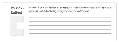
To accommodate the variety of content types, the page layouts had to follow suit—always maintaining an overall coherence, while honoring the content type. Tables and graphics, dialogs, worksheets and exercises, lists and descriptions, . . . this book had it all.
In addition to carrying the block theme from designer Louise OFarrell’s cover design through to the chapter opener pages, the visual motif was also employed as accents for several special sections.
The 8-1/2 x 11 page size is generally too large for comfortable reading of text in a single column. In the “page-within-a-page” design, the main text block is set in a narrower single column, with generous margins. The outer margin then used for notes, tips, as well as overflow space for pull quotes and oversize tables. Meanwhile, the included worksheets are designed to fully utilize the page area for writing space. These worksheets are also available in a separate download.