What makes a good layout? What is the hallmark of well done interior typography? These are questions that far too few people in publishing ask themselves. But the answer is quite simple: it should be so intuitive, you don’t notice is it designed.
Conversely, if you do notice the design, there had better be a good reason for interrupting the reader!
Unfortunately, in the original design of The Evergreen Author, author-publisher Roseanne Cheng fell into a classic trap: she was so focused on the cover design, she neglected to notice problems in the interior design. I alerted her to the shortcomings, and she ended up hiring me to redo the interior of both the print and eBooks.
In this article, I want to explain exactly why I was so bothered by the original, and what I did to improve things.
And one last note: my point here isn’t to throw anyone under the bus, and so I am not naming names for a reason. But this is such a great example to see how the typographic decisions we make really do matter. And because I have printed, published examples of both versions, I was really able to compare the on-screen and in-print original and the retypeset version when I was done.
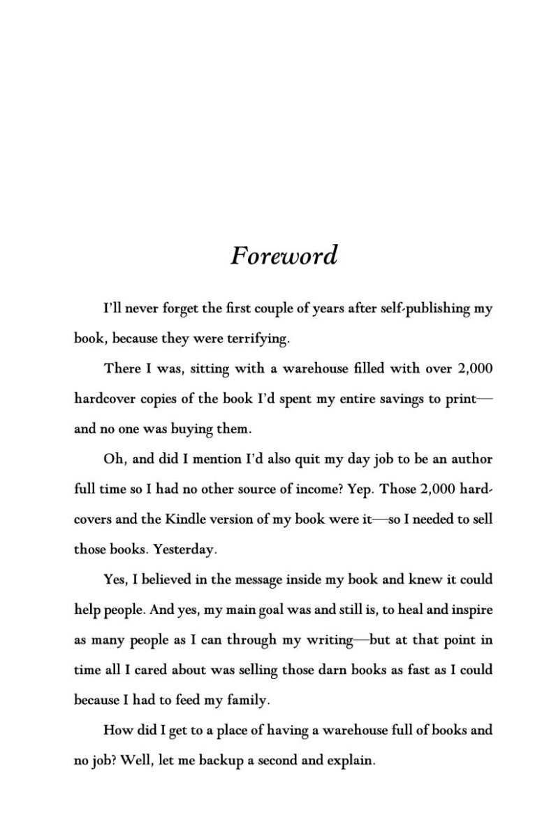
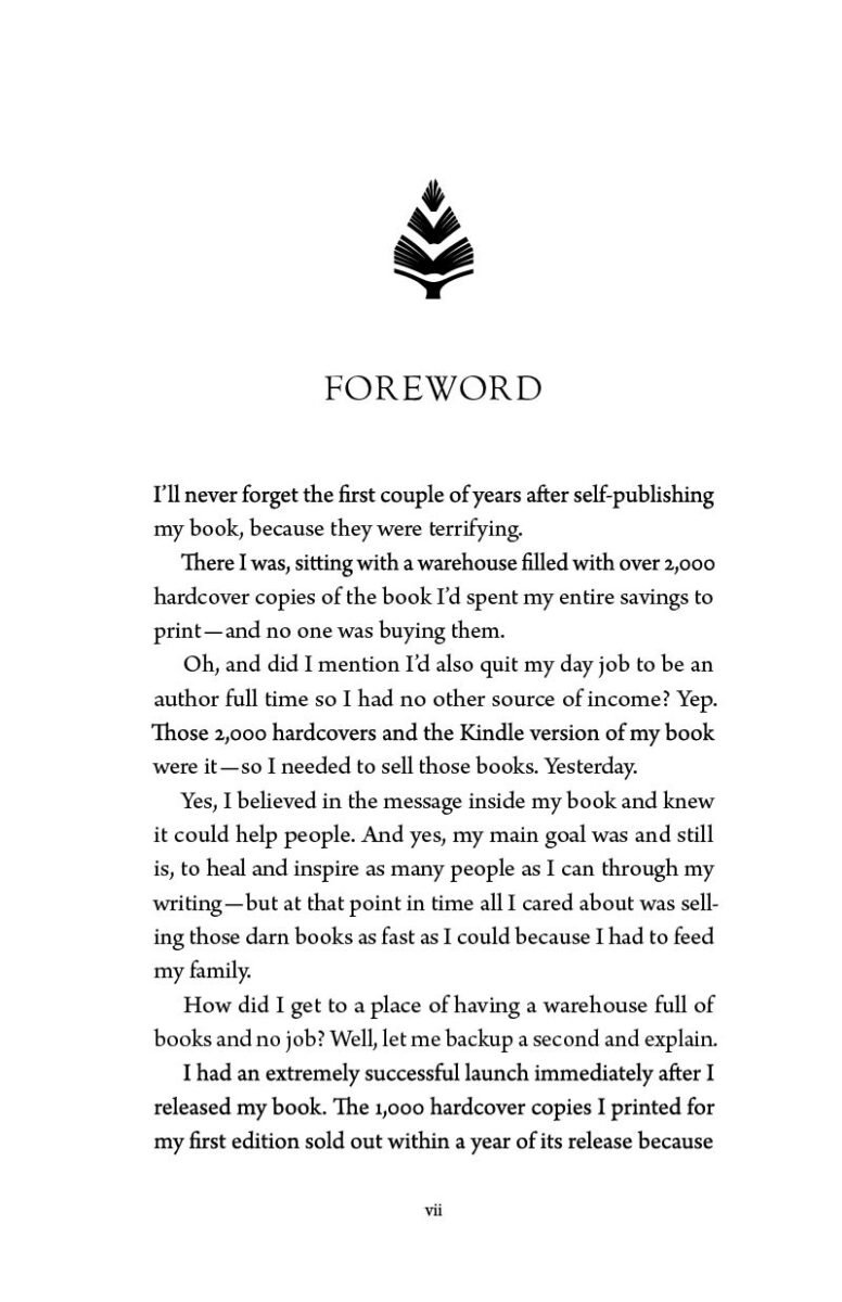
Before and After
Line Spacing
The first problem is the line spacing, what in typesetting we call leading (in reference to the metal lead used in thin strips to space lines of type in letterpress printing). In the original, the lines are too spaced out: when your eyes get to the end of a line, it is hard to zoom back to the left and not loose your place. This means reading the original version is more effort, and a less enjoyable experience, for your reader.
Wrong Typeface
To compound the problem, in the original, the beautiful Goudy Modern typeface from Monotype was used. However, this is not intended to be a text typeface. It is good for headers (and indeed I would use a similar Goudy Oldstyle for the retypeset headers). I replaced it with Arno Pro, a very solid and respectable text typeface.
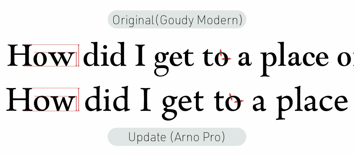
Arno’s x-height is slightly larger, meaning the relative height of the lowercase and uppercase letters is larger. This makes typeface easier to read.
In addition, Goudy is higher contrast,the ratio of thicks to thins is larger. While this is nice for a display face used in titles or headings, it is not something you want to read in small type page after page. Again, it is about legibility, and ease of reading.
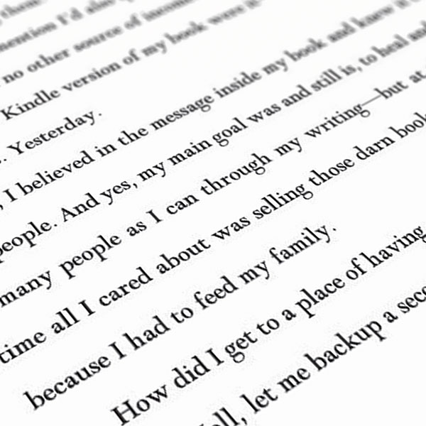
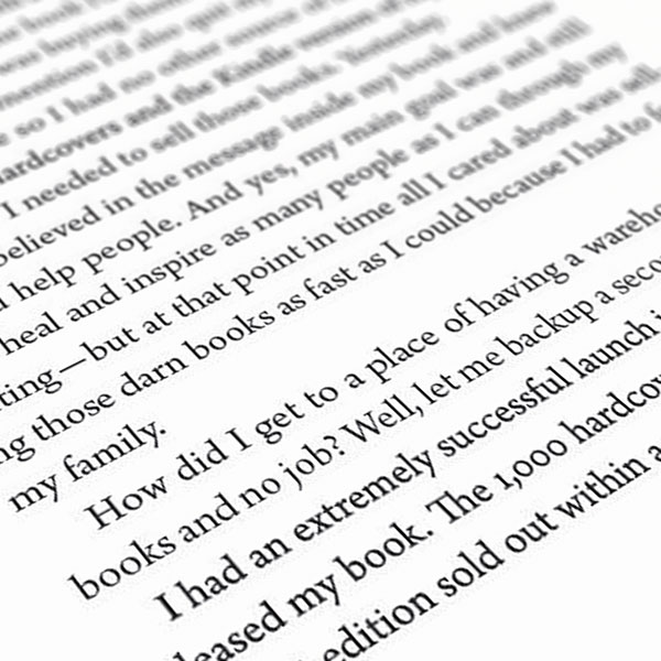
The art side of typography is that there is no one combination of font, font size, and leading that works. It depends on the page size, margins, and other elements that appear on the pages. But the general goal is a pleasing and uniform color of the page. By color I don’t mean hue, but average tone. Squint your eyes (or take your glasses off if you’re nearsighted like me); there should be a middle grey—not too much ink, not too much white in the page.
It is subjective, but not arbitrary.

Leave a Reply
You must be logged in to post a comment.