Memoir: The truth of “Liar, Liar”
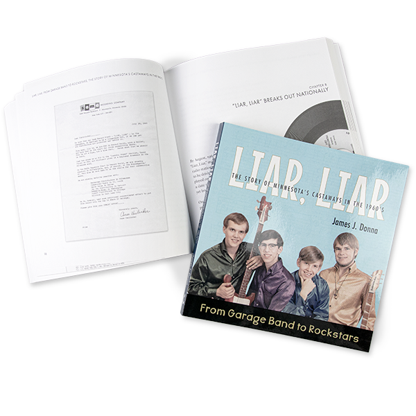
The fact that Minnesota is a hot-bed of musical talent was established long before “the purple one” broke out. In the summer of 1965, the Castaways, a garage band started in the suburbs just south of Minneapolis, would take their hit “Liar, Liar” all the way to #1.
While the story has been documented before, the whole story, the band’s rise and return to Earth as told by song writer, keyboardist, and band leader Jim Donna, was a project long in the making.
So it was that, fifty-seven years later, Jim and I were talking about how to turn his collected notes and pictures into a book.
Design Challenges
- Incorporate a wide array of photographs
- Work at multiple levels, for the readers and the skimmers
- Keep the price point manageable for direct sales
- Ensure the book feels substantial
- Build both a b&w print and color ePub edition
- Fun! This book is for the memories of the kids who first watched the band in the ’60’s
Cover Design
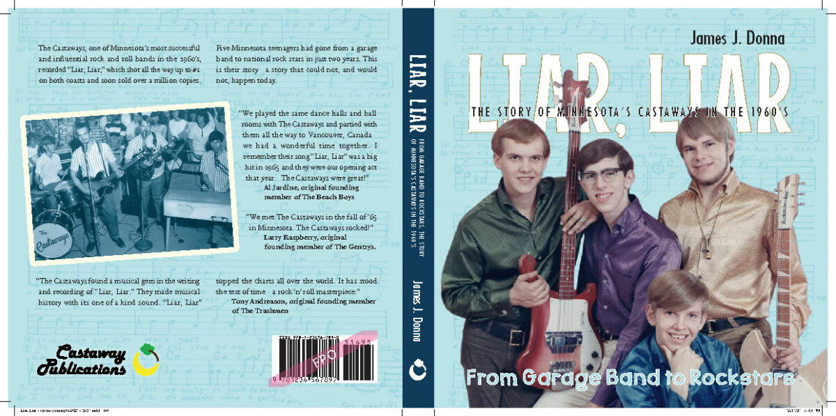
Playful, ’60’s, rock-n-roll. We wanted a cover that was catchy, but true to the era. Jim provided me with a number of comps—other books about bands from the era, especially Minnesota bands. Some good, some … left a lot to be desired. But at the least it seemed we would feature an image of the band. And we agreed that a square softcover book, an 8 x 8, would be a good balance of size, cost, and reminiscent of an album cover.
I worked up some ideas based on their publicity photo, in some cases digitally manipulating the photo to provide a better composition. I was going for a variety of styles, to see what resonated with Jim the most.
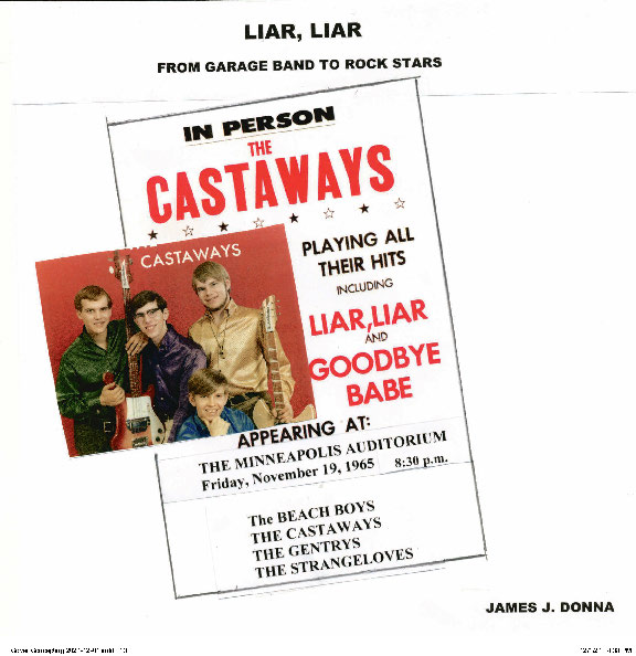
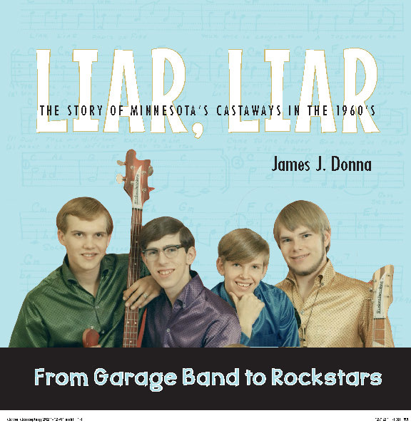
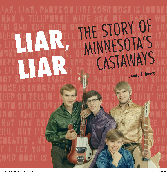
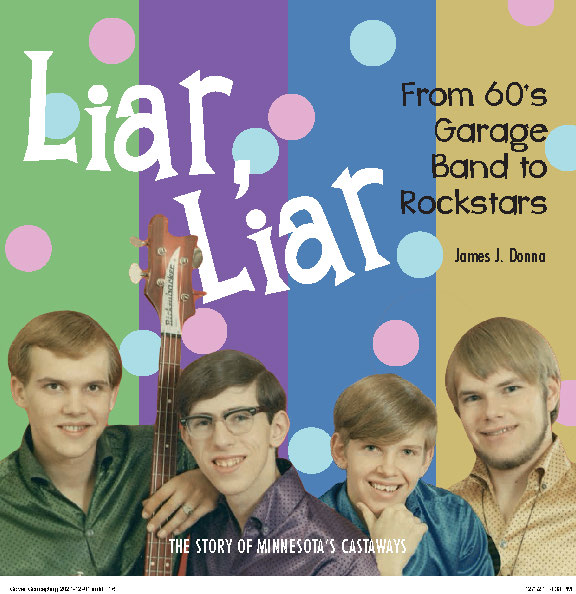
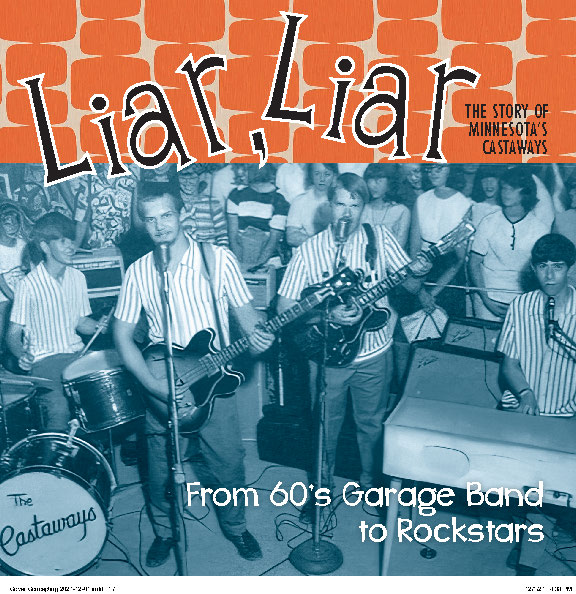
Jim loved the blue toned photo of the band in concert (the fifth option shown here), as did many former colleagues of Jim’s—anyone who was in a band at the time.
But ultimately we decided together that the version with the light blue field (a screened back version of the original sheet music of Liar, Liar) was stronger. But I made sure to include the band picture on the back cover, as I worked up a couple of alternative placements to test market. The original design really connected with people.
Layout & Typesetting
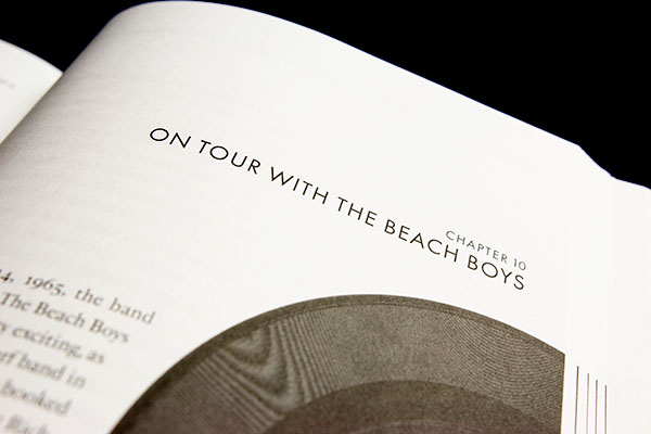
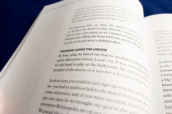
The decision to make and 8 x 8 square book rested in the idea of layout flexibility. It would be poor design to run text across the full width of an eight inch page—the line length is too long for comfortable reading. So I set the book up with a nominal four inch column, and a generous sidebar space. The sidebar allowed me to bump out photos and various pull quotes and excerpts from the story.
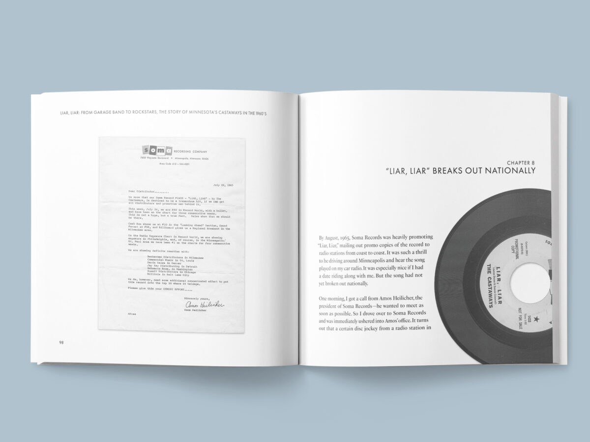
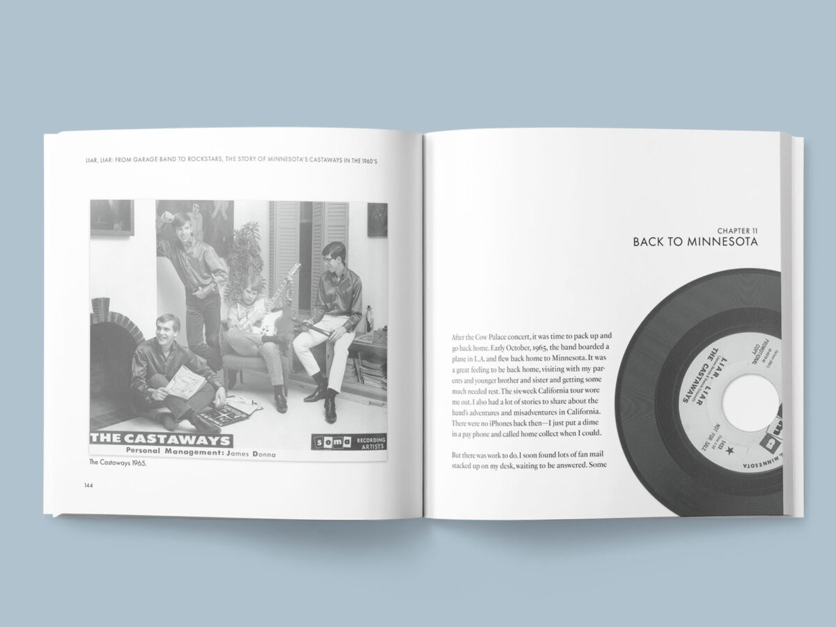
This layout gives the book more energy and surprise while reading. Plus, it allows a reader to skim through things easily, flipping to find photos and quotes. I could also use the sidebar area for chapter titles. And the fun bit of tchotchke that Jim really wanted, a scan of the original promotional ’45 of “Liar, Liar,” rotating a bit with each subsequent chapter. Cliché, sure. But still fun!
Since the target audience for this book were teenagers in the ’60’s, Jim also wanted to make sure things were easily readable. Not necessarily large type, but definitely clear type. I worked up a few sample pages for Jim in different fonts and type sizes to make sure he was happy with the results. Once that was nailed down, I could take the fully edited manuscript and flow it through my designed layout.
A word about font choices
I chose to use PS Fournier (Adobe) as the body text because I wanted something that, while still eminently readable, had a bit of character to it. Something with a bit of contrast (thicks-vs-thins), but that would still work on the planned digital press. Plus Stephane Elbaz’s work offers many weights, and a clean, well-paired italic.
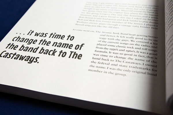
Headings and subheadings are in all caps Futura, very apropos for the time period of the book (1960’s), and one of my favorite fonts to use. It is clean, readable, and well styled in its thin weight. The title and pull quotes are where I could really have fun, and I chose Mouse Memoirs by Astigmatic, a font I’ve used previously, although only in children’s books. It’s playfulness seemed to capture the mood for these teenagers in the late 60’s heading off on their wacky adventure.
For the subtitle, Whiz Bang Pow (Brittney Murphy), another children’s book repeat, kept the funky hand-drawn unevenness idea going.
Photo editing
This book contains fifty-four images. As happens with most of the memoirs I design, some of the photos are good—sharp, clear, well scanned. And some of the photos need a lot of work. Touch-ups, noise and dust removal, repairing tears, and generally trying to clean up older photos is par for the course. It is important to me that we always get the pictures as good as we can.
I also wanted to run some test pages. By this point in the process, Jim had decided to use Bookmobile to print and bind the book. Which is good, Bookmobile generally does great work. But I have had issues with their printing of black and white images in the past, and wanted to make sure we had things dialed-in correctly before proceeding through all the book’s photo processing. More on that, below.
In this book, the task of photo editing was further complicated by the ePub version. In principle, since the print book is black and white and about half the images were already black and white, I could have just gone with black and white photos in the eBook. But being the detail oriented type, I decided it would be a nice touch to retain the color images where they existed for the electronic version.
I build the ePub after completing, and based on, the print version of the interior. So, that meant I needed to manage both the color and black and white versions of the images in my master file, simultaneously. More on that, also, below.
Indexing
While this book is part memoir, and tells the story of Jim’s life during this exciting period, it is also a reference. Since he talks about the music scene at the time—the places they played, the people they met—we made the decision that this book should contain an index. At least a simple one.
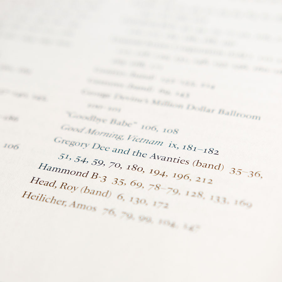
The mechanics of an index are easy enough—an alphabetical list of terms, and page numbers. But the creation of an index is anything but simple. For a full-blown index, it is necessary to hire an indexer. This specialized professional will read the finished book, and having knowledge about the subject matter already, build both a list of appropriate terms and concepts, as well as their relevant page references. This is always done at the very end of design, right before a book is made ready for printing.
This is, however, more than we needed for Liar, Liar. Instead, Jim created a list of terms so I could build a simple index (technically a concordance) right within InDesign, the software I use for page layout and typesetting. Given his terms as an input, I generate a list of page number based on a straight-forward text search.
It does mean we need to be careful about how we handle names (to capture people referred to by full name, as well as first of last name only), and other terms that might appear in more than one form (plural, for instance). And it still requires a careful review to make sure all the page numbers generated are pertinent.
For example, one of the terms is the name of the band, The Castaways. And as you might expect, the band name appears on almost every page of the book! So this needed to be winnowed down to just the references that a reader would want to use to seek out information on the band. The simple index is imperfect in this sense, but it still is a helpful tool to readers and researchers.
Our additional complicating factor is that this book is produced for both print and eBook. And while an index is less important in an electronic document (you can, after all, search the text), we made the decision to still include the index with the original page number references as hyperlinks in the ePub document.
Production
Test prints, hard proofs
Jim opted to do a small print run of books using Bookmobile, based here in Minneapolis, Minnesota. Bookmobile does an excellent job at short run soft cover color and art books, using one of their digital Xerox printer and in-house PUR perfect binding. They also do a great job with crisp text in black and white books using an Océ printer.
The trick comes when you want to print black and white images. For photo projects, such as David Wong’s Beauty in Plain Sight, a pair of photo books, we opted for the extra expense of the color printer. The blacks are richer, the printing is more controlled, and can be slightly tinted as a bonus. But for Jim’s book, we wanted to keep things more economical by using the black-only press for the interior.
Because I knew this had been problematic with previous projects at Bookmobile (issues such as shadows blocking up), I asked if we could run test sheets. Unfortunately, Bookmobile’s schedule wouldn’t allow it. So, after the digital equivalent of dotting my i’s and crossing my t’s, checking everything against their recommendations, we went ahead and had them run a full hard proof.
The big advantage of a digital printer is that the proof comes off the same press that will actually run the book. So you are seeing “the real thing.”
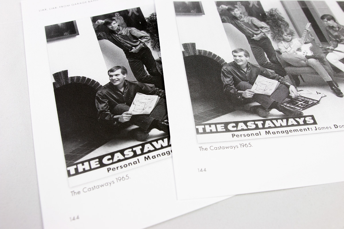
And what we saw, unfortunately, was still blocked up shadows. Even after I had adjusted every image to compensate for the heavy blacks they produce, the images still all felt heavy, dark. So we rejected the proof.
Fortunately, Bookmobile’s crack prepress folks helped us work through the problem. After chasing down a couple of red herrings, we finally determined the challenge: while the files I generated out of InDesign correctly used only the black ink channel, the combination of InDesign transparency (a slight outer shadow on images), greyscale photoshop images, and the Bookmobile PDF settings were leading to two different grey color spaces being used. (One of these days I’ll write a blog post about the technical aspects of this unusual problem.)
A printer’s raster image processing (RIP) software is responsible for converting my output files into a language the actual printer can understand. Theirs was misinterpreting things, resulting in an incorrect mapping of shades of grey. Bookmobile had missed this in their QC checks. Once we understood the problem, they were able to reprocess the file, and on a second proof everything looked better. Disaster averted!
Which is why, whenever possible, always look at printed proofs. Just imagine if Jim’s entire order showed up too dark!
ePub Conversion
In my workflow, I start by creating the print layout. That is used for final proofreading and, once everything is approved, is sent off for printing. In parallel, I create a new version of the layout file which is intended for ePub output. An ePub file is what is uploaded to Amazon’s Kindle, Apple’s iBook, and any of a host of other platforms that distribute eBooks.
Essentially an ePub is a self-contained website, based on a fairly old (by web-years) standard. There are several changes that have to take place to create a reflowable ePub—one that the reader can change the font and type size, change the background color, etc. First, I have to eliminate any specialized formatting that only applies to print—my typesetting controls that ensure there are no visual hiccups in the appearance of the lines of text in the book.
In the case of Liar, Liar, or any other book with images in the flow of the text, I also needed to ensure the captions would stick with the images, and the pair would be placed in the correct location within the text. While a print book’s layout is a finely crafted visual picture, a reflowable ePub can change—it can reflow—depending on the device’s screen size, orientation, and user settings. In other words, as a designer, I have almost zero control over how the text appears!
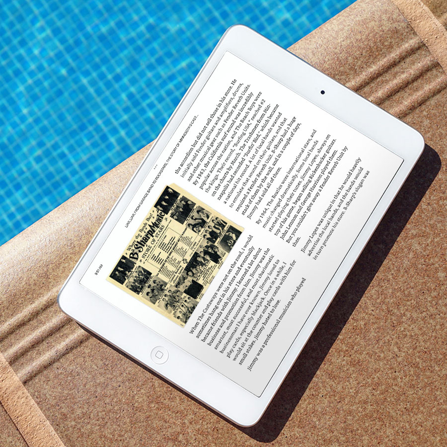
There were two other significant differences between the print and eBook versions. First is the images: because many of the photos were in color, I preserved the color versions in the ePub. And since the ePub is derived from the print layout, that meant I needed to keep two versions of every photo in the layout, switching the color off when generating the print ready files, and switching the b&w off when generating the ePub output files. A delicate balancing act, and careful planning allowed me to pull this off without issues.
Second, the index. Unfortunately, there isn’t a defined standard for how to handle an index in ePubs. Different platforms offer different options, but there is no one universal approach. So we opted to keep things simple: I preserved the print version’s page numbers in the ePub, but made them all hyperlinks to the appropriate reference wherever they showed up in the ePub text. Is this a bit of a cheat? I suppose so, and purists might cringe when they see it. But I figured it was better to err on the side of making it easier for the reader.
Marketing & Sales
Publishing Logo
While I don’t manage the business side of a publisher’s work, I will help advise where I can. One of these areas in Jim’s case was deciding under which name to publish Liar, Liar. I knew he was particularly sensitive about the topic of trademarks, having worked hard to ensure he retained the legal right to use the “Castaways” band name.
He opted to publish under the name “Castaways Publications.” And that meant he needed a new logo.
We opted to stick with something which was essentially the same as “The Castaways” logo, to make the association clear. But I rebuilt the image and reworked the text to make something more book appropriate. Both for the back cover, and on the spine.
Distribution decisions
How to handle book sales is something I always talk with my clients about early in the process. While it doesn’t affect the design directly, it is important to me that my clients understand the financial aspects of their decisions. Invariably, the question turns to distribution (the sale of books into stores) and fulfillment (shipping books to stores and/or online consumers).
Direct sales (sales by the author/publisher) lead to the best margins. But most authors are limited in how many possible readers they can personally reach—although with a good web page, targeted online ads, it is possible to build up to a substantial following.
In this case, Jim preferred to print books in advance, and warehouse them with Itasca. Itasca would also handle fulfillment of direct online orders, saving him the hassle of running to the post office every time someone ordered a book online.
Sell sheet & promotional
The help promote the book, Jim made the sound decision of asking me to also create a sell sheet. This one page sheet can be sent digitally or physically to media outlets and others who are (hopefully) willing to help promote the book. It contains all the pertinent details for ordering, as well as sound bite teasers about the content, and any endorsements.
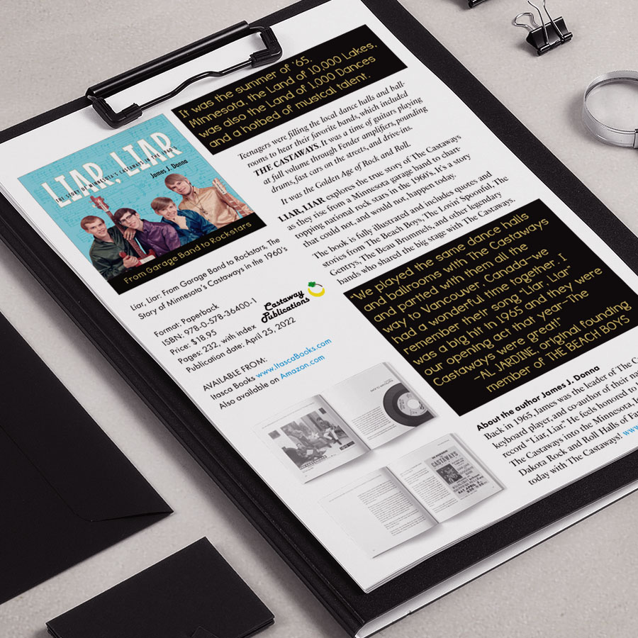
The challenge for me as a designer was creating something that was clear and understandable at a glance, but wasn’t too “designed.” I think we struck a good balance.
I also created a facebook image and a couple of smaller book-on-background images for Jim to help with his promotion efforts.