Why Publishers Hire Professional Designers for Book Interiors
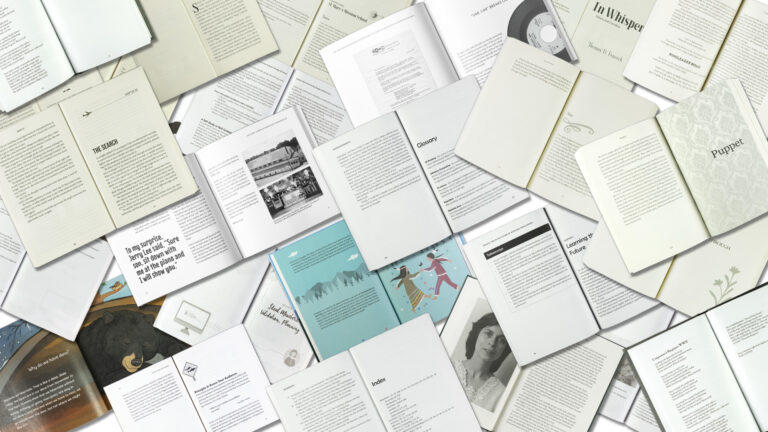
Recognizing the Value of Professional Design I want to compliment designer Andrea Reider for her guest post on Jane Friedman’s blog last week. It really did get me thinking. The…
Recognizing the Value of Professional Design I want to compliment designer Andrea Reider for her guest post on Jane Friedman’s blog last week. It really did get me thinking. The…

Paul Nylander and three other designers discuss their career paths at this AIGA Minnesota Lunch and Learn. Design is more than the rules!

One of the more perplexing questions to answer in preparing a book for production is what paper to use. Here I walk through the numbers, and explain my recommendations.
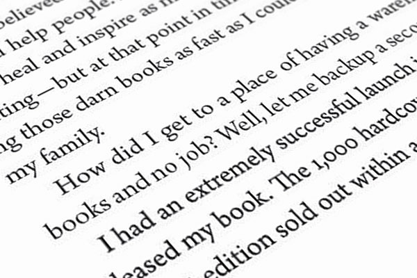
The hallmark of good book typography is an even “color,” or broad tonality, across the page. Here is a before and after example of book typesetting.

Understanding the limitations to font licenses can save headaches down the road, for publishers and designers alike.

What color black do you want? Understanding rich blacks in a real world comparison.
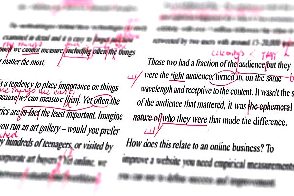
When used properly, digital commenting tools are faster, more traceable, and more accurate . . . if somewhat less flexible than their handwritten brethren.
